MEP Layout classes
MEP
stands for
Mise En Page
(which means "layout" in french). It was created as a bunch of easy-to-use
html
components for our content editors to nice and easily lay their articles out.
If you find a bug on a component, an error on this documentation or you want new features, please create a new query on the Drupal Trello board. We will work on it according to the priority.
CkEditor 5 Rules
Drupal has updated CkEditor into version 5. This new version has some new rules that you have to follow to avoid design errors.
Buttons / Links / Inputs without Parent
All
button, a
and
input
elements
can't be alone (without a parent element). A parent element can be:
- div (recommended)
- p
- td
- li
- blockquote
- h1
- h2
- h3
- h4
- h5
- h6
We recommended you to use
DIV
parent tag.
So you have to add a
parent element
before all
button, a and input
(DIV tag is recommended).
What happen if I don't add a parent element in
button, a and input?
CkEditor 5 will automaticly add a
P
tag inside your button, a or input, and it will break the design. Also it can put your SVG outside the button.
Example:
Without parent element
<a href="#">Text</a>
<button>Text</button>
<input type="text" />
<center>
  <a href="#">Text</a>
</center>
<span>
  <a href="#">Text</a>
</span>

When you save or unclick Source button in CkEditor it will be converted to
<p>
  <a href="#">Text</a>
</p>
<p>
  <button>Text</button>
</p>
<p>
  <input type="text" />
</p>
<p>
  <a href="#">Text</a>
</p>
<p>
  <a href="#">Text</a>
</p>
And it will break the design, so you have to add a parent element and we recommended to add a
DIV
for example:
Without parent element
<a href="#">Text</a>
<button>Text</button>
<input type="text" />
<center>
  <a href="#">Text</a>
</center>
<span>
  <a href="#">Text</a>
</span>

Result when you save or unclick Source button in CkEditor it will be converted to
<div>
  <a href="#">Text</a>
</div>
<div>
  <button>Text</button>
</div>
<div>
  <input type="text" />
</div>
<center>
  <div>
    <a href="#">Text</a>
  </div>
</center>
<div>
  <a href="#">Text</a>
</div>
Links without content inside
It's mandatory to add something inside
a href="your-link"
. If you don't add something, the link it's going to be replaced by
"& nbsp;"
(an empty space). You can add an icon, text or if you don't want to add any content, you can add
& nbsp;
Examples:
Link with anything inside (Wrong option)
<div>
  <a href="#"></a>
</div>
Result when you save or unclick Source button in CkEditor it will be converted to
& nbsp;

// ----------------------------------------------------------------------------

Link with only icon inside (Good option)
<div>
  <a href="#">
    <svg class="icon icon--16">
    <use xlink:href="/sites/your-web-url/themes/custom/agrippa/img/sprite.svg#icon-thumbs-up"></use>
  </svg>
  </a>
</div>
Result when you save or unclick Source button in CkEditor it will be converted to (the same)
<div>
  <a href="#">
    <svg class="icon icon--16">
    <use xlink:href="/sites/your-web-url/themes/custom/agrippa/img/sprite.svg#icon-thumbs-up"></use>
  </svg>
  </a>
</div>

// ----------------------------------------------------------------------------

Link with only text (Good option)
<div>
  <a href="#">
    Text
  </a>
</div>
Result when you save or unclick Source button in CkEditor it will be converted to (the same)
<div>
  <a href="#">
    Text
  </a>
</div>

// ----------------------------------------------------------------------------

Link with text and icon (Good option)
<div>
  <a href="#">
    Text
    <svg class="icon icon--16">
      <use xlink:href="/sites/your-web-url/themes/custom/agrippa/img/sprite.svg#icon-thumbs-up"></use>
    </svg>
  </a>
</div>
Result when you save or unclick Source button in CkEditor it will be converted to (the same)
<div>
  <a href="#">
    Text
    <svg class="icon icon--16">
      <use xlink:href="/sites/your-web-url/themes/custom/agrippa/img/sprite.svg#icon-thumbs-up"></use>
    </svg>
  </a>
</div>
Introduction paragraph
Simply add the
intro
class to your
p
tag.
Lorem ipsum dolor sit amet, consectetur adipisicing elit. Dolores iusto, expedita iure veritatis labore, nulla, ullam commodi iste velit dicta adipisci illo natus voluptatem quos fuga beatae! Odit ullam doloremque obcaecati provident consequatur voluptates atque labore ab totam ipsum aperiam tempore hic itaque, eligendi iste. Sunt esse, fuga rerum vitae.
<p class="intro">Text</p>
Summary
You can use ordered lists, unordered lists, and a mix of both types nested.
<nav class="summary" aria-labelledby="summary-title">
  <p id="summary-title" class="title">Summary:</p>
  <ol>
    <li><a href="#id1"></a>
      <ol>
        <li><a href="#id1a"></a>
          <ol>
            <li><a href="#id1a1"></a></li>
            <li><a href="#id1a2"></a></li>
          </ol>
        </li>
      </ol>
    </li>
    <li><a href="#id2"></a>
      <ol>
        <li><a href="#id1a"></a></li>
        <li><a href="#id1b"></a></li>
      </ol>
    </li>
    <li><a href="#id3"></a></li>
  </ol>
</nav>
Summary without title
Section Title
Lorem ipsum dolor sit amet, consectetur adipiscing elit, sed do eiusmod tempor incididunt ut labore et dolore magna aliqua. Ut enim ad minim veniam, quis nostrud exercitation ullamco laboris nisi ut aliquip ex ea commodo consequat. Duis aute irure dolor in reprehenderit in voluptate velit esse cillum dolore eu fugiat nulla pariatur. Excepteur sint occaecat cupidatat non proident, sunt in culpa qui officia deserunt mollit anim id est laborum.
<h3 id="title-id" Section Title </h3>
<p> Lorem ipsum dolor sit amet, consectetur adipiscing elit, sed do eiusmod tempor incididunt ut labore et dolore magna aliqua. Ut enim ad minim veniam, quis nostrud exercitation ullamco laboris nisi ut aliquip ex ea commodo consequat. Duis aute irure dolor in reprehenderit in voluptate velit esse cillum dolore eu fugiat nulla pariatur. Excepteur sint occaecat cupidatat non proident, sunt in culpa qui officia deserunt mollit anim id est laborum. </p>
<nav class="summary" aria-labelledby="title-id">
  <ol>
    <li><a href="#id1"></a>
      <ol>
        <li><a href="#id1a"></a>
          <ol>
            <li><a href="#id1a1"></a></li>
            <li><a href="#id1a2"></a></li>
          </ol>
        </li>
      </ol>
    </li>
    <li><a href="#id2"></a>
      <ol>
        <li><a href="#id1a"></a></li>
        <li><a href="#id1b"></a></li>
      </ol>
    </li>
    <li><a href="#id3"></a></li>
  </ol>
</nav>
Ordered Summary
<nav class="summary" aria-labelledby="summary-title">
  <p id="summary-title" class="title">Summary:</p>
  <ol>
    <li><a href="#id1"></a>
      <ol>
        <li><a href="#id1a"></a>
          <ol>
            <li><a href="#id1a1"></a></li>
            <li><a href="#id1a2"></a></li>
          </ol>
        </li>
      </ol>
    </li>
    <li><a href="#id2"></a>
      <ol>
        <li><a href="#id1a"></a></li>
        <li><a href="#id1b"></a></li>
      </ol>
    </li>
    <li><a href="#id3"></a></li>
  </ol>
</nav>
Unordered Summary
<nav class="summary" aria-labelledby="summary-title">
  <p id="summary-title" class="title">Summary:</p>
  <ul>
    <li><a href="#id1"></a>
      <ul>
        <li><a href="#id1a"></a>
          <ul>
            <li><a href="#id1a1"></a></li>
            <li><a href="#id1a2"></a></li>
          </ul>
        </li>
      </ul>
    </li>
    <li><a href="#id2"></a>
      <ul>
        <li><a href="#id1a"></a></li>
        <li><a href="#id1b"></a></li>
      </ul>
    </li>
    <li><a href="#id3"></a></li>
  </ul>
</nav>
Bullets Summary
<nav class="summary bullets" aria-labelledby="summary-title">
  <p id="summary-title" class="title">Summary:</p>
  <ol>
    <li><a href="#id1"></a>
      <ol>
        <li><a href="#id1a"></a>
          <ol>
            <li><a href="#id1a1"></a></li>
            <li><a href="#id1a2"></a></li>
          </ol>
        </li>
      </ol>
    </li>
    <li><a href="#id2"></a>
      <ol>
        <li><a href="#id1a"></a></li>
        <li><a href="#id1b"></a></li>
      </ol>
    </li>
    <li><a href="#id3"></a></li>
  </ol>
</nav>
Text Boxes
You can use these classes on 2 types of HTML tag:
<p>...</p>
when the content is a paragraph and
<div>...</div>
when the content is generic, like an advert.
Warning
Mind the gap!Too many people fall between the coche and the andén, because the estación is en curva.
<div class="text-box warning">
  <span class="title">Title</span>
  <p>Text</p>
</div>
Danger
Watch out!Don't ever swallow a Mentos and then drink Coca Cola, it can be dangerous!
<div class="text-box danger">
  <span class="title">Title</span>
  <p>Text</p>
</div>
GRDF
She's just a girl, and she's on fire. Hotter than a fantasy, longer like a highway. She's living in a world, and it's on fire. Feeling the catastrophe, but she knows she can fly away. Oh, she got both feet on the ground. And she's burning it down. Oh, she got her head in the clouds. And she's not backing down.
<div class="text-box grdf">
  <span class="title">Title</span>
  <p>Text</p>
</div>
Note
Qu’est-ce que le protocole de Kyoto ?La première prise de conscience de l’impact des GES sur l’environnement et le futur de la planète a eu lieu lors du protocole de Kyoto en 1997. 172 pays ont ratifié cet accord international visant à réduire les émissions de GES. Ainsi, pays industrialisés et grandes entreprises sont dans l’obligation de respecter des quotas de CO2 – soit les quantités maximales annuelles de CO2 qu’ils sont autorisés à émettre.
<div class="text-box note">
  <span class="title">Title</span>
  <p>Text</p>
</div>
Selectra
Déménagement ? Contactez Web Energie au 09 87 67 54 75 (lundi-vendredi 8H30-21H, samedi 9H-18H) pour mettre votre compteur d'électricité et/ou de gaz à votre nom ou ouvrir le compteur avec un fournisseur alternatif. Cette plateforme multifournisseurs se charge de vos démarches liées au déménagement et vous oriente vers l'offre partenaire la plus compétitive dans votre cas.
<div class="text-box selectra">
  <p>Text</p>
  <span class="info"></span>
</div>
Check
Qu’est-ce que le protocole de Kyoto ?La première prise de conscience de l’impact des GES sur l’environnement et le futur de la planète a eu lieu lors du protocole de Kyoto en 1997. 172 pays ont ratifié cet accord international visant à réduire les émissions de GES. Ainsi, pays industrialisés et grandes entreprises sont dans l’obligation de respecter des quotas de CO2 – soit les quantités maximales annuelles de CO2 qu’ils sont autorisés à émettre.
<div class="text-box check">
  <span class="title">Title</span>
  <p>Text</p>
</div>
Namely
Qu’est-ce que le protocole de Kyoto ?La première prise de conscience de l’impact des GES sur l’environnement et le futur de la planète a eu lieu lors du protocole de Kyoto en 1997. 172 pays ont ratifié cet accord international visant à réduire les émissions de GES. Ainsi, pays industrialisés et grandes entreprises sont dans l’obligation de respecter des quotas de CO2 – soit les quantités maximales annuelles de CO2 qu’ils sont autorisés à émettre.
<div class="text-box namely">
  <span class="title">Title</span>
  <p>Text</p>
</div>
Laptop
Qu’est-ce que le protocole de Kyoto ?La première prise de conscience de l’impact des GES sur l’environnement et le futur de la planète a eu lieu lors du protocole de Kyoto en 1997. 172 pays ont ratifié cet accord international visant à réduire les émissions de GES. Ainsi, pays industrialisés et grandes entreprises sont dans l’obligation de respecter des quotas de CO2 – soit les quantités maximales annuelles de CO2 qu’ils sont autorisés à émettre.
<div class="text-box laptop">
  <span class="title">Title</span>
  <p>Text</p>
</div>
Mobile
Qu’est-ce que le protocole de Kyoto ?La première prise de conscience de l’impact des GES sur l’environnement et le futur de la planète a eu lieu lors du protocole de Kyoto en 1997. 172 pays ont ratifié cet accord international visant à réduire les émissions de GES. Ainsi, pays industrialisés et grandes entreprises sont dans l’obligation de respecter des quotas de CO2 – soit les quantités maximales annuelles de CO2 qu’ils sont autorisés à émettre.
<div class="text-box mobile">
  <span class="title">Title</span>
  <p>Text</p>
</div>
Thumbs up
Qu’est-ce que le protocole de Kyoto ?La première prise de conscience de l’impact des GES sur l’environnement et le futur de la planète a eu lieu lors du protocole de Kyoto en 1997. 172 pays ont ratifié cet accord international visant à réduire les émissions de GES. Ainsi, pays industrialisés et grandes entreprises sont dans l’obligation de respecter des quotas de CO2 – soit les quantités maximales annuelles de CO2 qu’ils sont autorisés à émettre.
<div class="text-box thumbs-up">
  <span class="title">Title</span>
  <p>Text</p>
</div>
Qu’est-ce que le protocole de Kyoto ?La première prise de conscience de l’impact des GES sur l’environnement et le futur de la planète a eu lieu lors du protocole de Kyoto en 1997. 172 pays ont ratifié cet accord international visant à réduire les émissions de GES. Ainsi, pays industrialisés et grandes entreprises sont dans l’obligation de respecter des quotas de CO2 – soit les quantités maximales annuelles de CO2 qu’ils sont autorisés à émettre.
<div class="text-box pdf">
  <span class="title">Title</span>
  <p>Text</p>
</div>
Selectra's check
Qu’est-ce que le protocole de Kyoto ?La première prise de conscience de l’impact des GES sur l’environnement et le futur de la planète a eu lieu lors du protocole de Kyoto en 1997. 172 pays ont ratifié cet accord international visant à réduire les émissions de GES. Ainsi, pays industrialisés et grandes entreprises sont dans l’obligation de respecter des quotas de CO2 – soit les quantités maximales annuelles de CO2 qu’ils sont autorisés à émettre.
<div class="text-box selectra-check">
  <span class="title">Title</span>
  <p>Text</p>
</div>
Letter
Madame/ Monsieur,
Je suis aujourd’hui bénéficiaire d’un contrat d’assurance multirisques habitation, auprès de votre organisme d’assurance [Nom de l’entreprise]. Ce contrat souscrit le [date d’effet], portant le numéro [x], concerne [ma maison/ mon logement/ autre] situé (e) à [votre adresse]. Je souhaite aujourd’hui résilier mon contrat d’assurance habitation auprès de vos services. Conformément à la loi Hamon et à l’article L113-15-2 du Code des assurances, cette résiliation prendra effet, un mois à compter de la date de réception de ce courrier.
Je vous remercie d’avance de bien vouloir accéder à ma demande en prenant toutes les dispositions nécessaires et de me faire parvenir, à toutes fins utiles, une attestation à jour.
Dans l'attente d'une réponse de votre part, je vous prie, Madame, Monsieur, d'agréer mes sincères salutations.
[Signature de l’assuré]
<div class="text-box letter">
  <p>
    Text
  </p>
</div>
Text corner (mention)
You can add the
<div class="text-corner">
feature to most of the text-boxes if you need to emphasize on the fact it's an ad.
Déménagement ? Contactez Web Energie au 09 87 67 54 75 (lundi-vendredi 8H30-21H, samedi 9H-18H) pour mettre votre compteur d'électricité et/ou de gaz à votre nom ou ouvrir le compteur avec un fournisseur alternatif. Cette plateforme multifournisseurs se charge de vos démarches liées au déménagement et vous oriente vers l'offre partenaire la plus compétitive dans votre cas.
<div class="text-box selectra-check">
  <p>Text</p>
  <div class="text-corner">Annonce</div>
</div>
Text corner (mention) with Tooltip
You have to add
<div class="text-corner__wrapper">
and then, add inside the tooltip. Also, add
class="tooltip-left"
to put the tooltip text alignment to left.
<div class="text-box selectra-check">
  <p> Text </p>
  <div class="text-corner__wrapper">
    <div class="text-corner tooltip-left" data-toggle="tooltip" tabindex="0" title="tooltip text">
      <a aria-label="Help" class="btn-help btn-help--sm btn-help--right">
        <svg aria-hidden="true" class="icon btn-help__icon">
          <use xlink:href="/img/sprite.svg#icon-circle-info-outlined"></use>
        </svg>
        <svg aria-hidden="true" class="icon btn-help__icon">
          <use xlink:href="/img/sprite.svg#icon-circle-info-filled"></use>
        </svg>
      </a>
    </div>
  </div>
</div>
Advice
 Qu’est-ce que le protocole de Kyoto ?L'analyse de notre expert
La première prise de conscience de l’impact des GES sur l’environnement et le futur de la planète a eu lieu lors du protocole de Kyoto en 1997. 172 pays ont ratifié cet accord international visant à réduire les émissions de GES. Ainsi, pays industrialisés et grandes entreprises sont dans l’obligation de respecter des quotas de CO2 – soit les quantités maximales annuelles de CO2 qu’ils sont autorisés à émettre.
<div class="text-box advice">
  <img class="portrait" data-src="" alt="">
  <span class="title">Title</span>
  <span class="subtitle">Subtitle</span>
  <p>Text</p>
</div>Expert advice
La première prise de conscience de l’impact des GES sur l’environnement et le futur de la planète a eu lieu lors du protocole de Kyoto en 1997. 172 pays ont ratifié cet accord international visant à réduire les émissions de GES. Ainsi, pays industrialisés et grandes entreprises sont dans l’obligation de respecter des quotas de CO2 – soit les quantités maximales annuelles de CO2 qu’ils sont autorisés à émettre.
<div class="text-box expert-advice">
  <span class="title">Title</span>
  <p>Text</p>
  <figure>
    <img data-src="" alt="">
    <figcaption></figcaption>
  </figure>
</div>
Expert advice without image
La première prise de conscience de l’impact des GES sur l’environnement et le futur de la planète a eu lieu lors du protocole de Kyoto en 1997. 172 pays ont ratifié cet accord international visant à réduire les émissions de GES. Ainsi, pays industrialisés et grandes entreprises sont dans l’obligation de respecter des quotas de CO2 – soit les quantités maximales annuelles de CO2 qu’ils sont autorisés à émettre.
<div class="text-box expert-advice no-img">
  <span class="title">Title</span>
  <p>Text</p>
</div>
Table Legend
Watch out!Don't ever swallow a Mentos and then drink Coca Cola, it can be dangerous!
Table legend
<div class="text-box danger">
  <span class="title">Title</span>
  <p>Text</p>
</div>
<p class="table__legend"> Your text </p>
Lists
Box check list
This list has a green border and checkmarks.
- Lorem ipsum dolor sit amet, consectetur adipisHereng elit.
- Lorem ipsum dolor sit amet.
- Lorem ipsum dolor sit amet.
- Lorem ipsum dolor sit amet.
<ul class="list--box-check">
  <li class="title"></li>
  <li></li>
</ul>
Checkmark list
- Lorem ipsum dolor sit amet.
- Lorem ipsum dolor sit amet.
- Lorem ipsum dolor sit amet.
- Lorem ipsum dolor sit amet.
<ul class="list--check">
  <li></li>
  <li></li>
</ul>
Crossmark list
- Lorem ipsum dolor sit amet.
- Lorem ipsum dolor sit amet.
- Lorem ipsum dolor sit amet.
- Lorem ipsum dolor sit amet.
<ul class="list--cross">
  <li></li>
  <li></li>
</ul>
Custom list
- Lorem ipsum dolor sit amet.
- Lorem ipsum dolor sit amet.
- Lorem ipsum dolor sit amet.
- Lorem ipsum dolor sit amet.
<ul class="list--custom">
  <li class="b--check"></li>
  <li class="b--cross"></li>
  <li class="b--check"></li>
  <li class="b--cross"></li>
</ul>
Numbered list
- Lorem ipsum dolor sit amet.
- Lorem ipsum dolor sit amet.
- Lorem ipsum dolor sit amet.
<ol class="list--numbered">
  <li></li>
  <li></li>
</ol>
Basic icons
You only have to add the choosen class to a
span
tag. Then,
add your text outside the
span
tag.
Numbers
Numbered icons up to 20TextTextTextTextTextTextTextTextTextTextTextTextTextTextTextTextTextTextTextText
<span class="one"> </span>Text
<span class="two"> </span>Text
<span class="three"> </span>Text
<span class="four"> </span>Text
<span class="five"> </span>Text
<span class="six"> </span>Text
<span class="seven"> </span>Text
<span class="eight"> </span>Text
<span class="nine"> </span>Text
<span class="ten"> </span>Text
<span class="eleven"> </span>Text
<span class="twelve"> </span>Text
<span class="thirteen"> </span>Text
<span class="fourteen"> </span>Text
<span class="fifteen"> </span>Text
<span class="sixteen"> </span>Text
<span class="seventeen"> </span>Text
<span class="eighteen"> </span>Text
<span class="nineteen"> </span>Text
<span class="twenty"> </span>Text
Numbered icons inlineWhen three chickens go to the field, the first goes first the second goes behind the third is the last one.
<p>
When three chickens go to the field,
<span class="one"> </span> the first goes first
<span class="two"> </span> the second goes behind
<span class="three"> </span> the third is the last one.
</p>
Check / Cross
Check / Cross icons inlineThis is a nice way to: confirm that this is OKwhereas this is not OK at all.
<p>
This is a nice way to: confirm that this is OK <span class="icon--check"> </span>
whereas this is not OK at all. <span class="icon--cross"> </span>
</p>
Icons
You can add also icons with HTML code. Here is the whole icon list. . You have to change the source with the name of your site.
Icons & Flags
Icons that start with 'icon-xxx'
Flags
Icon
<svg class="icon" aria-hidden="true">
  <use xlink:href="/themes/custom/agrippa/img/sprite.svg#icon-arrow-curved-right"></use>
</svg>

Flags
<svg class="icon" aria-hidden="true">
  <use xlink:href="/themes/custom/agrippa/img/sprite.svg#flag-ar"></use>
</svg>
Colors (only icons)
You can modify the icon colors (no flags), adding only one class. In each site theme the colors are different (according to theme color), but the name classes are the same. You can combine color classes with position and size classes.
Primary
Secondary
Ternary
Warning
Danger
Success
Neutral
 Primary
<svg class="icon icon--primary" aria-hidden="true">
  <use xlink:href="/themes/custom/agrippa/img/sprite.svg#icon-arrow-curved-right"></use>
</svg>
 Secondary
<svg class="icon icon--secondary" aria-hidden="true">
  <use xlink:href="/themes/custom/agrippa/img/sprite.svg#icon-arrow-curved-right"></use>
</svg>
 Ternary
<svg class="icon icon--ternary" aria-hidden="true">
  <use xlink:href="/themes/custom/agrippa/img/sprite.svg#icon-arrow-curved-right"></use>
</svg>
 Danger
<svg class="icon icon--danger" aria-hidden="true">
  <use xlink:href="/themes/custom/agrippa/img/sprite.svg#icon-arrow-curved-right"></use>
</svg>
 Warning
<svg class="icon icon--warning" aria-hidden="true">
  <use xlink:href="/themes/custom/agrippa/img/sprite.svg#icon-arrow-curved-right"></use>
</svg>
 Success
<svg class="icon icon--success" aria-hidden="true">
  <use xlink:href="/themes/custom/agrippa/img/sprite.svg#icon-arrow-curved-right"></use>
</svg>
 Neutral
<svg class="icon icon--neutral" aria-hidden="true">
  <use xlink:href="/themes/custom/agrippa/img/sprite.svg#icon-arrow-curved-right"></use>
</svg>
Size
You can modify the icon size with 6 classes. Also, you can add color and position classes.
8
12
16
24
32
48
 8
<svg class="icon icon--primary icon--8" aria-hidden="true">
  <use xlink:href="/themes/custom/agrippa/img/sprite.svg#icon-arrow-curved-right"></use>
</svg>
<svg class="icon icon--primary icon--8" aria-hidden="true">
  <use xlink:href="/themes/custom/agrippa/img/sprite.svg#flag-at"></use>
</svg>
 12
<svg class="icon icon--secondary icon--12" aria-hidden="true">
  <use xlink:href="/themes/custom/agrippa/img/sprite.svg#icon-arrow-curved-right"></use>
</svg>
 <svg class="icon icon--primary icon--12" aria-hidden="true">
  <use xlink:href="/themes/custom/agrippa/img/sprite.svg#flag-be"></use>
</svg>
 16
<svg class="icon icon--ternary icon--16" aria-hidden="true">
  <use xlink:href="/themes/custom/agrippa/img/sprite.svg#icon-arrow-curved-right"></use>
</svg>
 <svg class="icon icon--primary icon--16" aria-hidden="true">
  <use xlink:href="/themes/custom/agrippa/img/sprite.svg#flag-br"></use>
</svg>
 24
<svg class="icon icon--danger icon--24" aria-hidden="true">
  <use xlink:href="/themes/custom/agrippa/img/sprite.svg#icon-arrow-curved-right"></use>
</svg>
 <svg class="icon icon--primary icon--24" aria-hidden="true">
  <use xlink:href="/themes/custom/agrippa/img/sprite.svg#flag-fr"></use>
</svg>
 32
<svg class="icon icon--warning icon--32" aria-hidden="true">
  <use xlink:href="/themes/custom/agrippa/img/sprite.svg#icon-arrow-curved-right"></use>
</svg>
 <svg class="icon icon--primary icon--32" aria-hidden="true">
  <use xlink:href="/themes/custom/agrippa/img/sprite.svg#flag-es"></use>
</svg>
 48
<svg class="icon icon--success icon--48" aria-hidden="true">
  <use xlink:href="/themes/custom/agrippa/img/sprite.svg#icon-arrow-curved-right"></use>
</svg>
 <svg class="icon icon--primary icon--48" aria-hidden="true">
  <use xlink:href="/themes/custom/agrippa/img/sprite.svg#flag-pe"></use>
</svg>
Position
If you add your icon with text, you can add a little margin between text and icon. Also, you can combine position classes with color an size classes.
If you add your icon first, and then the text, you have to add icon--left class.
If you add your text and then your icon, you have to add icon--right class.
Icon LeftMy text after the icon
Icon RightMy text first
 Left
<svg class="icon icon--primary icon--16 icon--left" aria-hidden="true">
  <use xlink:href="/themes/custom/agrippa/img/sprite.svg#icon-arrow-curved-right"></use>
</svg>
<span> My text after icon </span>


 Right
<span> My text before icon </span>
<svg class="icon icon--secondary icon--16 icon--right" aria-hidden="true">
  <use xlink:href="/themes/custom/agrippa/img/sprite.svg#icon-arrow-curved-right"></use>
</svg>
Quotations
Short Quotation Left
Lorem ipsum dolor sit amet, consectetur adipisHereng elit. Vero, rem, offHereis.Lorem ipsum dolor sit amet, consectetur adipisicing elit. Vero, rem, officiis.
Mollitia impedit tempora et maxime, atque hic aperiam sit ab earum aut recusandae tempore amet obcaecati vitae minus reHereendis odio sequi quisquam ipsum? Corporis velit pariatur sapiente beatae nesciunt quos, facere animi hic temporibus molestias rerum provident optio. Repellendus, praesentium, est! Quasi iste natus illum sunt deserunt animi minus ullam recusandae vel cumque necessitatibus nam iure dolorem ex odio quo odit non reHereendis esse unde offHereis dignissimos, assumenda nostrum quas. Itaque doloremque molestiae alias laborum tempore maxime quidem. Soluta molestiae eaque consequuntur, labore earum, tempora nemo dolorem fugiat porro.
<p>
  Text
  <q class="ahead left">Text</q>
  Text
</p>
Short Quotation Right
Lorem ipsum dolor sit amet, consectetur adipisHereng elit. Vero, rem, offHereis.Lorem ipsum dolor sit amet, consectetur adipisicing elit. Vero, rem, officiis.
Mollitia impedit tempora et maxime, atque hic aperiam sit ab earum aut recusandae tempore amet obcaecati vitae minus reHereendis odio sequi quisquam ipsum? Corporis velit pariatur sapiente beatae nesciunt quos, facere animi hic temporibus molestias rerum provident optio. Repellendus, praesentium, est! Quasi iste natus illum sunt deserunt animi minus ullam recusandae vel cumque necessitatibus nam iure dolorem ex odio quo odit non reHereendis esse unde offHereis dignissimos, assumenda nostrum quas. Itaque doloremque molestiae alias laborum tempore maxime quidem. Soluta molestiae eaque consequuntur, labore earum, tempora nemo dolorem fugiat porro.
<p>
  Text
  <q class="ahead right">Text</q>
  Text
</p>
Short Quotation Center
Lorem ipsum dolor sit amet, consectetur adipisHereng elit. Vero, rem, offHereis.Lorem ipsum dolor sit amet, consectetur adipisicing elit. Vero, rem, officiis.
Mollitia impedit tempora et maxime, atque hic aperiam sit ab earum aut recusandae tempore amet obcaecati vitae minus reHereendis odio sequi quisquam ipsum? Corporis velit pariatur sapiente beatae nesciunt quos, facere animi hic temporibus molestias rerum provident optio. Repellendus, praesentium, est! Quasi iste natus illum sunt deserunt animi minus ullam recusandae vel cumque necessitatibus nam iure dolorem ex odio quo odit non reHereendis esse unde offHereis dignissimos, assumenda nostrum quas. Itaque doloremque molestiae alias laborum tempore maxime quidem. Soluta molestiae eaque consequuntur, labore earum, tempora nemo dolorem fugiat porro.
<p>
  Text
  <q class="ahead center">Text</q>
  Text
</p>
Long Quotation Left
Lorem ipsum dolor sit amet, consectetur adipisicing elit. Vero, rem, officiis.
<blockquote>
  <p>Text</p>
  <footer>Person<cite title="source">source</cite></footer>
</blockquote>
Long Quotation Right
Lorem ipsum dolor sit amet, consectetur adipisicing elit. Vero, rem, officiis.
<blockquote class="inverse">
  <p>Text</p>
  <footer>Person<cite title="source">source</cite></footer>
</blockquote>
Image boxes
You must use this wrapper when you add an image to your article to make sure it's responsive and laying out correctly. Combine the different modifiers to achieve the desired appearance!
Left

Laziness (also known as indolence) is disinclination to activity or exertion despite having the ability to act or to exert oneself. It is often used as a pejorative; terms for a person seen to be lazy include "couch potato", "slacker", and "bludger".
One of the Catholic seven deadly sins is sloth, which is often defined as spiritual and/or physical apathy or laziness. Sloth is discouraged in (Hebrews 6:12), 2 Thessalonians, and associated with wickedness in one of the parables of Jesus in the Gospel of Matthew (Matthew 25:26). In the Wisdom books of Proverbs and Ecclesiastes, it is stated that laziness can lead to poverty (Proverbs 10:4, Ecclesiastes 10:18). According to Peter Binsfeld's Binsfeld's Classification of Demons, Belphegor is thought to be its chief demon.
<figure class="image-box left">
  <img class="u-img--fluid" data-src="url" alt="alt" />
  <figcaption>Caption</figcaption>
</figure>
<p>Text</p>
<p>Text</p>
Center
Laziness (also known as indolence) is disinclination to activity or exertion despite having the ability to act or to exert oneself. It is often used as a pejorative; terms for a person seen to be lazy include "couch potato", "slacker", and "bludger".
One of the Catholic seven deadly sins is sloth, which is often defined as spiritual and/or physical apathy or laziness. Sloth is discouraged in (Hebrews 6:12), 2 Thessalonians, and associated with wickedness in one of the parables of Jesus in the Gospel of Matthew (Matthew 25:26). In the Wisdom books of Proverbs and Ecclesiastes, it is stated that laziness can lead to poverty (Proverbs 10:4, Ecclesiastes 10:18). According to Peter Binsfeld's Binsfeld's Classification of Demons, Belphegor is thought to be its chief demon.
<figure class="image-box center">
  <img class="u-img--fluid" data-src="url" alt="alt" />
  <figcaption>Caption</figcaption>
</figure>
Right
Laziness (also known as indolence) is disinclination to activity or exertion despite having the ability to act or to exert oneself. It is often used as a pejorative; terms for a person seen to be lazy include "couch potato", "slacker", and "bludger".
One of the Catholic seven deadly sins is sloth, which is often defined as spiritual and/or physical apathy or laziness. Sloth is discouraged in (Hebrews 6:12), 2 Thessalonians, and associated with wickedness in one of the parables of Jesus in the Gospel of Matthew (Matthew 25:26). In the Wisdom books of Proverbs and Ecclesiastes, it is stated that laziness can lead to poverty (Proverbs 10:4, Ecclesiastes 10:18). According to Peter Binsfeld's Binsfeld's Classification of Demons, Belphegor is thought to be its chief demon.
<figure class="image-box right">
  <img class="u-img--fluid" data-src="url" alt="alt" />
  <figcaption>Caption</figcaption>
</figure>
<p>Text</p>
<p>Text</p>
No border left
Laziness (also known as indolence) is disinclination to activity or exertion despite having the ability to act or to exert oneself. It is often used as a pejorative; terms for a person seen to be lazy include "couch potato", "slacker", and "bludger".
One of the Catholic seven deadly sins is sloth, which is often defined as spiritual and/or physical apathy or laziness. Sloth is discouraged in (Hebrews 6:12), 2 Thessalonians, and associated with wickedness in one of the parables of Jesus in the Gospel of Matthew (Matthew 25:26). In the Wisdom books of Proverbs and Ecclesiastes, it is stated that laziness can lead to poverty (Proverbs 10:4, Ecclesiastes 10:18). According to Peter Binsfeld's Binsfeld's Classification of Demons, Belphegor is thought to be its chief demon.
<figure class="image-box left no-border">
  <img class="u-img--fluid" data-src="url" alt="alt" />
  <figcaption>Caption</figcaption>
</figure>
<p>Text</p>
<p>Text</p>
No border center
Laziness (also known as indolence) is disinclination to activity or exertion despite having the ability to act or to exert oneself. It is often used as a pejorative; terms for a person seen to be lazy include "couch potato", "slacker", and "bludger".
One of the Catholic seven deadly sins is sloth, which is often defined as spiritual and/or physical apathy or laziness. Sloth is discouraged in (Hebrews 6:12), 2 Thessalonians, and associated with wickedness in one of the parables of Jesus in the Gospel of Matthew (Matthew 25:26). In the Wisdom books of Proverbs and Ecclesiastes, it is stated that laziness can lead to poverty (Proverbs 10:4, Ecclesiastes 10:18). According to Peter Binsfeld's Binsfeld's Classification of Demons, Belphegor is thought to be its chief demon.
<figure class="image-box center no-border">
  <img class="u-img--fluid" data-src="url" alt="alt" />
  <figcaption>Caption</figcaption>
</figure>
No border right
Laziness (also known as indolence) is disinclination to activity or exertion despite having the ability to act or to exert oneself. It is often used as a pejorative; terms for a person seen to be lazy include "couch potato", "slacker", and "bludger".
One of the Catholic seven deadly sins is sloth, which is often defined as spiritual and/or physical apathy or laziness. Sloth is discouraged in (Hebrews 6:12), 2 Thessalonians, and associated with wickedness in one of the parables of Jesus in the Gospel of Matthew (Matthew 25:26). In the Wisdom books of Proverbs and Ecclesiastes, it is stated that laziness can lead to poverty (Proverbs 10:4, Ecclesiastes 10:18). According to Peter Binsfeld's Binsfeld's Classification of Demons, Belphegor is thought to be its chief demon.
<figure class="image-box right no-border">
  <img class="u-img--fluid" data-src="url" alt="alt" />
  <figcaption>Caption</figcaption>
</figure>
<p>Text</p>
<p>Text</p>
Double
If you want to display two adjacent images, use the
double
class.

Laziness (also known as indolence) is disinclination to activity or exertion despite having the ability to act or to exert oneself. It is often used as a pejorative; terms for a person seen to be lazy include "couch potato", "slacker", and "bludger".
One of the Catholic seven deadly sins is sloth, which is often defined as spiritual and/or physical apathy or laziness. Sloth is discouraged in (Hebrews 6:12), 2 Thessalonians, and associated with wickedness in one of the parables of Jesus in the Gospel of Matthew (Matthew 25:26). In the Wisdom books of Proverbs and Ecclesiastes, it is stated that laziness can lead to poverty (Proverbs 10:4, Ecclesiastes 10:18). According to Peter Binsfeld's Binsfeld's Classification of Demons, Belphegor is thought to be its chief demon.
<figure class="image-box double">
  <img class="u-img--fluid" data-src="url" alt="alt" />
  <img class="u-img--fluid" data-src="url2" alt="alt2" />
  <figcaption>Cats are known for their laziness, but dogs can be quite lazy too.</figcaption>
</figure>
No caption
Simply don't add the
figcaption
tag.
Laziness (also known as indolence) is disinclination to activity or exertion despite having the ability to act or to exert oneself. It is often used as a pejorative; terms for a person seen to be lazy include "couch potato", "slacker", and "bludger".
One of the Catholic seven deadly sins is sloth, which is often defined as spiritual and/or physical apathy or laziness. Sloth is discouraged in (Hebrews 6:12), 2 Thessalonians, and associated with wickedness in one of the parables of Jesus in the Gospel of Matthew (Matthew 25:26). In the Wisdom books of Proverbs and Ecclesiastes, it is stated that laziness can lead to poverty (Proverbs 10:4, Ecclesiastes 10:18). According to Peter Binsfeld's Binsfeld's Classification of Demons, Belphegor is thought to be its chief demon.
<figure class="image-box left no-border">
  <img class="u-img--fluid" data-src="url" alt="alt" />
</figure>
<p>Text</p>
<p>Text</p>
Caption centered
To center the caption you have to add
figcaption--center
class.
Laziness (also known as indolence) is disinclination to activity or exertion despite having the ability to act or to exert oneself. It is often used as a pejorative; terms for a person seen to be lazy include "couch potato", "slacker", and "bludger".
One of the Catholic seven deadly sins is sloth, which is often defined as spiritual and/or physical apathy or laziness. Sloth is discouraged in (Hebrews 6:12), 2 Thessalonians, and associated with wickedness in one of the parables of Jesus in the Gospel of Matthew (Matthew 25:26). In the Wisdom books of Proverbs and Ecclesiastes, it is stated that laziness can lead to poverty (Proverbs 10:4, Ecclesiastes 10:18). According to Peter Binsfeld's Binsfeld's Classification of Demons, Belphegor is thought to be its chief demon.
<figure class="image-box left no-border">
  <img class="u-img--fluid" data-src="url" alt="alt" />
  <figcaption class="figcaption--center">
    your text
  </figcaption>
</figure>
<p>Text</p>
<p>Text</p>
Formatting Text
Colors
You only have to add class into your text tag (
span,
p,
h1,
h2,
h3
...)
Lorem ipsum dolor sit amet, consectetur adipisicing elit.
Cupiditate quae ipsa, eum consequuntur ipsum est tempora, recusandae mollitia. Impedit soluta,
libero a nobis repellendus excepturi fugit repellat accusamus nisi velit.<!-- Green -->
<span class="text--green">Text</span>
<!-- Red -->
<p class="text--red">Text</p>
Sizes
XS inside normal text
Lorem ipsum dolor sit amet, consectetur adipisicing elit.
XL inside normal text
Impedit soluta, voluptatem, harum mollitia odio animi earum sapiente nesciunt sint blanditiis vero.
<!-- XS -->
<span class="text--xs">Text</span>

<!-- XL -->
<span class="text--xl">Text</span>
Styles
Bold (tel)
You can bold your text in 2 ways: adding a class or a tag
Lorem ipsum dolor sit amet, consectetur adipisicing elit.
<!-- Tag -->
<p>
  <strong>Text</strong>
</p>

<!-- Class -->
<p class="tel">Your text</p>
<span class="tel">Your text</span>
Highlighted
If you want to add more than 1 word, you have to add
& nbsp;
(without spaces between
&
and
nbsp) instead of a space.
Lorem ipsum dolor sit amet, consectetur adipisicing elit. Dolorem architecto, cupiditate molestiae nostrum delectus animi vitae nihil in porro dolorum.
<p>
  <mark class="mark">Text</mark>
  <mark class="mark">Text Text2</mark>
</p>
Striked
Lorem ipsum dolor sit amet,
consectetur adipisicing
elit. Dolorem architecto, cupiditate molestiae nostrum delectus animi vitae nihil in porro dolorum.
<p>
  <del>Text</del>
</p>
Underlined
Lorem ipsum dolor sit amet, consectetur adipisicing elit. Dolorem architecto, cupiditate molestiae nostrum delectus animi vitae nihil in porro dolorum.
<p>
  <u>Text</u>
</p>
Small
Lorem ipsum dolor sit amet, consectetur adipisicing elit. Dolorem architecto, cupiditate molestiae nostrum delectus animi vitae nihil in porro dolorum.
<p>
  <small>Text</small>
</p>
Mention
<div class="mention">Text</div>
Emphasis
Lorem ipsum dolor sit amet, consectetur adipisicing elit. Dolorem architecto, cupiditate molestiae nostrum delectus animi vitae nihil in porro dolorum.
<p>
  <em>Text</em>
</p>
Abbreviation
<abbr title="text on hover"> C.P.U. </abbr>
Alignment
Add any of the following modifiers to change the alignment of a text:
Left alignment (default)
Lorem ipsum dolor sit amet, consectetur adipisicing elit. Cupiditate quae ipsa, eum consequuntur ipsum est tempora, recusandae mollitia. Impedit soluta, libero a nobis repellendus excepturi fugit repellat accusamus nisi velit voluptatem, harum mollitia odio animi earum sapiente nesciunt sint blanditiis vero.
Centered alignment
Lorem ipsum dolor sit amet, consectetur adipisicing elit. Cupiditate quae ipsa, eum consequuntur ipsum est tempora, recusandae mollitia. Impedit soluta, libero a nobis repellendus excepturi fugit repellat accusamus nisi velit voluptatem, harum mollitia odio animi earum sapiente nesciunt sint blanditiis vero.
Right alignment
Lorem ipsum dolor sit amet, consectetur adipisicing elit. Cupiditate quae ipsa, eum consequuntur ipsum est tempora, recusandae mollitia. Impedit soluta, libero a nobis repellendus excepturi fugit repellat accusamus nisi velit voluptatem, harum mollitia odio animi earum sapiente nesciunt sint blanditiis vero.
<!-- Left (default) -->
<p class="text--left">Text</p>

<!-- Right -->
<p class="text--right">Text</p>

<!-- Center -->
<p class="text--center">Text</p>
Tables
Basic table
Basic code with no modifiers.
| Puissance du compteur | Abonnement annuel (Base) | Prix du kWh (Base) | Abonnement annuel (HP/HC) | Prix du kWh (HP) | Prix du kWh (HC) |
|---|---|---|---|---|---|
| 3 kVA | 102.18€ | 0.1439€ | / | / | / |
| 6 kVA | 126.55€ | 0.1439€ | 137.83€ | 0.1656€ | 0.1247€ |
| 9 kVA | 150.80€ | 0.1475€ | 170.18€ | 0.1656€ | 0.1247€ |
| 12 kVA | 175.04€ | 0.1475€ | 200.76€ | 0.1656€ | 0.1247€ |
Tarifs TTC à jour au 1er Septembre 2020.
<div class="table--swap">
  <table class="table">
    <caption class="table__title">Caption</caption>
    <thead>
      <tr>
        <th></th>
        <th></th>
        <th></th>
      </tr>
    </thead>
    <tbody>
      <tr>
        <td></td>
        <td></td>
        <td></td>
      </tr>
      <tr>
        <td></td>
        <td></td>
        <td></td>
      </tr>
    </tbody>
  </table>
</div>
<p class="table__legend">Legend</p>
Wrappers
You have to think mobile-first, and tables are a tricky element on narrow devices. Depending on the behaviour you expect from your table on small devices, you will choose one of the following wrappers:
Table swap
Write your table HTML code the usual way. A JS function will read each table with
table--swap
class and build a "mobile version" the following way:
- Each row of the original table will be turned into a table body
- Each original cell will be turned into a row
- The left column will repeat the content of the table head in each resulting body
- The right column will list the corresponding content of the original table body
Desktop
| Puissance du compteur | Abonnement annuel (Base) | Prix du kWh (Base) | Abonnement annuel (HP/HC) | Prix du kWh (HP) | Prix du kWh (HC) |
|---|---|---|---|---|---|
| 3 kVA | 11€ | 12€ | 13€ | 14€ | 15€ |
| 6 kVA | 21€ | 22€ | 23€ | 24€ | 25€ |
| 9 kVA | 31€ | 32€ | 33€ | 34€ | 35€ |
| 12 kVA | 41€ | 42€ | 43€ | 44€ | 45€ |
Tarifs TTC à jour au 1er Septembre 2020.
Mobile
| Puissance du compteur | 3kVA |
| Abonnement annuel (Base) | 11€ |
| Prix du kWh (Base) | 12€ |
| Abonnement annuel (HP/HC) | 13€ |
| Prix du kWh (HP) | 14€ |
| Prix du kWh (HC) | 15€ |
| Puissance du compteur | 6kVA |
| Abonnement annuel (Base) | 21€ |
| Prix du kWh (Base) | 22€ |
| Abonnement annuel (HP/HC) | 23€ |
| Prix du kWh (HP) | 24€ |
| Prix du kWh (HC) | 25€ |
| Puissance du compteur | 9kVA |
| Abonnement annuel (Base) | 31€ |
| Prix du kWh (Base) | 32€ |
| Abonnement annuel (HP/HC) | 33€ |
| Prix du kWh (HP) | 34€ |
| Prix du kWh (HC) | 35€ |
| Puissance du compteur | 12kVA |
| Abonnement annuel (Base) | 41€ |
| Prix du kWh (Base) | 42€ |
| Abonnement annuel (HP/HC) | 43€ |
| Prix du kWh (HP) | 44€ |
| Prix du kWh (HC) | 45€ |
<div class="table--swap">
  <table class="table">
    <caption class="table__title">Caption</caption>
    <thead>
      <tr>
        <th></th>
        <th></th>
        <th></th>
      </tr>
    </thead>
    <tbody>
      <tr>
        <td></td>
        <td></td>
        <td></td>
      </tr>
    </tbody>
  </table>
</div>
Table swap-cols
As for the default swap, write your table HTML code the usual way. A JS function will read each table with
table--swap-cols
class and build a "mobile version" the following way:
- Each column of the original table will be turned into a table body
except the first - Each original cell will be turned into a row
- The left column will repeat the content of the former table's first column in each resulting body
- The right column will list the corresponding content of the original table body
Desktop
| Puissance du compteur | Abonnement annuel (Base) | Prix du kWh (Base) | Abonnement annuel (HP/HC) | Prix du kWh (HP) | Prix du kWh (HC) |
|---|---|---|---|---|---|
| 3 kVA | 11€ | 12€ | 13€ | 14€ | 15€ |
| 6 kVA | 21€ | 22€ | 23€ | 24€ | 25€ |
| 9 kVA | 31€ | 32€ | 33€ | 34€ | 35€ |
| 12 kVA | 41€ | 42€ | 43€ | 44€ | 45€ |
Tarifs TTC à jour au 1er Septembre 2020.
Mobile
| Puissance du compteur | Abonnement annuel (Base) |
| 3kVA | 11€ |
| 6kVA | 21€ |
| 9kVA | 31€ |
| 12kVA | 41€ |
| Puissance du compteur | Prix du kWh (Base) |
| 3kVA | 12€ |
| 6kVA | 22 |
| 9kVA | 32€ |
| 12kVA | 42€ |
| Puissance du compteur | Abonnement annuel (HP/HC) |
| 3kVA | 13€ |
| 6kVA | 23€ |
| 9kVA | 33€ |
| 12kVA | 43€ |
| Puissance du compteur | Prix du kWh (HP) |
| 3kVA | 14€ |
| 6kVA | 24€ |
| 9kVA | 34€ |
| 12kVA | 44€ |
| Puissance du compteur | Prix du kWh (HC) |
| 3kVA | 15€ |
| 6kVA | 25€ |
| 9kVA | 35€ |
| 12kVA | 45€ |
<div class="table--swap-cols">
  <table class="table">
    <caption class="table__title">Caption</caption>
    <thead>
      <tr>
        <th></th>
        <th></th>
        <th></th>
      </tr>
    </thead>
    <tbody>
      <tr>
        <td></td>
        <td></td>
        <td></td>
      </tr>
    </tbody>
  </table>
</div>
Table responsive
Your table will simply be contained in a wrapper as wide as the screen, with an horizontal scroll.
Before
| Lorem ipsum. | Lorem. | Lorem. | Lorem. | Lorem. |
|---|---|---|---|---|
| Lorem ipsum dolor. | Lorem ipsum dolor. | Lorem ipsum dolor. | Lorem ipsum dolor. | Lorem ipsum dolor. |
| Lorem ipsum dolor. | Lorem ipsum dolor. | Lorem ipsum dolor. | Lorem ipsum dolor. | Lorem ipsum dolor. |
After
| Lorem ipsum. | Lorem. | Lorem. | Lorem. | Lorem. |
|---|---|---|---|---|
| Lorem ipsum dolor. | Lorem ipsum dolor. | Lorem ipsum dolor. | Lorem ipsum dolor. | Lorem ipsum dolor. |
| Lorem ipsum dolor. | Lorem ipsum dolor. | Lorem ipsum dolor. | Lorem ipsum dolor. | Lorem ipsum dolor. |
<div class="table--responsive">
  <table class="table">
    <caption>Caption</caption>
    <thead>
      <tr>
        <th></th>
        <th></th>
        <th></th>
      </tr>
    </thead>
    <tbody>
      <tr>
        <td></td>
        <td></td>
        <td></td>
      </tr>
    </tbody>
  </table>
</div>
Table collapse
This is not really a "responsive wrapper". The
table--collapse
class applied to the wrapper will:
- Hide every
<tbody>tag other than the first in mobile - Add a trigger that will allow the user to toggle hidden's content visibility
- Insert the text that you set up (will use default "Show more / Show less" if you don't set any)
Desktop
| Puissance du compteur | Abonnement annuel (Base) | Prix du kWh (Base) | Abonnement annuel (HP/HC) | Prix du kWh (HP) | Prix du kWh (HC) |
|---|---|---|---|---|---|
| 3 kVA | 102.18€ | 0.1439€ | / | / | / |
| 6 kVA | 126.55€ | 0.1439€ | 137.83€ | 0.1656€ | 0.1247€ |
| 9 kVA | 150.80€ | 0.1475€ | 170.18€ | 0.1656€ | 0.1247€ |
| 12 kVA | 175.04€ | 0.1475€ | 200.76€ | 0.1656€ | 0.1247€ |
Tarifs TTC à jour au 1er Septembre 2020.
Mobile
| Puissance du compteur | 3kVA |
| Abonnement annuel (Base) | 11€ |
| Prix du kWh (Base) | 12€ |
| Abonnement annuel (HP/HC) | 13€ |
| Prix du kWh (HP) | 14€ |
| Prix du kWh (HC) | 15€ |
| Puissance du compteur | 6kVA |
| Abonnement annuel (Base) | 21€ |
| Prix du kWh (Base) | 22€ |
| Abonnement annuel (HP/HC) | 23€ |
| Prix du kWh (HP) | 24€ |
| Prix du kWh (HC) | 25€ |
| Puissance du compteur | 9kVA |
| Abonnement annuel (Base) | 31€ |
| Prix du kWh (Base) | 32€ |
| Abonnement annuel (HP/HC) | 33€ |
| Prix du kWh (HP) | 34€ |
| Prix du kWh (HC) | 35€ |
| Puissance du compteur | 12kVA |
| Abonnement annuel (Base) | 41€ |
| Prix du kWh (Base) | 42€ |
| Abonnement annuel (HP/HC) | 43€ |
| Prix du kWh (HP) | 44€ |
| Prix du kWh (HC) | 45€ |
<div class="table--swap table--collapse" data-text-open="Voir plus" data-text-close="Voir moins">
  <table class="table">
    <caption class="table__title">Caption</caption>
    <thead>
      <tr>
        <th></th>
        <th></th>
        <th></th>
      </tr>
    </thead>
    <!-- First <tbody> tag will be displayed normally -->
    <tbody>
      <tr>
        <td></td>
        <td></td>
        <td></td>
      </tr>
      <tr>
        <td></td>
        <td></td>
        <td></td>
      </tr>
    </tbody>
    <!-- Second (or more) <tbody> tag will be hidden but showable on click -->
    <tbody>
      <tr>
        <td></td>
        <td></td>
        <td></td>
      </tr>
      <tr>
        <td></td>
        <td></td>
        <td></td>
      </tr>
    </tbody>
  </table>
</div>
<p class="table__legend">Legend</p>
Table collapse Not Hidden
This is an extension of
table--collapse
In the last table--collapse, if you have in desktop 3 rows visibles outside the collapse, in mobile you will see only 1 row outside the collapse. If you want to see in mobile the same rows outside the collapse, like in desktop, this is your table.
To do that, you only have to add the class
table--collapse-not-hidden
inside your first
tbody
Desktop (2 rows visible outside the collapse)
| Puissance du compteur | Abonnement annuel (Base) | Prix du kWh (Base) | Abonnement annuel (HP/HC) | Prix du kWh (HP) | Prix du kWh (HC) |
|---|---|---|---|---|---|
| 3 kVA | 102.18€ | 0.1439€ | / | / | / |
| 6 kVA | 126.55€ | 0.1439€ | 137.83€ | 0.1656€ | 0.1247€ |
| 9 kVA | 150.80€ | 0.1475€ | 170.18€ | 0.1656€ | 0.1247€ |
| 12 kVA | 175.04€ | 0.1475€ | 200.76€ | 0.1656€ | 0.1247€ |
Tarifs TTC à jour au 1er Septembre 2020.
Mobile (2 rows visible outside the collapse)
| Puissance du compteur | 3kVA |
| Abonnement annuel (Base) | 11€ |
| Prix du kWh (Base) | 12€ |
| Abonnement annuel (HP/HC) | 13€ |
| Prix du kWh (HP) | 14€ |
| Prix du kWh (HC) | 15€ |
| Puissance du compteur | 6kVA |
| Abonnement annuel (Base) | 21€ |
| Prix du kWh (Base) | 22€ |
| Abonnement annuel (HP/HC) | 23€ |
| Prix du kWh (HP) | 24€ |
| Prix du kWh (HC) | 25€ |
| Puissance du compteur | 9kVA |
| Abonnement annuel (Base) | 31€ |
| Prix du kWh (Base) | 32€ |
| Abonnement annuel (HP/HC) | 33€ |
| Prix du kWh (HP) | 34€ |
| Prix du kWh (HC) | 35€ |
| Puissance du compteur | 12kVA |
| Abonnement annuel (Base) | 41€ |
| Prix du kWh (Base) | 42€ |
| Abonnement annuel (HP/HC) | 43€ |
| Prix du kWh (HP) | 44€ |
| Prix du kWh (HC) | 45€ |
<div class="table--swap table--collapse" data-text-open="Voir plus" data-text-close="Voir moins">
  <table class="table">
    <caption class="table__title">Caption</caption>
    <thead>
      <tr>
        <th></th>
        <th></th>
        <th></th>
      </tr>
    </thead>
    <!-- First <tbody> tag will be displayed normally -->
    <tbody class="table--collapse-not-hidden">
      <tr>
        <td></td>
        <td></td>
        <td></td>
      </tr>
      <tr>
        <td></td>
        <td></td>
        <td></td>
      </tr>
    </tbody>
    <!-- Second (or more) <tbody> tag will be hidden but showable on click -->
    <tbody>
      <tr>
        <td></td>
        <td></td>
        <td></td>
      </tr>
      <tr>
        <td></td>
        <td></td>
        <td></td>
      </tr>
    </tbody>
  </table>
</div>
<p class="table__legend">Legend</p>
Modifiers
There are a handful of modifiers whose aim is to improve the readability of the table. Modifiers have to be added to the
<table>
tag.
- Bordered table
- Left aligned table
- Left aligned top
- Caption center aligned table
- Stripped table
- Smaller table
- Colored cells/rows
- Nowrap cells
Bordered table
Table with the
table--bordered
modifier applied,
| Puissance du compteur | Abonnement annuel (Base) | Prix du kWh (Base) | Abonnement annuel (HP/HC) | Prix du kWh (HP) | Prix du kWh (HC) |
|---|---|---|---|---|---|
| 3 kVA | 102.18€ | 0.1439€ | / | / | / |
| 6 kVA | 126.55€ | 0.1439€ | 137.83€ | 0.1656€ | 0.1247€ |
| 9 kVA | 150.80€ | 0.1475€ | 170.18€ | 0.1656€ | 0.1247€ |
| 12 kVA | 175.04€ | 0.1475€ | 200.76€ | 0.1656€ | 0.1247€ |
Tarifs TTC à jour au 1er Septembre 2020.
<div class="table--swap">
  <table class="table table--bordered">
    <caption class="table__title">Caption</caption>
    <thead>
      <tr>
        <th></th>
        <th></th>
        <th></th>
      </tr>
    </thead>
    <tbody>
      <tr>
        <td></td>
        <td></td>
        <td></td>
      </tr>
      <tr>
        <td></td>
        <td></td>
        <td></td>
      </tr>
    </tbody>
  </table>
</div>
<p class="table__legend">Legend</p>
Left aligned table
Table with the
table--left
modifier.
| Puissance du compteur | Abonnement annuel (Base) | Prix du kWh (Base) | Abonnement annuel (HP/HC) | Prix du kWh (HP) | Prix du kWh (HC) |
|---|---|---|---|---|---|
| 3 kVA | 102.18€ | 0.1439€ | / | / | / |
| 6 kVA | 126.55€ | 0.1439€ | 137.83€ | 0.1656€ | 0.1247€ |
| 9 kVA | 150.80€ | 0.1475€ | 170.18€ | 0.1656€ | 0.1247€ |
| 12 kVA | 175.04€ | 0.1475€ | 200.76€ | 0.1656€ | 0.1247€ |
Tarifs TTC à jour au 1er Septembre 2020.
<div class="table--swap">
  <table class="table table--left">
    <caption class="table__title">Caption</caption>
    <thead>
      <tr>
        <th></th>
        <th></th>
        <th></th>
      </tr>
    </thead>
    <tbody>
      <tr>
        <td></td>
        <td></td>
        <td></td>
      </tr>
      <tr>
        <t></td>
        <td></td>
        <td></td>
      </tr>
    </tbody>
  </table>
</div>
<p class="table__legend">Legend</p>
Top aligned table
Table with the
table--v-top
modifier.
| Puissance du compteur | Abonnement annuel (Base) | Prix du kWh (Base) |
|---|---|---|
| Lorem ipsum dolor sit amet, consectetur adipiscing elit. Suspendisse non ante orci. | Lorem ipsum dolor sit amet, consectetur adipiscing elit. Suspendisse non ante orci. Nullam efficitur iaculis ex, sit amet bibendum elit semper nec. Ut vitae risus massa. Vestibulum pretium vitae orci pretium congue. | Lorem ipsum dolor sit amet, consectetur adipiscing elit. Suspendisse non ante orci. Nullam efficitur iaculis ex, sit amet bibendum elit semper nec. |
| Lorem ipsum dolor sit amet, consectetur adipiscing elit. Suspendisse non ante orci. Nullam efficitur iaculis ex, sit amet bibendum elit semper nec. | Lorem ipsum dolor sit amet, consectetur adipiscing elit. Suspendisse non ante orci. | Lorem ipsum dolor sit amet, consectetur adipiscing elit. Suspendisse non ante orci. Nullam efficitur iaculis ex, sit amet bibendum elit semper nec. |
<div class="table--swap">
  <table class="table">
    <caption class="table__title">Caption</caption>
    <thead>
      <tr>
        <th></th>
        <th></th>
        <th></th>
      </tr>
    </thead>
    <tbody>
      <tr class="table--v-top">
        <td></td>
        <td></td>
        <td></td>
      </tr>
      <tr>
        <td></td>
        <td class="table--v-top"></td>
        <td></td>
      </tr>
    </tbody>
  </table>
</div>
<p class="table__legend">Legend</p>
Caption center table
Table with the
table__title--center
modifier.
| Puissance du compteur | Abonnement annuel (Base) | Prix du kWh (Base) | Abonnement annuel (HP/HC) | Prix du kWh (HP) | Prix du kWh (HC) |
|---|---|---|---|---|---|
| 3 kVA | 102.18€ | 0.1439€ | / | / | / |
| 6 kVA | 126.55€ | 0.1439€ | 137.83€ | 0.1656€ | 0.1247€ |
| 9 kVA | 150.80€ | 0.1475€ | 170.18€ | 0.1656€ | 0.1247€ |
| 12 kVA | 175.04€ | 0.1475€ | 200.76€ | 0.1656€ | 0.1247€ |
Tarifs TTC à jour au 1er Septembre 2020.
<div class="table--swap">
  <table class="table">
    <caption class="table__title table__title--center">Caption</caption>
    <thead>
      <tr>
        <th></th>
        <th></th>
        <th></th>
      </tr>
    </thead>
    <tbody>
      <tr>
        <td></td>
        <td></td>
        <td></td>
      </tr>
      <tr>
        <td></td>
        <td></td>
        <td></td>
      </tr>
    </tbody>
  </table>
</div>
<p class="table__legend">Legend</p>
Stripped table
Table with the
table--stripped
modifier.
| Puissance du compteur | Abonnement annuel (Base) | Prix du kWh (Base) | Abonnement annuel (HP/HC) | Prix du kWh (HP) | Prix du kWh (HC) |
|---|---|---|---|---|---|
| 3 kVA | 102.18€ | 0.1439€ | / | / | / |
| 6 kVA | 126.55€ | 0.1439€ | 137.83€ | 0.1656€ | 0.1247€ |
| 9 kVA | 150.80€ | 0.1475€ | 170.18€ | 0.1656€ | 0.1247€ |
| 12 kVA | 175.04€ | 0.1475€ | 200.76€ | 0.1656€ | 0.1247€ |
Tarifs TTC à jour au 1er Septembre 2020.
<div class="table--swap">
  <table class="table table--stripped">
    <caption class="table__title">Caption</caption>
    <thead>
      <tr>
        <th></th>
        <th></th>
        <th></th>
      </tr>
    </thead>
    <tbody>
      <tr>
        <td></td>
        <td></td>
        <td></td>
      </tr>
      <tr>
        <td></td>
        <td></td>
        <td></td>
      </tr>
    </tbody>
  </table>
</div>
<p class="table__legend">Legend</p>
Smaller table
Table with the
table--small
modifier. All the text inside this table will be slightly smaller.
| Puissance du compteur | Abonnement annuel (Base) | Prix du kWh (Base) | Abonnement annuel (HP/HC) | Prix du kWh (HP) | Prix du kWh (HC) |
|---|---|---|---|---|---|
| 3 kVA | 102.18€ | 0.1439€ | / | / | / |
| 6 kVA | 126.55€ | 0.1439€ | 137.83€ | 0.1656€ | 0.1247€ |
| 9 kVA | 150.80€ | 0.1475€ | 170.18€ | 0.1656€ | 0.1247€ |
| 12 kVA | 175.04€ | 0.1475€ | 200.76€ | 0.1656€ | 0.1247€ |
Tarifs TTC à jour au 1er Septembre 2020.
<div class="table--swap">
  <table class="table table--small">
    <caption class="table__title">Caption</caption>
    <thead>
      <tr>
        <th></th>
        <th></th>
        <th></th>
      </tr>
    </thead>
    <tbody>
      <tr>
        <td></td>
        <td></td>
        <td></td>
      </tr>
      <tr>
        <td></td>
        <td></td>
        <td></td>
      </tr>
    </tbody>
  </table>
</div>
<p class="table__legend">Legend</p>
Colored cells/rows
Table with the color modifiers (table--neutral,
table--secondary,
table--primary,
table--success,
table--danger) modifiers applied either to individual cells (<td>
and
<th>) or whole rows (<tr>).
| Neutral | Secondary | Primary | Success | Danger |
|---|
| Neutral | Neutral | Neutral |
| Secondary | Secondary | Secondary |
| Primary | Primary | Primary |
| Success | Success | Success |
| Danger | Danger | Danger |
<td class="table--neutral">Neutral</td>
<td class="table--secondary">Secondary</td>
<td class="table--primary">Primary</td>
<td class="table--success">Success</td>
<td class="table--danger">Danger</td>

<tr class="table--neutral">
  <td></td>
  <td></td>
  <td></td>
</tr>
<tr class="table--secondary">
  <td></td>
  <td></td>
  <td></td>
</tr>
<tr class="table--primary">
  <td></td>
  <td></td>
  <td></td>
</tr>
<tr class="table--success">
  <td></td>
  <td></td>
  <td></td>
</tr>
<tr class="table--danger">
  <td></td>
  <td></td>
  <td></td>
</tr>
Nowrap cells
If you need some piece of text not to be wrapper (typically a button or a phone number), you can add the
nowrap
class to the
<th>
or
<td>
tags and it will prevent the words to be broken.
| Puissance du compteur | Abonnement annuel (Base) | Abonnement annuel (HP/HC) | Contact (without nowrap class) | Contact (with nowrap class) |
|---|---|---|---|---|
| 3 kVA | 102.18€ | / | 06 66 66 66 66 | 06 66 66 66 66 |
| 6 kVA | 126.55€ | 137.83€ | 06 66 66 66 66 | 06 66 66 66 66 |
| 9 kVA | 150.80€ | 170.18€ | 06 66 66 66 66 | 06 66 66 66 66 |
| 12 kVA | 175.04€ | 200.76€ | 06 66 66 66 66 | 06 66 66 66 66 |
Tarifs TTC à jour au 1er Septembre 2020.
<div class="table--swap">
  <table class="table">
    <caption class="table__title">Caption</caption>
    <thead>
      <tr>
        <th></th>
        <th></th>
        <th></th>
      </tr>
    </thead>
    <tbody>
      <tr>
        <td></td>
        <td></td>
        <td class="nowrap"></td>
      </tr>
      <tr>
        <td></td>
        <td></td>
        <td class="nowrap"></td>
      </tr>
    </tbody>
  </table>
</div>
<p class="table__legend">Legend</p>
Youtube embed
The basic structure of this component is simple, you only need a
div
element with the class
youtube-embed
and a
data-id
attribute, used to specify the Youtube video ID.
<div class="youtube-embed" data-id="BTZl9KMjbrU" data-alt="Alt" aria-hidden="true"></div>
Additional configuration can be carried using modifiers or size and position.
50% width
Use this modifier to make the video player fill half of the parent container width.
<div class="youtube-embed youtube-embed--50" data-id="BTZl9KMjbrU" data-alt="Alt" aria-hidden="true"></div>
75% width
Use this modifier to make the video player fill three quarters of the parent container width.
<div class="youtube-embed youtube-embed--75" data-id="s-yVQzCCRMs" data-alt="Alt" aria-hidden="true"></div>
Float left
Float the player to the left.
Prince of Persia is a video game franchise created by Jordan Mechner, originally developed and published by Brøderbund, then The Learning Company, and currently Ubisoft. The franchise is built around a series of action-adventure games focused on various incarnations of the eponymous Iranian prince. The first game in the series was designed by Mechner after the success of his previous game with Brøderbund, Karateka. The original title spawned two sequels.
<div class="youtube-embed youtube-embed--50 youtube-embed--left" data-id="gC3WEwSJoHs" data-alt="Alt" aria-hidden="true"></div>
Float right
Float the player to the right.
Prince of Persia is a video game franchise created by Jordan Mechner, originally developed and published by Brøderbund, then The Learning Company, and currently Ubisoft. The franchise is built around a series of action-adventure games focused on various incarnations of the eponymous Iranian prince. The first game in the series was designed by Mechner after the success of his previous game with Brøderbund, Karateka. The original title spawned two sequels.
<div class="youtube-embed youtube-embed--50 youtube-embed--right" data-id="gC3WEwSJoHs" data-alt="Alt" aria-hidden="true"></div>
Vertical Videos
Sometimes you want to add vertical videos, like "Short videos in Youtube". You only have to add class
youtube-embed__iframe--vertical
Vois sur ton chemin gamins oubliés, égarés donne-leur la main pour les mener vers d'autres lendemains pour les mener vers d'autres lendemains
Sens, au cœur de la nuit L'onde d'espoir Ardeur de la vie Sentier de gloire Ardeur de la vie, de la vie
Sentier de gloire, sentier de gloire Bonheurs enfantins Trop vite oubliés, effacés Une lumière dorée Brille sans fin tout au bout du chemin Vite oubliés, effacés Une lumière dorée brille sans fin
Sens, au cœur de la nuit L'onde d'espoir Ardeur de la vie Sentier de gloire
Ardeur de la vie, de la vie Sentier de gloire, sentier de gloire Vois sur ton chemin Gamins oubliés, égarés Donne-leur la main
Pour les mener vers d'autres lendemains Donne-leur la main Pour les mener vers d'autres lendemains
Sens, au cœur de la nuit L'onde d'espoir Ardeur de la vie
Sentier de gloire sens, au cœur de la nuit L'onde d'espoir Ardeur de la vie Sentier de gloire
<div class="youtube-embed youtube-embed--50 youtube-embed--right youtube-embed__iframe--vertical" data-id="udZv20F8bS0" data-alt="Vois sur ton chemin" aria-hidden="true"></div>
<p> Vois sur ton chemin gamins oubliés, égarés donne-leur la main pour les mener vers d'autres lendemains pour les mener vers d'autres lendemains </p>
Badges
h3 heading Text
<h3>h3 heading <span class="badge">Text</span></h3>
Sizes
Size modifier allows you to change the font sizing ratio of the badge and its paddings.
h3 heading Small size
h3 heading Medium size
h3 heading Large size
<!-- Small -->
<span class="badge badge--sm"></span>

<!-- Medium -->
<span class="badge badge--md"></span>

<!-- Large -->
<span class="badge badge--lg"></span>
Colors
7 colors are available based on the main colors of the theme used in your project.
Primary Secondary Success Warning Danger White Neutral
<!-- Primary -->
<span class="badge badge--primary"></span>

<!-- Secondary -->
<span class="badge badge--secondary"></span>

<!-- Success -->
<span class="badge badge--success"></span>

<!-- Warning -->
<span class="badge badge--warning"></span>

<!-- Danger -->
<span class="badge badge--danger"></span>

<!-- White -->
<span class="badge badge--white"></span>

<!-- Neutral -->
<span class="badge badge--neutral"></span>
Pill
Badge can take the shape of a pill (round corners) using the modifier below.
Choose wisely: Blue pill or Red pill
<span class="badge badge--pill"></span>
Buttons
A button is composed by an element which has the
btn
class with a
size
and a
color
modifier, it can be used on the following elements:
button(type="button/submit/reset")input(type="button/submit/reset")a
<!-- Button -->
<button type="button" class="btn btn--md btn--secondary">Label</button>

<!-- Input -->
<input type="submit" class="btn btn--md btn--secondary" value="Label" />

<!-- Link -->
<a href="" class="btn btn--md btn--secondary">Label
Add the following modifiers to change the appearance of a button.
Size
Size modifier comes in 3 variants and allows you to change the font size and the padding of the button making it smaller or bigger.
<!-- Small -->
<button type="button" class="btn btn--sm btn--secondary">Label</button>

<!-- Medium -->
<button type="button" class="btn btn--md btn--secondary">Label</button>

<!-- Large -->
<button type="button" class="btn btn--lg btn--secondary">Label</button>
Color
8 colors are available based on the main colors of the theme used in your project.
<!-- Primary -->
<button type="button" class="btn btn--md btn--primary">Text</button>

<!-- Secondary -->
<button type="button" class="btn btn--md btn--secondary">Text</button>

<!-- Success -->
<button type="button" class="btn btn--md btn--success">Text</button>

<!-- Warning -->
<button type="button" class="btn btn--md btn--warning">Text</button>

<!-- Danger -->
<button type="button" class="btn btn--md btn--danger">Text</button>

<!-- White -->
<button type="button" class="btn btn--md btn--white">Text</button>

<!-- Secondary Pastel -->
<button type="button" class="btn btn--md btn--secondary-pastel">Text</button>

<!-- Neutral -->
<button type="button" class="btn btn--md btn--neutral">Text</button>
Pill
Button can take the shape of a pill (round corners) using the modifier below.
<button type="button" class="btn btn--md btn--secondary btn--pill">Text</button>
Outline
Outline modifier, remove the background of the button in profit of a border.
<button type="button" class="btn btn--md btn--secondary btn--outline">Text</button>
Circle
Circle modifier change the shape of the button for a circle, it must be used only with an icon.
<button type="button" class="btn btn--md btn--secondary btn--circle">
  <svg class="icon" aria-hidden="true">
    <use xlink:href="/themes/custom/agrippa/img/sprite.svg#icon-check-mark"></use>
  </svg>
</button>
Block
Block modifier allows the button to fit the whole width of his direct ancestor.
<button type="button" class="btn btn--block">Text</button>
Center
If you want to center a button you'll have to add
class="btn--center" style="width: 200px;"
where
width: 200px;
defines the width of your button (without a fixed width, a button can't be centered).
<button type="button" class="btn btn--md btn--secondary btn--center" style="width: 200px">Text</button>
Responsive utilities
We follow the Mobile first philosophy, which means we start designing/thinking for mobile devices, and we apply our modifications as we go up in size.
With this in mind, first apply the classes you need (i.E.: without breakpoints) to your elements, and start adding modifier classes to it when you want to hide/show the element in bigger screens.
↔️ Change the size of your window to see what happens ↔️
You can add these classes on any element in your code:
<!-- Hide a paragraph on any window wider than xs -->
<p class="u-display--sm-none"> ... </p>


<!-- Hide an image on xs devices and show it on sm and wider windows -->
<img class="u-display--none u-display--sm-block" />
| XS Extra small devices (Portrait phones) <576px |
SM Small devices (Landscape phones) ≥576px - <768px |
MD Medium devices (Tablets) ≥768px - <992px |
LG Large devices (Desktops) ≥992px - <1200px |
XL Extra large devices (Desktops) ≥1200px |
|
|---|---|---|---|---|---|
|
.u-display--none
|
Hidden | Hidden | Hidden | Hidden | Hidden |
|
.u-display--sm-none
|
Visible | Hidden | Hidden | Hidden | Hidden |
|
.u-display--md-none
|
Visible | Visible | Hidden | Hidden | Hidden |
|
.u-display--lg-none
|
Visible | Visible | Visible | Hidden | Hidden |
|
.u-display--xl-none
|
Visible | Visible | Visible | Visible | Hidden |
|
.u-display--block (Similar to not putting any class*) |
Visible | Visible | Visible | Visible | Visible |
|
.u-display--none +.u-display--xl-block
*
|
Hidden | Hidden | Hidden | Hidden | Visible |
|
.u-display--none +.u-display--lg-block
*
|
Hidden | Hidden | Hidden | Visible | Visible |
|
.u-display--none +.u-display--md-block
*
|
Hidden | Hidden | Visible | Visible | Visible |
|
.u-display--none +.u-display--sm-block
*
|
Hidden | Visible | Visible | Visible | Visible |
Action boxes
The action box is the equivalent of an advertisement. It can be sponsored or not.
Normally we set up two versions of the action box, depending on the state of the call center (open or closed).
Basic open version
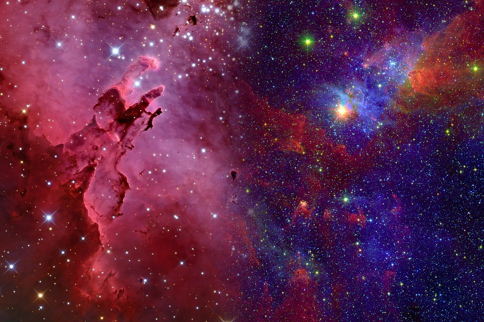
Visit the universe
Find a personalised journey in the cosmos by comparing online to get a free quote or by calling one of our friendly knowledgeable advisors.
Basic open/closed
Open version
Visit the universe
Find a personalised journey in the cosmos by comparing online to get a free quote or by calling one of our friendly knowledgeable advisors.
<div class="action-box call-block--open" data-callcenter="france-energie">
  <figure>
    <img data-src="/img/marquee/universe2.jpg" alt="universe" />
  </figure>
  <div class="action-box-body">
    <p class="title">Visit the universe</p>
    <p>Find a personalised journey in the cosmos by comparing online to get a free quote or by calling one of our friendly knowledgeable advisors.</p>
    <div class="action-box-btn">
      <a class="btn btn--md btn--pill btn--primary u-anim--shake btn--big-text" href="#" title="Appelez-nous gratuitement">
        <svg class="icon icon--left">
          <use xlink:href="/img/sprite.svg#icon-smartphone"></use>
        </svg>
        +∞ 00 00 00 00
      </a>
      <span class="separator">OR</span>
      <a class="btn btn--md btn--outline btn--secondary" href="#" title="Free callback">
        <svg class="icon icon--left">
          <use xlink:href="/img/sprite.svg#icon-arrow-curved-right"></use>
        </svg>
        Free callback
      </a>
    </div>
  </div>
</div>
Open version 2
Souscrire chez fournisseur
Nos conseillers vous aident à trouver l'offre la plus adaptée selon vos besoins chez fournisseur.
<div class="action-box call-block--open action-box__callback" data-callcenter="france-energie" data-action-box-url="/test">
  <figure>
    <img data-src="/img/marquee/universe2.jpg" alt="universe" />
  </figure>
  <div class="action-box-body">
    <p class="title">Visit the universe</p>
    <p>Find a personalised journey in the cosmos by comparing online to get a free quote or by calling one of our friendly knowledgeable advisors.</p>
    <div class="action-box-btn">
      <a class="btn btn--md btn--pill btn--primary u-anim--shake btn--big-text" href="#" title="Appelez-nous gratuitement">
        <svg class="icon icon--left">
          <use xlink:href="/img/sprite.svg#icon-smartphone"></use>
        </svg>
        +∞ 00 00 00 00
      </a>
      <span class="separator">OR</span>
      <div class="action-box__phone-wrapper" data-form-id="your-form-id">
        <div class="form-group">
          <div class="form-group__label form-group__label-addon">
            <label for="action-box__input-phone">
              Add your phone
            </label>
            <a aria-label="Help" class="btn-help btn-help--sm btn-help--right" data-toggle="tooltip" role="button" tabindex="0" title="tooltip text">
              <svg aria-hidden="true" class="icon btn-help__icon">
                <use xlink:href="/img/sprite.svg#icon-circle-info-outlined"></use>
              </svg>
              <svg aria-hidden="true" class="icon btn-help__icon">
                <use xlink:href="/img/sprite.svg#icon-circle-info-filled"></use>
              </svg>
            </a>
          </div>
          <div class="form-group__item-addon">
            <input class="form-group__item" id="action-box__input-phone" name="action-box__input-phone" placeholder="Add your phone" type="type" />
            <div>
              <button class="btn btn--md btn--primary form-group__addon-btn" data-middleware="/agrippa-modal/middleware" id="action-box__submit" name="action-box__submit" type="button"> Send </button>
            </div>
          </div>
           <div>
            <small class="form-group__msg form-group__msg--danger u-display--none"> Incorrect phone </small>
            <small class="form-group__msg form-group__msg--success u-display--none"> Message success </small>
          </div>
          <div class="form-group">
            <div class="form-group__item-addon">
              <input id="action-box__timestamp" name="action-box__timestamp" type="hidden" value="1624975754" />
            </div>
          </div>
      </div>
    </div>
  </div>
</div>
Closed version 1
Visit the universe
Our advisers will help you to find the best galaxy to visit.
<div class="action-box call-block--closed" data-callcenter="france-energie">
  <figure>
    <img data-src="/img/marquee/universe2.jpg" alt="universe" />
  </figure>
  <div class="action-box-body">
    <p class="title">Visit the universe</p>
    <p>Our advisers will help you to find the best galaxy to visit.</p>
    <div class="action-box-btn">
      <a class="btn btn--md btn--pill btn--primary" href="#" title="Compare">
        Compare offers
      </a>
      <span class="separator">OR</span>
      <a class="btn btn--md btn--outline btn--secondary" href="#" title="Free callback">
        <svg class="icon icon--left">
          <use xlink:href="/img/sprite.svg#icon-arrow-curved-right"></use>
        </svg>
        Free callback
      </a>
    </div>
  </div>
</div>
Closed version 2
<div class="action-box call-block--closed" data-callcenter="france-energie">
  <div class="action-box-header">Our space platform is currently closed</div>
  <div class="action-box-offer">
    <img data-src="/img/marquee/universe2.jpg" alt="universe" />
    <p class="title">We recommend visiting the universe</p>
    <a class="btn btn--md btn--primary" href="#">Online journey</a>
  </div>
</div>
Closed version 3
Visit the universe
Our advisers will help you to find the best galaxy to visit.
<div class="action-box call-block--closed" data-callcenter="france-energie">
  <figure>
    <img data-src="/img/marquee/universe2.jpg" alt="universe" />
  </figure>
  <div class="action-box-body">
    <p class="title">Visit the universe</p>
    <p>Our advisers will help you to find the best galaxy to visit.</p>
     <form>
       <fieldset>
         <div class="label-help">
           <label for=""> Je souhaite être rappelé par un conseiller : </label>
         </div>
         <div class="form-group day">
           <select aria-label="jour de rappel" class="dropdown dropdown--block" id="select-day">
             <option value=""> 28/11/2016 </option>
             <option value=""> 29/11/2016 </option>
             <option value=""> 30/11/2016 </option>
           </select>
         </div>
         <div class="form-group hour">
           <select aria-label="Moment de la journée" class="dropdown dropdown--block" id="select-hour">
             <option value=""> Matin </option>
             <option value=""> Midi </option>
             <option value=""> Soir </option>
           </select>
         </div>
         <div class="form-group tel">
           <input aria-label="Votre numéro de téléphone" class="form-group__item" placeholder="06 05 04 03 02" type="tel" />
         </div>
         <button class="btn btn--md btn--primary" type="submit"> Valider </button>
       </fieldset>
     </form>
  </div>
</div>
Link
<div class="action-box">
  <div class="action-box-link">
    <p class="title">The cosmos is the Universe</p>
    <div>
      <a class="btn btn--md btn--secondary" href="#">I want to know more!</a>
    </div>
    <div>
      <a class="btn btn--md btn--secondary" href="#">Button 2</a>
    </div>
  </div>
</div>
Presentation

To be
Lorem ipsum dolor sit amet, consectetur adipisicing elit. Numquam molestias placeat velit sint voluptatibus, expedita.
I want to be
Or not to be
Neque porro quisquam est qui dolorem ipsum quia. Neque porro quisquam est qui dolorem ipsum quia.
I prefer not to be
That is the question
Lorem ipsum dolor sit amet, consectetur adipisicing elit. Numquam molestias placeat velit sint voluptatibus, expedita.
I am not sure<div class="action-box">
<div class="action-box-presentation">
<div class="action-box-col"><img data-src="/img/marquee/skull2.png" alt="laptop" width="64" height="64" />
<p class="title">To be</p>
<p>Lorem ipsum dolor sit amet, consectetur adipisicing elit. Numquam molestias placeat velit sint voluptatibus, expedita.</p><a class="btn btn--md btn--primary" href="#">I want to be</a>
</div>
<div class="action-box-col"><img data-src="/img/marquee/skull4.png" alt="smartphone" width="64" height="64" />
<p class="title">Or not to be</p>
<p>Neque porro quisquam est qui dolorem ipsum quia. Neque porro quisquam est qui dolorem ipsum quia.</p><a class="btn btn--md btn--danger" href="#">I prefer not to be</a>
</div>
<div class="action-box-col"><img data-src="/img/marquee/skull3.png" alt="thumbs-up" width="64" height="64" />
<p class="title">That is the question</p>
<p>Lorem ipsum dolor sit amet, consectetur adipisicing elit. Numquam molestias placeat velit sint voluptatibus, expedita.</p><a class="btn btn--md btn--secondary" href="#">I am not sure</a>
</div>
</div>
</div>
Prize list


<div class="action-box">
  <figure><img data-src="/img/lazy-loading/lazy-3.jpg" alt="flowers" /></figure>
  <div class="action-box-body">
    <p class="title">Laziest animals ever</p>
    <ol class="prize-list">
      <li><a href="#" title="Number one"><img data-src="/img/marquee/lazydog.jpg" alt="lazy dog" /></a></li>
      <li><a href="#" title="Number one"><img data-src="/img/marquee/lazycat.jpg" alt="lazy cat" /></a></li>
      <li><a href="#" title="Number one"><img data-src="/img/marquee/lazywolf.jpg" alt="lazy wolf" /></a></li>
    </ol>
    <div>
      <a class="btn btn--md btn--secondary" href="#" title="See ranking"><svg class="icon icon--left">
          <use xlink:href="/img/sprite.svg#icon-arrow-curved-right"></use>
        </svg>See ranking
      </a>
    </div>
  </div>
</div>
Subscription

<div class="action-box">
  <figure class="centered">
    <img data-src="/img/lazy-loading/lazy-3.jpg" alt="flowers" />
  </figure>
  <div class="action-box-subscription">
    <img data-src="/img/favicons/mstile-70x70.png" alt="selectra" />
    <div>
      <a class="btn btn--md btn--primary" href="#" title="Online subscription">
        Online subscription
      </a>
    </div>
  </div>
</div>
Size
Half
Add the
half
class to any
action-box
to make it half the width of the content.
Visit the universe
Our advisers will help you to find the best galaxy to visit.
Using the word cosmos rather than the word universe implies viewing the universe as a complex and orderly system or entity; the opposite of chaos.
The cosmos, and our understanding of the reasons for its existence and significance, are studied in cosmology – a very broad discipline covering any scientific, religious, or philosophical contemplation of the cosmos and its nature, or reasons for existing. Religious and philosophical approaches may include in their concepts of the cosmos various spiritual entities or other matters deemed to exist outside our physical universe.
The philosopher Pythagoras first used the term cosmos (Ancient Greek: κόσμος) for the order of the universe. The term became part of modern language in the 19th century when geographer–polymath Alexander von Humboldt resurrected the use of the word from the ancient Greek, assigned it to his five-volume treatise, Kosmos, which influenced modern and somewhat holistic perception of the universe as one interacting entity.
<div class="action-box half call-block--closed" data-callcenter="france-energie">
  <figure>
    <img data-src="/img/marquee/universe2.jpg" alt="universe" />
  </figure>
  <div class="action-box-body">
    <p class="title">Visit the universe</p>
    <p>Our advisers will help you to find the best galaxy to visit.</p>
    <div class="action-box-btn">
      <a class="btn btn--md btn--pill btn--primary" href="#" title="Compare">
        Compare offers
      </a>
      <span class="separator">OR</span>
      <a class="btn btn--md btn--outline btn--secondary" href="#" title="Free callback">
        <svg class="icon icon--left">
          <use xlink:href="/img/sprite.svg#icon-arrow-curved-right"></use>
        </svg>
        Free callback
      </a>
    </div>
  </div>
</div>
Third
Add the
third
class to any
action-box
to make it third the width of the content.
Using the word cosmos rather than the word universe implies viewing the universe as a complex and orderly system or entity; the opposite of chaos.
The cosmos, and our understanding of the reasons for its existence and significance, are studied in cosmology – a very broad discipline covering any scientific, religious, or philosophical contemplation of the cosmos and its nature, or reasons for existing. Religious and philosophical approaches may include in their concepts of the cosmos various spiritual entities or other matters deemed to exist outside our physical universe.
<div class="action-box third call-block--closed" data-callcenter="france-energie">
  <div class="action-box-header">Our space platform is currently closed</div>
  <div class="action-box-offer">
    <img data-src="/img/marquee/universe2.jpg" alt="universe" />
    <p class="title">We recommend visiting the universe</p>
    </div>
      <a class="btn btn--md btn--primary" href="#">Online journey</a>
    </div>
  </div>
</div>
Color
Blue background
Add the
bg-blue
class to any
action-box
to make the background blue.
Visit the universe
Find a personalised journey in the cosmos by comparing online to get a free quote or by calling one of our friendly knowledgeable advisors.
<div class="action-box bg-blue call-block--open" data-callcenter="france-energie">
  <figure>
    <img data-src="/img/marquee/universe2.jpg" alt="universe" />
  </figure>
  <div class="action-box-body">
    <p class="title">Visit the universe</p>
    <p>Find a personalised journey in the cosmos by comparing online to get a free quote or by calling one of our friendly knowledgeable advisors.</p>
    <div class="action-box-btn">
      <a class="btn btn--md btn--pill btn--primary u-anim--shake btn--big-text" href="#" title="Appelez-nous gratuitement">
        <svg class="icon icon--left">
          <use xlink:href="/img/sprite.svg#icon-smartphone"></use>
        </svg>
        +∞ 00 00 00 00
      </a>
      <span class="separator">OR</span>
      <a class="btn btn--md btn--outline btn--white" href="#" title="Free callback">
        <svg class="icon icon--left">
          <use xlink:href="/img/sprite.svg#icon-arrow-curved-right"></use>
        </svg>
        Free callback
      </a>
    </div>
  </div>
</div>
Light blue background
Add the
bg-light-blue
class to any
action-box
to make the background light blue.
Visit the universe
Find a personalised journey in the cosmos by comparing online to get a free quote or by calling one of our friendly knowledgeable advisors.
<div class="action-box bg-light-blue call-block--open" data-callcenter="france-energie">
  <figure>
    <img data-src="/img/marquee/universe2.jpg" alt="universe" />
  </figure>
  <div class="action-box-body">
    <p class="title">Visit the universe</p>
    <p>Find a personalised journey in the cosmos by comparing online to get a free quote or by calling one of our friendly knowledgeable advisors.</p>
    <div class="action-box-btn">
      <a class="btn btn--md btn--pill btn--primary u-anim--shake btn--big-text" href="#" title="Appelez-nous gratuitement">
        <svg class="icon icon--left">
          <use xlink:href="/img/sprite.svg#icon-smartphone"></use>
        </svg>
        +∞ 00 00 00 00
      </a>
      <span class="separator">OR</span>
      <a class="btn btn--md btn--outline btn--white" href="#" title="Free callback">
        <svg class="icon icon--left">
          <use xlink:href="/img/sprite.svg#icon-arrow-curved-right"></use>
        </svg>
        Free callback
      </a>
    </div>
  </div>
</div>
Blue border
Add the
border-blue
class to any
action-box
to make the border blue.
Visit the universe
Find a personalised journey in the cosmos by comparing online to get a free quote or by calling one of our friendly knowledgeable advisors.
<div class="action-box border-blue call-block--open" data-callcenter="france-energie">
  <figure>
    <img data-src="/img/marquee/universe2.jpg" alt="universe" />
  </figure>
  <div class="action-box-body">
    <p class="title">Visit the universe</p>
    <p>Find a personalised journey in the cosmos by comparing online to get a free quote or by calling one of our friendly knowledgeable advisors.</p>
    <div class="action-box-btn">
      <a class="btn btn--md btn--pill btn--primary u-anim--shake btn--big-text" href="#" title="Appelez-nous gratuitement">
        <svg class="icon icon--left">
          <use xlink:href="/img/sprite.svg#icon-smartphone"></use>
        </svg>
        +∞ 00 00 00 00
      </a>
      <span class="separator">OR</span>
      <a class="btn btn--md btn--outline btn--secondary" href="#" title="Free callback">
        <svg class="icon icon--left">
          <use xlink:href="/img/sprite.svg#icon-arrow-curved-right"></use>
        </svg>
        Free callback
      </a>
    </div>
  </div>
</div>
Text Corner
Add the
text-corner__wrapper
element and the other classes to any
action-box
to create a
tooltip.
You have to add them inside
action-box-body
class.
Visit the universe
Find a personalised journey in the cosmos by comparing online to get a free quote or by calling one of our friendly knowledgeable advisors.
Inside
title
attribute, you can add the text you want to see displayed when hovered.
<div class="action-box call-block--open" data-callcenter="france-energie">
  <figure>
    <img data-src="/img/marquee/universe2.jpg" alt="universe" />
  </figure>
  <div class="action-box-body">
    <p class="title">Visit the universe</p>
    <p>Find a personalised journey in the cosmos by comparing online to get a free quote or by calling one of our friendly knowledgeable advisors.</p>
    <div class="action-box-btn">
      <a class="btn btn--md btn--pill btn--primary u-anim--shake btn--big-text" href="#" title="Appelez-nous gratuitement">
        <svg class="icon icon--left">
          <use xlink:href="/img/sprite.svg#icon-smartphone"></use>
        </svg>
        00 00 00 00
      </a>
      <span class="separator">OR</span>
      <a class="btn btn--md btn--outline btn--secondary" href="#" title="Free callback">
        <svg class="icon icon--left">
          <use xlink:href="/img/sprite.svg#icon-arrow-curved-right"></use>
        </svg>
        Free callback
      </a>
    </div>
    <div class="text-corner__wrapper">
      <div class="text-corner" data-toggle="tooltip" tabindex="0" title="tooltip text when hovered"> Announce
        <a class="btn-help btn-help--sm">
          <svg class="btn-help__icon">
            <use xlink:href="/themes/custom/agrippa/img/sprite.svg#icon-circle-info-outlined"></use>
          </svg>
          <svg class="btn-help__icon">
            <use xlink:href="/themes/custom/agrippa/img/sprite.svg#icon-circle-info-filled"></use>
          </svg>
        </a>
      </div>
    </div>
  </div>
</div>
Bold
You can add the class
text-corner--bold
near the class
text-corner
to put the text corner text in
strong
Visit the universe
Find a personalised journey in the cosmos by comparing online to get a free quote or by calling one of our friendly knowledgeable advisors.
<div class="action-box call-block--open" data-callcenter="france-energie">
  <figure>
    <img data-src="/img/marquee/universe2.jpg" alt="universe" />
  </figure>
  <div class="action-box-body">
    <p class="title">Visit the universe</p>
    <p>Find a personalised journey in the cosmos by comparing online to get a free quote or by calling one of our friendly knowledgeable advisors.</p>
    <div class="action-box-btn">
      <a class="btn btn--md btn--pill btn--primary u-anim--shake btn--big-text" href="#" title="Appelez-nous gratuitement">
        <svg class="icon icon--left">
          <use xlink:href="/img/sprite.svg#icon-smartphone"></use>
        </svg>
        00 00 00 00
      </a>
      <span class="separator">OR</span>
      <a class="btn btn--md btn--outline btn--secondary" href="#" title="Free callback">
        <svg class="icon icon--left">
          <use xlink:href="/img/sprite.svg#icon-arrow-curved-right"></use>
        </svg>
        Free callback
      </a>
    </div>
    <div class="text-corner__wrapper">
      <div class="text-corner text-corner--bold" data-toggle="tooltip" tabindex="0" title="tooltip text when hovered"> Announce
        <a class="btn-help btn-help--sm" href="#">
          <svg class="btn-help__icon">
            <use xlink:href="/themes/custom/agrippa/img/sprite.svg#icon-circle-info-outlined"></use>
          </svg>
          <svg class="btn-help__icon">
            <use xlink:href="/themes/custom/agrippa/img/sprite.svg#icon-circle-info-filled"></use>
          </svg>
        </a>
      </div>
    </div>
  </div>
</div>
Bigger
You can add the class
text-corner--bigger
near the class
text-corner
to put the text corner text bigger
Visit the universe
Find a personalised journey in the cosmos by comparing online to get a free quote or by calling one of our friendly knowledgeable advisors.
<div class="action-box call-block--open" data-callcenter="france-energie">
  <figure>
    <img data-src="/img/marquee/universe2.jpg" alt="universe" />
  </figure>
  <div class="action-box-body">
    <p class="title">Visit the universe</p>
    <p>Find a personalised journey in the cosmos by comparing online to get a free quote or by calling one of our friendly knowledgeable advisors.</p>
    <div class="action-box-btn">
      <a class="btn btn--md btn--pill btn--primary u-anim--shake btn--big-text" href="#" title="Appelez-nous gratuitement">
        <svg class="icon icon--left">
          <use xlink:href="/img/sprite.svg#icon-smartphone"></use>
        </svg>
        00 00 00 00
      </a>
      <span class="separator">OR</span>
      <a class="btn btn--md btn--outline btn--secondary" href="#" title="Free callback">
        <svg class="icon icon--left">
          <use xlink:href="/img/sprite.svg#icon-arrow-curved-right"></use>
        </svg>
        Free callback
      </a>
    </div>
    <div class="text-corner__wrapper">
      <div class="text-corner text-corner--bigger" data-toggle="tooltip" tabindex="0" title="tooltip text when hovered"> Announce
        <a class="btn-help btn-help--sm" href="#">
          <svg class="btn-help__icon">
            <use xlink:href="/themes/custom/agrippa/img/sprite.svg#icon-circle-info-outlined"></use>
          </svg>
          <svg class="btn-help__icon">
            <use xlink:href="/themes/custom/agrippa/img/sprite.svg#icon-circle-info-filled"></use>
          </svg>
        </a>
      </div>
    </div>
  </div>
</div>
Table Legend
Visit the universe
Find a personalised journey in the cosmos by comparing online to get a free quote or by calling one of our friendly knowledgeable advisors.
Table legend
<div class="action-box call-block--open" data-callcenter="france-energie">
  <figure>
    <img data-src="/img/marquee/universe2.jpg" alt="universe" />
  </figure>
  <div class="action-box-body">
    <p class="title">Visit the universe</p>
    <p>Find a personalised journey in the cosmos by comparing online to get a free quote or by calling one of our friendly knowledgeable advisors.</p>
    <div class="action-box-btn">
      <a class="btn btn--md btn--pill btn--primary u-anim--shake btn--big-text" href="#" title="Appelez-nous gratuitement">
        <svg class="icon icon--left">
          <use xlink:href="/img/sprite.svg#icon-smartphone"></use>
        </svg>
        00 00 00 00
      </a>
      <span class="separator">OR</span>
      <a class="btn btn--md btn--outline btn--secondary" href="#" title="Free callback">
        <svg class="icon icon--left">
          <use xlink:href="/img/sprite.svg#icon-arrow-curved-right"></use>
        </svg>
        Free callback
      </a>
    </div>
    <div class="text-corner__wrapper">
      <div class="text-corner text-corner--bigger" data-toggle="tooltip" tabindex="0" title="tooltip text when hovered"> Announce
        <a class="btn-help btn-help--sm" href="#">
          <svg class="btn-help__icon">
            <use xlink:href="/themes/custom/agrippa/img/sprite.svg#icon-circle-info-outlined"></use>
          </svg>
          <svg class="btn-help__icon">
            <use xlink:href="/themes/custom/agrippa/img/sprite.svg#icon-circle-info-filled"></use>
          </svg>
        </a>
      </div>
    </div>
  </div>
</div>
<p class="table__legend"> Your text </p>
Without img in mobile
Visit the universe
Find a personalised journey in the cosmos by comparing online to get a free quote or by calling one of our friendly knowledgeable advisors.
<div class="action-box call-block--open not-img--mobile" data-callcenter="france-energie">
  <figure>
    <img data-src="/img/marquee/universe2.jpg" alt="universe" />
  </figure>
  <div class="action-box-body">
    <p class="title">Visit the universe</p>
    <p>Find a personalised journey in the cosmos by comparing online to get a free quote or by calling one of our friendly knowledgeable advisors.</p>
    <div class="action-box-btn">
      <a class="btn btn--md btn--pill btn--primary u-anim--shake btn--big-text" href="#" title="Appelez-nous gratuitement">
        <svg class="icon icon--left">
          <use xlink:href="/img/sprite.svg#icon-smartphone"></use>
        </svg>
        00 00 00 00
      </a>
      <span class="separator">OR</span>
      <a class="btn btn--md btn--outline btn--secondary" href="#" title="Free callback">
        <svg class="icon icon--left">
          <use xlink:href="/img/sprite.svg#icon-arrow-curved-right"></use>
        </svg>
        Free callback
      </a>
    </div>
  </div>
</div>
Tooltip
Add a tooltip when some users may need some information but some others don't.
There are two ways to trigger a tooltip: hovering with the mouse and focusing with the tab key.
A tooltip component is simply an element with a
data-toggle="tooltip"
attribute and a
title
attribute in which you input the text you want to see displayed when hovered.
Also you can align the tooltip to the right or left adding
class="tooltip-right"
or
class="tooltip-left"
The
tabindex="0"
attribute makes the element focusable with tabindex (for accessibility purposes). The
button
element is focusable by default.
<!--Random icon-->
<div data-toggle="tooltip" title="Tooltip text here" tabindex="0">
  <svg class="icon icon--32 icon--secondary">
    <use xlink:href="/themes/custom/agrippa/img/sprite.svg#icon-check-mark"></use>
  </svg>
</div>

<!--Random button-->
<button class="btn btn--md btn--pill btn--secondary tooltip-left" href="#" data-toggle="tooltip" title="Tooltip text here">Hover please</button>

<!--Link-->
<a href="#" class="tooltip-right" data-toggle="tooltip" title="Tooltip text here" title="Tooltip text here" tabindex="0">Hoverable link</a>
F.A.Q.
Use this component at the bottom of your articles to display each question/answer in a collapse
Frequent Asked Questions
What is Lorem Ipsum?
Lorem Ipsum is simply dummy text of the printing and typesetting industry. Lorem Ipsum has been the industry's standard dummy text ever since the 1500s, when an unknown printer took a galley of type and scrambled it to make a type specimen book. It has survived not only five centuries, but also the leap into electronic typesetting, remaining essentially unchanged. It was popularised in the 1960s with the release of Letraset sheets containing Lorem Ipsum passages, and more recently with desktop publishing software like Aldus PageMaker including versions of Lorem Ipsum.
Where does it come from?
Contrary to popular belief, Lorem Ipsum is not simply random text. It has roots in a piece of classical Latin literature from 45 BC, making it over 2000 years old. Richard McClintock, a Latin professor at Hampden-Sydney College in Virginia, looked up one of the more obscure Latin words, consectetur, from a Lorem Ipsum passage, and going through the cites of the word in classical literature, discovered the undoubtable source. Lorem Ipsum comes from sections 1.10.32 and 1.10.33 of "de Finibus Bonorum et Malorum" (The Extremes of Good and Evil) by Cicero, written in 45 BC. This book is a treatise on the theory of ethics, very popular during the Renaissance. The first line of Lorem Ipsum, "Lorem ipsum dolor sit amet..", comes from a line in section 1.10.32.
Why do we use it?
It is a long established fact that a reader will be distracted by the readable content of a page when looking at its layout. The point of using Lorem Ipsum is that it has a more-or-less normal distribution of letters, as opposed to using 'Content here, content here', making it look like readable English. Many desktop publishing packages and web page editors now use Lorem Ipsum as their default model text, and a search for 'lorem ipsum' will uncover many web sites still in their infancy. Various versions have evolved over the years, sometimes by accident, sometimes on purpose (injected humour and the like).
Where can I get some?
There are many variations of passages of Lorem Ipsum available, but the majority have suffered alteration in some form, by injected humour, or randomised words which don't look even slightly believable. If you are going to use a passage of Lorem Ipsum, you need to be sure there isn't anything embarrassing hidden in the middle of text. All the Lorem Ipsum generators on the Internet tend to repeat predefined chunks as necessary, making this the first true generator on the Internet. It uses a dictionary of over 200 Latin words, combined with a handful of model sentence structures, to generate Lorem Ipsum which looks reasonable. The generated Lorem Ipsum is therefore always free from repetition, injected humour, or non-characteristic words etc.
This component is composed by a wrapper with the
faq
class, in which we add a title (html tag can change depending on SEO purposes) with
faq__title
class and then a succession of
collapse
elements. The collapses simply consist in a wrapper with
collapse
class and inside that, a title with
collapse__header
class and a
div
with
collapse__content
class.
<div class="faq">
  <h3 class="faq__title">Frequently Asked Questions</h3>
  <div class="collapse" data-opened="true">
    <h4 class="collapse__header">Question One</h4>
    <div class="collapse__content">
      <p>Answer One</p>
    </div>
  </div>
  <div class="collapse">
    <h4 class="collapse__header">Question Two</h4>
    <div class="collapse__content">
      <p>Answer Two</p>
    </div>
  </div>
  <div class="collapse">
    <h4 class="collapse__header">Question Three</h4>
    <div class="collapse__content">
      <p>Answer Three</p>
    </div>
  </div>
</div>
Data-opened
Add the following attribute to open one or more collapses by-default.
Frequent Asked Questions
Question One
Answer One
Question Two
Answer Two
Question Three
Answer Three
<div class="faq">
  <h3 class="faq__title">Frequently Asked Questions</h3>
  <div class="collapse">
    <h4 class="collapse__header">Question One</h4>
    <div class="collapse__content">
      <p>Answer One</p>
    </div>
  <div>
  <div class="collapse"data-opened="true">
    <h4 class="collapse__header">Question Two</h4>
    <div class="collapse__content">
      <p>Answer Two</p>
    </div>
  <div>
  <div class="collapse">
    <h4 class="collapse__header">Question Three</h4>
    <div class="collapse__content">
      <p>Answer Three</p>
    </div>
  </div>
</div>
Show More Arrow
Add a show-more--arrow component when you have a lot of information and don't want to show all directly. This component collapse your content and add a button "see more" to open the component and show the whole information.
You can add ellipsis at the end of your visible content to tell the users there're more content. When it opens the ellipsis will disappear.
Inside
show-more--arrow
you can add HTML.
Show more component without ellipsis:
This is the text that users can see directly.
This is the content inside. Here you can add some HTML
- This is an example of a list numbered
- This is an example of a list numbered
- This is an example of a list numbered
See MoreSee Less
Show more component with ellipsis:
You can add ellipsis at the end to tell users here is more information...
This is the content inside. Here you can add some HTML
Laziness (also known as indolence) is disinclination to activity or exertion despite having the ability to act or to exert oneself. It is often used as a pejorative; terms for a person seen to be lazy include "couch potato", "slacker", and "bludger".
One of the Catholic seven deadly sins is sloth, which is often defined as spiritual and/or physical apathy or laziness. Sloth is discouraged in (Hebrews 6:12), 2 Thessalonians, and associated with wickedness in one of the parables of Jesus in the Gospel of Matthew (Matthew 25:26). In the Wisdom books of Proverbs and Ecclesiastes, it is stated that laziness can lead to poverty (Proverbs 10:4, Ecclesiastes 10:18). According to Peter Binsfeld's Binsfeld's Classification of Demons, Belphegor is thought to be its chief demon.
See MoreSee Less
<div class="collapse show-more--arrow" data-opened="false">
  <p class="show-more--arrow__intro">
    This is the text that users can see directly.
  </p>

  <div class="collapse__content">
    <div class="collapse__content--text">
      <p> Here is your content inside <strong>show-more--arrow</strong> component </p>
    </div>
  </div>

  <div class="collapse__header u-display--none">
    <p class="show-more--arrow__target">
      <span id="textOpen"> See more </span>
      <span id="textClose"> See less </span>
    </p>
  </div>
</div>
Offer Cards Collapse
You can add these type of cards to display your offers. You can add a collapse to show more information about the offer.
<div itemprop="offers" itemscope="" itemtype="http://schema.org/Offer">
  <div class="customOffer">
    <div class="row noPaddings">
      <div class="col-lg-12 col-sm-12 col-xs-12 nameOffer"> Name Offer </div>
    </div>
    <div class="row">
      <div class="col-lg-2 col-sm-2 col-xs-12 logo text--center">
        <img alt="logo Eolo" src="https://selectra.net/sites/selectra.net/files/images/logo/sm/nobg/eolo.png">
      </div>
      <div class="col-lg-2 col-sm-2 col-xs-4 text--center">
        <div class="row">
          <div class="col-lg-12 tit"> VELOCITÀ </div>
        </div>
        <div class="row">
          <div class="col-lg-12 var"> 30 Mb </div>
        </div>
        <div class="row">
          <div class="col-lg-12 subt"> FIBRA </div>
        </div>
      </div>
      <div class="col-lg-2 col-sm-2 col-xs-4 text--center">
        <div class="row">
          <div class="col-lg-12 tit"> CHIAMATE </div>
        </div>
        <div class="row">
          <div class="col-lg-12 var"> Illimitati </div>
        </div>
        <div class="row">
          <div class="col-lg-12 subt"> FISSO </div>
        </div>
      </div>
      <div class="col-lg-2 col-sm-2 col-xs-4 text--center">
        <div class="row">
          <div class="col-lg-12 tit">PRECIO</div>
        </div>
        <div class="row">
          <div class="col-lg-12 var">
            <span> 24,90 € </span>
          </div>
        </div>
        <div class="row">
          <div class="col-lg-12 subt"> AL MESE </div>
        </div>
      </div>
      <div class="col-lg-4 col-sm-4 col-xs-12 text--center">
        <div class="call-block--open" data-callcenter="italy-telecom">
          <a class="btn btn--md btn--pill btn--success btn--block u-anim--shake u-display--md-none" href="#offer-cards-collapse" title="Servizio gratuito">02 829 58 100</a>
          <a class="btn btn--md btn--pill btn--success btn--block u-anim--shake u-display--none u-display--md-inline-flex" href="#offer-cards-collapse" target="_blank" title="Servizio gratuito" data-fetch-url="/callback/modal_eolo" data-modal-size="sm" data-target="callback-modal" data-toggle="modal">Ti Chiamiamo Noi</a>
        </div>
        <div class="call-block--closed" data-callcenter="italy-telecom" style="display: none !important;">
          <a class="btn btn--md btn--secondary btn--outline" href="#offer-cards-collapse">Ti Chiamiamo Noi</a>
        </div>
      </div>
    </div>
    <div class="extraInfo oculto" id="extraInfo5478">
      <div class="line-bottom">
        <div class="row">
          <div class="col-lg-12">
            <span class="tit">IMPEGNO:</span>
              <span class="var">
                <span class="nowrap">24 mesi</span>
              </span>
          </div>
        </div>
      </div>
    </div>
    <div class="text--center divMoreInfo">
      <a class="moreInfo extraInfoCollapse" data-target="#extraInfo5478" href="#"> See more details </a>
      <span class="u-display--none" id="seeMoreDetails"> See more details </span>
      <span class="u-display--none" id="hideMoreDetails"> Hide details </span>
    </div>
  </div>
</div>