
Nemo enim ipsam quis nostrum
Excepteur sint occaecat cupidatat non proident
| Variable name | Type | Required | Amount | Description |
|---|---|---|---|---|
background ⤵ |
Object | Yes | 1 | Config for the image on hero's background. |
background.image_url |
String | Yes | 1 | Content of the
src
attribute of hero's background image.
|
background.image_alt |
String | Yes | 1 | Content of the
alt
attribute of hero's background image.
|
logos ⤵ |
Object | No | 0 or 2 | Config of each logo image. Expected to be an amount between 0 and 2. |
logos.image_url |
String | Yes | 1 | Content of the
src
attribute of each logo displayed.
|
logos.image_alt |
String | Yes | 1 | Content of the
alt
attribute of each logo displayed.
|
logo_selectra ⤵ |
Object | No | 0 or 1 | Config of Selectra's logo image (will be a bit wider than the others). |
logo_selectra.image_url |
String | No | 0 or 1 | Content of the
src
attribute of Selectra's logo.
|
logo_selectra.image_alt |
String | No | 0 or 1 | Content of the
alt
attribute of Selectra's logo.
|
title |
String | Yes | 1 | Content of the hero's title, in a
<h1>
tag.
|
heading |
String | No | 0 or 1 | The HTML tag for the heading (for example
h3) to be chosen depending on your purposes regarding SEO. Required only if
title
is not empty. Default is
h1.
|
subtitle |
String | No | 0 or 1 | Content of the hero's subtitle, in a
<p>
tag.
|
subheading |
String | No | 0 or 1 | The HTML tag for the heading (for example
h3) to be chosen depending on your purposes regarding SEO. Required only if
title
is not empty. Default is
p.
|


Lorem ipsum dolor sit amet, consectetur adipiscing elit. Duis turpis mauris, malesuada consectetur nibh tristique, luctus finibus enim. Suspendisse in tortor vitae enim lobortis dignissim sit amet sed ante
| Variable name | Type | Required | Amount | Description |
|---|---|---|---|---|
heading |
String | No | 0 or 1 | The HTML tag for the heading (for example
h3) to be chosen depending on your purposes regarding SEO. Default is
h1.
|
header |
String | No | 0 or 1 | The first line of text appearing in smaller and secondary color at the top. It's part of the heading. |
light_version |
Boolean | Yes | 1 | If you select true you will have a light version of hero-btn. By default is "false" (normal colors). |
title_first |
String | No | 0 or 1 | The first part of the title, not highlighted. |
title_highlighted |
String | No | 0 or 1 | The highlighted part of the title. |
title_second |
String | No | 0 or 1 | The last part of the title, after the highlighted text. |
money |
String | No | 0 or 1 | Choose between
euro
or
yen, and the background img will change. By default is
euro
|
delete_money_icon |
Boolean | Yes | 1 | Change to
true
if you don't want the money icon to be displayed. By default is
false
|
button_help ⤵ |
Object | No | 0 or 1 | Config for the optional button-help at the end of the block's title. |
button_help.title |
String | Yes | 1 | Text to be displayed on hover. |
button_help.text |
String | No | 0 or 1 | The optional text to be displayed as button-help. |
button ⤵ |
Object | No | 0 or 1 | Config for the optional button at the bottom of the block. |
button.color |
String | Yes | 1 | Choose the button color between primary, secondary, success, white, warning or danger. |
button.url |
String | Yes | 1 | The content of the
href
attribute of the button.
|
button.extra_attributes |
String | No | 0 or 1 | Optional extra attributes you may need to apply to the button, like
target="_blank" rel="noopener".
|
button.icon_left |
String | No | 0 or 1 | Optional
id
of the icon to be displayed at the left of the button. You also can add
flags
adding flag name (
flag-es
) for example.
|
button.text |
String | Yes | 1 | Text to be displayed in the button. |
button.icon_right |
String | No | 0 or 1 | Optional
id
of the icon to be displayed at the right of the button. You also can add
flags
adding flag name (
flag-es
) for example.
|
button.big_text |
Boolean | No | 0 or 1 | Optional. Put
true
if you want a bigger text in the button. If not, delete the variable or set it
false
|
button2 ⤵ |
Object | No | 0 or 1 | Config for the optional button2. |
button2.color |
String | Yes | 1 | Choose the button color between primary, secondary, success, white, warning or danger. |
button2.url |
String | Yes | 1 | The content of the
href
attribute of the button.
|
button2.extra_attributes |
String | No | 0 or 1 | Optional extra attributes you may need to apply to the button, like
target="_blank" rel="noopener".
|
button2.icon_left |
String | No | 0 or 1 | Optional
id
of the icon to be displayed at the left of the button. You also can add
flags
adding flag name (
flag-es
) for example.
|
button2.text |
String | Yes | 1 | Text to be displayed in the button. |
button2.icon_right |
String | No | 0 or 1 | Optional
id
of the icon to be displayed at the right of the button. You also can add
flags
adding flag name (
flag-es
) for example.
|
button2.big_text |
Boolean | No | 0 or 1 | Optional. Put
true
if you want a bigger text in the button. If not, delete the variable or set it
false
|
| Variable name | Type | Required | Amount | Description |
|---|---|---|---|---|
heading_title |
String | No | 0 or 1 | The HTML tag for the heading (for example
h3) to be chosen depending on your purposes regarding SEO. Required only if
title
is not empty. Default is
h1.
|
title |
String | Yes | 1 | The title of your block. |
heading_subtitle |
String | No | 0 or 1 | The HTML tag for the heading (for example
h3) to be chosen depending on your purposes regarding SEO. Required only if
title
is not empty. Default is
h2.
|
subtitle |
String | No | 0 or 1 | The subtitle of your block. |
buttons ⤵ |
Array of objects | Yes | 1 | Config for the buttons under subtitle. May contain between 1 and 3 buttons. |
buttons[i].icon |
String | Yes | 1 | Id
of the icon (from
the sprite) to be displayed on the left of the button. You also can add
flags
adding flag name (
flag-es
) for example.
|
buttons[i].title |
String | Yes | 1 | The title of the button (small text on top). |
buttons[i].label |
String | Yes | 1 | The label of the button (bigger text on the bottom). |
buttons[i].href |
String | Yes | 1 | The content of the
href
attribute of the button itself.
|
buttons[i].arrow |
Boolean | No | 0 or 1 | Put
false
if you do not want to see the arrow in the button. By default is "true".
|
buttons[i].extra_attributes |
String | Yes | 1 | Extra attributes for the link, such as
target="_blank" rel="noopener".
|
sub_text |
String | Yes | 1 | Content of the text under the buttons. RawHTML
allowed. |
image ⤵ |
Object | Yes | 1 | Config for the image at the right of the hero. |
image.url |
String | Yes | 1 | The location of the image to be displayed. Preferably an
svg
file.
|
image.alt |
String | Yes | 1 | The alternative text of your image. |
button_help ⤵ |
Object | Yes | 1 | Config of the
btn-help
at the end of the sub_text.
|
button_help.title |
String | Yes | 1 | Text that will be displayed on hover. Raw HTML is allowed. |
button_help.title |
String | Yes | 1 | Config of the
btn-help
at the end of the sub_text.
|
button_help.typeText |
Boolean | Yes | 1 | If
true, the "info" icon will disappear in favor of the text you provide in the next variable
text.
|
button_help.text |
String | Yes | 1 | Content of the hoverable text that can replace the "info" icon in button_help. |
callcenter |
String | No | 0 or 1 | If you want a different block for OPENED version and for CLOSED, fill this variable with the name of your data-callcenter. Then you have to add data for your CLOSED Block. |
closed_block ⤵ |
Object | No | 0 or 1 | Data for your CLOSED Block. |
closed_block.heading_title |
String | No | 0 or 1 | The HTML tag for the heading (for example
h3) to be chosen depending on your purposes regarding SEO. Required only if
title
is not empty. Default is
h1.
|
closed_block.title |
String | Yes | 1 | The title of your block. |
closed_block.heading_subtitle |
String | No | 0 or 1 | The HTML tag for the heading (for example
h3) to be chosen depending on your purposes regarding SEO. Required only if
title
is not empty. Default is
h2.
|
closed_block.subtitle |
String | No | 0 or 1 | The subtitle of your block. |
closed_block.buttons ⤵ |
Array of objects | Yes | 1 | Config for the buttons under subtitle. May contain between 1 and 3 buttons. |
closed_block.buttons[i].icon |
String | Yes | 1 | Id
of the icon (from
the sprite) to be displayed on the left of the button. You also can add
flags
adding flag name (
flag-es
) for example.
|
closed_block.buttons[i].title |
String | Yes | 1 | The title of the button (small text on top). |
closed_block.buttons[i].label |
String | Yes | 1 | The label of the button (bigger text on the bottom). |
closed_block.buttons[i].href |
String | Yes | 1 | The content of the
href
attribute of the button itself.
|
closed_block.buttons[i].arrow |
Boolean | No | 0 or 1 | Put
false
if you do not want to see the arrow in the button. By default is "true".
|
closed_block.buttons[i].extra_attributes |
String | Yes | 1 | Extra attributes for the link, such as
target="_blank" rel="noopener".
|
closed_block.sub_text |
String | Yes | 1 | Content of the text under the buttons. RawHTML
allowed. |
closed_block.image ⤵ |
Object | Yes | 1 | Config for the image at the right of the hero. |
closed_block.image.url |
String | Yes | 1 | The location of the image to be displayed. Preferably an
svg
file.
|
closed_block.image.alt |
String | Yes | 1 | The alternative text of your image. |
closed_block.button_help ⤵ |
Object | Yes | 1 | Config of the
btn-help
at the end of the sub_text.
|
closed_block.button_help.title |
String | Yes | 1 | Text that will be displayed on hover. Raw HTML is allowed. |
closed_block.button_help.title |
String | Yes | 1 | Config of the
btn-help
at the end of the sub_text.
|
closed_block.button_help.typeText |
Boolean | Yes | 1 | If
true, the "info" icon will disappear in favor of the text you provide in the next variable
text.
|
closed_block.button_help.text |
String | Yes | 1 | Content of the hoverable text that can replace the "info" icon in button_help. |

| Variable name | Type | Required | Amount | Description |
|---|---|---|---|---|
heading_pretitle |
String | No | 0 or 1 | The HTML tag for the heading (for example
h3) to be chosen depending on your purposes regarding SEO. Required only if
title
is not empty. Default is
h1.
|
pretitle |
String | No | 0 or 1 | The pretitle of your block. |
heading_title |
String | No | 0 or 1 | The HTML tag for the heading (for example
h3) to be chosen depending on your purposes regarding SEO. Required only if
title
is not empty. Default is
p.
|
title |
String | No | 0 or 1 | The title of your block. |
heading_subtitle |
String | No | 0 or 1 | The HTML tag for the heading (for example
h3) to be chosen depending on your purposes regarding SEO. Required only if
title
is not empty. Default is
p.
|
subtitle |
String | No | 0 or 1 | The subtitle of your block. You can add here HTML code. |
cta ⤵ |
Object | Yes | 1 | Config for the CTA button. If you do not fill the LINK, CTA button will not appear. |
cta.text |
String | Yes | 1 | Text in the CTA Button |
cta.link |
String | No | 0 or 1 | The link of the button (if you do not fill the LINK, CTA button will not appear). |
cta.extra_attributes |
String | No | 0 or 1 | Extra attributes for the cta, such as
target="_blank" rel="noopener".
|
cta.color |
String | No | 0 or 1 | You can choose the button color between primary, secondary, warning, danger, success and white. |
cta.icon |
String | No | 0 or 1 | Id
of the icon (from
the sprite) to be displayed on the button's content. You also can add
flags
adding flag name (
flag-es
) for example.
|
cta.icon_position |
String | No | 0 or 1 | You can choose between left or right. |
star_rating ⤵ |
Object | Yes | 1 | Config for the star_rating. |
star_rating.average |
Number | Yes | 1 | Average of the score. For example: 4.5 |
star_rating.num_reviews |
String | Yes | 1 | Number of votes. |
star_rating.link_reviews |
String | No | 0 or 1 | Optional link of reviews. |
star_rating.extra_attributes |
String | No | 0 or 1 | Extra attributes for the cta, such as
target="_blank" rel="noopener".
|
img ⤵ |
Object | Yes | 1 | Config of the images. |
img.alt |
String | Yes | 1 | Alternative text for Img. |
img.type |
String | No | 0 or 1 | You can choose betweenenergy
(to use energy images), or
insurance
( to use insurance images).
but if you want to add your own custom images, delete this variable and add the source images in the next variables.
PS. If you add "energy" or "insurance" type, you don't have to add source images.
|
img.mobile ⤵ |
Object | Yes | 1 | Config for IMG Mobile size |
img.mobile.src |
String | Yes | 1 | Source for Img in mobile. |
img.tablet ⤵ |
Object | Yes | 1 | Config for Img tablet size |
img.tablet.src |
String | Yes | 1 | Source for Img in tablet. |
img.desktop ⤵ |
Object | Yes | 1 | Config for Img desktop size |
img.desktop.src |
String | Yes | 1 | Source for Img in desktop. |
reassurance ⤵ |
Object | Yes | 1 | Config of the reassurance element. |
reassurance.text_1 |
String | Yes | 1 | Text 1. Raw HTML is allowed. |
reassurance.text_2 |
String | No | 0 or 1 | Text 2. Optional. Raw HTML is allowed. |
reassurance.text_3 |
String | No | 0 or 1 | Text 3. Optional. Raw HTML is allowed. |
| Variable name | Type | Required | Amount | Description |
|---|---|---|---|---|
heading_pretitle |
String | No | 0 or 1 | The HTML tag for the heading (for example
h3) to be chosen depending on your purposes regarding SEO. Required only if
title
is not empty. Default is
h1.
|
pretitle |
String | No | 0 or 1 | The pretitle of your block. |
heading_title |
String | No | 0 or 1 | The HTML tag for the heading (for example
h3) to be chosen depending on your purposes regarding SEO. Required only if
title
is not empty. Default is
p.
|
title |
String | No | 0 or 1 | The title of your block. |
heading_subtitle |
String | No | 0 or 1 | The HTML tag for the heading (for example
h3) to be chosen depending on your purposes regarding SEO. Required only if
title
is not empty. Default is
p.
|
subtitle |
String | No | 0 or 1 | The subtitle of your block. You can add here HTML code. |
cta ⤵ |
Object | Yes | 1 | Config for the CTA button. If you do not fill the LINK, CTA button will not appear. |
cta.text |
String | Yes | 1 | Text in the CTA Button |
cta.link |
String | No | 0 or 1 | The link of the button (if you do not fill the LINK, CTA button will not appear). |
cta.extra_attributes |
String | No | 0 or 1 | Extra attributes for the cta, such as
target="_blank" rel="noopener".
|
cta.color |
String | No | 0 or 1 | You can choose the button color between primary, secondary, warning, danger, success and white. |
cta.icon |
String | No | 0 or 1 | Id
of the icon (from
the sprite) to be displayed on the button's content. You also can add
flags
adding flag name (
flag-es
) for example.
|
cta.icon_position |
String | No | 0 or 1 | You can choose between left or right. |
star_rating ⤵ |
Object | Yes | 1 | Config for the star_rating. |
star_rating.average |
Number | Yes | 1 | Average of the score. For example: 4.5 |
star_rating.num_reviews |
String | Yes | 1 | Number of votes. |
star_rating.link_reviews |
String | No | 0 or 1 | Optional link of reviews. |
star_rating.extra_attributes |
String | No | 0 or 1 | Extra attributes for the cta, such as
target="_blank" rel="noopener".
|
reassurance ⤵ |
Object | Yes | 1 | Config of the reassurance element. |
reassurance.text_1 |
String | Yes | 1 | Text 1. Raw HTML is allowed. |
reassurance.text_2 |
String | No | 0 or 1 | Text 2. Optional. Raw HTML is allowed. |
reassurance.text_3 |
String | No | 0 or 1 | Text 3. Optional. Raw HTML is allowed. |
Augmentez votre pouvoir d'achat, agissez sur vos factures d’énergie
Les ménages français perdent en moyenne200€/an à rester chez le même fournisseur, ne faites pas comme eux.
Comparer en 5 min| Variable name | Type | Required | Amount | Description |
|---|---|---|---|---|
pretitle_tag |
String | No | 0 or 1 | The HTML tag for the heading (for example
h3) to be chosen depending on your purposes regarding SEO. Required only if
title
is not empty. Default is
p.
|
pretitle |
String | No | 0 or 1 | Content of the pre heading. RawHTML
allowed. |
title_tag |
String | No | 0 or 1 | The HTML tag for the heading (for example
h3) to be chosen depending on your purposes regarding SEO. Required only if
title
is not empty. Default is
h2.
|
title |
String | Yes | 1 | Content of the bigger heading, which will be displayed in a
p
tag. Raw
HTML
allowed.
|
description |
String | No | 0 or 1 | Content of the description. RawHTML
allowed. |
button_1 ⤵ |
Object | No | 0 or 1 | Config for the first button. It is optional. |
button_1.link |
String | No | 0 or 1 | Content of the
href
attribute of hero's CTA first button. If you don't fill it you won't see the CTA button.
|
button_1.text |
String | No | 0 or 1 | Text that will be displayed inside of the button_1. |
button_1.color |
String | No | 0 or 1 | Color of the button_1. You can choose between primary, secondary, warning, danger, neutral or success. By default is secondary |
button_1.outlined |
Boolean | No | 0 or 1 | You can choose between true or false. |
button_1.custom_attr |
String | No | 0 or 1 | Extra attributes for the link, such as
target="_blank" rel="noopener".
|
button_2 ⤵ |
Object | No | 0 or 1 | Config for the first button. It is optional. |
button_2.link |
String | No | 0 or 1 | Content of the
href
attribute of hero's CTA second button. If you don't fill it you won't see the CTA button.
|
button_2.text |
String | No | 0 or 1 | Text that will be displayed inside of the button_2. |
button_2.color |
String | No | 0 or 1 | Color of the button_2. You can choose between primary, secondary, warning, danger, neutral or success. By default is secondary |
button_2.outlined |
Boolean | No | 0 or 1 | You can choose between true or false. |
button_2.custom_attr |
String | No | 0 or 1 | Extra attributes for the link, such as
target="_blank" rel="noopener".
|
cards_numbered |
Boolean | Yes | 1 | You can choose between true or false. If you choose TRUE, the cards are going to have a number (they are going to be ordered). |
card1 ⤵ |
Object | Yes | 1 | Config for the first card. |
card1.logo_src |
String | No | 0 or 1 | URL for the logo. It is optional. |
card1.logo_alt |
String | No | 0 or 1 | Alternative text for the logo in case you have added it. |
card1.title |
String | No | 0 or 1 | Card title. RawHTML
allowed. |
card1.upi |
String | No | 0 or 1 | The UPI of the provider you want the reviews to be displayed about. To know it, go to /admin/content/customer_reviews and you will see each provider UPI. If you add the UPI you will see values from your provider and you do not have to add star_rating
values mannually.
Important!
You only can add the UPI if you have enabled selectra_reviews_admin or selectra_reviews_client module.
|
card1.star_rating ⤵ |
Object | No | 0 or 1 | Value for star_rating if you want. It is only available if you do not have added
upi
value. If you have added UPI value, you will see values from UPI provider.
|
card1.star_rating.rating |
Number | No | 0 or 1 | Number of rating. For example, 3.5 (from 5). |
card1.star_rating.votes |
Number | No | 0 or 1 | Number of votes for your provider. |
card1.star_rating.votes_link |
String | No | 0 or 1 | Link when you click on votes number. It is optional. You can delete this variable if you do not want a link. |
card1.label_price |
String | No | 0 or 1 | At right of the card, you can add a small text above the price. |
card1.price |
String | No | 0 or 1 | It is optional. For example: 1435€ |
card1.price_value |
String | No | 0 or 1 | It is optional. Value for the price, like \annual or \h |
card1.button_link |
String | No | 0 or 1 | It is optional. If you want to add a button, here you have to add the link. |
card1.button_text |
String | No | 0 or 1 | It is optional. If you want to add a button, here you have to add the text inside the button. |
card1.button_icon |
String | No | 0 or 1 | It is optional. If you want to add a button and add an icon with it, you can add here theId
of the icon (from
the sprite) to be displayed on the left of the button's content. You also can add
flags
adding flag name (
flag-es
) for example.
|
card1.button_custom_attr |
String | No | 0 or 1 | It is optional. If you want to add a button, here you have to add extra attributes for the link, such as
target="_blank" rel="noopener".
|
card2 ⤵ |
Object | Yes | 2 | Config for the second card. |
card2.logo_src |
String | No | 0 or 1 | URL for the logo. It is optional. |
card2.logo_alt |
String | No | 0 or 1 | Alternative text for the logo in case you have added it. |
card2.title |
String | No | 0 or 1 | Card title. RawHTML
allowed. |
card2.upi |
String | No | 0 or 1 | The UPI of the provider you want the reviews to be displayed about. To know it, go to /admin/content/customer_reviews and you will see each provider UPI. If you add the UPI you will see values from your provider and you do not have to add star_rating
values mannually.
Important!
You only can add the UPI if you have enabled selectra_reviews_admin or selectra_reviews_client module.
|
card2.star_rating ⤵ |
Object | No | 0 or 1 | Value for star_rating if you want. It is only available if you do not have added
upi
value. If you have added UPI value, you will see values from UPI provider.
|
card2.star_rating.rating |
Number | No | 0 or 1 | Number of rating. For example, 3.5 (from 5). |
card2.star_rating.votes |
Number | No | 0 or 1 | Number of votes for your provider. |
card2.star_rating.votes_link |
String | No | 0 or 1 | Link when you click on votes number. It is optional. You can delete this variable if you do not want a link. |
card2.label_price |
String | No | 0 or 1 | At right of the card, you can add a small text above the price. |
card2.price |
String | No | 0 or 1 | It is optional. For example: 2435€ |
card2.price_value |
String | No | 0 or 1 | It is optional. Value for the price, like \annual or \h |
card2.button_link |
String | No | 0 or 1 | It is optional. If you want to add a button, here you have to add the link. |
card2.button_text |
String | No | 0 or 1 | It is optional. If you want to add a button, here you have to add the text inside the button. |
card2.button_icon |
String | No | 0 or 1 | It is optional. If you want to add a button and add an icon with it, you can add here theId
of the icon (from
the sprite) to be displayed on the left of the button's content. You also can add
flags
adding flag name (
flag-es
) for example.
|
card2.button_custom_attr |
String | No | 0 or 1 | It is optional. If you want to add a button, here you have to add extra attributes for the link, such as
target="_blank" rel="noopener".
|
card3 ⤵ |
Object | Yes | 1 | Config for the third card. |
card3.logo_src |
String | No | 0 or 1 | URL for the logo. It is optional. |
card3.logo_alt |
String | No | 0 or 1 | Alternative text for the logo in case you have added it. |
card3.title |
String | No | 0 or 1 | Card title. RawHTML
allowed. |
card3.upi |
String | No | 0 or 1 | The UPI of the provider you want the reviews to be displayed about. To know it, go to /admin/content/customer_reviews and you will see each provider UPI. If you add the UPI you will see values from your provider and you do not have to add star_rating
values mannually.
Important!
You only can add the UPI if you have enabled selectra_reviews_admin or selectra_reviews_client module.
|
card3.star_rating ⤵ |
Object | No | 0 or 1 | Value for star_rating if you want. It is only available if you do not have added
upi
value. If you have added UPI value, you will see values from UPI provider.
|
card3.star_rating.rating |
Number | No | 0 or 1 | Number of rating. For example, 3.5 (from 5). |
card3.star_rating.votes |
Number | No | 0 or 1 | Number of votes for your provider. |
card3.star_rating.votes_link |
String | No | 0 or 1 | Link when you click on votes number. It is optional. You can delete this variable if you do not want a link. |
card3.label_price |
String | No | 0 or 1 | At right of the card, you can add a small text above the price. |
card3.price |
String | No | 0 or 1 | It is optional. For example: 1435€ |
card3.price_value |
String | No | 0 or 1 | It is optional. Value for the price, like \annual or \h |
card3.button_link |
String | No | 0 or 1 | It is optional. If you want to add a button, here you have to add the link. |
card3.button_text |
String | No | 0 or 1 | It is optional. If you want to add a button, here you have to add the text inside the button. |
card3.button_icon |
String | No | 0 or 1 | It is optional. If you want to add a button and add an icon with it, you can add here theId
of the icon (from
the sprite) to be displayed on the left of the button's content. You also can add
flags
adding flag name (
flag-es
) for example.
|
card3.button_custom_attr |
String | No | 0 or 1 | It is optional. If you want to add a button, here you have to add extra attributes for the link, such as
target="_blank" rel="noopener".
|
Comparateur électricité / comparateur gaz
Les prix indiqués concernent les grilles tarifaires standards, pour une puissance de compteur de 6 kVA et une consommation de 7700 kWh.
| Variable name | Type | Required | Amount | Description |
|---|---|---|---|---|
title |
String | Yes | 1 | Content of the bigger heading, which will be displayed in a
p
tag. Raw
HTML
allowed.
|
heading |
String | No | 0 or 1 | The HTML tag for the heading (for example
h3) to be chosen depending on your purposes regarding SEO. Required only if
title
is not empty. Default is
p.
|
subtitle |
String | No | 0 or 1 | Content of the subtitle, which will be displayed in a
h1
tag for SEO purposes. Raw
HTML
allowed.
|
subheading |
String | No | 0 or 1 | The HTML tag for the heading (for example
h3) to be chosen depending on your purposes regarding SEO. Required only if
title
is not empty. Default is
h1.
|
without_image |
Boolean | No | 0 or 1 | If you don't want to see the background image, put this variable
true. By default is
false.
|
cta ⤵ |
Object | Yes | 1 | Config for the CTA button under subtitle. |
cta.url |
String | No | 0 or 1 | Content of the
href
attribute of hero's CTA. If you don't fill it you won't see the CTA button.
|
cta.attributes |
String | No | 0 or 1 | Extra attributes for the link, such as
target="_blank" rel="noopener".
|
cta.text |
String | Yes | 1 | Text that will be displayed inside of the button. |
cta.color |
String | No | 0 or 1 | Color of the cta button. You can choose between primary, secondary, ternary, warning, danger, neutral or success. By default is secondary |
cta.classes |
String | Yes | 1 | Extra classes to be applied to the button, such as
btn--big-text
if the button contains a number, or
btn--outline
for example.
|
cta.icon_left |
String | No | 0 or 1 | Id
of the icon (from
the sprite) to be displayed on the left of the button's content. You also can add
flags
adding flag name (
flag-es
) for example.
|
cta.icon_right |
String | No | 0 or 1 | Id
of the icon (from
the sprite) to be displayed on the right of the button's content. You also can add
flags
adding flag name (
flag-es
) for example.
|
card_left ⤵ |
Object | Yes | 1 | Config of the left card. |
card_left.title |
String | Yes | 1 | Title of the left card. RawHTML
allowed. |
card_left.paragraph |
String | No | 0 or 1 | Description of the left card. RawHTML
allowed. |
card_left.list ⤵ |
Array of objects | No | 0 or 1 | Config for the optional checklist under the card's description. |
card_left.list[i].url |
String | No | 0 or more | Content of the
href
attribute of the link on item nºi
of the list. If you don't fill it, you're going to have an
span
instead of an
a
|
card_left.list[i].title |
String | No | 0 or more | Visible text of the item nºi
of the list. |
card_left.marquee ⤵ |
Object | No | 0 or 1 | Config of
card_left's marquee.
|
card_left.marquee.title |
String | No | 0 or 1 | Text displayed right before the marquee. |
card_left.marquee.list ⤵ |
Array of objects | No | 0 or more | Config of the list of images displayed in the marquee. |
card_left.marquee.list[j].agrippa_image_id |
String | No | 0 or 1 | Id
of the image nº
j
to be used through
agrippa_image(id, marquee)
function.
|
card_left.marquee.list[j].url |
String | No | 0 or 1 | Url of the image nºj
of the marquee. |
card_left.marquee.list[j].alt |
String | No | 0 or 1 | Alternative text of the image nºj
of the marquee. |
card_left.marquee.more ⤵ |
Object | No | 0 or 1 | Configuration for the button showed on hover over the marquee, intended to show all the providers. |
card_left.marquee.more.text |
String | No | 0 or 1 | Content of the button "show more". |
card_left.marquee.more.url |
String | No | 0 or 1 | Content of the
href
attribute of the button "show more".
|
card_left.cta ⤵ |
Object | Yes | 1 | Config of the button at the bottom of the card. |
card_left.cta.text |
String | Yes | 1 | Text displayed inside the button. |
card_left.cta.url |
String | No | 0 or 1 | Content of the
href
attribute of the button.
|
card_left.cta.modal |
String | No | 0 or 1 | ID
of the modal you want to add instead of a normal link. |
card_right ⤵ |
Object | Yes | 1 | Config of the right card. |
card_right.title |
String | Yes | 1 | Title of the right card. RawHTML
allowed. |
card_right.paragraph |
String | No | 0 or 1 | Description of the right card. RawHTML
allowed. |
card_right.list ⤵ |
Array of objects | No | 0 or 1 | Config for the optional checklist under the card's description. |
card_right.list[k].url |
String | No | 0 or more | Content of the
href
attribute of the link on item nºi
of the list. If you don't fill it, you're going to have an
span
instead of an
a
|
card_right.list[k].title |
String | No | 0 or more | Visible text of the item nºi
of the list. |
card_right.marquee ⤵ |
Object | No | 0 or 1 | Config of
card_right's marquee.
|
card_right.marquee.title |
String | No | 0 or 1 | Text displayed right before the marquee. |
card_right.marquee.list ⤵ |
Array of objects | No | 0 or more | Config of the list of images displayed in the marquee. |
card_right.marquee.list[l].agrippa_image_id |
String | No | 0 or 1 | Id
of the image nº
l
to be used through
agrippa_image(id, marquee)
function.
|
card_right.marquee.list[l].url |
String | No | 0 or 1 | Url of the image nºl
of the marquee. |
card_right.marquee.list[l].alt |
String | No | 0 or 1 | Alternative text of the image nºl
of the marquee. |
card_right.marquee.more ⤵ |
Object | No | 0 or 1 | Configuration for the button showed on hover over the marquee, intended to show all the providers. |
card_right.marquee.more.text |
String | No | 0 or 1 | Content of the button "show more". |
card_right.marquee.more.url |
String | No | 0 or 1 | Content of the
href
attribute of the button "show more".
|
card_right.cta ⤵ |
Object | Yes | 1 | Config of the button at the bottom of the card. |
card_right.cta.text |
String | Yes | 1 | Text displayed inside the button. |
card_right.cta.url |
String | No | 0 or 1 | Content of the
href
attribute of the button.
|
card_right.cta.modal |
String | No | 0 or 1 | ID
of the modal you want to add instead of a normal link. |
banner ⤵ |
Object | No | 0 or 1 | Config for the optional banner under the two main cards. Note that on mobile, the banner is displayed before those two main cards. |
banner.title |
String | No | 0 or 1 | Title of the banner's card. It will be visible only on mobile version. It will be visible only on mobile version. If you don't fill it nor
description
you will see in mobile the img.
|
banner.description |
String | No | 0 or 1 | Description of the banner's card. It will be visible only on mobile version. It will be visible only on mobile version. If you don't fill it nor
title
you will see in mobile the img.
|
banner.link |
String | No | 0 or 1 | Content of the
href
attribute of the card.
|
banner.button_text |
String | No | 0 or 1 | Text encouraging the user to click. On mobile, it will be displayed as a one-item list under the description. On desktop, it will be a button showed on hover over the banner. |
banner.image_url |
String | No | 0 or 1 | Url of the image to be displayed on the desktop version of the banner. That image has to be designed specially for this purpose, preferably in
svg
format.
|
banner.image_alt |
String | No | 0 or 1 | Alternative text of the banner's image. |
banner_2 ⤵ |
Object | No | 0 or 1 | Config for the optional banner under the two main cards and the first banner (it's an optional second banner). Note that on mobile, the banner is displayed before those two main cards and the other banner. |
banner_2.title |
String | No | 0 or 1 | Title of the banner's card. It will be visible only on mobile version. It will be visible only on mobile version. If you don't fill it nor
description
you will see in mobile the img.
|
banner_2.description |
String | No | 0 or 1 | Description of the banner's card. It will be visible only on mobile version. It will be visible only on mobile version. If you don't fill it nor
title
you will see in mobile the img.
|
banner_2.link |
String | No | 0 or 1 | Content of the
href
attribute of the card.
|
banner_2.button_text |
String | No | 0 or 1 | Text encouraging the user to click. On mobile, it will be displayed as a one-item list under the description. On desktop, it will be a button showed on hover over the banner. |
banner_2.image_url |
String | No | 0 or 1 | Url of the image to be displayed on the desktop version of the banner. That image has to be designed specially for this purpose, preferably in
svg
format.
|
banner_2.image_alt |
String | No | 0 or 1 | Alternative text of the banner's image. |
cards ⤵ |
Array of objects | No | 0 or more, ideally 4 | Config for the small cards (card--cta) at the end of the component. |
cards[m].title |
String | No | 0 or 1 | Title of the card nºm. |
cards[m].paragraph |
String | No | 0 or 1 | Description of the card nºm. |
cards[m].cta ⤵ |
Array of objects | No | 0 or more | Config for the CTAs of the card. On mobile they are displayed as a list under the description, on desktop they are showed on hover. |
cards[m].cta[n].link |
String | No | 0 or 1 | Content of the
href
attribute of the CTA nºn.
|
cards[m].cta[n].text |
String | No | 0 or 1 | Text of the CTA nºn. |
cards[m].cta[n].icon ⤵ |
Object | No | 0 or 1 | Config for the icon inside CTA nºn. |
cards[m].cta[n].icon.position |
String | No | 0 or 1 | Position of the icon, can be
left
or
right.
|
cards[m].cta[n].icon.name |
String | No | 0 or 1 | Id
of the icon (from
the sprite) to be displayed on the right of the button's content. You also can add
flags
adding flag name (
flag-es
) for example.
|
cards[m].cta[n].icon.extra_class |
String | No | 0 or 1 | Set an additional CSS
class
for the icon, for example
270
for it to be rotated 270º clockwise (useful for arrow icons).
|
cards[m].footer ⤵ |
Object | Yes | 1 | Config for the image at the bottom of the card. |
cards[m].footer_image.url |
String | Yes | 1 | Url of the image to be displayed. Has to be designed for this very purpose, in svg format. |
cards[m].footer_image.alt |
String | Yes | 1 | Alternative text of the footer image. |
Lorem Ipsum Dolor ?
Excepteur sint occaecat cupidatat non proident
Sed ut perspiciatis unde omnis iste natus error sit voluptatem accusantium doloremque laudantium
Excepteur sint occaecat cupidatat non proident voluptatem accusantium doloremque laudantium
Lorem IpsumExcepteur sint occaecat cupidatat non proident voluptatem accusantium doloremque laudantium
Excepteur sint occaecat cupidatat non proident voluptatem accusantium doloremque laudantium
| Variable name | Type | Required | Amount | Description |
|---|---|---|---|---|
title |
String | Yes | 1 | The content for the heading of this block. |
heading_title |
String | No | 0 or 1 | The HTML tag for the heading (for example
h3) to be chosen depending on your purposes regarding SEO. Default is
h1.
|
img_bg |
String | No | 0 or 1 | Background image. You can choose between "plants", "keys" or "documents". By defauly is "documents" |
img_top_dropdown |
String | No | 0 or 1 | Image source before dropdown. It is optional. You can delete the variable and you will not see any image. |
img_top_dropdown_alt |
String | No | 0 or 1 | Alternative text for the image before dropdown. |
title_dropdown |
String | Yes | 1 | Dropdown title. This title appears inside the card. |
heading_title_dropdown |
String | Yes | 1 | The HTML tag for the heading (for example
h3) to be chosen depending on your purposes regarding SEO. Default is
h3.
|
btn_dropdown |
String | Yes | 1 | Text that you see in dropdown before open it. |
title_blind_people |
String | Yes | 1 | Title for blind people. Describe the action for the dropwdown. This is not visible. |
list ⤵ |
Array of objects | Yes | 1 | Config for the options inside the dropdown. |
list[i].text |
String | Yes | 1 | Text of the option number
i
|
list[i].link |
String | Yes | 1 | Link of the option number
i
. You can add a pdf adding rout-to-pdf.pdf
|
list[i].icon |
String | Yes | 1 | Id
of the icon (from
the sprite) to be displayed on the option nº
i. It is optional, if you delete this variable, any icon is going to appear.
You also can add
flags
adding flag name (
flag-es
) for example.
|
list[i].icon_position |
String | Yes | 1 | Position of the icon. You can choose between "left" and "right". |
list[i].custom_attr |
String | No | 1 | Attributes by default are:
target="_blank" rel="nofollow noopener"
if you fill this variable you will replace these attributes by attributes you want. If not, you will see the default attr.
|
Title for for hero dropdown

Note: The image and the gradient on the hero's background are not customizable for now.
| Variable name | Type | Required | Amount | Description |
|---|---|---|---|---|
title |
String | No | 0 or 1 | The content for the heading of this block. |
heading_title |
String | No | 0 or 1 | The HTML tag for the heading (for example
h3) to be chosen depending on your purposes regarding SEO. Required only if
title
is not empty. Default is
h1.
|
card_1 ⤵ |
Object | Yes | 1 | Config for the left card. |
card_1.title |
String | Yes | 1 | Title of the card, displayed in a
<h2>
tag.
|
card_1.heading |
String | No | 0 or 1 | The HTML tag for the heading (for example
h3) to be chosen depending on your purposes regarding SEO. Required only if
title
is not empty. Default is
h2.
|
card_1.button_text |
String | Yes | 1 | Text displayed on the button. |
card_1.button_url |
String | Yes | 1 | Content for the
href
attribute of the link.
|
card_1.custom_attr |
String | No | 0 or 1 | Custom attributes if you want. Like
target="_blank" rel="nofollow"
|
card_2 ⤵ |
Object | Yes | 1 | Config for the right card. |
card_2.title |
String | Yes | 1 | Title of the card, displayed in a
<h2>
tag.
|
card_2_heading |
String | No | 0 or 1 | The HTML tag for the heading (for example
h3) to be chosen depending on your purposes regarding SEO. Required only if
title
is not empty. Default is
h2.
|
card_2.button_text |
String | Yes | 1 | Text displayed on the button. |
card_2.button_url |
String | Yes | 1 | Content for the
href
attribute of the link.
|
card_2.custom_attr |
String | No | 0 or 1 | Custom attributes if you want. Like
target="_blank" rel="nofollow"
|
| Variable name | Type | Required | Amount | Description |
|---|---|---|---|---|
img_src |
String | No | 0 or 1 | If you want to change the default background img, add here the path of your img. IMPORTANT!! The img size HAS to be 1440x480 px |
img_alt |
String | No | 0 or 1 | If you have added a custom background img, here you can add the alternative img. |
h1 |
String | No | 0 or 1 | Title of the hero, displayed in a
<h1>
tag by default. Raw
HTML
is allowed.
|
first_heading |
String | No | 0 or 1 | The HTML tag for the first title (for example
h3) to be chosen depending on your purposes regarding SEO. Required only if
h1
is not empty. Default is
h1.
|
h2 |
String | No | 0 or 1 | Second title of the hero, displayed in a
<h2>
tag by default. Raw
HTML
is allowed.
|
second_heading |
String | No | 0 or 1 | The HTML tag for the second title (for example
h3) to be chosen depending on your purposes regarding SEO. Required only if
h2
is not empty. Default is
h2.
|
btn_help |
Boolean | Yes | 1 | Specifies wether a hoverable "button help" is required or not. |
tooltip_text |
String | No | 0 or 1 | Required only if
btn_help
is
true. Text to be displayed on the tooltip on "button help"'s hover.
|
card_1 ⤵ |
Object | Yes | 1 | Config for the first card. |
card_1.title |
String | Yes | 1 | Title for the first card. |
card_1.title_tag |
String | No | 0 or 1 | The HTML tag for the card 1 title (for example
h3) to be chosen depending on your purposes regarding SEO. Required only if
h2
is not empty. Default is
h2.
|
card_1.button_url |
String | Yes | 1 | URL for the button in first card. |
card_1.custom_attr |
String | No | 0 or 1 | Custom attributes if you want. Like
target="_blank" rel="nofollow"
|
card_1.button_text |
String | Yes | 1 | Text for the button in first card. |
card_2 ⤵ |
Object | Yes | 1 | Config for the second card. |
card_2.title |
String | Yes | 1 | Title for the second card. |
card_2.title_tag |
String | No | 0 or 1 | The HTML tag for the card 2 title (for example
h3) to be chosen depending on your purposes regarding SEO. Required only if
h2
is not empty. Default is
h2.
|
card_2.button_url |
String | Yes | 1 | URL for the button in second card. |
card_2.custom_attr |
String | No | 0 or 1 | Custom attributes if you want. Like
target="_blank" rel="nofollow"
|
card_2.button_text |
String | Yes | 1 | Text for the button in second card. |
| Variable name | Type | Required | Amount | Description |
|---|---|---|---|---|
logos ⤵ |
Array of objects | No | 1 | Config for the logos on top. |
logos.url |
String | No | 0 or more | Source of the logo image. |
logos.alt |
String | No | 0 or more | Alternative text for the logo image. |
title |
String | No | 0 or 1 | Title of the hero, displayed in a
<h1>
tag. Raw
HTML
is allowed.
|
heading |
String | No | 0 or 1 | The HTML tag for the heading (for example
h3) to be chosen depending on your purposes regarding SEO. Required only if
title
is not empty. Default is
h1.
|
subtitle |
String | No | 0 or 1 | Subitle of the hero, displayed in a
<p>
tag by default. Raw
HTML
is allowed.
|
subheading |
String | No | 0 or 1 | The HTML tag for the subtitle (for example
h3) to be chosen depending on your purposes regarding SEO. Required only if
subtitle
is not empty. Default is
p.
|
center_text |
Boolean | No | 0 or 1 | If you add
false
the title and subtitle will be centered in mobile and aligned to left in tablet and desktop. If you put
true
or delete the variable, the title and subtitle will be centered.
|
checklist ⤵ |
Array of objects | Yes | 1 | Config for the checklist. |
checklist.item_text |
String | Yes | 1 or more | Text for the checklist item. Raw
HTML
is allowed.
|
video |
Boolean | Yes | 1 | If
true, displays the video player for specified video id.
|
video_id |
String | No | 1 | Specifies the id of the video to be displayed. Required only if
video
is
true.
|
video_img_src |
String | No | 1 | Specifies the source of the image to be displayed if you don't want to use the default cover image. Required only if
video
is
true.
|
image ⤵ |
Object | No | 1 | Config for the image optionally displayed instead of the video. Required if
video
is
false.
|
image.url |
String | No | 1 | Source of the image to be displayed. |
image.alt |
String | No | 1 | Alternative text of the image to be displayed. |
button_1 ⤵ |
Object | Yes | 1 | Config for the left button. |
button_1.url |
String | Yes | 1 | Content of the
href
attribute of the button.
|
button_1.text |
String | Yes | 1 | Text displayed inside the button. If you don't fill it, the button won't appear. |
button_1.custom_attr |
String | No | 0 or 1 | Custom attributes if you want. Like
target="_blank" rel="nofollow"
|
button_1.icon ⤵ |
Object | No | 1 | Config for the button's icon. |
button_1.icon.position |
String | No | 1 | Set
left
or
right
position for the icon.
|
button_1.icon.name |
String | No | 1 | Set the
id
of the icon to be used. You also can add
flags
adding flag name (
flag-es
) for example.
|
button_1.icon.extra_class |
String | No | 0 or 1 | Set an additional CSS
class
for the icon, for example
270
for it to be rotated 270º clockwise (useful for arrow icons).
|
button_2 ⤵ |
Object | Yes | 1 | Config for the left button. |
button_2.url |
String | Yes | 1 | Content of the
href
attribute of the button.
|
button_2.text |
String | Yes | 1 | Text displayed inside the button. If you don't fill it, the button won't appear. |
button_2.custom_attr |
String | No | 0 or 1 | Custom attributes if you want. Like
target="_blank" rel="nofollow"
|
button_2.icon ⤵ |
Object | No | 1 | Config for the button's icon. |
button_2.icon.position |
String | No | 1 | Set
left
or
right
position for the icon.
|
button_2.icon.name |
String | No | 1 | Id
of the icon (from
the sprite) to be used. You also can add
flags
adding flag name (
flag-es
) for example.
|
button_2.icon.extra_class |
String | No | 1 | Set an additional CSS
class
for the icon, for example
270
for it to be rotated 270º clockwise (useful for arrow icons).
|
This is a subtitle
Lorem ipsum dolor sit amet, consectetur adipiscing elit
Luctus finibus enim. Suspendisse in tortor vitae enim lobortis
Sed vitae nunc elementum, porta leo vitae, dapibus orci. Cras vel gravida purus. Vivamus eu nunc vehicula, aliquam turpis et, tempus justo. Morbi quis enim odio.
| Variable name | Type | Required | Amount | Description |
|---|---|---|---|---|
title |
String | Yes | 1 | Title of the hero, displayed in a
<h1>
tag. Raw
HTML
is allowed.
|
heading_title |
String | No | 0 or 1 | The HTML tag for the heading (for example
h2) to be chosen depending on your purposes regarding SEO. Default is
h1.
|
subtitle |
String | Yes | 1 | Subtitle, displayed in a
<p>
tag by default. Raw
HTML
is allowed.
|
heading_subtitle |
String | No | 0 or 1 | The HTML tag for the heading subtitle (for example
h3) to be chosen depending on your purposes regarding SEO. Default is
p.
|
btn_link |
String | Yes | 1 | Link for the button. |
custom_attr |
String | No | 0 or 1 | Custom attributes if you want. Like
target="_blank" rel="nofollow"
|
btn_text |
String | Yes | 1 | Text for the button. |
btn_color |
String | No | 0 or 1 | Color of the button. You can choose between primary, secondary or ternary. |
Tous les ans, Selectra récompense les meilleurs fournisseurs, à partir d'éléments objectifs. Le but ? Donner des repères supplémentaires aux consommateurs pour bien choisir !
Découvrir les lauréats 2021Note: The image of the hero's background is not customizable for now.
| Variable name | Type | Required | Amount | Description |
|---|---|---|---|---|
h1 |
String | Yes | 1 | Content of title, displayed in a
<h1>
tag. Raw
HTML
is allowed.
|
heading |
String | No | 0 or 1 | The HTML tag for the heading (for example
h3) to be chosen depending on your purposes regarding SEO. Required only if
h1
is not empty. Default is
h1.
|
subtitle |
String | No | 0 or 1 | Content of subtitle. Raw
HTML
is allowed.
|
subheading |
String | Yes | 1 | The HTML tag for the subheading (for example
h3) to be chosen depending on your purposes regarding SEO. Required only if
subtitle
is not empty. Default is
p.
|
satisfied_customers ⤵ |
Object | Yes | 1 | Config of the "satisfied customers" block. |
satisfied_customers.title |
String | No | 0 or 1 | Content of the text displayed right above the stars. |
satisfied_customers.rating |
String | Yes | 1 | Average rating to be displayed. Has to be a floating point number or an integer. |
satisfied_customers.evaluations |
String | No | 0 or 1 | Content of the text displayed right after the stars. Raw
HTML
is allowed.
|
old_price ⤵ |
Object | No | 0 or 1 | Config of the optional "old price" in card's header. |
old_price.text |
String | Yes | 1 | Content of the text displayed right above the stricked number. |
old_price.number |
String | Yes | 1 | Content of the striked text (old price). Should be a number. |
old_price.unit |
String | Yes | 1 | Unit of the striked text (old price). |
new_price ⤵ |
Object | Yes | 1 | Config of the "new price" in card's header. |
new_price.text |
String | No | 0 or 1 | Content of the optional text displayed right above the non-stricked number. |
new_price.number |
String | Yes | 1 | Content of the non-striked text (new price). Should be a number. |
new_price.unit |
String | Yes | 1 | Unit of the non-striked text (new price). |
card_title |
String | Yes | 1 | Title of the card |
characteristics ⤵ |
Array of objects | Yes | 1 | Config for the card's checklist |
characteristics.name |
String | Yes | 1 or more | Text displayed on checklist's item. |
button ⤵ |
Object | Yes | 1 | Config for the button at the bottom of the card. |
button.link |
String | Yes | 1 | Content for the
href
attribute of the button's link.
|
button.custom_attr |
String | No | 0 or 1 | Custom attributes if you want. Like
target="_blank" rel="nofollow"
|
button.text |
String | Yes | 1 | Text displayed inside the button. |
callcenter |
String | No | 0 or 1 | If you want a different block for OPENED version and for CLOSED, fill this variable with the name of your data-callcenter. Then you have to add data for your CLOSED Block. |
closed_block ⤵ |
Object | No | 0 or 1 | Data for your CLOSED Block. |
closed_block.h1 |
String | Yes | 1 | Content of title, displayed in a
<h1>
tag. Raw
HTML
is allowed.
|
closed_block.heading |
String | No | 0 or 1 | The HTML tag for the heading (for example
h3) to be chosen depending on your purposes regarding SEO. Required only if
h1
is not empty. Default is
h1.
|
closed_block.subtitle |
String | No | 0 or 1 | Content of subtitle. Raw
HTML
is allowed.
|
closed_block.subheading |
String | Yes | 1 | The HTML tag for the subheading (for example
h3) to be chosen depending on your purposes regarding SEO. Required only if
subtitle
is not empty. Default is
p.
|
closed_block.satisfied_customers ⤵ |
Object | Yes | 1 | Config of the "satisfied customers" block. |
closed_block.satisfied_customers.title |
String | No | 0 or 1 | Content of the text displayed right above the stars. |
closed_block.satisfied_customers.rating |
String | Yes | 1 | Average rating to be displayed. Has to be a floating point number or an integer. |
closed_block.satisfied_customers.evaluations |
String | No | 0 or 1 | Content of the text displayed right after the stars. Raw
HTML
is allowed.
|
closed_block.old_price ⤵ |
Object | No | 0 or 1 | Config of the optional "old price" in card's header. |
closed_block.old_price.text |
String | Yes | 1 | Content of the text displayed right above the stricked number. |
closed_block.old_price.number |
String | Yes | 1 | Content of the striked text (old price). Should be a number. |
closed_block.old_price.unit |
String | Yes | 1 | Unit of the striked text (old price). |
closed_block.new_price ⤵ |
Object | Yes | 1 | Config of the "new price" in card's header. |
closed_block.new_price.text |
String | No | 0 or 1 | Content of the optional text displayed right above the non-stricked number. |
closed_block.new_price.number |
String | Yes | 1 | Content of the non-striked text (new price). Should be a number. |
closed_block.new_price.unit |
String | Yes | 1 | Unit of the non-striked text (new price). |
closed_block.card_title |
String | Yes | 1 | Title of the card |
closed_block.characteristics ⤵ |
Array of objects | Yes | 1 | Config for the card's checklist |
closed_block.characteristics.name |
String | Yes | 1 or more | Text displayed on checklist's item. |
closed_block.button ⤵ |
Object | Yes | 1 | Config for the button at the bottom of the card. |
closed_block.button.link |
String | Yes | 1 | Content for the
href
attribute of the button's link.
|
closed_block.button.custom_attr |
String | No | 0 or 1 | Custom attributes if you want. Like
target="_blank" rel="nofollow"
|
closed_block.button.text |
String | Yes | 1 | Text displayed inside the button. |
Phasellus velit dolor eget quam quis sodales ultricies lacus
Quisque dapibus ante sed ligula sag
| Variable name | Type | Required | Amount | Description |
|---|---|---|---|---|
title |
String | Yes | 1 | The title of your block. |
heading |
String | No | 0 or 1 | The HTML tag for the heading (for example
h3) to be chosen depending on your purposes regarding SEO. Required only if
title
is not empty. Default is
h1.
|
intro ⤵ |
Object | Yes | 1 | Config for the introduction text. |
intro.text |
String | Yes | 1 | Text to be displayed, can be as long as you need. |
intro.seeMore |
String | Yes | 1 | Content of the "See more" clickable text. |
intro.seeLess |
String | Yes | 1 | Content of the "See less" clickable text. |
intro.fullwidth |
Boolean | Yes | 1 | Specify wether the intro text will be full-width or not. Normally, as it's a hero it should be
true.
|
best_providers |
Object | Yes | 1 | Config for the three "best providers" to be displayed. You can choose not to display it, specifying the next variable to
false.
|
best_providers.display |
Boolean | Yes | 1 | Specify wether you want "best providers" to be displayed or not. |
best_providers.subtitle |
String | No | 0 or 1 | Optional subtitle to be displayed above the "best providers" logos. |
best_providers.subheading |
String | No | 0 or 1 | The HTML tag for the subheading (for example
h3) to be chosen depending on your purposes regarding SEO. Required only if
best_providers.subtitle
is not empty. Default is
p.
|
best_providers.link ⤵ |
Object | No | 0 or 1 | Configuration for the link under "best providers" logos, required only if
best_providers.display
is
true.
|
best_providers.link.text |
String | Yes | 1 | Text to be displayed as a link under the "best providers" logos. |
best_providers.link.url |
String | Yes | 1 | The content of the
href
attribute of the link.
|
best_providers.providers ⤵ |
Array of objects | Yes | 1 | Configuration for the "best providers" logos to be displayed. |
best_providers.providers.id |
Number | Yes | 3 | The provider's id for which you want the logo + name to be displayed. |
En plus des fournisseurs historiques EDF et Engie, le marché de l'électricité et du gaz naturel compte aujourd'hui 40 fournisseurs alternatifs de plus petite taille. Chacun se dote d'atouts spécifiques pour conquérir les clients : offres duales, à prix fixe, énergie verte, 100%. En plus des fournisseurs historiques EDF et Engie, le marché de l'électricité et du gaz naturel compte aujourd'hui 40 fournisseurs alternatifs de plus petite taille. Chacun se dote d'atouts spécifiques pour conquérir les clients : offres duales, à prix fixe, énergie verte 100%.
Voir plusVoir moins
Ilek
Ilek
Ilek
| Variable name | Type | Required | Amount | Description |
|---|---|---|---|---|
title |
String | Yes | 1 | Content of the title, displayed in a
<h1>
tag. Raw
HTML
is allowed.
|
heading |
String | No | 0 or 1 | The HTML tag for the heading (for example
h3) to be chosen depending on your purposes regarding SEO. Required only if
title
is not empty. Default is
h1.
|
subtitle |
String | No | 0 or 1 | Content of the subtitle. Raw
HTML
is allowed.
|
subheading |
String | No | 0 or 1 | The HTML tag for the heading (for example
h3) to be chosen depending on your purposes regarding SEO. Required only if
title
is not empty. Default is
p.
|
intro |
String | No | 0 or 1 | Content of the intro. Raw
HTML
is allowed.
|
video_id |
String | Yes | 1 | Id
of the video to be displayed. |
Phasellus velit dolor eget quam quis sodales ultricies lacus
Integer quis eleifend dolor. Sed vitae nunc elementum, porta leo vitae, dapibus orci.
| Variable name | Type | Required | Amount | Description |
|---|---|---|---|---|
img_src |
String | No | 0 or 1 | If you want to change the default background img, add here the path of your img. IMPORTANT!! The img size HAS to be 1440x480 px |
img_alt |
String | No | 0 or 1 | If you have added a custom background img, here you can add the alternative img. |
title |
String | Yes | 1 | Content of the title, displayed in a
<p>
tag. Raw
HTML
is allowed.
|
heading |
String | No | 0 or 1 | The HTML tag for the heading (for example
h3) to be chosen depending on your purposes regarding SEO. Required only if
title
is not empty. Default is
p.
|
subtitle |
String | No | 0 or 1 | Content of the subtitle, displayed in a
<p>
tag. Raw
HTML
is allowed.
|
subheading |
String | No | 0 or 1 | The HTML tag for the heading (for example
h3) to be chosen depending on your purposes regarding SEO.
|
btn_left ⤵ |
Object | Yes | 1 | Config for the left button. |
btn_left.link |
String | Yes | 1 | Content of the
href
attribute of the button.
|
btn_left.text |
String | Yes | 1 | Visible content of the button. |
btn_left.icon_left |
String | No | 0 or 1 | Id
of the icon (from
the sprite) to be displayed on the left. You also can add
flags
adding flag name (
flag-es
) for example.
|
btn_left.icon_right |
String | No | 0 or 1 | Id
of the icon (from
the sprite) to be displayed on the right. You also can add
flags
adding flag name (
flag-es
) for example.
|
btn_left.custom_attr |
String | No | 0 or 1 | Custom attributes if you want. Like
target="_blank" rel="nofollow"
|
separator |
String | Yes | 1 | Word separating the two buttons. |
btn_right ⤵ |
Object | Yes | 1 | Config for the left button. |
btn_right.link |
String | Yes | 1 | Content of the
href
attribute of the button.
|
btn_right.text |
String | Yes | 1 | Visible content of the button. |
btn_right.icon_left |
String | No | 0 or 1 | Id
of the icon (from
the sprite) to be displayed on the left. You also can add
flags
adding flag name (
flag-es
) for example.
|
btn_right.icon_right |
String | No | 0 or 1 | Id
of the icon (from
the sprite) to be displayed on the right. You also can add
flags
adding flag name (
flag-es
) for example.
|
btn_right.custom_attr |
String | No | 0 or 1 | Custom attributes if you want. Like
target="_blank" rel="nofollow"
|
btn_help |
Boolean | Yes | 1 | Specifies wether a hoverable "button help" is required or not. |
tooltip_text |
String | No | 0 or 1 | Required only if
btn_help
is
true. Text to be displayed on the tooltip on "button help"'s hover.
|
disclaimer_text |
String | Yes | 1 | Disclaimer text to be displayed at the bottom of the card. Raw
HTML
is allowed.
|
callcenter |
String | No | 0 or 1 | If you want a different block for OPENED version and for CLOSED, fill this variable with the name of your data-callcenter. Then you have to add data for your CLOSED Block. |
closed_block ⤵ |
Object | No | 0 or 1 | Data for your CLOSED Block. |
closed_block.img_src |
String | No | 0 or 1 | If you want to change the default background img, add here the path of your img. IMPORTANT!! The img size HAS to be 1440x480 px |
closed_block.img_alt |
String | No | 0 or 1 | If you have added a custom background img, here you can add the alternative img. |
closed_block.title |
String | Yes | 1 | Content of the title, displayed in a
<p>
tag. Raw
HTML
is allowed.
|
closed_block.heading |
String | No | 0 or 1 | The HTML tag for the heading (for example
h3) to be chosen depending on your purposes regarding SEO. Required only if
title
is not empty. Default is
p.
|
closed_block.subtitle |
String | No | 0 or 1 | Content of the subtitle, displayed in a
<p>
tag. Raw
HTML
is allowed.
|
closed_block.subheading |
String | No | 0 or 1 | The HTML tag for the heading (for example
h3) to be chosen depending on your purposes regarding SEO.
|
closed_block.btn_left ⤵ |
Object | Yes | 1 | Config for the left button. |
closed_block.btn_left.link |
String | Yes | 1 | Content of the
href
attribute of the button.
|
closed_block.btn_left.text |
String | Yes | 1 | Visible content of the button. |
closed_block.btn_left.icon_left |
String | No | 0 or 1 | Id
of the icon (from
the sprite) to be displayed on the left. You also can add
flags
adding flag name (
flag-es
) for example.
|
closed_block.btn_left.icon_right |
String | No | 0 or 1 | Id
of the icon (from
the sprite) to be displayed on the right. You also can add
flags
adding flag name (
flag-es
) for example.
|
closed_block.btn_left.custom_attr |
String | No | 0 or 1 | Custom attributes if you want. Like
target="_blank" rel="nofollow"
|
closed_block.separator |
String | Yes | 1 | Word separating the two buttons. |
closed_block.btn_right ⤵ |
Object | Yes | 1 | Config for the left button. |
closed_block.btn_right.link |
String | Yes | 1 | Content of the
href
attribute of the button.
|
closed_block.btn_right.text |
String | Yes | 1 | Visible content of the button. |
closed_block.btn_right.icon_left |
String | No | 0 or 1 | Id
of the icon (from
the sprite) to be displayed on the left. You also can add
flags
adding flag name (
flag-es
) for example.
|
closed_block.btn_right.icon_right |
String | No | 0 or 1 | Id
of the icon (from
the sprite) to be displayed on the right. You also can add
flags
adding flag name (
flag-es
) for example.
|
closed_block.btn_right.custom_attr |
String | No | 0 or 1 | Custom attributes if you want. Like
target="_blank" rel="nofollow"
|
closed_block.btn_help |
Boolean | Yes | 1 | Specifies wether a hoverable "button help" is required or not. |
closed_block.tooltip_text |
String | No | 0 or 1 | Required only if
btn_help
is
true. Text to be displayed on the tooltip on "button help"'s hover.
|
closed_block.disclaimer_text |
String | Yes | 1 | Disclaimer text to be displayed at the bottom of the card. Raw
HTML
is allowed.
|
| Variable name | Type | Required | Amount | Description |
|---|---|---|---|---|
img_src |
String | No | 0 or 1 | If you want to change the default background img, add here the path of your img. IMPORTANT!! The img size HAS to be 1440x480 px |
img_alt |
String | No | 0 or 1 | If you have added a custom background img, here you can add the alternative img. |
title |
String | Yes | 1 | Content of the title, displayed in a
<p>
tag. Raw
HTML
is allowed.
|
heading |
String | No | 0 or 1 | The HTML tag for the heading (for example
h3) to be chosen depending on your purposes regarding SEO. Required only if
title
is not empty. Default is
p.
|
subtitle |
String | No | 0 or 1 | Content of the subtitle, displayed in a
<p>
tag. Raw
HTML
is allowed.
|
subheading |
String | No | 0 or 1 | The HTML tag for the heading (for example
h3) to be chosen depending on your purposes regarding SEO.
|
cta_title |
String | Yes | 1 | Content of the title of the CTA button, displayed in a
<p>
tag. Raw
HTML
is allowed.
|
btn ⤵ |
Object | Yes | 1 | Config for the CTA button. |
btn.link |
String | Yes | 1 | Content of the
href
attribute of the button.
|
btn.text |
String | Yes | 1 | Visible content of the button. |
btn.icon_position |
String | Yes | 1 | Position for the icon in CTA button. You can choose only between left or right |
btn.icon |
String | Yes | 1 | Id
of the icon (from
the sprite) to be displayed on the right. You also can add
flags
adding flag name (
flag-es
) for example.
|
btn.custom_attr |
String | No | 0 or 1 | Custom attributes if you want. Like
target="_blank" rel="nofollow"
|
timetable ⤵ |
Object | Yes | 1 | Config for the timetable. |
timetable.first |
String | Yes | 1 | First part of the timetable. |
timetable.second |
String | Yes | 1 | Second part of the timetable. |
benefits ⤵ |
Object | Yes | 1 | Config for the benefits section. |
benefits.first ⤵ |
Object | Yes | 1 | Config for the first benefits column. |
benefits.first.icon |
Object | Yes | 1 | Id
of the icon (from
the sprite). You also can add
flags
adding flag name (
flag-es
) for example.
|
benefits.first.p |
Object | Yes | 1 | Content under the benefitd icon, displayed in a
<p>
tag. Raw
HTML
is allowed.
|
benefits.second ⤵ |
Object | Yes | 1 | Config for the second benefits column. |
benefits.second.icon |
Object | Yes | 1 | Id
of the icon (from
the sprite). You also can add
flags
adding flag name (
flag-es
) for example.
|
benefits.second.p |
Object | Yes | 1 | Content under the benefitd icon, displayed in a
<p>
tag. Raw
HTML
is allowed.
|
benefits.third ⤵ |
Object | Yes | 1 | Config for the third benefits column. |
benefits.third.icon |
Object | Yes | 1 | Id
of the icon (from
the sprite). You also can add
flags
adding flag name (
flag-es
) for example.
|
benefits.third.p |
Object | Yes | 1 | Content under the benefitd icon, displayed in a
<p>
tag. Raw
HTML
is allowed.
|
btn_help |
Boolean | Yes | 1 | Specifies wether a hoverable "button help" is required or not. |
tooltip_text |
String | No | 0 or 1 | Required only if
btn_help
is
true. Text to be displayed on the tooltip on "button help"'s hover.
|
disclaimer_text |
String | Yes | 1 | Disclaimer text to be displayed at the bottom of the card. Raw
HTML
is allowed.
|
image ⤵ |
Object | Yes | 1 | Config for the map image. |
image.url |
String | Yes | 1 | URL
of the map image. |
image.alt |
String | Yes | 1 | Alternative text of the image. |
callcenter |
String | No | 0 or 1 | If you want a different block for OPENED version and for CLOSED, fill this variable with the name of your data-callcenter. Then you have to add data for your CLOSED Block. |
closed_block ⤵ |
Object | No | 0 or 1 | Data for your CLOSED Block. |
closed_block.img_src |
String | No | 0 or 1 | If you want to change the default background img, add here the path of your img. IMPORTANT!! The img size HAS to be 1440x480 px |
closed_block.img_alt |
String | No | 0 or 1 | If you have added a custom background img, here you can add the alternative img. |
closed_block.title |
String | Yes | 1 | Content of the title, displayed in a
<p>
tag. Raw
HTML
is allowed.
|
closed_block.heading |
String | No | 0 or 1 | The HTML tag for the heading (for example
h3) to be chosen depending on your purposes regarding SEO. Required only if
title
is not empty. Default is
p.
|
closed_block.subtitle |
String | No | 0 or 1 | Content of the subtitle, displayed in a
<p>
tag. Raw
HTML
is allowed.
|
closed_block.subheading |
String | No | 0 or 1 | The HTML tag for the heading (for example
h3) to be chosen depending on your purposes regarding SEO.
|
closed_block.cta_title |
String | Yes | 1 | Content of the title of the CTA button, displayed in a
<p>
tag. Raw
HTML
is allowed.
|
closed_block.btn ⤵ |
Object | Yes | 1 | Config for the CTA button. |
closed_block.btn.link |
String | Yes | 1 | Content of the
href
attribute of the button.
|
closed_block.btn.text |
String | Yes | 1 | Visible content of the button. |
closed_block.btn.icon_position |
String | Yes | 1 | Position for the icon in CTA button. You can choose only between left or right |
closed_block.btn.icon |
String | Yes | 1 | Id
of the icon (from
the sprite) to be displayed on the right. You also can add
flags
adding flag name (
flag-es
) for example.
|
closed_block.btn.custom_attr |
String | No | 0 or 1 | Custom attributes if you want. Like
target="_blank" rel="nofollow"
|
closed_block.timetable ⤵ |
Object | Yes | 1 | Config for the timetable. |
closed_block.timetable.first |
String | Yes | 1 | First part of the timetable. |
closed_block.timetable.second |
String | Yes | 1 | Second part of the timetable. |
closed_block.benefits ⤵ |
Object | Yes | 1 | Config for the benefits section. |
closed_block.benefits.first ⤵ |
Object | Yes | 1 | Config for the first benefits column. |
closed_block.benefits.first.icon |
Object | Yes | 1 | Id
of the icon (from
the sprite). You also can add
flags
adding flag name (
flag-es
) for example.
|
closed_block.benefits.first.p |
Object | Yes | 1 | Content under the benefitd icon, displayed in a
<p>
tag. Raw
HTML
is allowed.
|
closed_block.benefits.second ⤵ |
Object | Yes | 1 | Config for the second benefits column. |
closed_block.benefits.second.icon |
Object | Yes | 1 | Id
of the icon (from
the sprite). You also can add
flags
adding flag name (
flag-es
) for example.
|
closed_block.benefits.second.p |
Object | Yes | 1 | Content under the benefitd icon, displayed in a
<p>
tag. Raw
HTML
is allowed.
|
closed_block.benefits.third ⤵ |
Object | Yes | 1 | Config for the third benefits column. |
closed_block.benefits.third.icon |
Object | Yes | 1 | Id
of the icon (from
the sprite). You also can add
flags
adding flag name (
flag-es
) for example.
|
closed_block.benefits.third.p |
Object | Yes | 1 | Content under the benefitd icon, displayed in a
<p>
tag. Raw
HTML
is allowed.
|
closed_block.btn_help |
Boolean | Yes | 1 | Specifies wether a hoverable "button help" is required or not. |
closed_block.tooltip_text |
String | No | 0 or 1 | Required only if
btn_help
is
true. Text to be displayed on the tooltip on "button help"'s hover.
|
closed_block.disclaimer_text |
String | Yes | 1 | Disclaimer text to be displayed at the bottom of the card. Raw
HTML
is allowed.
|
closed_block.image ⤵ |
Object | Yes | 1 | Config for the map image. |
closed_block.image.url |
String | Yes | 1 | URL
of the map image. |
closed_block.image.alt |
String | Yes | 1 | Alternative text of the image. |
Here is the code of the block in case you want to add it on a custom template or a custom block with "Twiggy" Editor:
{{ attach_library('agrippa/banner') }}
<section class="banner banner--map banner--no-bg">
  <div class="container">
      <div class="row">
          <div class="col-xs-12 col-md-12 banner__card">
              <div class="row banner__flex-container">
                  <div class="col-xs-12 col-lg-7 banner__flex-item-1">
                      <p class="card__title banner__title">
                          Title
                      </p>
                      <p class="banner__subtitle">
                          Subtitle if you want
                      </p>
                      <p class="banner__cta-title">
                          Button title
                      </p>
                      <p>
                          <a class="btn btn--md btn--secondary btn--banner btn--big-text btn--pill" href="#">{{ agrippa_icon('smartphone', 'left', '', '', '') }} Button </a>
                      </p>
                      <p class="banner__cta-timetable">
                          <small>Lor-Ip 8h-21h ; Dol 8h30-18h30 ; <br>
                          Am 9h-17h </small>
                      </p>
                  </div>
                  <div class="col-xs-12 banner__flex-item-2">
                      <div class="row banner__benefits">
                          <div class="banner__hr" aria-hidden="true">

                          </div>
                          <div class="col-xs-12 col-md-4 banner__benefits-item">
                              <p>
                                  {{ agrippa_icon('lightning-bolt', 'primary', '24', '', '') }}
                              </p>
                              <p class="banner__benefits-item-p">
                                  Excepteur sint occaecat cupidatat <strong>non proident </strong>
                              </p>
                          </div>
                          <div class="col-xs-12 col-md-4 banner__benefits-item">
                              <p>
                                  {{ agrippa_icon('lock-opened', 'primary', '24', '', '') }}
                              </p>
                              <p class="banner__benefits-item-p">
                                  Sunt in <strong>culpa qui officia </strong>deserunt mollit anim id
                              </p>
                          </div>
                          <div class="col-xs-12 col-md-4 banner__benefits-item">
                              <p>
                                  {{ agrippa_icon('chronometer-2', 'primary', '24', '', '') }}
                              </p>
                              <p class="banner__benefits-item-p">
                                  <strong>Excepteur </strong>sint occaecat cupidatat non proident
                              </p>
                          </div>
                      </div>
                  </div>
                  <div class="col-xs-12 banner__disclaimer banner__disclaimer--map banner__flex-item-3">
                      {{ attach_library('agrippa/tooltip') }} <a class="btn-help btn-help--sm btn-help--left" title="Lorem Ipsum Dolor Sit Amet" aria-label="Help" data-toggle="tooltip" role="button" tabindex="0">{{ agrippa_icon('circle-info-outlined', '', '', '', 'btn-help__icon') }} {{ agrippa_icon('circle-info-filled', '', '', '', 'btn-help__icon') }} </a><strong>Axcepteur </strong>- Selintna occaecat cupidatat non proident
                  </div>
                  <div class="col-xs-12 u-display--lg-block col-lg-5 banner__map banner__flex-item-4">
                      <img class="u-img--fluid banner__map-img" src="https://maps.googleapis.com/maps/api/staticmap?center=46.7885882,4.8058564&zoom=14&size=480x360&maptype=roadmapClabel:C%7C46.78373,4.85307&key=AIzaSyDOPGpEJvzVUotICb5tOnGbV37r3Z4Sdhk&sensor=false&scale=4" alt="Carte de l'agence EDF Chalon-sur-Saône">
                  </div>
              </div>
          </div>
      </div>
    </div>
</section>
| Variable name | Type | Required | Amount | Description |
|---|---|---|---|---|
title |
String | Yes | 1 | Content of the title. |
heading |
String | No | 0 or 1 | The HTML tag for the heading (for example
h3) to be chosen depending on your purposes regarding SEO. Default is
h1.
|
subtitle |
String | Yes | 1 | Content of the subtitle. |
subheading |
String | No | 0 or 1 | The HTML tag for the subheading (for example
h3) to be chosen depending on your purposes regarding SEO. Default is
p.
|
with_image |
Boolean | Yes | 1 | If you want to add an image, put
true, if not, put
false.
|
img_src |
String | No | 0 or 1 | If you have added in variable
with_image: true
you have to add here the img's source.
|
img_alt |
String | No | 0 or 1 | If you have added in variable
with_image: true
you have to add here the img's alt.
|

| Variable name | Type | Required | Amount | Description |
|---|---|---|---|---|
background_pastel |
Boolean | No | 0 or 1 | If
true, the component's whole section will have a pastel blue background. Use it to distinguish sections only on full-width pages.
|
title |
String | Yes | 1 | Content of the title. |
heading |
String | No | 0 or 1 | The HTML tag for the heading (for example
h3) to be chosen depending on your purposes regarding SEO. Required only if
title
is not empty. Default is
p.
|
img ⤵ |
Object | Yes | 1 | Config for the image. |
img.name |
String | No | 0 or 1 | Name of the image. You can choose between "binoculars", "graph" or "screen". |
img.alt |
String | Yes | 1 | Alt text for the image. |
img.src |
String | No | 0 or 1 | If you want to choose your own image, add here the path of the image. Image max width has to be 230px. |
display_logo |
Boolean | No | 0 or 1 | If
false, there won't be any logo above the CTA. Else, you'll have to provide config for the image except if you are on a provider page and you want to use that provider's logo.
|
logo ⤵ |
Object | Yes | 1 | Config for the logo. |
logo.id |
Number | No* | 0 or 1 | The ID of the image you want to be displayed. Leave empty if you are on a "provider" content type and you want to use that provider's logo. |
logo.src |
String | No* | 0 or 1 | If you prefer not to use the ID, you can add the path of the image here. |
logo.alt |
String | No | 0 or 1 | Required only if you specify the
logo.id.
|
button_first ⤵ |
Object | Yes | 1 | Config for the first button. |
button_first.modal_name |
String | No | 0 or 1 | If you want to add a modal link, add here the modal name. If you don't want a modal link, don't fill it. |
button_first.link |
String | Yes | 1 | Content of the
href
attribute.
|
button_first.custom_attr |
String | No | 0 or 1 | If the link is not a modal, you can add custom attributes. Like
target="_blank" rel="nofollow"
|
button_first.tooltip |
String | No | 0 or 1 | Text inside tooltip in first button in mobile and tablets. Only works if first button is a modal link. If you don't fill it you won't see the tooltip in mobile version. |
button_first.color |
String | Yes | 1 | First button color. It can be "primary or "secondary". |
button_first.outline |
Boolean | Yes | 1 | Put true if you want the have the color "outlined". Turn to false if not. |
button_first.icon_position |
String | Yes | 1 | The icon position. You can choose between "left" or "right" |
button_first.icon_name |
String | Yes | 1 | The icon name. For example: "smartphone".Name
of the icon (from
the sprite). You also can add
flags
adding flag name (
flag-es
) for example.
|
button_first.text |
String | Yes | 1 | Text inside first button. |
button_second ⤵ |
Object | Yes | 1 | Config for the second button. |
button_second.modal_name |
String | No | 0 or 1 | If you want to add a modal link, add here the modal name. If you don't want a modal link, don't fill it. |
button_second.link |
String | Yes | 1 | Content of the
href
attribute. If it's a phone, add "tel: " before. For example: "tel:+33972737200"
|
button_second.cusotm_attr |
String | No | 0 or 1 | If the link is not a modal, you can add custom attributes. Like
target="_blank" rel="nofollow"
|
button_second.tooltip |
String | No | 0 or 1 | Text inside tooltip in second button in mobile and tablets. Only works if second button is a modal link. If you don't fill it you won't see the tooltip in mobile version. |
button_second.color |
String | Yes | 1 | Second button color. It can be "primary or "secondary". |
button_second.outline |
Boolean | Yes | 1 | Put true if you want the have the color "outlined". Turn to false if not. |
button_second.icon_position |
String | Yes | 1 | The icon position. You can choose between "left" or "right" |
button_second.icon_name |
String | Yes | 1 | The icon name. For example: "arrow-curved-right".Name
of the icon (from
the sprite). You also can add
flags
adding flag name (
flag-es
) for example.
|
button_second.text |
String | Yes | 1 | Text inside second button. |
ad_tooltip ⤵ |
Object | No | 0 or 1 | Config for the ad tooltip. |
ad_tooltip.text_outside |
String | Yes | 1 | Text with tooltip. |
ad_tooltip.text_inside |
String | No | 0 or 1 | Text inside tooltip (when you put your mouse). If you not fill text_inside the ad_tooltip is not going to appear. |
callcenter |
String | No | 0 or 1 | If you want a different block for OPENED version and for CLOSED, fill this variable with the name of your data-callcenter. Then you have to add data for your CLOSED Block. |
closed_block ⤵ |
Object | No | 0 or 1 | Data for your CLOSED Block. |
closed_block.background_pastel |
Boolean | No | 0 or 1 | If
true, the component's whole section will have a pastel blue background. Use it to distinguish sections only on full-width pages.
|
closed_block.title |
String | Yes | 1 | Content of the title. |
closed_block.heading |
String | No | 0 or 1 | The HTML tag for the heading (for example
h3) to be chosen depending on your purposes regarding SEO. Required only if
title
is not empty. Default is
p.
|
closed_block.img ⤵ |
Object | Yes | 1 | Config for the image. |
closed_block.img.name |
String | No | 0 or 1 | Name of the image. You can choose between "binoculars", "graph" or "screen". |
closed_block.img.alt |
String | Yes | 1 | Alt text for the image. |
closed_block.img.src |
String | No | 0 or 1 | If you want to choose your own image, add here the path of the image. Image max width has to be 230px. |
closed_block.display_logo |
Boolean | No | 0 or 1 | If
false, there won't be any logo above the CTA. Else, you'll have to provide config for the image except if you are on a provider page and you want to use that provider's logo.
|
closed_block.logo ⤵ |
Object | Yes | 1 | Config for the logo. |
closed_block.logo.id |
Number | No* | 0 or 1 | The ID of the image you want to be displayed. Leave empty if you are on a "provider" content type and you want to use that provider's logo. |
closed_block.logo.alt |
String | No | 0 or 1 | Required only if you specify the
logo.id.
|
closed_block.button_first ⤵ |
Object | Yes | 1 | Config for the first button. |
closed_block.button_first.modal_name |
String | No | 0 or 1 | If you want to add a modal link, add here the modal name. If you don't want a modal link, don't fill it. |
closed_block.button_first.link |
String | Yes | 1 | Content of the
href
attribute.
|
closed_block.button_first.custom_attr |
String | No | 0 or 1 | If the link is not a modal, you can add custom attributes. Like
target="_blank" rel="nofollow"
|
closed_block.button_first.tooltip |
String | No | 0 or 1 | Text inside tooltip in first button in mobile and tablets. Only works if first button is a modal link. If you don't fill it you won't see the tooltip in mobile version. |
closed_block.button_first.color |
String | Yes | 1 | First button color. It can be "primary or "secondary". |
closed_block.button_first.outline |
Boolean | Yes | 1 | Put true if you want the have the color "outlined". Turn to false if not. |
closed_block.button_first.icon_position |
String | Yes | 1 | The icon position. You can choose between "left" or "right" |
closed_block.button_first.icon_name |
String | Yes | 1 | The icon name. For example: "smartphone".Name
of the icon (from
the sprite). You also can add
flags
adding flag name (
flag-es
) for example.
|
closed_block.button_first.text |
String | Yes | 1 | Text inside first button. |
closed_block.button_second ⤵ |
Object | Yes | 1 | Config for the second button. |
closed_block.button_second.modal_name |
String | No | 0 or 1 | If you want to add a modal link, add here the modal name. If you don't want a modal link, don't fill it. |
closed_block.button_second.link |
String | Yes | 1 | Content of the
href
attribute. If it's a phone, add "tel: " before. For example: "tel:+33972737200"
|
closed_block.button_second.cusotm_attr |
String | No | 0 or 1 | If the link is not a modal, you can add custom attributes. Like
target="_blank" rel="nofollow"
|
closed_block.button_second.tooltip |
String | No | 0 or 1 | Text inside tooltip in second button in mobile and tablets. Only works if second button is a modal link. If you don't fill it you won't see the tooltip in mobile version. |
closed_block.button_second.color |
String | Yes | 1 | Second button color. It can be "primary or "secondary". |
closed_block.button_second.outline |
Boolean | Yes | 1 | Put true if you want the have the color "outlined". Turn to false if not. |
closed_block.button_second.icon_position |
String | Yes | 1 | The icon position. You can choose between "left" or "right" |
closed_block.button_second.icon_name |
String | Yes | 1 | The icon name. For example: "arrow-curved-right".Name
of the icon (from
the sprite). You also can add
flags
adding flag name (
flag-es
) for example.
|
closed_block.button_second.text |
String | Yes | 1 | Text inside second button. |
closed_block.ad_tooltip ⤵ |
Object | No | 0 or 1 | Config for the ad tooltip. |
closed_block.ad_tooltip.text_outside |
String | Yes | 1 | Text with tooltip. |
closed_block.ad_tooltip.text_inside |
String | No | 0 or 1 | Text inside tooltip (when you put your mouse). If you not fill text_inside the ad_tooltip is not going to appear. |
| Variable name | Type | Required | Amount | Description |
|---|---|---|---|---|
fullWidth |
Boolean | No | 1 | Put
true, if you want that a full-width block.
|
withAside |
Boolean | No | 1 | Put
true, if in your page has an aside block.
|
title |
String | No | 0 or 1 | Content of the title, displayed in a
<h3>
tag by default. Raw
HTML
is allowed.
|
heading |
String | No | 0 or 1 | The HTML tag for the heading (for example
h3) to be chosen depending on your purposes regarding SEO. Required only if
title
is not empty. Default is
h3.
|
subtitle |
String | No | 0 or 1 | Content of the subtitle, displayed in a
<p>
tag. Raw
HTML
is allowed.
|
button_link |
String | No | 0 or 1 | Content of the
href
attribute of the button.
|
button_text |
String | No | 0 or 1 | Visible content of the button. |
button_custom_attr |
String | No | 0 or 1 | Custom attributes if you want. Like
target="_blank" rel="nofollow"
|
img_type |
String | No | 0 or 1 | Name of the image type. You can choose between
cards-separated
or
cards-unified
. By default is
cards-unified
|
img_alt |
String | No | 0 or 1 | The alternative text of the img. |
Here is the code of the block in case you want to add it on a custom template or a custom block with "Twiggy" Editor:
Code for banner--score with cards-separated
{{ attach_library('agrippa/banner--score') }}

<div class="banner-score container">
  <div class="banner-score__info cards-separated">
    <h3 class="banner-score__title"> Quel est le Selectra Score de votre offre d’électricité ou de gaz ? </h3>
    <p class="banner-score__subtitle"> A B C D ou E ? Vérifiez la note obtenue par chaque offre du marché  </p>
    <img src="/themes/custom/agrippa/img/score/score-cards.svg" alt="img alternative text for mobile" />
    <a class="btn btn--md btn--white" href="#your-link" target="_blank"> Découvrir la note de votre offre </a>
  </div>

  <div class="banner-score__img cards-separated">
    <img src="/themes/custom/agrippa/img/score/score-cards.svg" alt="img alternative text for desktop">
  </div>
</div>
Code for banner--score with cards-unified
{{ attach_library('agrippa/banner--score') }}

<div class="banner-score container">
  <div class="banner-score__info cards-unified">
    <h3 class="banner-score__title"> Quel est le Selectra Score de votre offre d’électricité ou de gaz ? </h3>
    <p class="banner-score__subtitle"> A B C D ou E ? Vérifiez la note obtenue par chaque offre du marché  </p>
    <img src="/themes/custom/agrippa/img/score/score-logo-general.svg" alt="img alternative text for mobile" />
    <a class="btn btn--md btn--white" href="#your-link" target="_blank"> Découvrir la note de votre offre </a>
  </div>

  <div class="banner-score__img cards-unified">
    <img src="/themes/custom/agrippa/img/score/score-logo-general.svg" alt="img alternative text for desktop">
  </div>
</div>
If you want your banner be full width you have to add the class bg-secondary-wide:
{{ attach_library('agrippa/banner--score') }}

<div class="banner-score container  bg-secondary-wide ">
  <div class="banner-score__info cards-unified">
    <h3 class="banner-score__title"> Quel est le Selectra Score de votre offre d’électricité ou de gaz ? </h3>
    <p class="banner-score__subtitle"> A B C D ou E ? Vérifiez la note obtenue par chaque offre du marché  </p>
    <img src="/themes/custom/agrippa/img/score/score-logo-general.svg" alt="img alternative text for mobile" />
    <a class="btn btn--md btn--white" href="#your-link" target="_blank"> Découvrir la note de votre offre </a>
  </div>

  <div class="banner-score__img cards-unified">
    <img src="/themes/custom/agrippa/img/score/score-logo-general.svg" alt="img alternative text for desktop">
  </div>
</div>
If your banner is in a page with an aside you have to add the class with-aside:
{{ attach_library('agrippa/banner--score') }}

<div class="banner-score container  with-aside ">
  <div class="banner-score__info cards-unified">
    <h3 class="banner-score__title"> Quel est le Selectra Score de votre offre d’électricité ou de gaz ? </h3>
    <p class="banner-score__subtitle"> A B C D ou E ? Vérifiez la note obtenue par chaque offre du marché  </p>
    <img src="/themes/custom/agrippa/img/score/score-logo-general.svg" alt="img alternative text for mobile" />
    <a class="btn btn--md btn--white" href="#your-link" target="_blank"> Découvrir la note de votre offre </a>
  </div>

  <div class="banner-score__img cards-unified">
    <img src="/themes/custom/agrippa/img/score/score-logo-general.svg" alt="img alternative text for desktop">
  </div>
</div>
If your banner is in a page with an
aside and you wanto to have a full width banner, you con combine both classes:{{ attach_library('agrippa/banner--score') }}
<div class="banner-score container with-aside bg-secondary-wide ">
<div class="banner-score__info cards-unified">
<h3 class="banner-score__title"> Quel est le Selectra Score de votre offre d’électricité ou de gaz ? </h3>
<p class="banner-score__subtitle"> A B C D ou E ? Vérifiez la note obtenue par chaque offre du marché </p>
<img src="/themes/custom/agrippa/img/score/score-logo-general.svg" alt="img alternative text for mobile" />
<a class="btn btn--md btn--white" href="#your-link" target="_blank"> Découvrir la note de votre offre </a>
</div>
<div class="banner-score__img cards-unified">
<img src="/themes/custom/agrippa/img/score/score-logo-general.svg" alt="img alternative text for desktop">
</div>
</div>
 Découvrir la note de votre offre
 Découvrir la note de votre offre
| Variable name | Type | Required | Amount | Description |
|---|---|---|---|---|
img_src |
String | No | 0 or 1 | If you want to change the default background img, add here the path of your img. IMPORTANT!! The img size HAS to be 1440x480 px |
img_alt |
String | No | 0 or 1 | If you have added a custom background img, here you can add the alternative img. |
title |
String | Yes | 1 | Content of the title, displayed in a
<p>
tag. Raw
HTML
is allowed.
|
heading |
String | No | 0 or 1 | The HTML tag for the heading (for example
h3) to be chosen depending on your purposes regarding SEO. Required only if
title
is not empty. Default is
p.
|
subtitle |
String | No | 0 or 1 | Content of the subtitle, displayed in a
<p>
tag. Raw
HTML
is allowed.
|
btn_left ⤵ |
Object | Yes | 1 | Config for the left button. |
btn_left.link |
String | Yes | 1 | Content of the
href
attribute of the button.
|
btn_left.cusotm_attr |
String | No | 0 or 1 | Custom attributes if you want. Like
target="_blank" rel="nofollow"
|
btn_left.text |
String | Yes | 1 | Visible content of the button. |
btn_left.icon_left |
String | No | 0 or 1 | Id
of the icon (from
the sprite) to be displayed on the left. You also can add
flags
adding flag name (
flag-es
) for example.
|
btn_left.icon_right |
String | No | 0 or 1 | Id
of the icon (from
the sprite) to be displayed on the right. You also can add
flags
adding flag name (
flag-es
) for example.
|
separator |
String | Yes | 1 | Word separating the two buttons. |
btn_right ⤵ |
Object | Yes | 1 | Config for the left button. |
btn_right.link |
String | Yes | 1 | Content of the
href
attribute of the button.
|
btn_right.cusotm_attr |
String | No | 0 or 1 | Custom attributes if you want. Like
target="_blank" rel="nofollow"
|
btn_right.text |
String | Yes | 1 | Visible content of the button. |
btn_right.icon_left |
String | No | 0 or 1 | Id
of the icon (from
the sprite) to be displayed on the left. You also can add
flags
adding flag name (
flag-es
) for example.
|
btn_right.icon_right |
String | No | 0 or 1 | Id
of the icon (from
the sprite) to be displayed on the right. You also can add
flags
adding flag name (
flag-es
) for example.
|
rating ⤵ |
Object | Yes | 1 | Config for the rating. |
rating.title |
String | Yes | 1 | Bigger text at the left of the rating section. |
rating.link |
String | Yes | 1 | Content of the
href
attribute wrapping the stars.
|
rating.cusotm_attr |
String | No | 0 or 1 | Custom attributes if you want. Like
target="_blank" rel="nofollow"
|
rating.rate |
Number | Yes | 1 | Rate given. Use either an integer or a floating-point number (remember to use a dot, not a comma). |
rating.baseline |
String | Yes | 1 | Text at the right of the stars. Raw
HTML
is allowed.
|
benefits ⤵ |
Object | Yes | 1 | Config for the benefits. |
benefits.first ⤵ |
Object | Yes | 1 | Config for the first benefit. |
benefits.first.icon |
String | Yes | 1 | Id
of the icon (from
the sprite) to be displayed on this benefit. You also can add
flags
adding flag name (
flag-es
) for example.
|
benefits.first.p |
String | Yes | 1 | Text describing this benefit. Raw
HTML
is allowed.
|
benefits.second ⤵ |
Object | Yes | 1 | Config for the second benefit. |
benefits.second.icon |
String | Yes | 1 | Id
of the icon (from
the sprite) to be displayed on this benefit. You also can add
flags
adding flag name (
flag-es
) for example.
|
benefits.second.p |
String | Yes | 1 | Text describing this benefit. Raw
HTML
is allowed.
|
benefits.third ⤵ |
Object | Yes | 1 | Config for the third benefit. |
benefits.third.icon |
String | Yes | 1 | Id
of the icon (from
the sprite) to be displayed on this benefit. You also can add
flags
adding flag name (
flag-es
) for example.
|
benefits.third.p |
String | Yes | 1 | Text describing this benefit. Raw
HTML
is allowed.
|
btn_help |
Boolean | Yes | 1 | Specifies wether a hoverable "button help" is required or not. |
tooltip_text |
String | No | 0 or 1 | Required only if
btn_help
is
true. Text to be displayed on the tooltip on "button help"'s hover.
|
disclaimer_text |
String | Yes | 1 | Disclaimer text to be displayed at the bottom of the card. Raw
HTML
is allowed.
|
callcenter |
String | No | 0 or 1 | If you want a different block for OPENED version and for CLOSED, fill this variable with the name of your data-callcenter. Then you have to add data for your CLOSED Block. |
closed_block ⤵ |
Object | No | 0 or 1 | Data for your CLOSED Block. |
closed_block.img_src |
String | No | 0 or 1 | If you want to change the default background img, add here the path of your img. IMPORTANT!! The img size HAS to be 1440x480 px |
closed_block.img_alt |
String | No | 0 or 1 | If you have added a custom background img, here you can add the alternative img. |
closed_block.title |
String | Yes | 1 | Content of the title, displayed in a
<p>
tag. Raw
HTML
is allowed.
|
closed_block.heading |
String | No | 0 or 1 | The HTML tag for the heading (for example
h3) to be chosen depending on your purposes regarding SEO. Required only if
title
is not empty. Default is
p.
|
closed_block.subtitle |
String | No | 0 or 1 | Content of the subtitle, displayed in a
<p>
tag. Raw
HTML
is allowed.
|
closed_block.btn_left ⤵ |
Object | Yes | 1 | Config for the left button. |
closed_block.btn_left.link |
String | Yes | 1 | Content of the
href
attribute of the button.
|
closed_block.btn_left.cusotm_attr |
String | No | 0 or 1 | Custom attributes if you want. Like
target="_blank" rel="nofollow"
|
closed_block.btn_left.text |
String | Yes | 1 | Visible content of the button. |
closed_block.btn_left.icon_left |
String | No | 0 or 1 | Id
of the icon (from
the sprite) to be displayed on the left. You also can add
flags
adding flag name (
flag-es
) for example.
|
closed_block.btn_left.icon_right |
String | No | 0 or 1 | Id
of the icon (from
the sprite) to be displayed on the right. You also can add
flags
adding flag name (
flag-es
) for example.
|
closed_block.separator |
String | Yes | 1 | Word separating the two buttons. |
closed_block.btn_right ⤵ |
Object | Yes | 1 | Config for the left button. |
closed_block.btn_right.link |
String | Yes | 1 | Content of the
href
attribute of the button.
|
closed_block.btn_right.cusotm_attr |
String | No | 0 or 1 | Custom attributes if you want. Like
target="_blank" rel="nofollow"
|
closed_block.btn_right.text |
String | Yes | 1 | Visible content of the button. |
closed_block.btn_right.icon_left |
String | No | 0 or 1 | Id
of the icon (from
the sprite) to be displayed on the left. You also can add
flags
adding flag name (
flag-es
) for example.
|
closed_block.btn_right.icon_right |
String | No | 0 or 1 | Id
of the icon (from
the sprite) to be displayed on the right. You also can add
flags
adding flag name (
flag-es
) for example.
|
closed_block.rating ⤵ |
Object | Yes | 1 | Config for the rating. |
closed_block.rating.title |
String | Yes | 1 | Bigger text at the left of the rating section. |
closed_block.rating.link |
String | Yes | 1 | Content of the
href
attribute wrapping the stars.
|
closed_block.rating.cusotm_attr |
String | No | 0 or 1 | Custom attributes if you want. Like
target="_blank" rel="nofollow"
|
closed_block.rating.rate |
Number | Yes | 1 | Rate given. Use either an integer or a floating-point number (remember to use a dot, not a comma). |
closed_block.rating.baseline |
String | Yes | 1 | Text at the right of the stars. Raw
HTML
is allowed.
|
closed_block.benefits ⤵ |
Object | Yes | 1 | Config for the benefits. |
closed_block.benefits.first ⤵ |
Object | Yes | 1 | Config for the first benefit. |
closed_block.benefits.first.icon |
String | Yes | 1 | Id
of the icon (from
the sprite) to be displayed on this benefit. You also can add
flags
adding flag name (
flag-es
) for example.
|
closed_block.benefits.first.p |
String | Yes | 1 | Text describing this benefit. Raw
HTML
is allowed.
|
closed_block.benefits.second ⤵ |
Object | Yes | 1 | Config for the second benefit. |
closed_block.benefits.second.icon |
String | Yes | 1 | Id
of the icon (from
the sprite) to be displayed on this benefit. You also can add
flags
adding flag name (
flag-es
) for example.
|
closed_block.benefits.second.p |
String | Yes | 1 | Text describing this benefit. Raw
HTML
is allowed.
|
closed_block.benefits.third ⤵ |
Object | Yes | 1 | Config for the third benefit. |
closed_block.benefits.third.icon |
String | Yes | 1 | Id
of the icon (from
the sprite) to be displayed on this benefit. You also can add
flags
adding flag name (
flag-es
) for example.
|
closed_block.benefits.third.p |
String | Yes | 1 | Text describing this benefit. Raw
HTML
is allowed.
|
closed_block.btn_help |
Boolean | Yes | 1 | Specifies wether a hoverable "button help" is required or not. |
closed_block.tooltip_text |
String | No | 0 or 1 | Required only if
closed_block.btn_help
is
true. Text to be displayed on the tooltip on "button help"'s hover.
|
closed_block.disclaimer_text |
String | Yes | 1 | Disclaimer text to be displayed at the bottom of the card. Raw
HTML
is allowed.
|
🔍
Note:
This block displays articles dynamically using the
agrippa_articles(type, amount)
function, which returns a specified amount of articles based on the current url. Therefore,
it will only work on
homepages
and
first level urls.
| Variable name | Type | Required | Amount | Description |
|---|---|---|---|---|
container |
Boolean | Yes | 1 | If
true, the component will be contained in a wrapper preventing it to take the whole width of the page. Set it as
false
for all pages that are not full-width (they have an aside).
|
background_pastel |
Boolean | Yes | 1 | If
true, the component's whole section will have a pastel blue background. Use it to distinguish sections only on full-width pages.
|
title |
String | No | 0 or 1 | The content for the heading of this block. |
heading |
String | No | 0 or 1 | The HTML tag for the heading (for example
h3) to be chosen depending on your purposes regarding SEO. Required only if
title
is not empty. Default is
h2.
|
heading_id |
String | No | 0 or 1 | The optional
id
to be added to the heading of the block, for it to be targetable by anchors or auto-summary.
|
sort_enable |
Boolean | No | 0 or 1 | If
true
the block will allow sorting the articles, showing an inline menu (right under the title) displaying all the categories and linking to corresponding
/category/news
page.
|
articles_type |
String | Yes | 1 | Must be one of
news
or
guides. It will be passed as the first parameter to the
agrippa_articles()
function to return one or the other article type.
|
articles_amount |
Integer | Yes | 1 | Sets the amount of articles to be returned by the
agrippa_articles
function. It corresponds to the second parameter to be passed to the function. We recommend using 6 for it to display correctly either with 2 or 3 columns (depending on the device).
|
more_button_enable |
Boolean | No | 0 or 1 | If
true
the block will display a link at the bottom, intended to allow user to see "all articles".
|
more_button ⤵ |
Object | No | 0 or 1 | Only needed if
more_button_enable
is set to
true.
|
more_button.text |
String | No | 0 or 1 | The text to be displayed as an anchor to show all articles. |
more_button.url |
String | No | 0 or 1 | The content of the
href
attribute of the "Show all articles" button.
|
Transition énergétique : quelle place pour le nucléaire ?
Electricité : hausse des tarifs EJP d'EDF en août 2020
Energies renouvelables : le Ministère de la Transition Energétique publie les chiffres clés
Plan de relance de la France : quelle place pour l'écologie et la Transition Energétique ?
Tarif réglementé du gaz : Augmentation de 0,6% en septembre 2020 par rapport à l’année dernière
Chèque énergie 2019 : encore un mois pour les utiliser !
🔍
Note:
This block displays articles dynamically using the
agrippa_articles()
function, which returns a specified amount of articles based on the current url. Therefore,
it will only work on
the very specific url
that you set up as
press page.
| Variable name | Type | Required | Amount | Description |
|---|---|---|---|---|
container |
Boolean | Yes | 1 | If
true, the component will be contained in a wrapper preventing it to take the whole width of the page. Set it as
false
for all pages that are not full-width (they have an aside).
|
background_pastel |
Boolean | Yes | 1 | If
true, the component's whole section will have a pastel blue background. Use it to distinguish sections only on full-width pages.
|
title |
String | No | 0 or 1 | The content for the heading of this block. |
heading |
String | No | 0 or 1 | The HTML tag for the heading (for example
h3) to be chosen depending on your purposes regarding SEO. Required only if
title
is not empty. Default is
h2.
|
heading_id |
String | No | 0 or 1 | The optional
id
to be added to the heading of the block, for it to be targetable by anchors or auto-summary.
|
intro |
String | No | 0 or 1 | The intro for the heading of this component. Raw HTML is allowed. |
subheading |
String | No | 0 or 1 | The HTML tag for the subheadings (for example
h4) to be chosen depending on your purposes regarding SEO. Required only if
releases_title
and
articles_title
are not empty.
|
releases_title |
String | No | 0 or 1 | The first subheading, naming the press releases part. |
releases_amount |
Integer | Yes | 1 | The amount of press releases to be displayed |
articles_title |
String | No | 0 or 1 | The second subheading, naming the press articles part. |
articles_amount |
Integer | Yes | 1 | The amount of press articles to be displayed. |
press_releases_link_text |
String | No | 0 or 1 | The text inside buttons links in press releases. If you don't add it, by default is "Go to article". |
press_releases_pdf_text |
String | No | 0 or 1 | The text inside buttons with pdf link in press releases. If you don't add it, by default is "Press release". |
press_articles_link_text |
String | No | 0 or 1 | The text inside buttons links in press articles. If you don't add it, by default is "Go to article". |
press_articles_pdf_text |
String | No | 0 or 1 | The text inside buttons with pdf link in press articles. If you don't add it, by default is "Press release". |
Selectra est une start-up née en 2007 sur les bancs de Sciences Po. Loin des projecteurs de la French Tech, l'entreprise est sans doute une des plus belles réussites françaises en termes de croissance sans levée de fonds. En janvier 2020, elle compte plus de 1000 salariés, réalise la moitié de ses 50 millions de chiffre d'affaire à l'étranger et appartient toujours à 100% à ses fondateurs.

Description Press Release
Description Press Release
Description Press Release
Description Press Release
Description article
Description article
Description article
Description article
| Variable name | Type | Required | Amount | Description |
|---|---|---|---|---|
container |
Boolean | Yes | 1 | If
true, the component will be contained in a wrapper preventing it to take the whole width of the page. Set it as
false
for all pages that are not full-width (they have an aside).
|
background_pastel |
Boolean | Yes | 1 | If
true, the component's whole section will have a pastel blue background. Use it to distinguish sections only on full-width pages.
|
withAside |
Boolean | No | 1 | Put
true, if in your page has an aside block.
|
plus |
Boolean | Yes | 1 | If
true, will display a
icon-plus
(from
our sprite) between each benefit.We strongly recommend not to use plus
and
slider
at the same time, as each icon-plus will create one slide.
|
slider |
Boolean | Yes | 1 | If
true, will turn into a
slider
on small devices.We strongly recommend not to use plus
and
slider
at the same time, as each icon-plus will create one slide.
|
vertical |
Boolean | Yes | 1 | If
true, will display the benefits vertically (recommended when there are more than 3). Else they will be displayed horizontally.
|
title |
String | No | 0 or 1 | The content for the heading of this block. |
heading |
String | No | 0 or 1 | The HTML tag for the heading (for example
h3) to be chosen depending on your purposes regarding SEO. Required only if
title
is not empty. Default is
h2.
|
heading_id |
String | No | 0 or 1 | The optional
id
to be added to the heading of the block, for it to be targetable by anchors or auto-summary.
|
benefits ⤵ |
Array of objects | Yes | 2 or more | Config for the benefits of this component. |
benefits[i].icon |
String | No | 0 or 1 | Id
of the icon (from
the sprite) to be displayed on the benefit nºi.
You also can add
flags
adding flag name (
flag-es
) for example.
|
benefits[i].color |
String | No | 0 or 1 | Color of the icon to be displayed on the benefit nºi. Can be one of
primary,
secondary,
ternary,
success,
warning,
danger
or
neutral.
|
benefits[i].img_src |
String | No | 0 or 1 | If you do not want an icon and you prefer an image, add the image'\s path. If you delete the variable
img_src
you will see the icon.
|
benefits[i].img_alt |
String | No | 0 or 1 | If you add a custom img, the alternative text of the img. |
benefits[i].name |
String | No | 0 or 1 | Title (highlighted text) of the benefit nºi. Raw
HTML
is allowed.
|
benefits[i].name_tag |
String | No | 0 or 1 | The HTML tag for the name (for example
h3) to be chosen depending on your purposes regarding SEO. Required only if
name
variable is not empty. Default is
h4.
|
benefits[i].name_color |
String | No | 0 or 1 | Color for the title of the benefits nªi. You can choose between "primary", "secondary", "ternary" and "black". By default is "secondary". |
benefits[i].description |
String | No | 0 or 1 | Description of the benefit nºi. Raw
HTML
is allowed.
|
benefits[i].button ⤵ |
Object | No | 1 | Config for the optional button at the bottom of the benefit. |
benefits[i].button.url |
String | Yes | 1 | Content of the
href
attribute of the button.
|
benefits[i].button.extra_attributes |
String | No | 1 | Extra attributes for your link, such as
target="_blank" rel="noopener".
|
benefits[i].button.text |
String | Yes | 1 | Content of the button. |
benefits[i].button.color |
String | No | 0 or 1 | Color of the button. |
Qui dolorem ipsum quia dolor sit amet, consectetur, adipisci velit, sed quia non numquam eius modi tempora incidunt ut labore.
Quis autem vel eum iure reprehenderit qui in ea voluptate velit esse quam nihil molestiae consequatur, vel illum qui dolorem eum fugiat.
Consectetur adipiscing elit, sed do eiusmod tempor incididunt ut labore et dolore magna aliqua. Ut enim ad minim veniam.
| Variable name | Type | Required | Amount | Description |
|---|---|---|---|---|
container |
Boolean | Yes | 1 | If
true, the component will be contained in a wrapper preventing it to take the whole width of the page. Set it as
false
for all pages that are not full-width (they have an aside).
|
background_pastel |
Boolean | Yes | 1 | If
true, the component's whole section will have a pastel blue background. Use it to distinguish sections only on full-width pages.
|
title |
String | No | 0 or 1 | The content for the heading of this block. |
heading |
String | No | 0 or 1 | The HTML tag for the heading (for example
h3) to be chosen depending on your purposes regarding SEO. Required only if
title
is not empty. Default is
h2.
|
heading_id |
String | No | 0 or 1 | The optional
id
to be added to the heading of the block, for it to be targetable by anchors or auto-summary.
|
benefits ⤵ |
Array of objects | Yes | 1 | Config for the benefits of this component. |
benefits[i].image ⤵ |
Object | Yes | 1 | Configuration for the image to be displayed on the benefit nºi. |
benefits[i].image.url |
String | Yes | 1 | Location of the image to be displayed on the benefit nº
i.
svg
format is strongly recommended.
|
benefits[i].image.alt |
String | Yes | 1 | Alternative text of the image. |
benefits[i].description |
String | Yes | 1 | Description of the benefit nºi. Raw
HTML
is allowed.
|
background_image ⤵ |
Object | Yes | 1 | Config for the background image of this component. |
background_image.url |
String | Yes | 1 | Location of the image to be displayed on the component's background.
svg
format is strongly recommended. The size of this img has to be
969x192px
|
background_image.alt |
String | Yes | 1 | Alternative text of the background image. |
| Variable name | Type | Required | Amount | Description |
|---|---|---|---|---|
container |
Boolean | Yes | 1 | If
true, the component will be contained in a wrapper preventing it to take the whole width of the page. Set it as
false
for all pages that are not full-width (they have an aside).
|
withAside |
Boolean | Yes | 1 | If
true, the component will add a class to style it with an aside block. Set it as
true
for all pages that contain an aside block.
|
background_pastel |
Boolean | Yes | 1 | If
true, the component's whole section will have a pastel blue background. Use it to distinguish sections only on full-width pages.
|
title |
String | No | 0 or 1 | The content for the heading of this block. Raw
HTML
is allowed.
|
heading |
String | No | 0 or 1 | The HTML tag for the heading (for example
h3) to be chosen depending on your purposes regarding SEO. Required only if
title
is not empty. Default is
h2.
|
heading_id |
String | No | 0 or 1 | The optional
id
to be added to the heading of the block, for it to be targetable by anchors or auto-summary.
|
list ⤵ |
Array of objects | Yes | 1 | Config for the list of this component. |
list[i].title |
String | Yes | 1 | Title of the benefit number
i. Raw
HTML
is allowed.
|
list[i].title_heading |
String | No | 0 or 1 | The HTML tag for the heading for the benefit number
i
(for example
h3) to be chosen depending on your purposes regarding SEO. Required only if
title
is not empty. Default is
h2.
|
list[i].icon |
String | No | 0 or 1 | Id
of the icon (from
the sprite) to be displayed on the benefit nº
i.
You also can add
flags
adding flag name (
flag-es
) for example.
|
list[i].img_src |
String | No | 0 or 1 | If you do not want an icon and you prefer an image, add the image'\s path. If you delete the variable
img_src
you will see the icon.
|
list[i].img_alt |
String | No | 0 or 1 | If you add a custom img, the alternative text of the img. |
list[i].text |
String | Yes | 1 | Text in benefit number
i. Raw
HTML
is allowed.
|
les journées rouges en plein hiver, c'est fini ! Un prix du kWh unique pour un confort égal toute l'année.
Et en plus, Total Direct Energie vous rembourse les frais liés au changement de votre compteur E.J.P et vous accompagne avec des conseillers spécialement formés !
Appelez le 09 87 98 64 98 pour plus de renseignements ou pour bénéficier de l'offre. Pour toutes questions, écrivez-nous à ejp@selectra.info.
| Variable name | Type | Required | Amount | Description |
|---|---|---|---|---|
container |
Boolean | Yes | 1 | If
true, the component will be contained in a wrapper preventing it to take the whole width of the page. Set it as
false
for all pages that are not full-width (they have an aside).
|
background_pastel |
Boolean | Yes | 1 | If
true, the component's whole section will have a pastel blue background. Use it to distinguish sections only on full-width pages.
|
title |
String | No | 0 or 1 | The content for the heading of this block. |
heading |
String | No | 0 or 1 | The HTML tag for the heading (for example
h3) to be chosen depending on your purposes regarding SEO. Required only if
title
is not empty. Default is
h2.
|
heading_id |
String | No | 0 or 1 | The optional
id
to be added to the heading of the block, for it to be targetable by anchors or auto-summary.
|
benefits ⤵ |
Array of objects | Yes | 1 | Config for the benefits of this component. |
benefits[i].title |
String | Yes | 1 | Title of the benefit number
i
|
benefits[i].title_color |
String | No | 0 or 1 | Color of the title of the benefit number
i. You can choose between "primary", "secondary", "ternary" and "black". By default is "secondary"
|
benefits[i].check_color |
String | No | 0 or 1 | Color of the check of the benefit number
i. You can choose between "primary", "secondary", "ternary" and "black". By default is "primary"
|
benefits[i].description |
String | Yes | 1 | Text of the benefit number
i
|
video_id |
String | No | 0 or 1 | Description of the benefit number
id
of the video you want to be displayed.
|
image ⤵ |
Object | No | 0 or 1 | Config for the optional image to be displayed instead of the video. Required if
video_id
is empty.
|
image.url |
String | Yes | 1 | Url of the image to be displayed. |
image.alt |
String | Yes | 1 | Alternative text of the image to be displayed. |
Magni dolores
Qui dolorem ipsum quia amet ea commodi consequatur consectetur, adipisci velit. Consequatur consectetur, adipisci velit.
Eos qui ratione
Integer quis eleifend dolor ea commodi consequatur sed vitae nunc elementum consequatur consectetur, adipisci.
Voluptatem ea comodi
Nisi ut aliquid ex aequo ea commodi consequatur vitae nunc elementum sed consequatur consectetur velit.
| Variable name | Type | Required | Amount | Description |
|---|---|---|---|---|
title |
String | Yes | 1 | Title of the banner's card. It will be visible only on mobile version. If you don't fill it nor
description
you will see in mobile the img.
|
heading |
String | No | 0 or 1 | The HTML tag for the title (for example
h3) to be chosen depending on your purposes regarding SEO. Required only if
title
is not empty. Default is
h2.
|
description |
String | Yes | 1 | Description of the banner's card. It will be visible only on mobile version. It will be visible only on mobile version. If you don't fill it nor
title
you will see in mobile the img.
|
link |
String | Yes | 1 | Content of the
href
attribute of the card.
|
custom_attr |
String | No | 0 or 1 | Custom attributes if you want. Like
target="_blank" rel="nofollow"
|
button_text |
String | Yes | 1 | Text encouraging the user to click. On mobile, it will be displayed as a one-item list under the description. On desktop, it will be a button showed on hover over the banner. |
image_url |
String | Yes | 1 | Url of the image to be displayed on the desktop version of the banner. That image has to be designed specially for this purpose, preferably in
svg
format.
|
image_alt |
String | Yes | 1 | Alternative text of the banner's image. |
Excepteur sint occaecat cupidatat non proident voluptatem accusantium doloremque laudantium
Lorem Ipsum| Variable name | Type | Required | Amount | Description |
|---|---|---|---|---|
container |
Boolean | Yes | 1 | If
true, the component will be contained in a wrapper preventing it to take the whole width of the page. Set it as
false
for all pages that are not full-width (they have an aside).
|
background_pastel |
Boolean | Yes | 1 | If
true, the component's whole section will have a pastel blue background. Use it to distinguish sections only on full-width pages.
|
withAside |
Boolean | No | 1 | Put
true, if in your page has an aside block.
|
title |
String | No | 0 or 1 | The content for the heading of this block. |
heading |
String | No | 0 or 1 | The HTML tag for the heading (for example
h3) to be chosen depending on your purposes regarding SEO. Required only if
title
is not empty. Default is
h2.
|
heading_id |
String | No | 0 or 1 | The optional
id
to be added to the heading of the block, for it to be targetable by anchors or auto-summary.
|
articles ⤵ |
Array of objects | Yes | 1 or more | Config for the benefits of this component. |
articles[i].title |
String | Yes | 1 | Content of the article's title, displayed right under the logo and linked to an url to be specified. |
articles[i].link |
String | Yes | 1 | Content of the title's
href
attribute.
|
articles[i].link_attributes |
String | No | 0 or 1 | Extra attributes for the link, such as
target="_blank" rel="noopener".
|
articles[i].image ⤵ |
Object | Yes | 1 | Config for the displayed image (should be a logo). |
articles[i].image.url |
String | Yes | 1 | Url of the image to be displayed. |
articles[i].image.alt |
String | Yes | 1 | Alternative text of the image to be displayed. |
| Variable name | Type | Required | Amount | Description |
|---|---|---|---|---|
container |
Boolean | Yes | 1 | If
true, the component will be contained in a wrapper preventing it to take the whole width of the page. Set it as
false
for all pages that are not full-width (they have an aside).
|
bg_pastel |
Boolean | Yes | 1 | If
true, the component's whole section will have a pastel blue background. Use it to distinguish sections only on full-width pages.
|
withAside |
Boolean | No | 1 | Put
true, if in your page has an aside block.
|
title |
String | No | 0 or 1 | The content for the heading of this block. |
heading |
String | No | 0 or 1 | The HTML tag for the heading (for example
h3) to be chosen depending on your purposes regarding SEO. Required only if
title
is not empty. Default is
h2.
|
heading_id |
String | No | 0 or 1 | The optional
id
to be added to the heading of the block, for it to be targetable by anchors or auto-summary.
|
subtitle |
String | No | 0 or 1 | Add a subtitle with a
p
tag if you want. Also, you can add HTML tags here.
|
cards ⤵ |
Array of objects | Yes | 1 or more | Config for the cards. |
cards[i].link_provider |
String | Yes | 1 | Content of the
href
attribute of the image in the card. Usually, the link of the provider's page.
|
cards[i].custom_attr |
String | No | 0 or 1 | Custom attributes if you want. Like
target="_blank" rel="nofollow"
|
cards[i].logo_src |
String | Yes | 1 | Url of the image to be displayed on the desktop version of the banner. That image has to be designed specially for this purpose, preferably in
svg
format.
|
cards[i].logo_alt |
String | Yes | 1 | Alternative text of the card's image. usually, the provider's name. |
cards[i].btn_grp_1 ⤵ |
Object | No | 0 or 1 | Config for the first button in the card. |
cards[i].btn_grp_1.icon |
String | Yes | 1 | Id
of the icon (from
the sprite) to be used. You also can add
flags
adding flag name (
flag-es
) for example.
|
cards[i].btn_grp_1.link |
String | Yes | 1 | Content of the
href
attribute of the first button in the card.
|
cards[i].btn_grp_1.custom_attr |
String | Yes | 1 | Custom attributes if you want. Like
target="_blank" rel="nofollow"
|
cards[i].btn_grp_1.text |
String | Yes | 1 | Text inside the first button in the card. |
cards[i].btn_grp_2 ⤵ |
Object | No | 0 or 1 | Config for the second button in the card. It's optional. |
cards[i].btn_grp_2.icon |
String | Yes | 1 | Id
of the icon (from
the sprite) to be used. You also can add
flags
adding flag name (
flag-es
) for example.
|
cards[i].btn_grp_2.link |
String | Yes | 1 | Content of the
href
attribute of the second button in the card.
|
cards[i].btn_grp_2.custom_attr |
String | No | 0 or 1 | Custom attributes if you want. Like
target="_blank" rel="nofollow"
|
cards[i].btn_grp_2.text |
String | Yes | 1 | Text inside the second button in the card. |
cards[i].btn_grp_3 ⤵ |
Object | No | 0 or 1 | Config for the third button in the card. It's optional. |
cards[i].btn_grp_3.icon |
String | Yes | 1 | Id
of the icon (from
the sprite) to be used. You also can add
flags
adding flag name (
flag-es
) for example.
|
cards[i].btn_grp_3.link |
String | Yes | 1 | Content of the
href
attribute of the third button in the card.
|
cards[i].btn_grp_3.custom_attr |
String | No | 0 or 1 | Custom attributes if you want. Like
target="_blank" rel="nofollow"
|
cards[i].btn_grp_3.text |
String | Yes | 1 | Text inside the third button in the card. |
cards[i].button_footer ⤵ |
Object | No | 0 or 1 | Config for the button in the footer of the card. It's optional. |
cards[i].button_footer.link |
String | Yes | 1 | Content of the
href
attribute of the footer button in the card.
|
cards[i].button_footer.custom_attr |
String | No | 0 or 1 | Custom attributes if you want. Like
target="_blank" rel="nofollow"
|
cards[i].button_footer.color |
String | Yes | 1 | Color of the footer button in the card. You can choose between primary, secondary or ternary. |
cards[i].button_footer.text |
String | Yes | 1 | Text inside the footer button in the card. |
Duis finibus urna elit, sed ullamcorper lectus auctor eu. Ut sit amet sodales turpis, ac congue odio. Cras felis lacus, bibendum at augue id, rutrum pharetra purus. Morbi est tortor, blandit eu sem sed, suscipit tristique eros.
| Variable name | Type | Required | Amount | Description |
|---|---|---|---|---|
container |
Boolean | Yes | 1 | If
true, the component will be contained in a wrapper preventing it to take the whole width of the page. Set it as
false
for all pages that are not full-width (they have an aside).
|
bg_pastel |
Boolean | Yes | 1 | If
true, the component's whole section will have a pastel blue background. Use it to distinguish sections only on full-width pages.
|
withAside |
Boolean | No | 1 | Put
true, if in your page has an aside block.
|
title |
String | No | 0 or 1 | The content for the heading of this block. |
heading |
String | No | 0 or 1 | The HTML tag for the heading (for example
h3) to be chosen depending on your purposes regarding SEO. Required only if
title
is not empty. Default is
h2.
|
heading_id |
String | No | 0 or 1 | The optional
id
to be added to the heading of the block, for it to be targetable by anchors or auto-summary.
|
advantages_title |
String | Yes | 1 | Header of the advantages card. |
advantages_title_heading |
String | No | 0 or 1 | The HTML tag for each card title (for example
h3) to be chosen depending on your purposes regarding SEO. Required only if
title
is not empty. Default is
h3.
|
list_check ⤵ |
Array of objects | Yes | 1 | Config for the list check card. |
list_check[i].text_list |
String | Yes | 1 or more | Text displayed in the card. You can add the ones you want. Raw
HTML
is allowed.
|
inconvenients_title |
String | Yes | 1 | Header of the inconvenients card. |
inconvenients_title_heading |
String | No | 0 or 1 | The HTML tag for each card title (for example
h3) to be chosen depending on your purposes regarding SEO. Required only if
title
is not empty. Default is
h3.
|
list_cross ⤵ |
Array of objects | Yes | 1 or more | Config for the list cross card. |
list_cross[i].text_list |
String | Yes | 1 | Text displayed in the card. You can add the ones you want. Raw
HTML
is allowed.
|
show_more_arrow ⤵ |
Object | No | 0 or 1 | Config for the show_more_arrow to be displayed. It is optional. |
intro |
String | Yes | 1 | Text you can see. |
openButton |
String | Yes | 1 | Text with arrow to open collapse. |
closeButton |
String | Yes | 1 | Text with arrow to close collapse |
collapseContent |
String | Yes | 1 | Text inside collapse. Raw
HTML
is allowed.
|
Here is the code of the block in case you want to add it on a custom template or a custom block with "Twiggy" Editor:
{{ attach_library('agrippa/cards--comparative') }}
<section class="cards--comparative new-mep container">
  <div class="row">
      <div class="col-md-6">
          <div class="card">
              <div class="card-header card-header--arrow card-header--neutral">
                  <h3 class="card__title">
                      Villes les plus proches :
                  </h3>
              </div>
              <ul class="check-list">
                  <li class="check-list__item">
                      Sed lectus vestibulum mattis ullamcorper velit sed ullamcorper morbi.
                  </li>
                  <li class="check-list__item">
                      Ullamcorper velit sed ullamcorper morbi tincidunt ornare.
                  </li>
                  <li class="check-list__item">
                      Ornare massa eget egestas.
                  </li>
                  <li class="check-list__item">
                      Vestibulum mattis ullamcorper velit morbi.
                  </li>
              </ul>
          </div>
      </div>
      <div class="col-md-6">
          <div class="card">
              <div class="card-header card-header--arrow card-header--neutral">
                  <h3 class="card__title">
                      Nom et distance des agences les plus proches :
                  </h3>
              </div>
              <ul class="check-list">
                  <li class="check-list__item">
                      Boutique EDF Dijon. <em><span class="text--red">(Boutique fermée)</span></em>
                  </li>
                  <li class="check-list__item">
                      Boutique EDF Bourg en Bresse. <em><span class="text--red">(Boutique fermée)</span></em>
                  </li>
              </ul>
          </div>
      </div>
  </div>
</section>| Variable name | Type | Required | Amount | Description |
|---|---|---|---|---|
container |
Boolean | Yes | 1 | If
true, the component will be contained in a wrapper preventing it to take the whole width of the page. Set it as
false
for all pages that are not full-width (they have an aside).
|
background_pastel |
Boolean | Yes | 1 | If
true, the component's whole section will have a pastel blue background. Use it to distinguish sections only on full-width pages.
|
withAside |
Boolean | No | 1 | Put
true, if in your page has an aside block.
|
title |
String | No | 0 or 1 | The content for the heading of this block. |
heading |
String | No | 0 or 1 | The HTML tag for the heading (for example
h3) to be chosen depending on your purposes regarding SEO. Required only if
title
is not empty. Default is
h2.
|
heading_id |
String | No | 0 or 1 | The optional
id
to be added to the heading of the block, for it to be targetable by anchors or auto-summary.
|
intro |
String | No | 0 or 1 | Optional introduction text (highlighted) for this component. Raw
HTML
is allowed.
|
text |
String | No | 0 or 1 | Optional text for this component. Raw
HTML
is allowed.
|
cards3Fullwidth |
Boolean | No | 0 or 1 | This variable is designed to when you have 3 cards and you want them to be full width. By default is false. If you have
3 cards only
and you want them to be full width, put
true
|
cards ⤵ |
Array of objects | Yes | 1 or more | Config for the cards displayed on this component. |
cards[i].title |
String | Yes | 1 | Title of the card. |
cards[i].heading |
String | No | 0 or 1 | The HTML tag for each card title (for example
h3) to be chosen depending on your purposes regarding SEO. Required only if
title
is not empty. Default is
h2.
|
cards[i].paragraph |
String | No | 0 or 1 | Text of the card. Raw
HTML
is allowed.
|
cards[i].paragraph_center |
Boolean | Yes | 1 | If you do not want to align your cards vertical centered, turn to
false
By default it is
true
|
cards[i].cta ⤵ |
Array of objects | Yes | 1 or more | Config for the cta buttons displayed on the links list (mobile) or hover on the card (desktop). If you do not fill CTA variables, you will not seen buttons on hover. |
cards[i].cta[j].link |
String | Yes | 1 | Content of the button's
href
attribute.
|
cards[i].cta[j].custom_attr |
String | No | 0 or 1 | Custom attributes if you want. Like
target="_blank" rel="nofollow"
|
cards[i].cta[j].text |
String | Yes | 1 | Text displayed inside the button. |
cards[i].cta[j].icon ⤵ |
Object | No | 0 or 1 | Text displayed inside the button. |
cards[i].cta[j].icon.position |
String | No | 0 or 1 | Position of the icon in the button. Can be
left
or
right.
|
cards[i].cta[j].icon.name |
String | No | 0 or 1 | Id
of the icon (from
the sprite) to be displayed. You also can add
flags
adding flag name (
flag-es
) for example.
|
cards[i].cta[j].icon.extra_class |
String | No | 0 or 1 | Set an additional CSS
class
for the icon, for example
270
for it to be rotated 270º clockwise (useful for arrow icons).
|
cards[i].cta[j].outline |
Boolean | No | 0 or 1 | If
true, the button will be outlined.
|
cards[i].footer_image ⤵ |
Object | Yes | 1 | Config for the image of card's footer. |
cards[i].footer_image.url |
String | Yes | 1 | Url of the image to be displayed. The imagehas to be created for this purpose
in
svg
format.
|
cards[i].footer_image.alt |
String | Yes | 1 | Alternative text of the image to be displayed. |
Pellentesque commodo quam hendrerit dignissim blandit. Vestibulum ante ipsum primis in faucibus orci luctus et ultrices posuere cubilia curae
Sit voluptatem accusantium doloremque laudantium, totam rem aperiam, eaque ipsa quae ab illo inventore veritatis et quasi architecto.
Nemo enim ipsam voluptatem quia voluptas sit aspernatur aut odit aut fugit
Adipisci velit, sed quia non numquam eius modi tempora incidunt ut labore et dolore magnam aliquam quaerat voluptatem.
Quis autem vel eum iure reprehenderit qui in ea voluptate velit esse quam nihil molestiae consequatur, vel illum qui dolorem eum fugiat quo voluptas nulla pariatur
| Variable name | Type | Required | Amount | Description |
|---|---|---|---|---|
container |
Boolean | Yes | 1 | If
true, the component will be contained in a wrapper preventing it to take the whole width of the page. Set it as
false
for all pages that are not full-width (they have an aside).
|
bg_pastel |
Boolean | Yes | 1 | If
true, the component's whole section will have a pastel blue background. Use it to distinguish sections only on full-width pages.
|
withAside |
Boolean | No | 1 | Put
true, if in your page has an aside block.
|
title |
String | No | 0 or 1 | The content for the heading of this block. |
heading |
String | No | 0 or 1 | The HTML tag for the heading (for example
h3) to be chosen depending on your purposes regarding SEO. Required only if
title
is not empty. Default is
h2.
|
heading_id |
String | No | 0 or 1 | The optional
id
to be added to the heading of the block, for it to be targetable by anchors or auto-summary.
|
options ⤵ |
Array of objects | Yes | 1 or more | Config for the options filters. Add as many as you want. |
options[i].name |
String | Yes | 1 | Name for the filter. If you put "all" all cards are going to be visible. You can not add spaces or accents or accents or ñ. Ex: energie-verte |
cards ⤵ |
Array of objects | Yes | 1 or more | Config for the cards. Add as many as you want. |
cards[i].card_section |
String | Yes | 1 | value/s to filter your card in sort-buttons. You can add more than 1 value. You can not add spaces or accents or accents or ñ. Ex: energie-verte nos-suggestions |
cards[i].card_product_rounded ⤵ |
String | Yes | 1 | Config for the card. |
cards[i].card_product_rounded.card_color |
String | Yes | 1 | Color of the card header. You can choose: primary, secondary, ternary, warning, danger, success and neutral. |
cards[i].card_product_rounded.text_inline |
String | No | 0 or 1 | Text in top of card. |
cards[i].card_product_rounded.header_top |
String | No | 0 or 1 | Text in top of header card. |
cards[i].card_product_rounded.header_number |
Number | No | 0 or 1 | A big number in header card. |
cards[i].card_product_rounded.header_perTime |
String | No | 0 or 1 | Text "per time". Ex: /h, /annual |
cards[i].card_product_rounded.header_bottom |
String | No | 0 or 1 | Text in bottom of header card. |
cards[i].card_product_rounded.provider_logo_source |
String | No | 0 or 1 | Logo image source. |
cards[i].card_product_rounded.provider_name |
String | No | 0 or 1 | Name for the provider's logo. |
cards[i].card_product_rounded.upi |
String | No | 0 or 1 | The UPI of the provider you want the reviews to be displayed about. Required only if you are not on a provider's page, or if you are but you want the reviews of a different provider to be displayed. To know it, go to /admin/content/customer_reviews and you will see each provider UPI. If you add the UPI and the star_rating value, you will see the UPI. Important! You only can add the UPI if you have enabled selectra_reviews_admin or selectra_reviews_client module. |
cards[i].card_product_rounded.star_rating ⤵ |
Object | No | 0 or 1 | Config for the rating. |
cards[i].card_product_rounded.star_rating.rating |
Number | No | 0 or 1 | The number (integer or one-decimal) corresponding to the average rating to be displayed. | Note: You have to use a period(
cards[i].card_product_rounded.card_title |
String | Yes | 1 | Title for the card. |
cards[i].card_product_rounded.characteristics ⤵ |
Array of objects | Yes | 1 or more | Config for the text inside cards. You can add as many you want. |
cards[i].card_product_rounded.characteristics[j].text |
String | Yes | 1 | Text inside the card. Raw
HTML
is allowed.
|
cards[i].card_product_rounded.characteristics[j].trait_green |
Boolean | No | 0 or 1 | Trait green can be
true
or
false. If you put
true
your sentence will be green. By default is
false
|
cards[i].card_product_rounded.footer_text |
String | No | 0 or 1 | Text in the card bottom. Small sentence with Selectra's logo. |
cards[i].card_product_rounded.button ⤵ |
Object | Yes | 1 | Config for the button in the card. |
cards[i].card_product_rounded.button.text |
String | No | 0 or 1 | Text inside the button in the card. If you delete this variable, this button won0t appear. |
cards[i].card_product_rounded.button.link |
String | No | 0 or 1 | Button link. |
cards[i].card_product_rounded.button.modal |
String | No | 0 or 1 | ID
of the modal you want to add instead of a normal link. |
cards[i].card_product_rounded.button.title |
String | Yes | 1 | Title for the button in the card. |
cards[i].card_product_rounded.button.custom_attr |
String | No | 0 or 1 | Custom attributes if you want. Like
target="_blank" rel="nofollow"
|
cards[i].card_product_rounded.button_2 ⤵ |
Object | No | 0 or 1 | Config for the second button in the card. |
cards[i].card_product_rounded.button_2.text |
String | No | 0 or 1 | Text inside the button in the card. If you don't fill it you won't see the second button. |
cards[i].card_product_rounded.button_2.link |
String | No | 0 or 1 | Button link. |
cards[i].card_product_rounded.button_2.modal |
String | No | 0 or 1 | ID
of the modal you want to add instead of a normal link. |
cards[i].card_product_rounded.button_2.title |
String | No | 0 or 1 | Title for the button in the card. |
cards[i].card_product_rounded.button_2.custom_attr |
String | No | 0 or 1 | Custom attributes if you want. Like
target="_blank" rel="nofollow"
|
cards[i].card_product_rounded.button_2.color |
String | Yes | 1 | Color of the second button. You can choose between primary, secondary, ternary, success, warning, danger, info. |
cards[i].card_product_rounded.button_2.outline |
Boolean | No | 0 or 1 | Change to
true
if you want to put the button outlined.
|
other_content ⤵ |
Array of objects | No | 1 or more | Config for the "other content". Here you can add HTML and it will be filtered like cards. Add as many as you want. |
other_content[i].section |
String | Yes | 1 | value/s to filter your content in sort-buttons, like in cards. You can add more than 1 value. You can not add spaces or accents or accents or ñ. Ex: energie-verte nos-suggestions |
other_content[i].content |
String | Yes | 1 | Content inside the filtered element. Raw
HTML
is allowed.
|
callcenter |
String | No | 0 or 1 | If you want a different block for OPENED version and for CLOSED, fill this variable with the name of your data-callcenter. Then you have to add data for your CLOSED Block. |
closed_block ⤵ |
Object | No | 0 or 1 | Data for your CLOSED Block. |
closed_block.container |
Boolean | Yes | 1 | If
true, the component will be contained in a wrapper preventing it to take the whole width of the page. Set it as
false
for all pages that are not full-width (they have an aside).
|
closed_block.bg_pastel |
Boolean | Yes | 1 | If
true, the component's whole section will have a pastel blue background. Use it to distinguish sections only on full-width pages.
|
closed_block.withAside |
Boolean | No | 1 | Put
true, if in your page has an aside block.
|
closed_block.title |
String | No | 0 or 1 | The content for the heading of this block. |
closed_block.heading |
String | No | 0 or 1 | The HTML tag for the heading (for example
h3) to be chosen depending on your purposes regarding SEO. Required only if
title
is not empty. Default is
h2.
|
closed_block.heading_id |
String | No | 0 or 1 | The optional
id
to be added to the heading of the block, for it to be targetable by anchors or auto-summary.
|
closed_block.options ⤵ |
Array of objects | Yes | 1 or more | Config for the options filters. Add as many as you want. |
closed_block.options[i].name |
String | Yes | 1 | Name for the filter. If you put "all" all cards are going to be visible. You can not add spaces or accents or accents or ñ. Ex: energie-verte |
closed_block.cards ⤵ |
Array of objects | Yes | 1 or more | Config for the cards. Add as many as you want. |
closed_block.cards[i].card_section |
String | Yes | 1 | value/s to filter your card in sort-buttons. You can add more than 1 value. You can not add spaces or accents or accents or ñ. Ex: energie-verte nos-suggestions |
closed_block.cards[i].card_product_rounded ⤵ |
String | Yes | 1 | Config for the card. |
closed_block.cards[i].card_product_rounded.card_color |
String | Yes | 1 | Color of the card header. You can choose: primary, secondary, ternary, warning, danger, success and neutral. |
closed_block.cards[i].card_product_rounded.text_inline |
String | No | 0 or 1 | Text in top of card. |
closed_block.cards[i].card_product_rounded.header_top |
String | No | 0 or 1 | Text in top of header card. |
closed_block.cards[i].card_product_rounded.header_number |
Number | No | 0 or 1 | A big number in header card. |
closed_block.cards[i].card_product_rounded.header_perTime |
String | No | 0 or 1 | Text "per time". Ex: /h, /annual |
closed_block.cards[i].card_product_rounded.header_bottom |
String | No | 0 or 1 | Text in bottom of header card. |
closed_block.cards[i].card_product_rounded.provider_logo_source |
String | No | 0 or 1 | Logo image source. |
closed_block.cards[i].card_product_rounded.provider_name |
String | No | 0 or 1 | Name for the provider's logo. |
closed_block.cards[i].card_product_rounded.upi |
String | No | 0 or 1 | The UPI of the provider you want the reviews to be displayed about. Required only if you are not on a provider's page, or if you are but you want the reviews of a different provider to be displayed. To know it, go to /admin/content/customer_reviews and you will see each provider UPI. If you add the UPI and the star_rating value, you will see the UPI. Important! You only can add the UPI if you have enabled selectra_reviews_admin or selectra_reviews_client module. |
closed_block.cards[i].card_product_rounded.star_rating ⤵ |
Object | No | 0 or 1 | Config for the rating. |
closed_block.cards[i].card_product_rounded.star_rating.rating |
Number | No | 0 or 1 | The number (integer or one-decimal) corresponding to the average rating to be displayed. | Note: You have to use a period(
closed_block.cards[i].card_product_rounded.card_title |
String | Yes | 1 | Title for the card. |
closed_block.cards[i].card_product_rounded.characteristics ⤵ |
Array of objects | Yes | 1 or more | Config for the text inside cards. You can add as many you want. |
closed_block.cards[i].card_product_rounded.characteristics[j].text |
String | Yes | 1 | Text inside the card. Raw
HTML
is allowed.
|
closed_block.cards[i].card_product_rounded.characteristics[j].trait_green |
Boolean | No | 0 or 1 | Trait green can be
true
or
false. If you put
true
your sentence will be green. By default is
false
|
closed_block.cards[i].card_product_rounded.footer_text |
String | No | 0 or 1 | Text in the card bottom. Small sentence with Selectra's logo. |
closed_block.cards[i].card_product_rounded.button ⤵ |
Object | Yes | 1 | Config for the button in the card. |
closed_block.cards[i].card_product_rounded.button.text |
String | No | 0 or 1 | Text inside the button in the card. If you delete this variable, this button won0t appear. |
closed_block.cards[i].card_product_rounded.button.link |
String | No | 0 or 1 | Button link. |
closed_block.cards[i].card_product_rounded.button.modal |
String | No | 0 or 1 | ID
of the modal you want to add instead of a normal link. |
closed_block.cards[i].card_product_rounded.button.title |
String | Yes | 1 | Title for the button in the card. |
closed_block.cards[i].card_product_rounded.button.custom_attr |
String | No | 0 or 1 | Custom attributes if you want. Like
target="_blank" rel="nofollow"
|
closed_block.cards[i].card_product_rounded.button_2 ⤵ |
Object | No | 0 or 1 | Config for the second button in the card. |
closed_block.cards[i].card_product_rounded.button_2.text |
String | No | 0 or 1 | Text inside the button in the card. If you don't fill it you won't see the second button. |
closed_block.cards[i].card_product_rounded.button_2.link |
String | No | 0 or 1 | Button link. |
closed_block.cards[i].card_product_rounded.button_2.modal |
String | No | 0 or 1 | ID
of the modal you want to add instead of a normal link. |
closed_block.cards[i].card_product_rounded.button_2.title |
String | No | 0 or 1 | Title for the button in the card. |
closed_block.cards[i].card_product_rounded.button_2.custom_attr |
String | No | 0 or 1 | Custom attributes if you want. Like
target="_blank" rel="nofollow"
|
closed_block.cards[i].card_product_rounded.button_2.color |
String | Yes | 1 | Color of the second button. You can choose between primary, secondary, ternary, success, warning, danger, info. |
closed_block.cards[i].card_product_rounded.button_2.outline |
Boolean | No | 0 or 1 | Change to
true
if you want to put the button outlined.
|
closed_block.other_content ⤵ |
Array of objects | No | 1 or more | Config for the "other content". Here you can add HTML and it will be filtered like cards. Add as many as you want. |
closed_block.other_content[i].section |
String | Yes | 1 | value/s to filter your content in sort-buttons, like in cards. You can add more than 1 value. You can not add spaces or accents or accents or ñ. Ex: energie-verte nos-suggestions |
closed_block.other_content[i].content |
String | Yes | 1 | Content inside the filtered element. Raw
HTML
is allowed.
|
Meilleur fournisseur d’électricité 2020
100% Online & Green
 Souscription facile
Meilleur fournisseur d’électricité 2020
Online Électricité + Gaz
Souscription facile
Astucio Eco Electricité + Gaz
Souscription facileAstucio Eco Electricité + Gaz
Souscription facile
Astucio Eco Electricité + Gaz
Souscription facile| Variable name | Type | Required | Amount | Description |
|---|---|---|---|---|
container |
Boolean | Yes | 1 | If
true, the component will be contained in a wrapper preventing it to take the whole width of the page. Set it as
false
for all pages that are not full-width (they have an aside).
|
background_pastel |
Boolean | Yes | 1 | If
true, the component's whole section will have a pastel blue background. Use it to distinguish sections only on full-width pages.
|
withAside |
Boolean | No | 1 | Put
true, if in your page has an aside block.
|
title |
String | No | 0 or 1 | The content for the heading of this block. |
heading |
String | No | 0 or 1 | The HTML tag for the heading (for example
h3) to be chosen depending on your purposes regarding SEO. Required only if
title
is not empty. Default is
h2.
|
heading_id |
String | No | 0 or 1 | The optional
id
to be added to the heading of the block, for it to be targetable by anchors or auto-summary.
|
cards ⤵ |
Array of objects | Yes | 1 or more | Config for the cards displayed on this component. |
cards[i].icon |
String | Yes | 1 | Id
of the icon (from
the sprite) to be used. You also can add
flags
adding flag name (
flag-es
) for example.
|
cards[i].text |
String | Yes | 1 | Text inside the card. Raw
HTML
is allowed.
|
| Variable name | Type | Required | Amount | Description |
|---|---|---|---|---|
container |
Boolean | Yes | 1 | If
true, the component will be contained in a wrapper preventing it to take the whole width of the page. Set it as
false
for all pages that are not full-width (they have an aside).
|
background_pastel |
Boolean | Yes | 1 | If
true, the component's whole section will have a pastel blue background. Use it to distinguish sections only on full-width pages.
|
title |
String | No | 0 or 1 | The content for the heading of this block. |
heading |
String | No | 0 or 1 | The HTML tag for the heading (for example
h3) to be chosen depending on your purposes regarding SEO. Required only if
title
is not empty. Default is
h2.
|
heading_id |
String | No | 0 or 1 | The optional
id
to be added to the heading of the block, for it to be targetable by anchors or auto-summary.
|
cards_heading |
String | No | 0 or 1 | The HTML tag for the card's heading (for example
p) to be chosen depending on your purposes regarding SEO. By default is
h4
|
cards ⤵ |
Array of objects | Yes | 1 or more | Config for the cards displayed on this component. |
cards[i].title |
String | Yes | 1 | Title of the card. |
cards[i].text |
String | Yes | 1 | Text of the card. Raw
HTML
is allowed.
|
cards[i].cta ⤵ |
Object | Yes | 1 | Config for the cta buttons displayed on the links list (mobile) or hover on the card (desktop). |
cards[i].cta.link |
String | Yes | 1 | Content of the button's
href
attribute.
|
cards[i].cta.custom_attr |
String | No | 0 or 1 | Custom attributes if you want. Like
target="_blank" rel="nofollow"
|
cards[i].cta.color |
String | No | 0 or 1 | Color of the button. You can choose between primary, secondary or ternary. |
cards[i].cta.outline |
String | No | 0 or 1 | Choose if you want an outlined button. by default is
false
|
cards[i].cta.text |
String | Yes | 1 | Text displayed inside the button. |
cards[i].image ⤵ |
Object | Yes | 1 | Config for the image of cardr. |
cards[i].image.url |
String | Yes | 1 | Url of the image to be displayed. |
cards[i].image.alt |
String | Yes | 1 | Alternative text of the image to be displayed. |
cards[i].image.position |
String | Yes | 1 | Position of the image in the card. You can choose between
left
or
right.
|

Identifier les sources principales de vos émissions permettra de fixer des objectifs de réduction stratégiques et significatifs, basés sur la science (SBT). La mise en place d’un plan d’actions est donc recommandée dans votre parcours bas carbone. Selectra Climate Consulting vous propose également de suivre votre évolution au cours des années grâce au reporting et à la comparaison de vos bilans.
Beatae vitae dictaIdentifier les sources principales de vos émissions permettra de fixer des objectifs de réduction stratégiques et significatifs, basés sur la science (SBT). La mise en place d’un plan d’actions est donc recommandée dans votre parcours bas carbone. Selectra Climate Consulting vous propose également de suivre votre évolution au cours des années grâce au reporting et à la comparaison de vos bilans.
Beatae vitae dicta

Identifier les sources principales de vos émissions permettra de fixer des objectifs de réduction stratégiques et significatifs, basés sur la science (SBT). La mise en place d’un plan d’actions est donc recommandée dans votre parcours bas carbone. Selectra Climate Consulting vous propose également de suivre votre évolution au cours des années grâce au reporting et à la comparaison de vos bilans.
Beatae vitae dicta| Variable name | Type | Required | Amount | Description |
|---|---|---|---|---|
container |
Boolean | Yes | 1 | If
true, the component will be contained in a wrapper preventing it to take the whole width of the page. Set it as
false
for all pages that are not full-width (they have an aside).
|
background_pastel |
Boolean | Yes | 1 | If
true, the component's whole section will have a pastel blue background. Use it to distinguish sections only on full-width pages.
|
title |
String | No | 0 or 1 | The content for the heading of this block. |
heading |
String | No | 0 or 1 | The HTML tag for the heading (for example
h3) to be chosen depending on your purposes regarding SEO. Required only if
title
is not empty. Default is
h2.
|
heading_id |
String | No | 0 or 1 | The optional
id
to be added to the heading of the block, for it to be targetable by anchors or auto-summary.
|
intro |
String | No | 0 or 1 | Optional introduction text (highlighted) for this component. Raw
HTML
is allowed.
|
cards_heading |
String | Yes | 1 | The HTML tag for the card's heading (for example
h4) to be chosen depending on your purposes regarding SEO.
|
cards ⤵ |
Array of objects | Yes | 1 or more | Config for the cards displayed on this component. |
cards[i].image ⤵ |
Object | Yes | 1 | Config for the image of cardr. |
cards[i].image.url |
String | Yes | 1 | Url of the image to be displayed. |
cards[i].image.alt |
String | Yes | 1 | Alternative text of the image to be displayed. |
cards[i].title |
String | Yes | 1 | Title of the card. |
cards[i].paragraph |
String | No | 0 or 1 | Text of the card. Raw
HTML
is allowed.
|
cards[i].cta ⤵ |
Object | Yes | 1 | Config for the cta buttons displayed on the links list (mobile) or hover on the card (desktop). |
cards[i].cta.link |
String | Yes | 1 | Content of the button's
href
attribute.
|
cards[i].cta.custom_attr |
String | No | 0 or 1 | Custom attributes if you want. Like
target="_blank" rel="nofollow"
|
cards[i].cta.color |
String | No | 0 or 1 | Color of the button. You can choose between primary, secondary or ternary. |
cards[i].cta.outline |
String | No | 0 or 1 | Choose if you want an outlined button. by default is
false
|
cards[i].cta.text |
String | Yes | 1 | Text displayed inside the button. |
callcenter |
String | No | 0 or 1 | If you want a different block for OPENED version and for CLOSED, fill this variable with the name of your data-callcenter. Then you have to add data for your CLOSED Block. |
closed_block ⤵ |
Object | No | 0 or 1 | Data for your CLOSED Block. |
closed_block.container |
Boolean | Yes | 1 | If
true, the component will be contained in a wrapper preventing it to take the whole width of the page. Set it as
false
for all pages that are not full-width (they have an aside).
|
closed_block.background_pastel |
Boolean | Yes | 1 | If
true, the component's whole section will have a pastel blue background. Use it to distinguish sections only on full-width pages.
|
closed_block.title |
String | No | 0 or 1 | The content for the heading of this block. |
closed_block.heading |
String | No | 0 or 1 | The HTML tag for the heading (for example
h3) to be chosen depending on your purposes regarding SEO. Required only if
title
is not empty. Default is
h2.
|
closed_block.heading_id |
String | No | 0 or 1 | The optional
id
to be added to the heading of the block, for it to be targetable by anchors or auto-summary.
|
closed_block.intro |
String | No | 0 or 1 | Optional introduction text (highlighted) for this component. Raw
HTML
is allowed.
|
closed_block.cards_heading |
String | Yes | 1 | The HTML tag for the card's heading (for example
h4) to be chosen depending on your purposes regarding SEO.
|
closed_block.cards ⤵ |
Array of objects | Yes | 1 or more | Config for the cards displayed on this component. |
closed_block.cards[i].image ⤵ |
Object | Yes | 1 | Config for the image of cardr. |
closed_block.cards[i].image.url |
String | Yes | 1 | Url of the image to be displayed. |
closed_block.cards[i].image.alt |
String | Yes | 1 | Alternative text of the image to be displayed. |
closed_block.cards[i].title |
String | Yes | 1 | Title of the card. |
closed_block.cards[i].paragraph |
String | No | 0 or 1 | Text of the card. Raw
HTML
is allowed.
|
closed_block.cards[i].cta ⤵ |
Object | Yes | 1 | Config for the cta buttons displayed on the links list (mobile) or hover on the card (desktop). |
closed_block.cards[i].cta.link |
String | Yes | 1 | Content of the button's
href
attribute.
|
closed_block.cards[i].cta.custom_attr |
String | No | 0 or 1 | Custom attributes if you want. Like
target="_blank" rel="nofollow"
|
closed_block.cards[i].cta.color |
String | No | 0 or 1 | Color of the button. You can choose between primary, secondary or ternary. |
closed_block.cards[i].cta.outline |
String | No | 0 or 1 | Choose if you want an outlined button. by default is
false
|
closed_block.cards[i].cta.text |
String | Yes | 1 | Text displayed inside the button. |
Duis finibus urna elit, sed ullamcorper lectus auctor eu. Ut sit amet sodales turpis, ac congue odio. Cras felis lacus, bibendum at augue id, rutrum pharetra purus. Morbi est tortor, blandit eu sem sed, suscipit tristique eros.
Pellentesque commodo quam hendrerit dignissim blandit. Vestibulum ante ipsum primis in faucibus orci luctus et ultrices posuere cubilia curae
| Variable name | Type | Required | Amount | Description |
|---|---|---|---|---|
container |
Boolean | Yes | 1 | If
true, the component will be contained in a wrapper preventing it to take the whole width of the page. Set it as
false
for all pages that are not full-width (they have an aside).
|
background_pastel |
Boolean | Yes | 1 | If
true, the component's whole section will have a pastel blue background. Use it to distinguish sections only on full-width pages.
|
withAside |
Boolean | No | 1 | Put
true, if in your page has an aside block.
|
title |
String | No | 0 or 1 | The content for the heading of this block. |
heading |
String | No | 0 or 1 | The HTML tag for the heading (for example
h3) to be chosen depending on your purposes regarding SEO. Required only if
title
is not empty. Default is
h2.
|
heading_id |
String | No | 0 or 1 | The optional
id
to be added to the heading of the block, for it to be targetable by anchors or auto-summary.
|
text |
String | No | 0 or 1 | Optional text for this component. Raw
HTML
is allowed.
|
cards ⤵ |
Array of objects | Yes | 1 or more | Config for the cards to be displayed. |
cards[i].header_image ⤵ |
Object | No | 0 or 1 | Config for the card's optional header image. |
cards[i].header_image.url |
String | Yes | 1 | Url of the image on card's header. |
cards[i].header_image.alt |
String | Yes | 1 | Alternative text of the image on card's header. |
cards[i].header_logo ⤵ |
Object | Yes | 1 or more | Config for the logo right under the card's header. |
cards[i].header_logo.url |
String | No | 0 or 1 | Url of the logo right under card's header. If you delete it, logo won't appear. |
cards[i].header_logo.alt |
String | Yes | 1 | Alternative text of the logo right under card's header. |
cards[i].title ⤵ |
Object | Yes | 1 or more | Config for card's title. |
cards[i].title.icon |
String | Yes | 1 | Id
of the icon (from
the sprite) to be displayed just before the title. You also can add
flags
adding flag name (
flag-es
) for example.
|
cards[i].title.text |
String | Yes | 1 | The content for card's title. |
cards[i].description |
String | Yes | 1 | The content for card's description, right under the title. Raw
HTML
is allowed.
|
cards[i].list ⤵ |
Array of objects | No | 0 or 1 | Config for the checklist under card's description. |
cards[i].list[j].text |
String | No | 0 or more | Text for each item in checklist. Raw
HTML
is allowed.
|
cards[i].collapse_title ⤵ |
Object | Yes | 1 | Config for the checklist under card's description. |
cards[i].collapse_title.icon |
String | Yes | 1 | Id
of the icon (from
the sprite) to be displayed just before the collapse's title. You also can add
flags
adding flag name (
flag-es
) for example.
|
cards[i].collapse_title.text |
String | Yes | 1 | Text for the collapse's title. |
cards[i].collapse_description ⤵ |
Object | Yes | 1 | Config for the checklist inside card's collapse. |
cards[i].collapse_description.paragraph_before |
String | Yes | 1 | Text displayed inside the collapse, just before the checklist. Raw
HTML
is allowed.
|
cards[i].collapse_description.checklist ⤵ |
Array of objects | Yes | 1 | Text for the collapse's title. |
cards[i].collapse_description.checklist[k].text |
String | Yes | 1 or more | Text for each item of the checklist inside the collapse. Raw
HTML
is allowed.
|
cards[i].collapse_description.paragraph_after |
String | Yes | 1 | Text displayed inside the collapse, just after the checklist. Raw
HTML
is allowed.
|
cards[i].button_1 ⤵ |
Object | Yes | 1 | Config for card's first button. |
cards[i].button_1.link |
String | Yes | 1 | Content of the
href
attribute of first button.
|
cards[i].button_1.custom_attr |
String | No | 0 or 1 | Custom attributes if you want. Like
target="_blank" rel="nofollow"
|
cards[i].button_1.color |
String | No | 0 or 1 | Color of the button. You can choose between primary, secondary or ternary. |
cards[i].button_1.text |
String | Yes | 1 | Text displayed inside first button. |
cards[i].button_1.icon ⤵ |
Object | No | 0 or 1 | Config for the optional icon inside first button. |
cards[i].button_1.icon.name |
String | No | 0 or 1 | Id
of the icon (from
the sprite) to be displayed inside first button. You also can add
flags
adding flag name (
flag-es
) for example.
|
cards[i].button_1.icon.position |
String | No | 0 or 1 | Position of the icon. Can be
left
or
right.
|
cards[i].button_2 ⤵ |
Object | No | 0 or 1 | Config for card's second button. |
cards[i].button_2.link |
String | Yes | 1 | Content of the
href
attribute of second button.
|
cards[i].button_2.custom_attr |
String | No | 0 or 1 | Custom attributes if you want. Like
target="_blank" rel="nofollow"
|
cards[i].button_2.color |
String | No | 0 or 1 | Color of the button. You can choose between primary, secondary or ternary. |
cards[i].button_2.text |
String | Yes | 1 | Text displayed inside second button. |
cards[i].button_2.icon ⤵ |
Object | No | 0 or 1 | Config for the optional icon inside second button. |
cards[i].button_2.icon.name |
String | No | 0 or 1 | Id
of the icon (from
the sprite) to be displayed inside second button. You also can add
flags
adding flag name (
flag-es
) for example.
|
cards[i].button_2.icon.position |
String | No | 0 or 1 | Position of the icon. Can be
left
or
right.
|
cards[i].footer ⤵ |
Object | Yes | 1 | Config for card's footer. |
cards[i].footer.info |
String | Yes | 1 | Text at the bottom of the card, right before the links. Raw
HTML
is allowed.
|
cards[i].footer.links ⤵ |
Array of objects | Yes | 1 or more | Config for the links displayed at the bottom of the card. |
cards[i].footer.links[l].link |
String | Yes | 1 | Content of the
href
attribute of each link.
|
cards[i].footer.links[l].text |
String | Yes | 1 | Text of each link. |
cards[i].footer.links[l].attributes |
String | No | 0 or 1 | Extra attributes for the link, such as
target="_blank" rel="noopener".
|
Pellentesque commodo quam hendrerit dignissim blandit. Vestibulum ante ipsum primis in faucibus orci luctus et ultrices posuere cubilia curae

Depuis 1982, Handicap International intervient dans les situations de pauvreté et d’exclusion, de conflits et de catastrophes aux côtés des personnes handicapées et des populations vulnérables.
Les besoins financiers d’Handicap International sont nombreux et chaque euro compte. Très concrètement, avec ilek, votre facture d’énergie pourra contribuer à financer chaque année :
… sans que ça ne vous coûte un centime de plus qu’avec les fournisseurs historiques !
9h à 19h du lundi au vendredi. Appel non surtaxé
Voir le descriptif completAccéder à la grille tarifaire
HANDI’CHIENS éduque et remet gratuitement des chiens d’assistance à des personnes en situation de handicap. Objectifs : offrir plus d’autonomie, aider au quotidien, et au-delà, créer plus de lien social… Des vies transformées !
Éduquer et remettre un chien d’assistance coûte 15 000 € à l’association. Très concrètement, avec ilek, votre facture d’énergie pourra contribuer à financer :
… sans que ça ne vous coûte un centime de plus qu’avec les fournisseurs historiques !
9h à 19h du lundi au vendredi. Appel non surtaxé
Voir le descriptif completAccéder à la grille tarifaire
Accélérer la transition agroécologique en faisant pousser des fermes respectueuses de la nature et des humains partout en France :
Fermes d’Avenir accompagne des porteurs de projets, des entreprises et des collectivités à lancer des projets agricoles vertueux. Très concrètement, avec ilek, votre facture d’énergie pourra contribuer à financer :
… sans que ça ne vous coûte un centime de plus qu’avec les fournisseurs historiques !
9h à 19h du lundi au vendredi. Appel non surtaxé
Voir le descriptif completAccéder à la grille tarifaire| Variable name | Type | Required | Amount | Description |
|---|---|---|---|---|
container |
Boolean | Yes | 1 | If
true, the component will be contained in a wrapper preventing it to take the whole width of the page. Set it as
false
for all pages that are not full-width (they have an aside).
|
background_pastel |
Boolean | Yes | 1 | If
true, the component's whole section will have a pastel blue background. Use it to distinguish sections only on full-width pages.
|
withAside |
Boolean | No | 1 | Put
true, if in your page has an aside block.
|
title |
String | No | 0 or 1 | The content for the heading of this block. |
heading |
String | No | 0 or 1 | The HTML tag for the heading (for example
h3) to be chosen depending on your purposes regarding SEO. Required only if
title
is not empty. Default is
h2.
|
heading_id |
String | No | 0 or 1 | The optional
id
to be added to the heading of the block, for it to be targetable by anchors or auto-summary.
|
intro |
String | No | 0 or 1 | Optional introduction text (highlighted) for this component. Raw
HTML
is allowed.
|
text |
String | No | 0 or 1 | Optional text for this component. Raw
HTML
is allowed.
|
cards ⤵ |
Array of objects | Yes | 1 or more | Config for the cards displayed on this component. |
cards[i].link |
String | Yes | 1 | Content. |
cards[i].title |
String | Yes | 1 | Title of the card. Raw
HTML
is allowed.
|
cards[i].attributes |
String | No | 0 or 1 | Extra attributes for the link, such as
target="_blank" rel="noopener".
|
Pellentesque commodo quam hendrerit dignissim blandit. Vestibulum ante ipsum primis in faucibus orci luctus et ultrices posuere cubilia curae
| Variable name | Type | Required | Amount | Description |
|---|---|---|---|---|
container |
Boolean | Yes | 1 | If
true, the component will be contained in a wrapper preventing it to take the whole width of the page. Set it as
false
for all pages that are not full-width (they have an aside).
|
background_pastel |
Boolean | Yes | 1 | If
true, the component's whole section will have a pastel blue background. Use it to distinguish sections only on full-width pages.
|
withAside |
Boolean | No | 1 | Put
true, if in your page has an aside block.
|
title |
String | No | 0 or 1 | The content for the heading of this block. |
heading |
String | No | 0 or 1 | The HTML tag for the heading (for example
h3) to be chosen depending on your purposes regarding SEO. Required only if
title
is not empty. Default is
h2.
|
heading_id |
String | No | 0 or 1 | The optional
id
to be added to the heading of the block, for it to be targetable by anchors or auto-summary.
|
intro |
String | No | 0 or 1 | Optional introduction text (highlighted) for this component. Raw
HTML
is allowed.
|
text |
String | No | 0 or 1 | Optional text for this component. Raw
HTML
is allowed.
|
card_left ⤵ |
Object | Yes | 1 or more | Config for the left card. |
card_left.title |
String | Yes | 1 | Title of the card. Raw
HTML
is allowed.
|
card_left.heading |
String | No | 0 or 1 | The HTML tag for the card left title (for example
h3) to be chosen depending on your purposes regarding SEO. Required only if
title
is not empty. Default is
h2.
|
card_left.paragraph |
String | Yes | 1 | Text of the card, under the title. Raw
HTML
is allowed.
|
card_left.list ⤵ |
Array of objects | No | 0 or 1 | Config for the list under the description. |
card_left.list[i].url |
String | No | 0 or 1 | Content of the
href
attribute of the link.
|
card_left.list[i].title |
String | No | 0 or 1 | Text of each item of the list. Raw
HTML
is allowed.
|
card_left.list[i].custom_attr |
String | No | 0 or 1 | Custom attributes if you want. Like
target="_blank" rel="nofollow"
|
card_left.marquee ⤵ |
Object | No | 0 or 1 | Config for the list under the description. |
card_left.marquee.title |
String | No | 0 or 1 | Text displayed right at the left of the marquee. |
card_left.marquee.list ⤵ |
Array of objects | No | 0 or 1 | Config for the logos in the marquee. |
card_left.marquee.list[j].agrippa_image_id |
String | No | 0 or 1 | Id
of the image nº
j
to be used through
agrippa_image(id, marquee)
function.
|
card_left.marquee.list[j].url |
String | No | 0 or more | Url for each image in the marquee (should be a logo). |
card_left.marquee.list[j].alt |
String | No | 0 or more | Alternative text for each image in the marquee. |
card_left.marquee.more ⤵ |
Object | No | 0 or 1 | Config for the button displayed on marquee hover. |
card_left.marquee.more.text |
String | No | 0 or 1 | Text inside the button displayed on marquee hover. |
card_left.marquee.more.url |
String | No | 0 or 1 | Content of the
href
attribute of the button displayed on marquee hover.
|
card_left.cta ⤵ |
Object | Yes | 1 | Config for the button at the bottom of the card. |
card_left.cta.text |
String | Yes | 1 | Text to be displayed inside the button. |
card_left.cta.url |
String | Yes | 1 | Content of the
href
attribute of the button at the bottom of the card.
|
card_left.cta.button_color |
String | No | 0 or 1 | Color of the button. You can choose between primary, secondary or ternary. |
card_left.cta.button_outline |
Boolean | No | 0 or 1 | Choose if you want an outlined button. by default is
true
|
card_left.cta.custom_attr |
String | No | 0 or 1 | Custom attributes if you want. Like
target="_blank" rel="nofollow"
|
card_right ⤵ |
Object | Yes | 1 or more | Config for the right card. |
card_right.title |
String | Yes | 1 | Title of the card. Raw
HTML
is allowed.
|
card_right.heading |
String | No | 0 or 1 | The HTML tag for the card right title (for example
h3) to be chosen depending on your purposes regarding SEO. Required only if
title
is not empty. Default is
h2.
|
card_right.paragraph |
String | Yes | 1 | Text of the card, under the title. Raw
HTML
is allowed.
|
card_right.list ⤵ |
Array of objects | No | 0 or 1 | Config for the list under the description. |
card_right.list[i].url |
String | No | 0 or 1 | Content of the
href
attribute of the link.
|
card_right.list[i].title |
String | No | 0 or 1 | Text of each item of the list. Raw
HTML
is allowed.
|
card_right.list[i].custom_attr |
String | No | 0 or 1 | Custom attributes if you want. Like
target="_blank" rel="nofollow"
|
card_right.marquee ⤵ |
Object | No | 0 or 1 | Config for the list under the description. |
card_right.marquee.title |
String | No | 0 or 1 | Text displayed right at the left of the marquee. |
card_right.marquee.list ⤵ |
Array of objects | No | 0 or 1 | Config for the logos in the marquee. |
card_right.marquee.list[j].agrippa_image_id |
String | No | 0 or 1 | Id
of the image nº
j
to be used through
agrippa_image(id, marquee)
function.
|
card_right.marquee.list[j].url |
String | No | 0 or more | Url for each image in the marquee (should be a logo). |
card_right.marquee.list[j].alt |
String | No | 0 or more | Alternative text for each image in the marquee. |
card_right.marquee.more ⤵ |
Object | No | 0 or 1 | Config for the button displayed on marquee hover. |
card_right.marquee.more.text |
String | No | 0 or 1 | Text inside the button displayed on marquee hover. |
card_right.marquee.more.url |
String | No | 0 or 1 | Content of the
href
attribute of the button displayed on marquee hover.
|
card_right.cta ⤵ |
Object | Yes | 1 | Config for the button at the bottom of the card. |
card_right.cta.text |
String | Yes | 1 | Text to be displayed inside the button. |
card_right.cta.url |
String | Yes | 1 | Content of the
href
attribute of the button at the bottom of the card.
|
card_right.cta.button_color |
String | Yes | 1 | Color of the button. You can choose between primary, secondary or ternary. |
card_right.cta.button_outline |
Boolean | No | 0 or 1 | Choose if you want an outlined button. by default is
true
|
card_right.cta.custom_attr |
String | No | 0 or 1 | Custom attributes if you want. Like
target="_blank" rel="nofollow"
|
Pellentesque commodo quam hendrerit dignissim blandit. Vestibulum ante ipsum primis in faucibus orci luctus et ultrices posuere cubilia curae
Excepteur sint occaecat cupidatat non proident
Sed ut perspiciatis unde omnis iste natus error sit voluptatem accusantium doloremque laudantium
| Variable name | Type | Required | Amount | Description |
|---|---|---|---|---|
container |
Boolean | Yes | 1 | If
true, the component will be contained in a wrapper preventing it to take the whole width of the page. Set it as
false
for all pages that are not full-width (they have an aside).
|
background_pastel |
Boolean | Yes | 1 | If
true, the component's whole section will have a pastel blue background. Use it to distinguish sections only on full-width pages.
|
heading |
String | No | 0 or 1 | The HTML tag for the heading (for example
h3) to be chosen depending on your purposes regarding SEO. Required only if
title
is not empty. Default is
h2.
|
heading_id |
String | No | 0 or 1 | The ID for the heading. |
title |
String | No | 0 or 1 | The title of your whole block. |
view_more |
String | No | 0 or 1 | If you add lists in your cards, you can add here the translation of "view more" in your language |
view_less |
String | No | 0 or 1 | If you add lists in your cards, you can add here the translation of "view less" in your language |
garanties |
String | No | 0 or 1 | If you add lists in your cards, you can add here the translation of "garanties" in your language |
cards ⤵ |
Array of objects | Yes | 1 or more | Config for the cards. |
card.layout |
string | Yes | 1 | Layout of card,horizontal or vertical. |
card[i].card_color |
String | Yes | 1 | Color for header numbers text color and buttons color. You can choose between secondary, warning, danger, success and neutral. "secondary" is by default. |
card[i].card_header ⤵ |
Object | Yes | 1 | Config for the card header. |
card[i].card_header.flag ⤵ |
Object | No | 0 or 1 | Config for Flag. Flag is optional |
card[i].card_header.flag.color |
String | No | 0 or 1 | You can choose: secondary, warning, danger, success, gold, silver, bronze, neutral. By default is "secondary". |
card[i].card_header.flag.text |
String | No | 0 or 1 | If you don't fill it, the flag is not going to appear. |
card[i].card_header.flag.icon |
String | No | 0 or 1 | Id
of the icon (from
the sprite) to be displayed on the flag's content. You also can add
flags
adding flag name (
flag-es
) for example.
|
card[i].card_header.image ⤵ |
Object | No | 0 or 1 | Config for Image (logo). |
card[i].card_header.image.url |
String | Yes | 1 | URL of your image. |
card[i].card_header.image.alt |
String | Yes | 1 | Alternative text for the image. |
card[i].card_header.title |
String | No | 0 or 1 | Title of the card. It is optional. |
card[i].card_header.title_big |
Boolean | No | 0 or 1 | Choose between true or false. Depending if you want the card title bigger than usual or not. |
card[i].card_header.data ⤵ |
Object | No | 0 or 1 | Config for data in header card. It is optional. |
card[i].card_header.data.price_top |
String | No | 0 or 1 | Text on top in header card. |
card[i].card_header.data.price |
String | No | 0 or 1 | Big number in header card. |
card[i].card_header.data.value_1 |
String | No | 0 or 1 | Small number near big number. |
card[i].card_header.data.value_2 |
String | No | 0 or 1 | Small number near big number and under value_1. |
card[i].card_header.data.price_bottom |
String | No | 0 or 1 | Text on bottom in header card. |
card[i].card_header.rating |
String | No | 0 or 1 | If you do not want the rating element, delete rating variable. You can choose rating Textual or Visual |
card[i].card_header.rating_upi |
String | No | 0 or 1 | The UPI of the provider you want the reviews to be displayed about. Required only if you are not on a provider's page, or if you are but you want the reviews of a different provider to be displayed. To know it, go to /admin/content/customer_reviews and you will see each provider UPI. If you add the UPI and the star_rating value, you will see the UPI. Important! You only can add the UPI if you have enabled selectra_reviews_admin or selectra_reviews_client module. |
card[i].card_header.rating_value |
String | No | 0 or 1 | Score of the rating. If you do not want to add upi and add your own data, delete upi variable. |
card[i].card_header.rating_votes |
String | No | 0 or 1 | Total of votes. If you do not want to add upi and add your own data, delete upi variable. |
card[i].card_header.rating_link |
String | No | 0 or 1 | Score rating Link. If you do not want to add upi and add your own data, delete upi variable. |
card[i].card_body ⤵ |
Object | Yes | 1 | Config for the card body. |
card[i].card_body.text |
String | No | 0 or 1 | Text optional above badges and footer. Raw
HTML
is allowed.
|
card[i].card_body.image_feat ⤵ |
Object | No | 0 or 1 | Config for image_feat optional element. |
card[i].card_body.image_feat.variant |
Object | No | 0 or 1 | You can choose between framed or unframed. By default is unframed |
card[i].card_body.image_feat.image_direction |
Object | No | 0 or 1 | You can choose between left or right. By default image position is left |
card[i].card_body.image_feat.image ⤵ |
Object | No | 0 or 1 | Config Img inside image_feat element. |
card[i].card_body.image_feat.image.url |
String | No | 0 or 1 | URL of the img inside image_feat element. |
card[i].card_body.image_feat.image.alt |
String | No | 0 or 1 | Alternative text of the img inside image_feat element. |
card[i].card_body.image_feat.title |
String | No | 0 or 1 | Title in image_feat |
card[i].card_body.badge ⤵ |
Object | No | 0 or 1 | Config for badge optional element. |
card[i].card_body.badge.text |
String | No | 0 or 1 | Text inside the badge. If you do not fill text, the badge is not going to appear. |
card[i].card_body.badge.icon |
String | No | 0 or 1 | Id
of the icon (from
the sprite) to be displayed on the badge
.
You also can add
flags
adding flag name (
flag-es
) for example.
|
card[i].card_body.badge.variant |
String | No | 0 or 1 | Color of the badge. You can choose between primary, secondary, success, warning, danger, neutral and selectra. By default it is neutral. And Selecra variant has a different style. |
card[i].card_body.badge_2 ⤵ |
Object | No | 0 or 1 | Config for badge 2 optional element. |
card[i].card_body.badge_2.text |
String | No | 0 or 1 | Text inside the badge 2. If you do not fill text, the badge 2 is not going to appear. |
card[i].card_body.badge_2.icon |
String | No | 0 or 1 | Id
of the icon (from
the sprite) to be displayed on the badge
.
You also can add
flags
adding flag name (
flag-es
) for example.
|
card[i].card_body.badge_2.variant |
String | No | 0 or 1 | Color of the badge 2. You can choose between primary, secondary, success, warning, danger, neutral and selectra. By default it is neutral. And Selecra variant has a different style. |
card[i].card_body.list ⤵ |
Array of objects | No | 0 or 1 | Config for list optional element. |
card[i].card_body.list[i].title |
String | No | 0 or 1 | Title for the list[i]. it is optional. |
card[i].card_body.list[i].variant |
String | No | 0 or 1 | You can choose between unordered, ordered, checked, crossed, numbered, custom. In case of custom you can select the icon also. By default is "unordered" |
card[i].card_body.list[i].data ⤵ |
Object | No | 0 or 1 | Config of data inside lists. if you have selected "custom" list, you can select the icon also. If "custom" list is not selected, you can't add your custom icon. |
card[i].card_body.list[i].data.text |
Object | No | 0 or 1 | Text inside LI of [i] list. Raw
HTML
is allowed.
|
card[i].card_body.list[i].data.icon |
Object | No | 0 or 1 | Id
of the icon (from
the sprite) to be displayed on the li nº
i.
You also can add
flags
adding flag name (
flag-es
) for example.
|
card[i].card_body.body_value ⤵ |
Array of objects | No | 0 or 1 | Config for body_value optional element. |
card[i].card_body.body_value[i].variant |
String | No | 0 or 1 | Color of the body_value. You can choose between secondary, success, warning, danger, neutral or selectra. By default is neutral |
card[i].card_body.body_value[i].title |
String | No | 0 or 1 | Title |
card[i].card_body.body_value[i].icon_1 |
String | No | 0 or 1 | Id
of the icon (from
the sprite) to be displayed.
|
card[i].card_body.body_value[i].unit_1 |
String | No | 0 or 1 | Value of the unit 1. |
card[i].card_body.body_value[i].unit_1_value |
String | No | 0 or 1 | Value of the unit 1 value (for example /$). |
card[i].card_body.body_value[i].icon_2 |
String | No | 0 or 1 | Id
of the icon (from
the sprite) to be displayed.
|
card[i].card_body.body_value[i].unit_2 |
String | No | 0 or 1 | Value of the unit 2. |
card[i].card_body.body_value[i].unit_2_value |
String | No | 0 or 1 | Value of the unit 2 value (for example /€). |
card[i].card_footer ⤵ |
Object | Yes | 1 | Config for the card footer. Card footer is composed of 2 buttons (first outlined and second filled). |
card[i].card_footer.outline ⤵ |
Object | No | 0 or 1 | Config first and optional outlined button. |
card[i].card_footer.outline.text |
String | No | 0 or 1 | Text inside first and outlined button. If you do not fill the text, the button will not appear. |
card[i].card_footer.outline.link |
String | No | 0 or 1 | Link for first and outlined button. |
card[i].card_footer.outline.custom_attr |
String | No | 0 or 1 | Custom attributes if you want. Like
target="_blank" rel="nofollow"
|
card[i].card_footer.outline.icon |
String | No | 0 or 1 | Id
of the icon (from
the sprite) to be displayed on the outlined button
. It is optional.
|
card[i].card_footer.outline.icon_direction |
String | No | 0 or 1 | You can choose between left or right. |
card[i].card_footer.text |
String | No | 0 or 1 | Text inside second and filled button. If you do not fill the text, the filled button will not appear. |
card[i].card_footer.link |
String | No | 0 or 1 | Link for second and filled button. |
card[i].card_footer.custom_attr |
String | No | 0 or 1 | Custom attributes for the filled button if you want. Like
target="_blank" rel="nofollow"
|
card[i].card_footer.icon |
String | No | 0 or 1 | Id
of the icon (from
the sprite) to be displayed on the filled button
. It is optional.
|
card[i].card_footer.icon_direction |
String | No | 0 or 1 | You can choose between left or right. For the filled button. |
Card Title
Card Title
Card Title
| Variable name | Type | Required | Amount | Description |
|---|---|---|---|---|
container |
Boolean | Yes | 1 | If
true, the component will be contained in a wrapper preventing it to take the whole width of the page. Set it as
false
for all pages that are not full-width (they have an aside).
|
background_pastel |
Boolean | Yes | 1 | If
true, the component's whole section will have a pastel blue background. Use it to distinguish sections only on full-width pages.
|
withAside |
Boolean | No | 1 | Put
true, if in your page has an aside block.
|
title |
String | No | 0 or 1 | The content for the heading of this block. |
heading |
String | No | 0 or 1 | The HTML tag for the heading (for example
h3) to be chosen depending on your purposes regarding SEO. Required only if
title
is not empty. Default is
h2.
|
heading_id |
String | No | 0 or 1 | The optional
id
to be added to the heading of the block, for it to be targetable by anchors or auto-summary.
|
intro |
String | No | 0 or 1 | Optional introduction text (highlighted) for this component. Raw
HTML
is allowed.
|
text |
String | No | 0 or 1 | Optional text for this component. Raw
HTML
is allowed.
|
cards_heading |
String | Yes | 1 | The HTML tag for the card's heading (for example
h4) to be chosen depending on your purposes regarding SEO.
|
cards ⤵ |
Object | Yes | 1 or more | Config for the cards.tr |
card.image ⤵ |
Object | Yes | 1 | Config for the card's image. It should be a portrait. |
card.image.url |
String | Yes | 1 | Location of the image to be displayed. |
card.image.visible_on_mobile |
Boolean | No | 0 or 1 | By default the img doesn't appear in mobile. If you change this variable to
true
you will see the image in mobile also.
|
card.image.alt |
String | Yes | 1 | Alternative text of the image. |
card.position |
String | Yes | 1 | The position of the person described. Raw
HTML
is allowed, you can use a
|
card.title |
String | Yes | 1 | Title of the card. Raw
HTML
is allowed.
|
card.paragraph |
String | Yes | 1 | Text of the card, it should be the resume of the person on the card. Raw
HTML
is allowed.
|
Duis finibus urna elit, sed ullamcorper lectus auctor eu. Ut sit amet sodales turpis, ac congue odio. Cras felis lacus, bibendum at augue id, rutrum pharetra purus. Morbi est tortor, blandit eu sem sed, suscipit tristique eros.
Pellentesque commodo quam hendrerit dignissim blandit. Vestibulum ante ipsum primis in faucibus orci luctus et ultrices posuere cubilia curae
NEMO IPSAM
VESTIBULUM ANTE PRIMIS
Duis finibus urna elit, sed ullamcorper lectus auctor eu. Ut sit amet sodales turpis, ac congue odio. Cras felis lacus, bibendum at augue id, rutrum pharetra purus. Morbi est tortor, blandit eu sem sed, suscipit tristique eros. Duis finibus urna elit, sed ullamcorper lectus auctor eu. Ut sit amet sodales turpis, ac congue odio. Cras felis lacus, bibendum at augue id, rutrum pharetra purus. Morbi est tortor, blandit eu sem sed, suscipit tristique eros.
NEMO IPSAM
VESTIBULUM ANTE PRIMIS
Excepteur sint occaecat cupidatat, sed ullamcorper lectus auctor eu. Ut sit amet sodales turpis, ac congue odio. Cras felis lacus, bibendum at augue id, rutrum pharetra purus. Morbi est tortor, blandit eu sem sed, suscipit tristique eros. Duis finibus urna elit, sed ullamcorper lectus auctor eu. Ut sit amet sodales turpis, ac congue odio. Cras felis lacus, bibendum at augue id, rutrum pharetra purus. Morbi est tortor, blandit eu sem sed, suscipit tristique eros.
| Variable name | Type | Required | Amount | Description |
|---|---|---|---|---|
container |
Boolean | Yes | 1 | If
true, the component will be contained in a wrapper preventing it to take the whole width of the page. Set it as
false
for all pages that are not full-width (they have an aside).
|
background_pastel |
Boolean | Yes | 1 | If
true, the component's whole section will have a pastel blue background. Use it to distinguish sections only on full-width pages.
|
withAside |
Boolean | No | 1 | Put
true, if in your page has an aside block.
|
title |
String | No | 0 or 1 | The content for the heading of this block. |
heading |
String | No | 0 or 1 | The HTML tag for the heading (for example
h3) to be chosen depending on your purposes regarding SEO. Required only if
title
is not empty. Default is
h2.
|
heading_id |
String | No | 0 or 1 | The optional
id
to be added to the heading of the block, for it to be targetable by anchors or auto-summary.
|
text |
String | No | 0 or 1 | Optional text for this component. Raw
HTML
is allowed.
|
cards ⤵ |
Array of objects | Yes | 1 or more | Config for the cards to be displayed. Add as many as you want. |
cards[i].color |
String | Yes | 1 | Color of the card's header. Can be one of
primary,
secondary,
ternary,
success,
warning,
danger
or
neutral.
|
cards[i].old_price ⤵ |
Object | No | 0 or 1 | Config of the optional "old price" in card's header. |
cards[i].old_price.text |
String | Yes | 1 | Content of the text displayed right above the stricked number. |
cards[i].old_price.number |
String | Yes | 1 | Content of the striked text (old price). Should be a number. |
cards[i].old_price.unit |
String | Yes | 1 | Unit of the striked text (old price). |
cards[i].new_price ⤵ |
Object | Yes | 1 | Config of the "new price" in card's header. |
cards[i].new_price.text |
String | No | 0 or 1 | Content of the optional text displayed right above the non-stricked number. |
cards[i].new_price.number |
String | Yes | 1 | Content of the non-striked text (new price). Should be a number. |
cards[i].new_price.unit |
String | Yes | 1 | Unit of the non-striked text (new price). |
cards[i].logo ⤵ |
Object | Yes | 1 | Config for the logo displayed at the top of the card. |
cards[i].logo.url |
String | Yes | 1 | Url for the location of the image. Should be a logo. |
cards[i].logo.alt |
String | Yes | 1 | Alternative text for the image. |
cards[i].title |
String | Yes | 1 | Title of the card |
cards[i].characteristics ⤵ |
Array of objects | Yes | 1 | Config for the card's checklist |
cards[i].characteristics.name |
String | Yes | 1 or more | Text displayed on checklist's item. |
cards[i].button ⤵ |
Object | Yes | 1 | Config for the button at the bottom of the card. |
cards[i].button.link |
String | No | 0 or 1 | Content for the
href
attribute of the button's link.
|
cards[i].button.modal |
String | No | 0 or 1 | ID
of the modal you want to add instead of a normal link. |
cards[i].button.text |
String | Yes | 1 | Text displayed inside the button. |
cards[i].button.attributes |
String | No | 0 or 1 | Extra attributes for the link, such as
target="_blank" rel="noopener".
|
callcenter |
String | No | 0 or 1 | If you want a different block for OPENED version and for CLOSED, fill this variable with the name of your data-callcenter. Then you have to add data for your CLOSED Block. |
closed_block ⤵ |
Object | No | 0 or 1 | Data for your CLOSED Block. |
closed_block.container |
Boolean | Yes | 1 | If
true, the component will be contained in a wrapper preventing it to take the whole width of the page. Set it as
false
for all pages that are not full-width (they have an aside).
|
closed_block.background_pastel |
Boolean | Yes | 1 | If
true, the component's whole section will have a pastel blue background. Use it to distinguish sections only on full-width pages.
|
closed_block.withAside |
Boolean | No | 1 | Put
true, if in your page has an aside block.
|
closed_block.title |
String | No | 0 or 1 | The content for the heading of this block. |
closed_block.heading |
String | No | 0 or 1 | The HTML tag for the heading (for example
h3) to be chosen depending on your purposes regarding SEO. Required only if
title
is not empty. Default is
h2.
|
closed_block.heading_id |
String | No | 0 or 1 | The optional
id
to be added to the heading of the block, for it to be targetable by anchors or auto-summary.
|
closed_block.text |
String | No | 0 or 1 | Optional text for this component. Raw
HTML
is allowed.
|
closed_block.cards ⤵ |
Array of objects | Yes | 1 or more | Config for the cards to be displayed. Add as many as you want. |
closed_block.cards[i].color |
String | Yes | 1 | Color of the card's header. Can be one of
primary,
secondary,
ternary,
success,
warning,
danger
or
neutral.
|
closed_block.cards[i].old_price ⤵ |
Object | No | 0 or 1 | Config of the optional "old price" in card's header. |
closed_block.cards[i].old_price.text |
String | Yes | 1 | Content of the text displayed right above the stricked number. |
closed_block.cards[i].old_price.number |
String | Yes | 1 | Content of the striked text (old price). Should be a number. |
closed_block.cards[i].old_price.unit |
String | Yes | 1 | Unit of the striked text (old price). |
closed_block.cards[i].new_price ⤵ |
Object | Yes | 1 | Config of the "new price" in card's header. |
closed_block.cards[i].new_price.text |
String | No | 0 or 1 | Content of the optional text displayed right above the non-stricked number. |
closed_block.cards[i].new_price.number |
String | Yes | 1 | Content of the non-striked text (new price). Should be a number. |
closed_block.cards[i].new_price.unit |
String | Yes | 1 | Unit of the non-striked text (new price). |
closed_block.cards[i].logo ⤵ |
Object | Yes | 1 | Config for the logo displayed at the top of the card. |
closed_block.cards[i].logo.url |
String | Yes | 1 | Url for the location of the image. Should be a logo. |
closed_block.cards[i].logo.alt |
String | Yes | 1 | Alternative text for the image. |
closed_block.cards[i].title |
String | Yes | 1 | Title of the card |
closed_block.cards[i].characteristics ⤵ |
Array of objects | Yes | 1 | Config for the card's checklist |
closed_block.cards[i].characteristics.name |
String | Yes | 1 or more | Text displayed on checklist's item. |
closed_block.cards[i].button ⤵ |
Object | Yes | 1 | Config for the button at the bottom of the card. |
closed_block.cards[i].button.link |
String | No | 0 or 1 | Content for the
href
attribute of the button's link.
|
closed_block.cards[i].button.modal |
String | No | 0 or 1 | ID
of the modal you want to add instead of a normal link. |
closed_block.cards[i].button.text |
String | Yes | 1 | Text displayed inside the button. |
closed_block.cards[i].button.attributes |
String | No | 0 or 1 | Extra attributes for the link, such as
target="_blank" rel="noopener".
|
Pellentesque commodo quam hendrerit dignissim blandit. Vestibulum ante ipsum primis in faucibus orci luctus et ultrices posuere cubilia curae
Fastweb casa
Internet unlimited
Fastweb casa
Internet unlimited
| Variable name | Type | Required | Amount | Description |
|---|---|---|---|---|
container |
Boolean | Yes | 1 | If
true, the component will be contained in a wrapper preventing it to take the whole width of the page. Set it as
false
for all pages that are not full-width (they have an aside).
|
background_pastel |
Boolean | Yes | 1 | If
true, the component's whole section will have a pastel blue background. Use it to distinguish sections only on full-width pages.
|
withAside |
Boolean | No | 1 | Put
true, if in your page has an aside block.
|
title |
String | No | 0 or 1 | The content for the heading of this block. |
heading |
String | No | 0 or 1 | The HTML tag for the heading (for example
h3) to be chosen depending on your purposes regarding SEO. Required only if
title
is not empty. Default is
h2.
|
heading_id |
String | No | 0 or 1 | The optional
id
to be added to the heading of the block, for it to be targetable by anchors or auto-summary.
|
cards_heading |
String | Yes | 1 | The HTML tag for the cards' headings (for example
h3
) to be chosen depending on your purposes regarding SEO.
|
medias ⤵ |
Array of objects | Yes | 1 or more | Config for the cards of the slider. |
medias[i].name |
String | No | 0 or 1 | Title displayed on top of the card. |
medias[i].link |
String | Yes | 1 | Content of the
href
attribute of the card's link.
|
medias[i].custom_attr |
String | No | 0 or 1 | Custom attributes if you want. Like
target="_blank" rel="nofollow"
|
medias[i].image ⤵ |
Object | Yes | 1 | Config for the image of the card. |
medias[i].image.url |
String | Yes | 1 | Source of the image to be displayed. Should be a logo. |
medias[i].image.alt |
String | Yes | 1 | Alternative text of the image to be displayed. |
| Variable name | Type | Required | Amount | Description |
|---|---|---|---|---|
container |
Boolean | Yes | 1 | If
true, the component will be contained in a wrapper preventing it to take the whole width of the page. Set it as
false
for all pages that are not full-width (they have an aside).
|
bg_pastel |
Boolean | Yes | 1 | If
true, the component's whole section will have a pastel blue background. Use it to distinguish sections only on full-width pages.
|
withAside |
Boolean | No | 1 | Put
true, if in your page has an aside block.
|
title |
String | No | 0 or 1 | The content for the heading of this block. |
heading |
String | No | 0 or 1 | The HTML tag for the heading (for example
h3) to be chosen depending on your purposes regarding SEO. Required only if
title
is not empty. Default is
h2.
|
heading_id |
String | No | 0 or 1 | The optional
id
to be added to the heading of the block, for it to be targetable by anchors or auto-summary.
|
card_text_1 |
String | No | 0 or 1 | The text for the first card. Raw
HTML
is allowed.
|
card_text_2 |
String | No | 0 or 1 | The text for the second card. Raw
HTML
is allowed.
|
img_1 |
String | No | 0 or 1 | The source for the img for the first card. |
img_2 |
String | No | 0 or 1 | The source for the img for the second card. |
btn_link_1 |
String | Yes | 1 | The link for the button. |
btn_icon_1 |
String | No | 0 or 1 | The icon for the button. |
btn_text_1 |
String | Yes | 1 | The text for the button. |
show_more_arrow ⤵ |
Object | No | 0 or 1 | Config for the show_more_arrow to be displayed. It is optional. |
intro |
String | Yes | 1 | Text you can see. |
openButton |
String | Yes | 1 | Text with arrow to open collapse. |
closeButton |
String | Yes | 1 | Text with arrow to close collapse |
collapseContent |
String | Yes | 1 | Text inside collapse. Raw
HTML
is allowed.
|
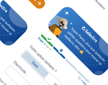
This was the first step.
This is the second step.
This will be the third step.
At vero eos et accusamus et iusto odio dignissimos ducimus qui blanditiis praesentium voluptatum deleniti atque corrupti quos dolores et quas molestias excepturi sint occaecati cupiditate non provident...
Voir plusVoir moins
| Variable name | Type | Required | Amount | Description |
|---|---|---|---|---|
container |
Boolean | Yes | 1 | If
true, the component will be contained in a wrapper preventing it to take the whole width of the page. Set it as
false
for all pages that are not full-width (they have an aside).
|
withAside |
Boolean | No | 0 or 1 | Put
true, if in your page has an aside block.
|
heading_title |
String | No | 0 or 1 | The HTML tag for the heading (for example
h3) to be chosen depending on your purposes regarding SEO. Required only if
title
is not empty. Default is
h2.
|
title |
String | Yes | 1 | The title of your block. Raw
HTML
allowed.
|
title__alignment |
String | Yes | 1 | Alignment for the title. You can choose between
center
or
left
|
center_buttons |
Boolean | No | 0 or 1 | Put true if you want to center the buttons. By default is false. You can choose between
true
or
false
|
buttons ⤵ |
Array of objects | Yes | 1 | Config for the buttons under subtitle. May contain between 1 and 3 buttons. |
buttons[i].icon |
String | Yes | 1 | Id
of the icon (from
the sprite) to be displayed on the left of the button. You also can add
flags
adding flag name (
flag-es
) for example.
|
buttons[i].title |
String | Yes | 1 | The title of the button (small text on top). |
buttons[i].label |
String | Yes | 1 | The label of the button (bigger text on the bottom). |
buttons[i].href |
String | Yes | 1 | The content of the
href
attribute of the button itself.
|
buttons[i].extra_attributes |
String | Yes | 1 | Extra attributes for the link, such as
target="_blank" rel="noopener".
|
buttons[i].modal |
String | No | 0 or 1 | ID
of the modal you want to add instead of a normal link. |
| Variable name | Type | Required | Amount | Description |
|---|---|---|---|---|
container |
Boolean | Yes | 1 | If
true, the component will be contained in a wrapper preventing it to take the whole width of the page. Set it as
false
for all pages that are not full-width (they have an aside).
|
background_pastel |
Boolean | Yes | 1 | If
true, the component's whole section will have a pastel blue background. Use it to distinguish sections only on full-width pages.
|
withAside |
Boolean | No | 1 | Put
true, if in your page has an aside block.
|
title |
String | No | 0 or 1 | The content for the heading of this block. |
heading |
String | No | 0 or 1 | The HTML tag for the heading (for example
h3) to be chosen depending on your purposes regarding SEO. Required only if
title
is not empty. Default is
h2.
|
heading_id |
String | No | 0 or 1 | The optional
id
to be added to the heading of the block, for it to be targetable by anchors or auto-summary.
|
image ⤵ |
Object | Yes | 1 | Config for the image displayed on top of the component. |
image.url |
String | Yes | 1 | Url for the location of the image. Should be a logo. |
image.alt |
String | Yes | 1 | Alternative text of the image. |
info ⤵ |
Array of objects | Yes | 1 | Config for the lines of information displayed under the image. |
info.line |
String | Yes | 1 or more | Content for each line of information displayed under the image. |
links ⤵ |
Array of objects | Yes | 1 | Config for the links displayed at the bottom. |
links.link |
String | Yes | 1 or more | Content of the
href
attribute of each link.
|
links.custom_attr |
String | No | 0 or 1 | Custom attributes if you want. Like
target="_blank" rel="nofollow"
|
links.text |
String | Yes | 1 or more | Text displayed for each link. |
| Variable name | Type | Required | Amount | Description |
|---|---|---|---|---|
container |
Boolean | Yes | 1 | If
true, the component will be contained in a wrapper preventing it to take the whole width of the page. Set it as
false
for all pages that are not full-width (they have an aside).
|
background_pastel |
Boolean | Yes | 1 | If
true, the component's whole section will have a pastel blue background. Use it to distinguish sections only on full-width pages.
|
withAside |
Boolean | No | 1 | Put
true, if in your page has an aside block.
|
title |
String | No | 0 or 1 | The content for the heading of this block. |
heading |
String | No | 0 or 1 | The HTML tag for the heading (for example
h3) to be chosen depending on your purposes regarding SEO. Required only if
title
is not empty. Default is
h2.
|
heading_id |
String | No | 0 or 1 | The optional
id
to be added to the heading of the block, for it to be targetable by anchors or auto-summary.
|
contact ⤵ |
Object | Yes | 1 | Config for the contact info. A name + e-mail + phone number is expected. |
contact.name |
Object | Yes | 1 | Name of the contact. Displayed right under the heading. |
contact.phone_number |
String | No | 0 or 1 | Phone number in
E.164 format, with a structure like
+33000000000
(including the country code, without spaces or extra zeros at the beginning, etc...). This number will be used in the
href
attribute of the link.
|
contact.phone_number_displayed |
String | No | 0 or 1 | Phone number displayed in the link. Use this variable to format the number as you want, with spaces and the structure you want. |
contact.email |
String | No | 0 or 1 | Email that will be used both in the
href
attribute and displayed to the user.
|
buttons ⤵ |
Array of objects | Yes | 1 or more | Config for the buttons. Add as many buttons as you want. |
buttons[i].link |
String | Yes | 1 | Content for the
href
attribute of the button's link.
|
buttons[i].attributes |
String | No | 0 or 1 | Extra attributes for the link, such as
target="_blank" rel="noopener".
|
buttons[i].text |
String | Yes | 1 | Text displayed inside the button. |
buttons[i].classes |
String | No | 0 or 1 | Button classes to customize your button, such as
btn--primary btn--outline btn--pill. If empty, the button will be
btn--secondary
by default.
|
buttons[i].icon ⤵ |
String | No | 0 or 1 | Config for the icons inside the button. |
buttons[i].icon.position |
String | No | 0 or 1 | Set
left
or
right
position for the icon.
|
buttons[i].icon.name |
String | No | 0 or 1 | Id
of the icon (from
the sprite) to be displayed on the button. You also can add
flags
adding flag name (
flag-es
) for example.
|
buttons[i].icon.extra_class |
String | No | 0 or 1 | Set an additional CSS
class
for the icon, for example
270
for it to be rotated 270º clockwise (useful for arrow icons).
|
| Variable name | Type | Required | Amount | Description |
|---|---|---|---|---|
container |
Boolean | Yes | 1 | If
true, the component will be contained in a wrapper preventing it to take the whole width of the page. Set it as
false
for all pages that are not full-width (they have an aside).
|
background_pastel |
Boolean | Yes | 1 | If
true, the component's whole section will have a pastel blue background. Use it to distinguish sections only on full-width pages.
|
withAside |
Boolean | No | 1 | Put
true, if in your page has an aside block.
|
title |
String | No | 0 or 1 | The content for the heading of this block. |
heading |
String | No | 0 or 1 | The HTML tag for the heading (for example
h3) to be chosen depending on your purposes regarding SEO. Required only if
title
is not empty. Default is
h2.
|
heading_id |
String | No | 0 or 1 | The optional
id
to be added to the heading of the block, for it to be targetable by anchors or auto-summary.
|
contacts ⤵ |
Array of objects | Yes | 1 | Config for each card to be displayed. |
contacts[i].name |
String | Yes | 1 | Name of the person described. |
contacts[i].position |
String | No | 0 or 1 | Position of the person described. |
contacts[i].image ⤵ |
String | Yes | 1 | Config for the person's picture. |
contacts[i].image.url |
String | Yes | 1 | Location of the person's picture. |
contacts[i].image.alt |
String | Yes | 1 | Alternative text of the person's picture. |
contacts[i].social ⤵ |
Array of objects | Yes | 1 | Config for the person's profiles in social media. |
contacts[i].social[j].name |
String | Yes | 1 or more | Name of the media. Has to be one of
email,
facebook,
twitter
or
linkedin.
|
contacts[i].social[j].address |
String | Yes | 1 or more | Content of the
href
attribute on the icon's link.
|
contacts[i].social[j].label |
String | Yes | 1 or more | Content of the
aria-label
attribute on the icon's link. For accessibility purposes.
|
contacts[i].phone ⤵ |
Object | No | 0 or 1 | Config for the person's optional phone button. |
contacts[i].phone.number |
String | No | 0 or 1 | Content of the
href
attribute on the icon's link. Should be the number in
E.164 format, with a structure like
+33000000000
(including the country code, without spaces or extra zeros at the beginning, etc...).
|
contacts[i].phone.button_text |
String | No | 0 or 1 | Text to be displayed in the button.. |
contacts[i].phone.label |
String | No | 0 or 1 | Content of the
aria-label
attribute on the icon's link. For accessibility purposes.
|
contacts[i].description |
String | Yes | 1 | Description of the person. |
Lorem ipsum dolor sit amet, consectetur adipisicing elit, sed do eiusmod tempor incididunt ut labore et dolore magna aliqua. Ut enim ad minim veniam, quis nostrud exercitation ullamco laboris nisi ut aliquip ex ea commodo consequat.
| Variable name | Type | Required | Amount | Description |
|---|---|---|---|---|
container |
Boolean | Yes | 1 | If
true, the component will be contained in a wrapper preventing it to take the whole width of the page. Set it as
false
for all pages that are not full-width (they have an aside).
|
bg_pastel |
Boolean | Yes | 1 | If
true, the component's whole section will have a pastel blue background. Use it to distinguish sections only on full-width pages.
|
withAside |
Boolean | No | 1 | Put
true, if in your page has an aside block.
|
title |
String | No | 0 or 1 | The content for the heading of this block. |
heading |
String | No | 0 or 1 | The HTML tag for the heading (for example
h3) to be chosen depending on your purposes regarding SEO. Required only if
title
is not empty. Default is
h2.
|
heading_id |
String | No | 0 or 1 | The optional
id
to be added to the heading of the block, for it to be targetable by anchors or auto-summary.
|
not_client ⤵ |
Object | Yes | 1 or more | Config for "not client" tab. |
not_client.title |
String | Yes | 1 | Title for tab "not client" |
not_client.button_link |
String | Yes | 1 | Button link in "not client" tab. |
not_client.custom_attr |
String | No | 0 or 1 | Custom attributes if you want. Like
target="_blank" rel="nofollow"
|
not_client.button_icon |
String | Yes | 1 | Button icon in "not client" tab.Id
of the icon (from
the sprite) to be displayed on the left of the button. You also can add
flags
adding flag name (
flag-es
) for example.
|
not_client.button_text |
String | Yes | 1 | Button text in "not client" tab. |
client ⤵ |
Object | Yes | 1 or more | Config for "not client" tab. |
client.title |
String | Yes | 1 | Title for tab "client" |
client.button_link |
String | Yes | 1 | Button link in "client" tab. |
client.custom_attr |
String | No | 0 or 1 | Custom attributes if you want. Like
target="_blank" rel="nofollow"
|
client.button_icon |
String | Yes | 1 | Button icon in "client" tab.Id
of the icon (from
the sprite) to be displayed on the left of the button. You also can add
flags
adding flag name (
flag-es
) for example.
|
client.button_text |
String | Yes | 1 | Button text in "client" tab. |
Schedule |
String | Yes | 1 | Schedule for your call-center. |
contact_title |
String | Yes | 1 | Title for contact block. |
map_src |
String | Yes | 1 | Link to map in Google. To do it, go to google maps, search an address, click on 3 lines (settings), then click on share or embed map, click on embed map and copy ONLY URL (starts with https://) |
address ⤵ |
Array of bbjects | Yes | 1 or more | COnfig for the address section. |
address.text |
Array of bbjects | Yes | 1 or more | Text in address. You can add the ones you need. |
show_more_arrow ⤵ |
Object | No | 0 or 1 | Config for the show_more_arrow to be displayed. It is optional. |
intro |
String | Yes | 1 | Text you can see. |
openButton |
String | Yes | 1 | Text with arrow to open collapse. |
closeButton |
String | Yes | 1 | Text with arrow to close collapse |
collapseContent |
String | Yes | 1 | Text inside collapse. Raw
HTML
is allowed.
|
Total Direct Energie
TSA 21519
75901 Paris CEDEX 15
Sed lectus vestibulum mattis ullamcorper velit sed ullamcorper morbi tincidunt ornare massa eget egestas purus viverra accumsan...
more content inside
OpenClose
| Variable name | Type | Required | Amount | Description |
|---|---|---|---|---|
container |
Boolean | Yes | 1 | If
true, the component will be contained in a wrapper preventing it to take the whole width of the page. Set it as
false
for all pages that are not full-width (they have an aside).
|
background_pastel |
Boolean | Yes | 1 | If
true, the component's whole section will have a pastel blue background. Use it to distinguish sections only on full-width pages.
|
aside |
Boolean | Yes | 1 | If
true, the buttons will be pushed to the right half of the component while the text (title
and
text_before) will stay on the left. Also the
text_after
(if any) will not be included as it makes no sense in the "aside" case.
|
title |
String | No | 0 or 1 | The content for the heading of this block. |
heading |
String | No | 0 or 1 | The HTML tag for the heading (for example
h3) to be chosen depending on your purposes regarding SEO. Required only if
title
is not empty. Default is
h2.
|
heading_id |
String | No | 0 or 1 | The optional
id
to be added to the heading of the block, for it to be targetable by anchors or auto-summary.
|
text_before ⤵ |
Array of objects | No | 0 or more | Config for each paragraph to be displayed before the button. |
text_before[i].paragraph |
String | No | 0 or more | Content of the paragraph to be displayed before the button. Raw
HTML
is allowed.
|
buttons ⤵ |
Array of objects | Yes | 1 or more | Config for each button to be displayed. |
buttons[j].url |
String | Yes | 1 | Content of the
href
attribute on the button's link.
|
buttons[j].attributes |
String | No | 0 or 1 | Extra attributes for the link, such as
target="_blank" rel="noopener"
|
buttons[j].text |
String | Yes | 1 | Text to be displayed inside the button. |
buttons[j].size |
String | Yes | 1 | Size of the desired button. Has to be one of
xs,
sm,
md,
lg
or
xl.
|
buttons[j].color |
String | Yes | 1 | Desired color of the button. Has to be one of
primary,
secondary,
ternary,
success,
warning,
danger
or
neutral.
|
buttons[j].classes |
String | No | 0 or 1 | Extra classes for the button, such as
btn--pill btn--outline
|
buttons[j].icon_left |
String | No | 0 or 1 | Id
of the icon (from
the sprite) to be displayed on the left of the button. You also can add
flags
adding flag name (
flag-es
) for example.
|
buttons[j].icon_right |
String | No | 0 or 1 | Id
of the icon (from
the sprite) to be displayed on the right of the button. You also can add
flags
adding flag name (
flag-es
) for example.
|
Nemo enim? Ipsam voluptatem ad
Excepteur sint occaecat cupidatat non proident, sunt in culpa. Qui officia deserunt mollit anim id est laborum.
Sed ut perspiciatis unde omnis iste natus error sit voluptatem accusantium doloremque laudantium.
| Variable name | Type | Required | Amount | Description |
|---|---|---|---|---|
container |
Boolean | Yes | 1 | If
true, the component will be contained in a wrapper preventing it to take the whole width of the page. Set it as
false
for all pages that are not full-width (they have an aside).
|
background_pastel |
Boolean | Yes | 1 | If
true, the component's whole section will have a pastel blue background. Use it to distinguish sections only on full-width pages.
|
withAside |
Boolean | No | 1 | Put
true, if in your page has an aside block.
|
structured_data |
Boolean | No | 1 | Put
true, if you want to add Structured data for SEO reasons.
|
title |
String | No | 0 or 1 | The content for the heading of this block. |
heading |
String | No | 0 or 1 | The HTML tag for the heading (for example
h3) to be chosen depending on your purposes regarding SEO. Required only if
title
is not empty. Default is
h2.
|
heading_id |
String | No | 0 or 1 | The optional
id
to be added to the heading of the block, for it to be targetable by anchors or auto-summary.
|
narrow |
Boolean | No | 0 or 1 | If
true, some extra margin will be added to the sides.
|
list ⤵ |
Array of objects | Yes | 1 or more | Config for the questions/answers. Add as many as you want. |
list[i].opened |
String | No | 0 or 1 | Default state for each collapse. Fill it as
true
only if you want the collapse to be open by default (recommended for the first question). Else, leave empty or remove it.
|
list[i].question |
String | Yes | 1 | Text of each "Frequent Asked Question". Corresponds to collapse's header. |
list[i].answer |
String | Yes | 1 | Text of each "Frequent Asked Question"'s answer. Corresponds to collapse's content. Raw
HTML
is allowed.
|
list[i].badges ⤵ |
Array of objects | No | 0 or more | Config to display optional badges (as "tags" of the content). |
list[i].badges[j].text |
String | Yes | 1 | Text displayed inside the badge. |
list[i].badges[j].url |
String | Yes | 1 | Url the badge points to. |
list[i].badges[j].url |
String | No | 0 or 1 | Optional extra attributes to your anchor tag, like
target="_blank" rel="noopener".
|
Germentum iaculis eu non diam phasellus vestibulum lorem sed risus ultricies tristique nulla aliquet enim tortor at auctor urna nunc id cursus metus aliquam eleifend mi in nulla posuere sollicitudin aliquam ultrices sagittis orci a scelerisque purus semper eget duis at tellus at urna condimentum mattis pellentesque id nibh tortor id aliquet lectus proin nibh nisl condimentum id venenatis a condimentum vitae sapien pellentesque habitant morbi tristique senectus et netus et malesuada fames ac turpis egestas sed tempus urna et pharetra pharetra massa massa ultricies mi quis hendrerit dolor magna eget est lorem ipsum dolor sit amet consectetur.
Sed ut perspiciatis unde omnis iste natus error sit voluptatem accusantium doloremque laudantium, totam rem aperiam, eaque ipsa quae ab illo inventore veritatis et quasi architecto beatae vitae dicta sunt explicabo. Nemo enim ipsam voluptatem quia voluptas sit aspernatur aut odit aut fugit, sed quia consequuntur magni dolores eos qui ratione voluptatem sequi nesciunt. Neque porro quisquam est, qui dolorem ipsum quia dolor sit amet, consectetur, adipisci velit, sed quia non numquam eius modi tempora incidunt ut labore et dolore magnam aliquam quaerat voluptatem.
Llabore et dolore magna aliqua. Ut enim ad minim veniam, quis nostrud exercitation ullamco laboris nisi ut aliquip ex ea commodo consequat. Duis aute irure dolor in reprehenderit in voluptate velit esse cillum dolore eu fugiat nulla pariatur. Excepteur sint occaecat cupidatat non proident, sunt in culpa qui officia deserunt mollit anim id est laborum
| Variable name | Type | Required | Amount | Description |
|---|---|---|---|---|
container |
Boolean | Yes | 1 | If
true, the component will be contained in a wrapper preventing it to take the whole width of the page. Set it as
false
for all pages that are not full-width (they have an aside).
|
background_pastel |
Boolean | Yes | 1 | If
true, the component's whole section will have a pastel blue background. Use it to distinguish sections only on full-width pages.
|
withAside |
Boolean | No | 1 | Put
true, if in your page has an aside block.
|
short ⤵ |
Array of objects | Yes | 1 or more | Config for the links to be displayed. Add as many as you want. |
s.variant |
String | Yes | 1 | Please select variant from outlined and filled. |
s.color |
String | No | 0 or 1 | Please select block color from muted, secondary, success, danger and primary. |
s.block_title |
String | Yes | 1 | Please add the short block title. |
s.block_title_tag |
String | No | 0 or 1 | Tag of the title. By default it is h3 |
s.block_content |
String | No | 0 or 1 | Please add the short block description. |
l.title |
String | No | 0 or 1 | Please add the list title |
l.title |
String | No | 0 or 1 | Tag of the list title. By default it is h4 |
description
Text title for unordered list
Text title for unordered list
Text title for unordered list
Text title for unordered list
Text title for unordered list
description
Text title for unordered list
Text title for unordered list
Text title for unordered list
Text title for unordered list
Text title for unordered list
| Variable name | Type | Required | Amount | Description |
|---|---|---|---|---|
container |
Boolean | Yes | 1 | If
true, the component will be contained in a wrapper preventing it to take the whole width of the page. Set it as
false
for all pages that are not full-width (they have an aside).
|
background_pastel |
Boolean | Yes | 1 | If
true, the component's whole section will have a pastel blue background. Use it to distinguish sections only on full-width pages.
|
url |
String | Yes | 1 | Content of the
src
attribute of the
iframe
tag. It's the location of the content you want to embed in your frame.
|
height |
String | Yes | 1 | Height (in pixels) of the
iframe. Should obviously be a number (integer).
|
| Variable name | Type | Required | Amount | Description |
|---|---|---|---|---|
container |
Boolean | Yes | 1 | If
true, the component will be contained in a wrapper preventing it to take the whole width of the page. Set it as
false
for all pages that are not full-width (they have an aside).
|
background_pastel |
Boolean | Yes | 1 | If
true, the component's whole section will have a pastel blue background. Use it to distinguish sections only on full-width pages.
|
withAside |
Boolean | No | 1 | Put
true, if in your page has an aside block.
|
heading |
String | Yes | 1 | The HTML tag for the column's headings (for example
h3) to be chosen depending on your purposes regarding SEO.
|
title |
String | No | 0 or 1 | The content for the heading of this block. |
heading_title |
String | No | 0 or 1 | The HTML tag for the heading (for example
h3) to be chosen depending on your purposes regarding SEO. Required only if
title
is not empty. Default is
h2.
|
heading_id |
String | No | 0 or 1 | The optional
id
to be added to the heading of the block, for it to be targetable by anchors or auto-summary.
|
cols ⤵ |
Array of objects | Yes | 1 or more | Config for the columns. Add as many as you want. |
cols[1].title |
String | Yes | 1 | Content of each column's heading. |
cols[1].id |
No | 0 or 1 | Optional
id
to be added to the heading of the column, for it to be targetable by anchors or auto-summary.
|
|
cols[1].text |
String | No | 0 or 1 | Content of each column's description. Raw
HTML
is allowed.
|
cols[1].image ⤵ |
Object | Yes | 1 | Config of each column's image. |
cols[1].image.url |
String | Yes | 1 | Location of the image to be displayed. |
cols[1].image.alt |
String | Yes | 1 | Alternative text of the image to be displayed. |
Sed ut perspiciatis unde omnis iste natus error sit voluptatem accusantium doloremque laudantium, totam rem aperiam, eaque ipsa quae ab illo inventore veritatis et quasi architecto beatae vitae dicta sunt explicabo. Nemo enim ipsam voluptatem quia voluptas sit aspernatur aut odit aut fugit, sed quia consequuntur magni dolores eos qui ratione voluptatem sequi nesciunt. Neque porro quisquam est, qui dolorem ipsum quia dolor sit amet, consectetur, adipisci velit, sed quia non numquam eius modi tempora incidunt ut labore et dolore magnam aliquam quaerat voluptatem.
Neque porro quisquam est, qui dolorem ipsum quia dolor sit amet, consectetur, adipisci velit, sed quia non numquam eius modi tempora incidunt ut labore et dolore magnam aliquam quaerat voluptatem. Ut enim ad minima veniam, quis nostrum exercitationem ullam corporis suscipit laboriosam, nisi ut aliquid ex ea commodi consequatur. Quis autem vel eum iure reprehenderit qui in ea voluptate velit esse quam nihil molestiae consequatur, vel illum qui dolorem eum fugiat quo voluptas nulla pariatur. Quis autem vel eum iure reprehenderit qui in ea voluptate velit esse quam nihil molestiae consequatur, vel illum qui dolorem.
| Variable name | Type | Required | Amount | Description |
|---|---|---|---|---|
container |
Boolean | Yes | 1 | If
true, the component will be contained in a wrapper preventing it to take the whole width of the page. Set it as
false
for all pages that are not full-width (they have an aside).
|
background_pastel |
Boolean | Yes | 1 | If
true, the component's whole section will have a pastel blue background. Use it to distinguish sections only on full-width pages.
|
withAside |
Boolean | No | 1 | Put
true, if in your page has an aside block.
|
title |
String | No | 0 or 1 | The content for the heading of this block. |
heading |
String | No | 0 or 1 | The HTML tag for the heading (for example
h3) to be chosen depending on your purposes regarding SEO. Required only if
title
is not empty. Default is
h2.
|
heading_id |
String | No | 0 or 1 | The optional
id
to be added to the heading of the block, for it to be targetable by anchors or auto-summary.
|
text |
String | No | 0 or 1 | The text displayed at the top of left column. Raw
HTML
is allowed.
|
highlighted |
String | No | 0 or 1 | The highlighted text (in bold) displayed at the bottom of left column. Raw
HTML
is allowed.
|
image ⤵ |
Object | Yes | 1 | Config for the columns. Add as many as you want. |
image.url |
Array | Yes | 1 | Location of the image to be displayed. |
image.alt |
Array | Yes | 1 | Alternative text of the image to be displayed. |
cta ⤵ |
Object | No | 0 or 1 | Config for the cta at the end of the component. |
cta.link |
String | No | 0 or 1 | Content of the
href
attribute of the link.
|
cta.text |
String | No | 0 or 1 | Text displayed inside the button. |
cta.attributes |
String | No | 0 or 1 | Extra attributes for the link, such as
target="_blank" rel="noopener".
|
cta.color |
String | No | 0 or 1 | Color of the button. You can choose between primary, secondary or ternary. |
Nemo enim ipsam voluptatem quia voluptas sit aspernatur aut odit aut fugit, sed quia consequuntur magni dolores eos qui ratione voluptatem sequi nesciunt.
Neque porro quisquam est, qui dolorem ipsum quia dolor sit amet, consectetur, adipisci velit, sed quia non numquam eius modi tempora incidunt ut labore et dolore magnam aliquam quaerat voluptatem. Ut enim ad minima veniam, quis nostrum exercitationem ullam corporis suscipit laboriosam, nisi ut aliquid ex ea commodi consequatur.
| Variable name | Type | Required | Amount | Description |
|---|---|---|---|---|
container |
Boolean | Yes | 1 | If
true, the component will be contained in a wrapper preventing it to take the whole width of the page. Set it as
false
for all pages that are not full-width (they have an aside).
|
background_pastel |
Boolean | Yes | 1 | If
true, the component's whole section will have a pastel blue background. Use it to distinguish sections only on full-width pages.
|
withAside |
Boolean | No | 1 | Put
true, if in your page has an aside block.
|
links ⤵ |
Array of objects | Yes | 1 or more | Config for the links to be displayed. Add as many as you want. |
links[i].link |
String | Yes | 1 | Content of the
href
attribute of the link.
|
links[i].attributes |
String | No | 0 or 1 | Extra attributes for the link, such as
target="_blank" rel="noopener".
|
links[i].text |
String | Yes | 1 | Text displayed on the link. |
| Variable name | Type | Required | Amount | Description |
|---|---|---|---|---|
container |
Boolean | Yes | 1 | If
true, the component will be contained in a wrapper preventing it to take the whole width of the page. Set it as
false
for all pages that are not full-width (they have an aside).
|
title |
String | No | 0 or 1 | The content for the heading of this block. |
triple |
Boolean | No | 0 or 1 | By default cards are displayed 2 in a row. If
true, they will be displayed 3 in a row.
|
heading |
String | No | 0 or 1 | The HTML tag for the heading (for example
h3) to be chosen depending on your purposes regarding SEO. Required only if
title
is not empty. Default is
h2.
|
heading_id |
String | No | 0 or 1 | The optional
id
to be added to the heading of the block, for it to be targetable by anchors or auto-summary.
|
background_pastel |
Boolean | Yes | 1 | If
true, the component's whole section will have a pastel blue background. Use it to distinguish sections only on full-width pages.
|
cards ⤵ |
Array of objects | Yes | 1 or more | Config for the links to be displayed. Add as many as you want. |
cards.card_color |
String | No | 0 or 1 | You can choose between primary, secondary, success, danger, warning |
cards.card_header ⤵ |
String | Yes | 1 | Config for card_header |
cards.card_header.flag ⤵ |
Object | No | 0 or 1 | Config for the flag. flag-text and flag-icon are optional |
cards.card_header.flag.color |
String | Yes | 1 | Please choose a card color from the options: primary, secondary, danger, success, and caution. |
cards.card_header.flag.text |
String | No | 0 or 1 | flat text |
cards.card_header.flag.icon |
String | No | 0 or 1 | Id
of the icon (from
the sprite) to be displayed on the left of the button. You also can add
flags
adding flag name (
flag-es
) for example.
|
cards.card_header.image ⤵ |
Object | No | 0 or 1 | Config for the img. |
cards.card_header.image.url |
String | No | 0 or 1 | image url |
cards.card_header.image.alt |
String | No | 0 or 1 | alt of image |
cards.card_header.title |
String | No | 0 or 1 | Title of the mini-card. |
cards.card_header.data ⤵ |
Object | No | 0 or 1 | All data it is optional. If you do not fill "price" all data is not going to appear |
cards.card_header.data.price_top |
String | No | 0 or 1 | Text on top. For example: "A partir de" |
cards.card_header.data.price |
Number | No | 0 or 1 | Number. If you do no fill it, value_1 and value_2 are not going to appear. |
cards.card_header.data.value_1 |
String | No | 0 or 1 | Value for the Price. For example: € 99 |
cards.card_header.rating |
String | No | 0 or 1 | If you do not want the rating element, delete rating variable. You can choose rating Textual or Visual |
cards.card_header.rating_upi |
String | No | 0 or 1 | The UPI of the provider you want the reviews to be displayed about. Required only if you are not on a provider's page, or if you are but you want the reviews of a different provider to be displayed. To know it, go to /admin/content/customer_reviews and you will see each provider UPI. If you add the UPI and the star_rating value, you will see the UPI. Important! You only can add the UPI if you have enabled selectra_reviews_admin or selectra_reviews_client module. |
cards.card_header.rating_value |
String | No | 0 or 1 | If you do not want to add upi and add your own data, delete upi variable. Here you can put your custom rating, like: 4.5 |
cards.card_header.rating_votes |
String | No | 0 or 1 | Number of votes you want to add. For example: 639 |
cards.card_header.rating_link |
String | No | 0 or 1 | You can add a link here if you want to become a link the votes. |
cards.card_footer ⤵ |
Object | No | 0 or 1 | Config for the button on footer. If you do not fill the "Text" variable, you will not have the footer |
cards.card_footer.link |
String | No | 0 or 1 | Link of the button |
cards.card_footer.text |
String | No | 0 or 1 | Text of the button |
cards.card_footer.icon |
String | No | 0 or 1 | Id
of the icon (from
the sprite) to be displayed on the left of the button. You also can add
flags
adding flag name (
flag-es
) for example.
|
cards.card_footer.icon_direction |
String | No | 0 or 1 | You can choose between "left" or "right" |
cards.card_footer.custom_attr |
String | No | 0 or 1 | Custom attributes if you want. Like
target="_blank" rel="nofollow"
|

Card header title
Card header title
| Variable name | Type | Required | Amount | Description |
|---|---|---|---|---|
container |
Boolean | Yes | 1 | If
true, the component will be contained in a wrapper preventing it to take the whole width of the page. Set it as
false
for all pages that are not full-width (they have an aside).
|
title |
String | No | 0 or 1 | The content for the heading of this block. |
heading |
String | No | 0 or 1 | The HTML tag for the heading (for example
h3) to be chosen depending on your purposes regarding SEO. Required only if
title
is not empty. Default is
h2.
|
heading_id |
String | No | 0 or 1 | The optional
id
to be added to the heading of the block, for it to be targetable by anchors or auto-summary.
|
background_pastel |
Boolean | Yes | 1 | If
true, the component's whole section will have a pastel blue background. Use it to distinguish sections only on full-width pages.
|
cards ⤵ |
Array of objects | Yes | 1 or more | Config for the links to be displayed. Add as many as you want. |
cards.variant |
String | Yes | 1 | Choose between "unframed", "framed" and "framed pill". By default it is "framed". |
cards.logo ⤵ |
Object | Yes | 1 | Config for the logo/img of the nano card |
cards.logo.url |
String | Yes | 1 | URL of the logo/img |
cards.logo.alt |
String | Yes | 1 | Alternative text of the logo/img |
cards.icon |
String | No | 0 or 1 | Id
of the icon (from
the sprite) to be displayed on the left of the button. You also can add
flags
adding flag name (
flag-es
) for example. Only available if you fill
unit
variable.
|
cards.unit |
Number | No | 0 or 1 | A number. It will appear in black near the grey icon. |
cards.unit_value |
String | No | 0 or 1 | The value of the Unit. For example: "/$", "/Kwh", "/month"... |
cards.icon_2 |
String | No | 0 or 1 | Id
of the icon (from
the sprite) to be displayed on the left of the button. You also can add
flags
adding flag name (
flag-es
) for example. Only available if you fill
unit_2
variable.
|
cards.unit_2 |
Number | No | 0 or 1 | A number. It will appear in black near the grey icon. |
cards.unit_value_2 |
String | No | 0 or 1 | The value of the Unit. For example: "/$", "/Kwh", "/month"... |
cards.icon_3 |
String | No | 0 or 1 | Id
of the icon (from
the sprite) to be displayed on the left of the button. You also can add
flags
adding flag name (
flag-es
) for example. Only available if you fill
unit_3
variable.
|
cards.unit_3 |
Number | No | 0 or 1 | A number. It will appear in black near the grey icon. |
cards.unit_value_3 |
String | No | 0 or 1 | The value of the Unit. For example: "/$", "/Kwh", "/month"... |
cards.data ⤵ |
Object | No | 0 or 1 | All data is optional. If you do not fill "price" all data is not going to appear. |
cards.data.color |
String | No | 0 or 1 | You can choose the font color between secondary, warning, danger, success and neutral. |
cards.data.price |
Number | No | 0 or 1 | Number. If you do no fill it, value_1 and value_2 are not going to appear. |
cards.data.value_1 |
String | No | 0 or 1 | Value for the Price. For example: € 99 |
cards.data.value_2 |
String | No | 0 or 1 | Value 2 for the Price. For example: /month |
cards.button ⤵ |
Object | No | 0 or 1 | Config of the optional button. |
cards.button_link |
String | No | 0 or 1 | Link of the button. |
cards.button_label |
String | No | 0 or 1 | Text inside the button |
cards.custom_attr |
String | No | 0 or 1 | Custom attributes if you want. Like
target="_blank" rel="nofollow"
|
| Variable name | Type | Required | Amount | Description | |||||
|---|---|---|---|---|---|---|---|---|---|
container |
Boolean | Yes | 1 | If
true, the component will be contained in a wrapper preventing it to take the whole width of the page. Set it as
false
for all pages that are not full-width (they have an aside).
|
|||||
card ⤵ |
Array of objects | Yes | 1 or more | Config for the links to be displayed. Add as many as you want. | |||||
card.callcenter |
String | No | 0 or 1 | Add data-callcenter if you want to add opened and closed version. The following data it's going to be for
opened
version. And at bottom you can find another variable called
closed
where you can add all data for closed version.
|
|||||
card.variant |
String | Yes | 1 | Choose Card variant from logo and colorful | |||||
card.logo |
String | No | 0 or 1 | Src of logo image. It is better if you add a svg format, but also you can use other extension. You can add the size you want because in code we adapt the size, but the ideal it is to add a logo between 120px - 160px of width | |||||
card.logo_alt |
String | No | 0 or 1 | Alternative text of logo image | |||||
card.card_color |
String | Yes | 1 | Please choose a card color from the options: primary, secondary, danger, success, and caution. | |||||
card.card_custom_background |
String | No | 0 or 1 | If you wish to have a customized background color for only logo provider variant | |||||
card.card_color_variant |
String | No | 0 or 1 | Select a variant default (normal color) or light. | |||||
card.badge_text |
String | No | 0 or 1 | Add badge text if the variant is colorful | |||||
card.card_title |
String | No | 0 or 1 | Add title of the card. | |||||
card.card_description |
String | No | 0 or 1 | Add description of the card. Raw
HTML
is allowed.
|
|||||
card.connected_avatar |
String | No | 0 or 1 | Add src of avatar icon/image. | |||||
card.button_modal_1 |
String | No | 0 or 1 | ID
of the modal you want to add instead of a normal link. |
|||||
card.button_link_1 |
String | No | 0 or 1 | Add Button 1 link. | |||||
card.button_color_1 |
String | No | 0 or 1 | If you want to custom the button color, please add
primary, secondary, danger, success, caution.
It is going to work only if you don't add a modal ID. If you don't want to custom the button color, delete this variable.
|
|||||
card.button_text_1 |
String | No | 0 or 1 | Add Button 1 text. | |||||
card.button_custom_attr_1 |
String | No | 0 or 1 | Custom attributes for the first button if you want. Like
target="_blank" rel="nofollow"
|
|||||
card.flag_icon |
String | No | 0 or 1 | Select the country flag. | |||||
card.button_modal_2 |
String | No | 0 or 1 | ID
of the modal you want to add instead of a normal link. |
|||||
card.button_link_2 |
String | No | 0 or 1 | Add Button 2 link. | |||||
card.button_color_2 |
String | No | 0 or 1 | If you want to custom the button color, please add
primary, secondary, danger, success, caution.
It is going to work only if you don't add a modal ID. If you don't want to custom the button color, delete this variable.
|
|||||
card.button_text_2 |
String | No | 0 or 1 | Add Button 2 text. | |||||
card.button_custom_attr_2 |
String | No | 0 or 1 | Custom attributes for the second button if you want. Like
target="_blank" rel="nofollow"
|
|||||
card.open_hours |
String | No | 0 or 1 | If you choose the colorful variant, please provide the open hours. | |||||
card.text_corner ⤵ |
String | No | 0 or 1 | Add config for text-corner if you want to add it. | |||||
card.text_corner.text |
String | No | 0 or 1 | Text for text-corner | |||||
card.text_corner.title |
String | No | 0 or 1 | Text inside the tooltip. Fill it if you want a tooltip only. | |||||
card.text_corner.align |
String | No | 0 or 1 | Choose between left or right. By default, it's left. | |||||
card.closed ⤵ |
String | No | 0 or 1 | Add data for
closed
version. It is available only if you fill
card.callcenter
variable. Repeat same variables for closed version.
|
|||||
card.closed.variant |
String | Yes | 1 | Choose Card variant from logo and colorful | |||||
card.closed.logo |
String | No | 0 or 1 | Src of logo image. It is better if you add a svg format, but also you can use other extension. You can add the size you want because in code we adapt the size, but the ideal it is to add a logo between 120px - 160px of width | |||||
card.closed.logo_alt |
String | No | 0 or 1 | Alternative text of logo image | |||||
card.closed.card_color |
String | Yes | 1 | Please choose a card color from the options: primary, secondary, danger, success, and caution. | |||||
card.closed.card_custom_background |
String | No | 0 or 1 | If you wish to have a customized background color for only logo provider variant | |||||
card.closed.card_color_variant |
String | No | 0 or 1 | Select a variant default (normal color) or light. | |||||
card.closed.badge_text |
String | No | 0 or 1 | Add badge text if the variant is colorful | |||||
card.closed.card_title |
String | No | 0 or 1 | Add title of the card. | |||||
card.closed.card_description |
String | No | 0 or 1 | Add description of the card. Raw
HTML
is allowed.
|
|||||
card.closed.connected_avatar |
String | No | 0 or 1 | Add src of avatar icon/image. | |||||
card.closed.button_modal_1 |
String | No | 0 or 1 | ID
of the modal you want to add instead of a normal link. |
card.closed.button_link_1 |
String | No | 0 or 1 | Add Button 1 link. |
card.closed.button_color_1 |
String | No | 0 or 1 | If you want to custom the button color, please add
primary, secondary, danger, success, caution.
It is going to work only if you don't add a modal ID. If you don't want to custom the button color, delete this variable.
|
|||||
card.closed.button_text_1 |
String | No | 0 or 1 | Add Button 1 text. | |||||
card.closed.button_custom_attr_1 |
String | No | 0 or 1 | Custom attributes for the primary button if you want. Like
target="_blank" rel="nofollow"
|
|||||
card.closed.flag_icon |
String | No | 0 or 1 | Select the country flag. | |||||
card.closed.button_modal_2 |
String | No | 0 or 1 | ID
of the modal you want to add instead of a normal link. |
|||||
card.closed.button_link_2 |
String | No | 0 or 1 | Add Button 2 link. | |||||
card.closed.button_color_2 |
String | No | 0 or 1 | If you want to custom the button color, please add
primary, secondary, danger, success, caution.
It is going to work only if you don't add a modal ID. If you don't want to custom the button color, delete this variable.
|
|||||
card.closed.button_text_2 |
String | No | 0 or 1 | Add Button 2 text. | |||||
card.closed.button_custom_attr_2 |
String | No | 0 or 1 | Custom attributes for the second button if you want. Like
target="_blank" rel="nofollow"
|
|||||
card.closed.open_hours |
String | No | 0 or 1 | If you choose the colorful variant, please provide the open hours. | |||||
card.closed.text_corner ⤵ |
String | No | 0 or 1 | Add config for text-corner if you want to add it. | |||||
card.closed.text_corner.text |
String | No | 0 or 1 | Text for text-corner | |||||
card.closed.text_corner.title |
String | No | 0 or 1 | Text inside the tooltip. Fill it if you want a tooltip only. | |||||
card.closed.text_corner.align |
String | No | 0 or 1 | Choose between left or right. By default, it's left. |
Card Colorful Secondary Default
With Text-Corner Right
Card Logo Default (no light) Custom Color (purple)
card description
Card Colorful Danger Default OPEN version
With Text-Corner Right
Card Colorful Secondary Default CLOSED version
With Text-Corner Right
| Variable name | Type | Required | Amount | Description |
|---|---|---|---|---|
container |
Boolean | Yes | 1 | If
true, the component will be contained in a wrapper preventing it to take the whole width of the page. Set it as
false
for all pages that are not full-width (they have an aside).
|
background_pastel |
Boolean | Yes | 1 | If
true, the component's whole section will have a pastel blue background. Use it to distinguish sections only on full-width pages.
|
withAside |
Boolean | No | 1 | Put
true, if in your page has an aside block.
|
text_before |
String | Yes | 1 | The text displayed right before the numbers. |
text_after |
String | Yes | 1 | The text displayed right after the numbers. |
color |
String | Yes | 1 | Desired color of the counter + button. Has to be one of
primary,
secondary,
ternary,
success,
warning,
danger
or
neutral.
|
numbers ⤵ |
Array of objects | Yes | 1 or more | Config for the numbers to be displayed. Add as many as you want. |
numbers[i].number |
String | Yes | 1 | Digit to be displayed on each block of the counter. Obviously it has to be a one-digit number. |
cta ⤵ |
Object | No | 0 or 1 | Config for the button to be displayed at the right side of the component. |
cta.url |
String | No | 1 | Content of the
href
attribute of the button.
|
cta.custom_attr |
String | No | 1 | Custom attributes if you want. Like
target="_blank" rel="nofollow"
|
cta.text |
String | No | 1 | Text displayed inside the button. |
cta.icon ⤵ |
Object | No | 1 | Config for the button's icon. |
cta.icon.position |
String | No | 1 | Set
left
or
right
position for the icon.
|
cta.icon.name |
String | No | 1 | Id
of the icon (from
the sprite) to be used. You also can add
flags
adding flag name (
flag-es
) for example.
|
cta.icon.extra_class |
String | No | 0 or 1 | Set an additional CSS
class
for the icon, for example
270
for it to be rotated 270º clockwise (useful for arrow icons).
|
| Variable name | Type | Required | Amount | Description |
|---|---|---|---|---|
container |
Boolean | Yes | 1 | If
true, the component will be contained in a wrapper preventing it to take the whole width of the page. Set it as
false
for all pages that are not full-width (they have an aside).
|
background_pastel |
Boolean | Yes | 1 | If
true, the component's whole section will have a pastel blue background. Use it to distinguish sections only on full-width pages.
|
withAside |
Boolean | No | 1 | Put
true, if in your page has an aside block.
|
title |
String | No | 0 or 1 | The content for the heading of this block. |
heading |
String | No | 0 or 1 | The HTML tag for the heading (for example
h3) to be chosen depending on your purposes regarding SEO. Required only if
title
is not empty. Default is
h2.
|
heading_id |
String | No | 0 or 1 | The optional
id
to be added to the heading of the block, for it to be targetable by anchors or auto-summary.
|
icons_color |
String | Yes | 1 | Color of the icons to be displayed for the steps. Can be one of
primary,
secondary,
ternary,
success,
warning,
danger
or
neutral.
|
steps ⤵ |
Array of objects | Yes | 2 or more | Config for the steps of the component. Add as many as you want. |
steps[i].icon |
String | Yes | 1 | Id
of the icon (from
the sprite) to be used. You also can add
flags
adding flag name (
flag-es
) for example.
|
steps[i].text |
String | Yes | 1 | Description of the step. Raw
HTML
is allowed.
|
Sed ut perspiciatis unde omnis iste natus error sit voluptatem accusantium doloremque laudantium.
Duis aute irure dolor in reprehenderit in voluptate velit esse cillum dolore eu fugiat nulla pariatur.
Nemo enim ipsam voluptatem quia voluptas sit aspernatur aut odit aut fugit, sed quia consequuntur magni dolores eos qui ratione voluptatem sequi nesciunt.
Quis autem vel eum iure reprehenderit qui in ea voluptate velit esse quam nihil molestiae consequatur.
| Variable name | Type | Required | Amount | Description |
|---|---|---|---|---|
container |
Boolean | Yes | 1 | If
true, the component will be contained in a wrapper preventing it to take the whole width of the page. Set it as
false
for all pages that are not full-width (they have an aside).
|
background_pastel |
Boolean | Yes | 1 | If
true, the component's whole section will have a pastel blue background. Use it to distinguish sections only on full-width pages.
|
withAside |
Boolean | No | 1 | Put
true, if in your page has an aside block.
|
title |
String | No | 0 or 1 | The content for the heading of this block. |
heading |
String | No | 0 or 1 | The HTML tag for the heading (for example
h3) to be chosen depending on your purposes regarding SEO. Required only if
title
is not empty. Default is
h2.
|
heading_id |
String | No | 0 or 1 | The optional
id
to be added to the heading of the block, for it to be targetable by anchors or auto-summary.
|
icons_color |
String | Yes | 1 | Color of the icons to be displayed for the steps. Can be one of
primary,
secondary,
ternary,
success,
warning,
danger
or
neutral.
|
steps ⤵ |
Array of objects | Yes | 2 or more | Config for the steps of the component. We recommend to add not more than 4. |
steps[i].icon |
String | Yes | 1 | Id
of the icon (from
the sprite) to be used. You also can add
flags
adding flag name (
flag-es
) for example.
|
steps[i].name |
String | No | 0 or 1 | Name of the step (big highlighted text). Raw
HTML
is allowed.
|
steps[i].text |
String | No | 0 or 1 | Description of the step (normal text). Raw
HTML
is allowed.
|
Dolor sit
Sed ut perspiciatis unde omnis iste natus error sit voluptatem accusantium doloremque laudantium.
Duis aute urur
Duis aute irure dolor in reprehenderit in voluptate velit esse cillum dolore eu fugiat nulla pariatur.
Finibus Bonorum
Nemo enim ipsam voluptatem quia voluptas sit aspernatur aut odit aut fugit, sed quia consequuntur magni dolores eos qui ratione voluptatem sequi nesciunt.
Duis aute urur
Quis autem vel eum iure reprehenderit qui in ea voluptate velit esse quam nihil molestiae consequatur.
| Variable name | Type | Required | Amount | Description |
|---|---|---|---|---|
container |
Boolean | Yes | 1 | If
true, the component will be contained in a wrapper preventing it to take the whole width of the page. Set it as
false
for all pages that are not full-width (they have an aside).
|
background_pastel |
Boolean | Yes | 1 | If
true, the component's whole section will have a pastel blue background. Use it to distinguish sections only on full-width pages.
|
title |
String | No | 0 or 1 | The content for the heading of this block. |
heading |
String | No | 0 or 1 | The HTML tag for the heading (for example
h3) to be chosen depending on your purposes regarding SEO. Required only if
title
is not empty. Default is
h2.
|
heading_id |
String | No | 0 or 1 | The optional
id
to be added to the heading of the block, for it to be targetable by anchors or auto-summary.
|
steps ⤵ |
Array of objects | Yes | 2 or more | Config for the steps of the component. We recommend to add not more than 4. |
steps[i].image ⤵ |
Object | Yes | 1 | Config for the image to be displayed. |
steps[i].image.url |
String | Yes | 1 | Location of the image to be used. |
steps[i].image.alt |
String | Yes | 1 | Alternative text of the image to be used. |
steps[i].name |
String | No | 0 or 1 | Name of the step (big highlighted text). Raw
HTML
is allowed.
|
steps[i].text |
String | No | 0 or 1 | Description of the step (normal text). Raw
HTML
is allowed.
|
| Variable name | Type | Required | Amount | Description |
|---|---|---|---|---|
container |
Boolean | Yes | 1 | If
true, the component will be contained in a wrapper preventing it to take the whole width of the page. Set it as
false
for all pages that are not full-width (they have an aside).
|
background_pastel |
Boolean | Yes | 1 | If
true, the component's whole section will have a pastel blue background. Use it to distinguish sections only on full-width pages.
|
withAside |
Boolean | No | 1 | Put
true, if in your page has an aside block.
|
title |
String | No | 0 or 1 | The content for the heading of this block. |
heading |
String | No | 0 or 1 | The HTML tag for the heading (for example
h3) to be chosen depending on your purposes regarding SEO. Required only if
title
is not empty. Default is
h2.
|
heading_id |
String | No | 0 or 1 | The optional
id
to be added to the heading of the block, for it to be targetable by anchors or auto-summary.
|
providers ⤵ |
Array of objects | Yes | 1 or more | Config for images to be displayed on the marquee. Add as many as you want. |
providers[i].agrippa_image_id |
String | Yes | 1 | Id
of the image nº
j
to be used through
agrippa_image(id, marquee)
function.
|
providers[i].image_url |
String | No | 0 or 1 | Location of the image. Should be a logo. Needed only if
agrippa_image_id
is empty.
|
providers[i].image_alt |
String | Yes | 1 | Alternative text of the image. |
button_hover |
Boolean | Yes | 1 | If
true, the button will be displayed on hover over the marquee. Else, it will be statically displayed under the marquee.
|
see_all ⤵ |
Object | Yes | 1 | Config for the button. |
see_all.link |
String | Yes | 1 | Content of the
href
attribute of the button's link
|
see_all.custom_attr |
String | No | 0 or 1 | Custom attributes if you want. Like
target="_blank" rel="nofollow"
|
see_all.text |
String | Yes | 1 | Text to be displayed inside the button. |
see_all.typeBtn |
Boolean | Yes | 1 | If true, the link will be displayed as a btn--seconday button. Else it will simply be a link. |
Important!
hero--provider-list
block. Also, a small block like a
text-box
or
action-box.
If you add another block, the aside is not going to work.
body.
If you want to add yaml blocks, create a new custom block and add here your yaml blocks. Then, add the token in the
body
badge__provider.
This badge is designed to add a link to the rates. You can add it in the
summary
of the provider page, adding this markup:
<div> <a class="badge__provider" href="#your-link"> Your text </a> </div>
| Variable name | Type | Required | Amount | Description |
|---|---|---|---|---|
title |
String | No | 0 or 1 | The content for the heading of this block. |
heading |
String | No | 0 or 1 | The HTML tag for the heading (for example
h3) to be chosen depending on your purposes regarding SEO. Required only if
title
is not empty. Default is
h2.
|
heading_id |
String | No | 0 or 1 | The optional
id
to be added to the heading of the block, for it to be targetable by anchors or auto-summary.
|
base_url |
String | No | 0 or 1 | The optional
url
to get the providers. If you delete it, it will take current url as base url. For example: 'energie/fournisseurs'
|
global_partners |
String | No | 0 or 1 | It's optional. By default it's
false
If you put
true
all providers your site have, will appear (energy, telecom, finance...)
|
priority_list |
Array of objects | No | 0 or 1 | It's optional. You can prioritized providers. They are going to appear first in the providers list. To do it, add the provider
ID
You can add all prioritized providers you want.
|
aside_filter ⤵ |
Object | Yes | 1 | Config for the aside_filter component. |
aside_filter.title |
String | Yes | 1 | Title for the aside component. For example: "Filter les fournisseurs" |
aside_filter.title_sm |
String | Yes | 1 | Text inside the button that appears in tablet and mobiles sizes (the button will open a modal). For example: "Filter" |
aside_filter.apply |
String | Yes | 1 | Text inside the button in the modal filter. This button applies the filters. For example: "Apply the filters" |
aside_filter.sort_providers ⤵ |
Object | Yes | 1 | Config for the content inside the filter elements. |
aside_filter.sort_providers.group_label |
String | Yes | 1 | Text to identify the filters. For example, if you're showing energy providers, you can write "Energy offered" |
aside_filter.sort_providers.label_for_all |
String | Yes | 1 | Word to identify "all" filter. The normal use is to put "All" in your language. |
 Souscription facileSouscription facile
Direct Energie
Souscription facile
Lampiris
 Souscription facile
| Variable name | Type | Required | Amount | Description |
|---|---|---|---|---|
container |
Boolean | Yes | 1 | If
true, the component will be contained in a wrapper preventing it to take the whole width of the page. Set it as
false
for all pages that are not full-width (they have an aside).
|
bg_pastel |
Boolean | Yes | 1 | If
true, the component's whole section will have a pastel blue background. Use it to distinguish sections only on full-width pages.
|
withAside |
Boolean | No | 1 | Put
true, if in your page has an aside block.
|
title |
String | No | 0 or 1 | The content for the heading of this block. |
heading |
String | No | 0 or 1 | The HTML tag for the heading (for example
h3) to be chosen depending on your purposes regarding SEO. Required only if
title
is not empty. Default is
h2.
|
heading_id |
String | No | 0 or 1 | The optional
id
to be added to the heading of the block, for it to be targetable by anchors or auto-summary.
|
providers ⤵ |
Array of objects | Yes | 1 or more | Config for images to be displayed on the marquee. Add as many as you want. |
providers[i].link |
String | Yes | 1 | Link to provider page |
providers[i].alt |
String | No | 0 or 1 | Alternative text of the image. |
providers[i].src |
String | Yes | 1 | Suorce of logo. |
providers[i].link_2 |
String | Yes | 1 | Link to provider page |
providers[i].alt_2 |
String | No | 0 or 1 | Alternative text of the image. |
providers[i].src_2 |
String | Yes | 1 | Suorce of logo. |
btn_more_info ⤵ |
Object | Yes | 1 | Config for the button more info. |
btn_more_info.text |
String | Yes | 1 | Text displayed as link. |
btn_more_info.link |
String | Yes | 1 | Content of the
href
attribute of the button's link.
|
btn_more_info.icon |
String | Yes | 1 | Icon to be displayed inside the button. You also can add
flags
adding flag name (
flag-es
) for example.
|
btn_more_info.custom_attributes |
String | No | 0 or 1 | Custom attributes if you want. Like
target="_blank" rel="nofollow"
|
show_more_arrow ⤵ |
Object | No | 0 or 1 | Config for the show_more_arrow to be displayed. It is optional. |
intro |
String | Yes | 1 | Text you can see. |
openButton |
String | Yes | 1 | Text with arrow to open collapse. |
closeButton |
String | Yes | 1 | Text with arrow to close collapse |
collapseContent |
String | Yes | 1 | Text inside collapse. Raw
HTML
is allowed.
|
schema |
Boolean | Yes | 1 | If you want to add schema.org markup to the collapse content. Default is
TRUE
. The code added is:
itemscope itemtype="https://schema.org/Brand"
|
Sed lectus vestibulum mattis ullamcorper velit sed ullamcorper morbi tincidunt ornare massa eget egestas purus viverra accumsan...
more content inside
OpenClose
| Variable name | Type | Required | Amount | Description |
|---|---|---|---|---|
container |
Boolean | Yes | 1 | If
true, the component will be contained in a wrapper preventing it to take the whole width of the page. Set it as
false
for all pages that are not full-width (they have an aside).
|
bg_pastel |
Boolean | Yes | 1 | If
true, the component's whole section will have a pastel blue background. Use it to distinguish sections only on full-width pages.
|
withAside |
Boolean | No | 1 | Put
true, if in your page has an aside block.
|
title |
String | No | 0 or 1 | The content for the heading of this block. |
heading |
String | No | 0 or 1 | The HTML tag for the heading (for example
h3) to be chosen depending on your purposes regarding SEO. Required only if
title
is not empty. Default is
h2.
|
heading_id |
String | No | 0 or 1 | The optional
id
to be added to the heading of the block, for it to be targetable by anchors or auto-summary.
|
star_rating ⤵ |
Object | Yes | 1 | Config for the global rating. |
rating |
Number | Yes | 1 | The number (integer or one-decimal) corresponding to the average rating to be displayed.
Note:
You have to use a period(.) instead of a comma(,) for floating numbers.
|
evaluations |
String | Yes | 1 | Text displayed right under the stars. Raw
HTML
is allowed.
|
dealers ⤵ |
Array of objects | No | 0 or 1 | Config for the rating entities. Add no more than 3. You can choose between "dealers" and "progress_bar", but can't choose both at the same time. |
dealers[i].logo_link |
String | Yes | 1 | Content of the
href
attribute of the link (on the logo).
|
dealers[i].logo_src |
String | Yes | 1 | Location of the image to display. Should be the logo of the dealer. |
dealers[i].logo_custom_attr |
String | No | 0 or 1 | Custom attributes if you want. Like
target="_blank" rel="nofollow"
|
dealers[i].logo_alt |
String | Yes | 1 | Alternative text of the image to display. |
dealers[i].number |
Number | Yes | 1 | The number (integer or one-decimal) corresponding to the rating to be displayed.
Note:
You have to use a period(.) instead of a comma(,) for floating numbers.
|
dealers[i].fraction |
Number | No | 0 or 1 | The number corresponding to the max rating. By default it is 5. |
progress_bar ⤵ |
Objects | No | 0 or 1 | Config for the progress bar reviews. You can choose between "dealers" and "progress_bar", but can't choose both at the same time. |
rating_1 |
Number | Yes | 1 | Number of ratings for rating 1. |
rating_2 |
Number | Yes | 1 | Number of ratings for rating 2. |
rating_3 |
Number | Yes | 1 | Number of ratings for rating 3. |
rating_4 |
Number | Yes | 1 | Number of ratings for rating 4. |
rating_5 |
Number | Yes | 1 | Number of ratings for rating 5. |
testimonials ⤵ |
Array of objects | Yes | 1 or more | Config for the cusomers' reviews. Add no more than 3. |
reviews[j].author |
String | No | 0 or 1 | Name of the customer that left the review. By default it is "Anonymous". |
reviews[j].rating |
Number | Yes | 1 | The number (integer or one-decimal) corresponding to the rating from the customer.
Note:
You have to use a period(.) instead of a comma(,) for floating numbers.
|
reviews[j].show_more ⤵ |
Object | Yes | 1 | Config for "show more" component. |
reviews[j].show_more.text |
String | Yes | 1 | Comment left by the customer. If it is longer than 100 characters, it will be cut and hidden unless the user makes the action of opening the whole comment. Raw
HTML
is allowed.
|
reviews[j].show_more.seeMore |
String | Yes | 1 | Text corresponding to "show more" or "show whole comment" on comments longer than 100 chars. This variable was added for translation purposes. |
reviews[j].show_more.seeLess |
String | Yes | 1 | Text corresponding to "show less" on comments longer than 100 chars. This variable was added for translation purposes. |
btn_more_info ⤵ |
Object | No | 0 or 1 | Config for the first link at the bottom of the component. This button is optional. |
btn_more_info.text |
String | Yes | 1 | Text displayed on the link. |
btn_more_info.link |
String | Yes | 1 | Content of the
href
attribute of the link.
|
btn_more_info.custom_attributes |
String | No | 0 or 1 | Custom attributes if you want. Like
target="_blank" rel="nofollow"
|
btn_share ⤵ |
Object | No | 0 or 1 | Config for the first link at the bottom of the component. This button is optional. |
btn_share.text |
String | Yes | 1 | Text displayed on the link. |
btn_share.link |
String | Yes | 1 | Content of the
href
attribute of the link.
|
btn_share.custom_attr |
String | No | 0 or 1 | Custom attributes if you want. Like
target="_blank" rel="nofollow"
|
| Variable name | Type | Required | Amount | Description |
|---|---|---|---|---|
container |
Boolean | Yes | 1 | If
true, the component will be contained in a wrapper preventing it to take the whole width of the page. Set it as
false
for all pages that are not full-width (they have an aside).
|
bg_pastel |
Boolean | Yes | 1 | If
true, the component's whole section will have a pastel blue background. Use it to distinguish sections only on full-width pages.
|
withAside |
Boolean | No | 1 | Put
true, if in your page has an aside block.
|
title |
String | No | 0 or 1 | The content for the heading of this block. |
heading |
String | No | 0 or 1 | The HTML tag for the heading (for example
h3) to be chosen depending on your purposes regarding SEO. Required only if
title
is not empty. Default is
h2.
|
heading_id |
String | No | 0 or 1 | The optional
id
to be added to the heading of the block, for it to be targetable by anchors or auto-summary.
|
upi |
String | No* | 0 or 1 | The UPI of the provider you want the reviews to be displayed about. Required only if you are not on a provider's page, or if you are but you want the reviews of a different provider to be displayed. To know it, go to /admin/content/customer_reviews and you will see each provider UPI. |
| Variable name | Type | Required | Amount | Description |
|---|---|---|---|---|
container |
Boolean | Yes | 1 | If
true, the component will be contained in a wrapper preventing it to take the whole width of the page. Set it as
false
for all pages that are not full-width (they have an aside).
|
background_pastel |
Boolean | Yes | 1 | If
true, the component's whole section will have a pastel blue background. Use it to distinguish sections only on full-width pages.
|
text ⤵ |
Array of objects | Yes | 1 or more | Config for the paragraphs to be displayed. Add as many as you want. |
text[i].paragraph |
String | Yes | 1 | Text to be displayed in each paragraph. Raw
HTML
is allowed.
|
(1) Sed ut perspiciatis unde omnis iste natus error sit voluptatem accusantium doloremque laudantium, totam rem aperiam, eaque ipsa quae ab illo inventore veritatis et quasi architecto beatae vitae dicta sunt explicabo.
(2) Nemo enim ipsam voluptatem quia voluptas sit aspernatur aut odit aut fugit, sed quia consequuntur magni dolores eos qui ratione voluptatem sequi nesciunt. Neque porro quisquam est, qui dolorem ipsum quia dolor sit amet.
(3) Ut enim ad minima veniam, quis nostrum exercitationem ullam corporis suscipit laboriosam, nisi ut aliquid ex ea commodi consequatur.
| Variable name | Type | Required | Amount | Description |
|---|---|---|---|---|
withAside |
Boolean | Yes | 1 | Put
true, if in your page has an aside block.
|
title |
String | No | 0 or 1 | The content for the heading of this block. |
heading |
String | No | 0 or 1 | The HTML tag for the heading (for example
h3) to be chosen depending on your purposes regarding SEO. Required only if
title
is not empty. Default is
h2.
|
heading_id |
String | No | 0 or 1 | The optional
id
to be added to the heading of the block, for it to be targetable by anchors or auto-summary.
|
btn_start_title |
String | No | 1 | Text for the button to start the test. Default is
"Start"
and it's translated.
|
btn_start_subtitle |
String | No | 1 | Subtext for the button to start the test. Default is
"Speed Test"
and it's translated.
|
btn_reload_title |
String | No | 1 | Text for the button to restart the test. Default is
"Reload"
and it's translated.
|
border |
Boolean | No | 1 | You can add a border to the component by setting this variable to
true
. Default is
false
.
|
download_text |
String | No | 1 | Text for download. Default is
"Download"
and it's translated.
|
upload_text |
String | No | 1 | Text for upload. Default is
"Upload"
and it's translated.
|
scores |
String | No | 1 | change to
false
if you do not want to see video and gaming scores. By default it is
true
|
video_streaming_label |
String | No | 1 | Text for video streaming label. Default is
"video streaming"
and it's translated.
|
online_gaming_label |
String | No | 1 | Text for online gaming label. Default is
"online gaming"
and it's translated.
|
video_chatting_label |
String | No | 1 | Text for video chattinglabel. Default is
"video chatting"
and it's translated.
|
translate_scores ⤵ |
Object | No | 0 or 1 | If you want, you can custom the scores translation. |
translate_scores.bad |
String | No | 0 or 1 | Custom translation for "Bad". |
translate_scores.poor |
String | No | 0 or 1 | Custom translation for "Poor". |
translate_scores.average |
String | No | 0 or 1 | Custom translation for "Average". |
translate_scores.good |
String | No | 0 or 1 | Custom translation for "Good". |
translate_scores.great |
String | No | 0 or 1 | Custom translation for "Great". |
loading |
String | No | 0 or 1 | Custom translation for "Loading". For example: "Searching info ..." |
results_body |
String | No | 0 or 1 | When the speed test has finished, the results will be shown. You can custom this text. You can all
HTML
you want (also MEP elements). Also, you have the results accesible to use in your code. You only have to add there:
|
| Variable name | Type | Required | Amount | Description |
|---|---|---|---|---|
container |
Boolean | Yes | 1 | If
true, the component will be contained in a wrapper preventing it to take the whole width of the page. Set it as
false
for all pages that are not full-width (they have an aside).
|
background_pastel |
Boolean | Yes | 1 | If
true, the component's whole section will have a pastel blue background. Use it to distinguish sections only on full-width pages.
|
withAside |
Boolean | No | 1 | Put
true, if in your page has an aside block.
|
title |
String | No | 0 or 1 | The content for the heading of this block. |
heading |
String | No | 0 or 1 | The HTML tag for the heading (for example
h3) to be chosen depending on your purposes regarding SEO. Required only if
title
is not empty. Default is
h2.
|
heading_id |
String | No | 0 or 1 | The optional
id
to be added to the heading of the block, for it to be targetable by anchors or auto-summary.
|
intro |
String | No | 0 or 1 | Optional introduction text (highlighted) for this component. Raw
HTML
is allowed.
|
hide_images_mobile |
Boolean | No | 1 or 0 | If
true, the images will be hidden on mobile devices.
|
blocks_heading |
String | Yes | 1 | The HTML tag for the blocks heading (for example
h4) to be chosen depending on your purposes regarding SEO.
|
blocks ⤵ |
Array of objects | Yes | 1 or more | Config for the blocks to be displayed. Add as many as you want, they will alternate automatically. |
blocks[i].title |
String | No | 0 or 1 | Title of each block. |
blocks[i].paragraphs[j] |
Array of strings | Yes | 1 or more | Content of each paragraph on the block. |
blocks[i].image ⤵ |
Object | Yes | 1 | Configuration for the image of each block. |
blocks[i].image.url |
String | Yes | 1 | Location of the image to display. It should be in svg format. |
blocks[i].image.alt |
String | Yes | 1 | Alternative text of the image. |
blocks[i].image.caption |
String | No | 0 or 1 | Optional caption for the image. |
Duis finibus urna elit, sed ullamcorper lectus auctor eu. Ut sit amet sodales turpis, ac congue odio. Cras felis lacus, bibendum at augue id, rutrum pharetra purus. Morbi est tortor, blandit eu sem sed, suscipit tristique eros.
Pellentesque commodo quam hendrerit dignissim blandit. Vestibulum ante ipsum primis in faucibus orci luctus et ultrices posuere cubilia curae
2007: ANTE IPSUM
Duis finibus urna elit, sed ullamcorper lectus auctor eu. Ut sit amet sodales turpis, ac congue odio. Cras felis lacus, bibendum at augue id, rutrum pharetra purus. Morbi est tortor, blandit eu sem sed, suscipit tristique eros.
Pellentesque commodo quam hendrerit dignissim blandit. Vestibulum ante ipsum primis in faucibus orci luctus et ultrices posuere cubilia curae.
| Variable name | Type | Required | Amount | Description |
|---|---|---|---|---|
container |
Boolean | Yes | 1 | If
true, the component will be contained in a wrapper preventing it to take the whole width of the page. Set it as
false
for all pages that are not full-width (they have an aside).
|
background_pastel |
Boolean | Yes | 1 | If
true, the component's whole section will have a pastel blue background. Use it to distinguish sections only on full-width pages.
|
withAside |
Boolean | No | 1 | Put
true, if in your page has an aside block.
|
title |
String | No | 0 or 1 | The content for the heading of this block. |
heading |
String | No | 0 or 1 | The HTML tag for the heading (for example
h3) to be chosen depending on your purposes regarding SEO. Required only if
title
is not empty. Default is
h2.
|
heading_id |
String | No | 0 or 1 | The optional
id
to be added to the heading of the block, for it to be targetable by anchors or auto-summary.
|
paragraphs ⤵ |
Array of objects | Yes | 1 or more | Config for the paragraphs to be displayed. Add as many as you want. |
paragraphs[i].paragraph |
String | Yes | 1 | Content of each paragraph. Raw
HTML
is allowed.
|
numbers ⤵ |
Object | Yes | 1 | Configuration for the numbers on the right side of the block. |
numbers.number |
String | Yes | 1 | Big number you want to highlight. Should obviously be a number. |
numbers.unit |
String | Yes | 1 | Unit of the number. Has to be very short. |
numbers.text |
String | Yes | 1 | Big text right under the number. |
numbers.disclaim |
String | Yes | 1 | Small text at the bottom. |
Sed ut perspiciatis unde omnis iste natus error sit voluptatem accusantium doloremque laudantium, totam rem aperiam, eaque ipsa quae ab illo inventore veritatis et quasi architecto beatae vitae dicta sunt explicabo.
Nemo enim ipsam voluptatem quia voluptas sit aspernatur aut odit aut fugit, sed quia consequuntur magni dolores eos qui ratione voluptatem sequi nesciunt. Neque porro quisquam est, qui dolorem ipsum quia dolor sit amet. Ut enim ad.
Nisi ut aliquid ex (ea commodi consequatur).
999Munde omnis istenatus error sit voluptatem accusantium
| Variable name | Type | Required | Amount | Description |
|---|---|---|---|---|
withAside |
Boolean | No | 1 | Put
true, if in your page has an aside block.
|
title |
String | No | 0 or 1 | The content for the heading of this block. |
heading |
String | No | 0 or 1 | The HTML tag for the heading (for example
h3) to be chosen depending on your purposes regarding SEO. Required only if
title
is not empty. Default is
h2.
|
heading_id |
String | No | 0 or 1 | The optional
id
to be added to the heading of the block, for it to be targetable by anchors or auto-summary.
|
items ⤵ |
Array of objects | Yes | 1 or more | Config for the paragraphs to be displayed. Add as many as you want. |
items[i].icon |
String | Yes | 1 | Id
of the icon (from
the sprite) to be displayed on the left of the button. You also can add
flags
adding flag name (
|
items[i].title |
String | No | 0 or 1 | Title of each item. |
items[i].title_heading |
String | No | 0 or 1 | Heading of title of each item. The HTML tag for the heading (for example
h3) to be chosen depending on your purposes regarding SEO. Required only if
title
is not empty. Default is
p.
|
items[i].badge_title |
String | No | 0 or 1 | Content of the badge. |
items[i].description |
String | Yes | 1 | Content of each item. Raw
HTML
is allowed.
|
Title Step 1
Title Step 2
Title Step 3
Title Step 4
| Variable name | Type | Required | Amount | Description |
|---|---|---|---|---|
variant |
String | Yes | 1 | This is the top-offer-box type. You can choose between
framed(by default)
accent, accent-secondary, accent-danger, accent-success, accent-caution, squares, circles
and
unframed
but "unframed" only works in ASIDE region. For "squares" and "circles" you can select then the color you want.
|
color |
String | Yes | 1 | If you choose "variant"
squares
or
circles
you can choose between colors:primary (default), secondary, danger, warning, success
|
title |
String | Yes | 1 | Description is optional. |
description |
String | No | 0 or 1 | The content for the heading of this block. Raw
HTML
is allowed.
|
nano_cards ⤵ |
Array of objects | Yes | 1 or more | Config for the nano-cards inside top-offer-box element. Usually, you have to use 3 nano-cards |
nano_cards[i].bg |
Boolean | No | 0 or 1 | Only available if your top-offer-box variant is
accent or accent-secondary
you can put true or false. If you put
true
your nano-card will have a white background and a border with box-shadow.
|
nano_cards[i].bg_rounded |
Boolean | No | 0 or 1 | If variant is SQUARES, CIRCLES or ACCENT with bg: true, you can select bg_rounded "true" or "false" and you will have your nano card with background white and borders rounded (if you added true). |
nano_cards[i].img_src |
String | No | 0 or 1 | Is optional. If you do not fill it, img will not appear. |
nano_cards[i].img_alt |
String | No | 0 or 1 | Is optional. Only available if you fill img_src variable. |
nano_cards[i].btn_href |
String | No | 0 or 1 | Is optional. If you do not fill it, Button will not appear. |
nano_cards[i].btn_color |
String | No | 0 or 1 | If you fill btn_href variable, you can choose color btn between: primary (default), secondary, warning, danger and success. |
nano_cards[i].btn_text |
String | No | 0 or 1 | Only available if you fill btn_href variable |
nano_cards[i].btn_extra_attr |
String | No | 0 or 1 | Custom attributes for the first button if you want. Like
target="_blank" rel="nofollow"
|
nano_cards[i].icon |
String | No | 0 or 1 | Id
of the icon (from
the sprite) to be used. You also can add
flags
adding flag name (
|
nano_cards[i].text_icon |
String | No | 0 or 1 | Text near icon. It is optional. |
nano_cards[i].text_icon_unit |
String | No | 0 or 1 | Text unit near text_icon nd icon. It is optional. |
nano_cards[i].text_green |
String | No | 0 or 1 | Big number in green. |
nano_cards[i].text_green_up |
String | No | 0 or 1 | Small text near text_green. Usually the unit value, like 95€ |
nano_cards[i].text_green_down |
String | No | 0 or 1 | Small text near text_green and text_green_up. Usually the time value, like /month |
callcenter |
String | No | 0 or 1 | If you want a different block for OPENED version and for CLOSED, fill this variable with the name of your data-callcenter. Then you have to add data for your CLOSED Block. |
closed_block ⤵ |
Object | No | 0 or 1 | Data for your CLOSED Block. |
closed_block.variant |
String | Yes | 1 | This is the top-offer-box type. You can choose between
framed(by default)
accent, accent-secondary, accent-danger, accent-success, accent-caution, squares, circles
and
unframed
but "unframed" only works in ASIDE region. For "squares" and "circles" you can select then the color you want.
|
closed_block.color |
String | Yes | 1 | If you choose "variant"
squares
or
circles
you can choose between colors:primary (default), secondary, danger, warning, success
|
closed_block.title |
String | Yes | 1 | Description is optional. |
closed_block.description |
String | No | 0 or 1 | The content for the heading of this block. Raw
HTML
is allowed.
|
closed_block.nano_cards ⤵ |
Array of objects | Yes | 1 or more | Config for the nano-cards inside top-offer-box element. Usually, you have to use 3 nano-cards |
closed_block.nano_cards[i].bg |
Boolean | No | 0 or 1 | Only available if your top-offer-box variant is
accent or accent-secondary
you can put true or false. If you put
true
your nano-card will have a white background and a border with box-shadow.
|
closed_block.nano_cards[i].bg_rounded |
Boolean | No | 0 or 1 | If variant is SQUARES, CIRCLES or ACCENT with bg: true, you can select bg_rounded "true" or "false" and you will have your nano card with background white and borders rounded (if you added true). |
closed_block.nano_cards[i].img_src |
String | No | 0 or 1 | Is optional. If you do not fill it, img will not appear. |
closed_block.nano_cards[i].img_alt |
String | No | 0 or 1 | Is optional. Only available if you fill img_src variable. |
closed_block.nano_cards[i].btn_href |
String | No | 0 or 1 | Is optional. If you do not fill it, Button will not appear. |
closed_block.nano_cards[i].btn_color |
String | No | 0 or 1 | If you fill btn_href variable, you can choose color btn between: primary (default), secondary, warning, danger and success. |
closed_block.nano_cards[i].btn_text |
String | No | 0 or 1 | Only available if you fill btn_href variable |
closed_block.nano_cards[i].btn_extra_attr |
String | No | 0 or 1 | Custom attributes for the first button if you want. Like
target="_blank" rel="nofollow"
|
closed_block.nano_cards[i].icon |
String | No | 0 or 1 | Id
of the icon (from
the sprite) to be used. You also can add
flags
adding flag name (
|
closed_block.nano_cards[i].text_icon |
String | No | 0 or 1 | Text near icon. It is optional. |
closed_block.nano_cards[i].text_icon_unit |
String | No | 0 or 1 | Text unit near text_icon nd icon. It is optional. |
closed_block.nano_cards[i].text_green |
String | No | 0 or 1 | Big number in green. |
closed_block.nano_cards[i].text_green_up |
String | No | 0 or 1 | Small text near text_green. Usually the unit value, like 95€ |
closed_block.nano_cards[i].text_green_down |
String | No | 0 or 1 | Small text near text_green and text_green_up. Usually the time value, like /month |
Framed (normal and basic)
Profitez des meilleures offres du moment.

Accent Primary (default) and framed nano cards
Profitez des meilleures offres du moment.
Squares Secondary
Profitez des meilleures offres du moment.
Circles Success
Profitez des meilleures offres du moment.
| Variable name | Type | Required | Amount | Description |
|---|---|---|---|---|
header ⤵ |
Object | Yes | 1 | Config for the header |
header.text_top |
String | No | 0 or 1 | Text in the header at top. |
header.big_number |
String | Yes | 1 | Text bigger in the header. |
header.text_bottom |
String | No | 0 or 1 | Text in the header at bottom. |
card_title |
String | Yes | 1 | The card title. |
list ⤵ |
Array | Yes | 1 | Config for the list. |
list.text |
String | Yes | 1 | Content of the item in the list. Raw
HTML
is allowed.
|
list.green |
Boolean | Yes | 1 | If it is true the item text will be in green. If you put false it will be in grey. |
button ⤵ |
Object | Yes | 1 | Config for the button. |
button.link |
String | Yes | 1 | Link of the button. |
button.text |
String | Yes | 1 | Text of the button. |
button.custom_attr |
String | No | 0 or 1 | Custom attributes if you want. Like
target="_blank" rel="nofollow"
|
| Variable name | Type | Required | Amount | Description |
|---|---|---|---|---|
sort |
String | Yes | 1 | You can choose between best, most_useful, worst or all to select your comment to show. |
| Variable name | Type | Required | Amount | Description |
|---|---|---|---|---|
btn ⤵ |
Object | Yes | 1 | Config for the list. |
btn.color |
String | Yes | 1 | Select the button color. You can choose between primary, secondary or ternary. |
btn.outline |
Boolean | Yes | 1 | Put
true
if you want your button outlined. If not, change to
false
|
btn.pill |
Boolean | Yes | 1 | Put
true
if you want your button like a pill. If not, change to
false
|
btn.text |
String | Yes | 1 | Text inside the button. |
btn.link |
String | Yes | 1 | Link added in the button. |
btn.custom_attr |
String | No | 0 or 1 | Custom attributes if you want. Like
target="_blank" rel="nofollow"
|
| Variable name | Type | Required | Amount | Description |
|---|---|---|---|---|
list_icons ⤵ |
Array | Yes | 1 | Config for the list. |
list_icons.icon |
String | Yes | 1 | Title for the list. |
list_icons.text |
Array | Yes | 1 | Config for the items in the list. Raw
HTML
is allowed.
|
| Variable name | Type | Required | Amount | Description |
|---|---|---|---|---|
section ⤵ |
Array | Yes | 1 | Config for the list. |
section.title |
String | Yes | 1 | Title for the list. |
section.list |
Array | Yes | 1 | Config for the items in the list. |
section.list.link |
String | No | 0 or 1 | Link to the item. It is optional. If you don't fill it, the text will be a
span
|
section.list.text |
String | Yes | 1 | Text for the item in list. If you add the
link
it will be a link. If not, it will be a
span
|
| Variable name | Type | Required | Amount | Description |
|---|---|---|---|---|
rating.baseline |
String | Yes | 1 | Text at the right of the stars. Raw
HTML
is allowed.
|
row ⤵ |
Array | Yes | 1 | Config for each row of the section. |
row.title |
String | Yes | 1 | Row title. Raw
HTML
is allowed.
|
row.data_actual |
String | Yes | 1 | Data for the actual provider. If you are writting the config for the provider 1, you have to add here the data for provider 1. |
row.data_oppsite |
String | Yes | 1 | Data for the opposite provider. If you are writting the config for the provider 1, you have to add here the data for provider 2. |
row.suffix |
String | Yes | 1 | Suffix for data for actual provider. For example €/kWh |
btn_more_info_actual ⤵ |
Object | Yes | 1 | Config for button more info of the actual provider. If you are writting the config for the provider 1, you have to add here the data for provider 1. |
btn_more_info_actual.link |
String | Yes | 1 | Link for the button more info actual provider. |
btn_more_info_actual.text |
String | Yes | 1 | Text for the button more info actual provider. |
btn_more_info_actual.custom_attr |
String | Yes | 1 | Custom attributes if you want. Like
target="_blank" rel="nofollow"
|
btn_more_info_opposite ⤵ |
Object | Yes | 1 | Config for button more info of the actual provider. If you are writting the config for the provider 1, you have to add here the data for provider 2. |
btn_more_info_opposite.link |
String | Yes | 1 | Link for the button more info actual provider. |
btn_more_info_opposite.text |
String | Yes | 1 | Text for the button more info actual provider. |
btn_more_info_opposite.custom_attr |
String | Yes | 1 | Custom attributes if you want. Like
target="_blank" rel="nofollow"
|
footer_text_actual |
String | No | 0 or 1 | Content for the footer of actual provider. If you are writting the config for the provider 1, you have to add here the data for
provider 1.
Raw
HTML
is allowed.
|
footer_text_mobile |
String | No | 0 or 1 | Content for the footer only for
mobile.
This footer is
shared by both providers.
Raw
HTML
is allowed.
|
Title 1
Title 2
Title 3
| Variable name | Type | Required | Amount | Description |
|---|---|---|---|---|
list_type |
String | Yes | 1 | You can choose between check or cross |
list ⤵ |
Array | Yes | 1 | If you have added a custom background img, here you can add the alternative img. |
list.text |
String | Yes | 1 | Text inside the list. Raw
HTML
is allowed.
|
| Variable name | Type | Required | Amount | Description |
|---|---|---|---|---|
- |
- | - | - | No variables needed |


Je tiens particulièrement à remercier votre conseillère que j'ai eu ce matin concernant ma situation de déménagement : un très bon relationnel avec une voix très agréable, elle a répondu à mes questions et l'entretien a été très clair et s'est très bien déroulé...Bravo!
See moreSee less