


Acsol Energía es una comercializadora del mercado libre, que ofrece tarifas de luz personalizadas a particulares y empresas. Además, pone a disposición de sus clientes servicios de asesoría para optimizar su consumo eléctrico
MEP
stands for
Mise En Page
(which means "layout" in french). It was created as a bunch of easy-to-use
html
components for our content editors to nice and easily lay their articles out.
If you find a bug on a component, an error on this documentation or you want new features, please create a new query on the Drupal Trello board. We will work on it according to the priority.
Drupal has updated CkEditor into version 5. This new version has some new rules that you have to follow to avoid design errors.
All
button, a
and
input
elements
can't be alone (without a parent element). A parent element can be:
We recommended you to use
DIV
parent tag.
So you have to add a
parent element
before all
button, a and input
(DIV tag is recommended).
What happen if I don't add a parent element in
button, a and input?
CkEditor 5 will automaticly add a
P
tag inside your button, a or input, and it will break the design. Also it can put your SVG outside the button.
Example:
Without parent element
<a href="#">Text</a>
<button>Text</button>
<input type="text" />
<center>
  <a href="#">Text</a>
</center>
<span>
  <a href="#">Text</a>
</span>

When you save or unclick Source button in CkEditor it will be converted to
<p>
  <a href="#">Text</a>
</p>
<p>
  <button>Text</button>
</p>
<p>
  <input type="text" />
</p>
<p>
  <a href="#">Text</a>
</p>
<p>
  <a href="#">Text</a>
</p>
And it will break the design, so you have to add a parent element and we recommended to add a
DIV
for example:
Without parent element
<a href="#">Text</a>
<button>Text</button>
<input type="text" />
<center>
  <a href="#">Text</a>
</center>
<span>
  <a href="#">Text</a>
</span>

Result when you save or unclick Source button in CkEditor it will be converted to
<div>
  <a href="#">Text</a>
</div>
<div>
  <button>Text</button>
</div>
<div>
  <input type="text" />
</div>
<center>
  <div>
    <a href="#">Text</a>
  </div>
</center>
<div>
  <a href="#">Text</a>
</div>
It's mandatory to add something inside
a href="your-link"
. If you don't add something, the link it's going to be replaced by
"& nbsp;"
(an empty space). You can add an icon, text or if you don't want to add any content, you can add
& nbsp;
Examples:
Link with anything inside (Wrong option)
<div>
  <a href="#"></a>
</div>
Result when you save or unclick Source button in CkEditor it will be converted to
& nbsp;

// ----------------------------------------------------------------------------

Link with only icon inside (Good option)
<div>
  <a href="#">
    <svg class="icon icon--16">
    <use xlink:href="/themes/custom/agrippa/img/sprite.svg#icon-thumbs-up"></use>
  </svg>
  </a>
</div>
Result when you save or unclick Source button in CkEditor it will be converted to (the same)
<div>
  <a href="#">
    <svg class="icon icon--16">
    <use xlink:href="/themes/custom/agrippa/img/sprite.svg#icon-thumbs-up"></use>
  </svg>
  </a>
</div>

// ----------------------------------------------------------------------------

Link with only text (Good option)
<div>
  <a href="#">
    Text
  </a>
</div>
Result when you save or unclick Source button in CkEditor it will be converted to (the same)
<div>
  <a href="#">
    Text
  </a>
</div>

// ----------------------------------------------------------------------------

Link with text and icon (Good option)
<div>
  <a href="#">
    Text
    <svg class="icon icon--16">
      <use xlink:href="/themes/custom/agrippa/img/sprite.svg#icon-thumbs-up"></use>
    </svg>
  </a>
</div>
Result when you save or unclick Source button in CkEditor it will be converted to (the same)
<div>
  <a href="#">
    Text
    <svg class="icon icon--16">
      <use xlink:href="/themes/custom/agrippa/img/sprite.svg#icon-thumbs-up"></use>
    </svg>
  </a>
</div>
Simply add the
intro
class to your
p
tag.
Once upon a time there was a sweet little girl. Everyone who saw her liked her, but most of all her grandmother, who did not know what to give the child next. Once she gave her a little cap made of red velvet. Because it suited her so well, and she wanted to wear it all the time, she came to be known as Little Red Riding Hood. One day her mother said to her: "Come Little Red Riding Hood. Here is a piece of cake and a bottle of wine. Take them to your grandmother. She is sick and weak, and they will do her well. Mind your manners and give her my greetings. Behave yourself on the way, and do not leave the path, or you might fall down and break the glass, and then there will be nothing for your sick grandmother."
<p class="intro">Text</p>
<div class="single-link">
  <span class="single-link__label">Single variant </span>
  <a class="single-link__url" href="#">Option Base de l'électricité : Prix 2023, Avantages et Comparatif</a>
</div>

<div class="single-link outlined">
  <span class="single-link__label">Outlined Variant</span>
  <a class="single-link__url" href="#">Option Base de l'électricité : Prix 2023, Avantages et Comparatif</a>
</div>
<div class="multiple-link">
  <span class="multiple-link__label">Background grey Variant</span>
  <ul>
    <li><a class="multiple-link__url" href="#">Option Base de l'électricité : Prix 2023, Avantages et Comparatif</a></li>
    <li><a class="multiple-link__url" href="#">Option Base de l'électricité : Prix 2023, Avantages et Comparatif</a></li>
    <li><a class="multiple-link__url" href="#">Option Base de l'électricité : Prix 2023, Avantages et Comparatif</a></li>
    <li><a class="multiple-link__url" href="#">Option Base de l'électricité : Prix 2023, Avantages et Comparatif</a></li>
  </ul>
</div>

<div class="multiple-link outlined">
  <span class="multiple-link__label">Outlined Variant</span>
  <ul>
    <li><a class="multiple-link__url" href="#">Option Base de l'électricité : Prix 2023, Avantages et Comparatif</a></li>
    <li><a class="multiple-link__url" href="#">Option Base de l'électricité : Prix 2023, Avantages et Comparatif</a></li>
    <li><a class="multiple-link__url" href="#">Option Base de l'électricité : Prix 2023, Avantages et Comparatif</a></li>
    <li><a class="multiple-link__url" href="#">Option Base de l'électricité : Prix 2023, Avantages et Comparatif</a></li>
  </ul>
</div>
<div class="card card--aside aside-card__most-read">
  <h3 class="card__title">A lire aussi:
  <ol class="list-numbered">
    <li class="list-numbered__item"><a href="#">Option Base de l'électricité : Prix 2023, Avantages et Comparatif
    <li class="list-numbered__item"><a href="#">Option Base de l'électricité : Prix 2023, Avantages et Comparatif
    <li class="list-numbered__item"><a href="#">Option Base de l'électricité : Prix 2023, Avantages et Comparatif
    <li class="list-numbered__item"><a href="#">Option Base de l'électricité : Prix 2023, Avantages et Comparatif
  </ol>
<div>
<div class="card card--aside aside-card__most-read unframed">
  <h3 class="card__title">A lire aussi:
  <ol class="list-numbered">
    <li class="list-numbered__item"><a href="#">Option Base de l'électricité : Prix 2023, Avantages et Comparatif
    <li class="list-numbered__item"><a href="#">Option Base de l'électricité : Prix 2023, Avantages et Comparatif
    <li class="list-numbered__item"><a href="#">Option Base de l'électricité : Prix 2023, Avantages et Comparatif
    <li class="list-numbered__item"><a href="#">Option Base de l'électricité : Prix 2023, Avantages et Comparatif
  </ol>
<div>
<div class="most-read__articles">
<h3 class="block-title"> Les articles "énergie" les plus lus</h3>
<div class="most-read__items">
<div class="views-row">
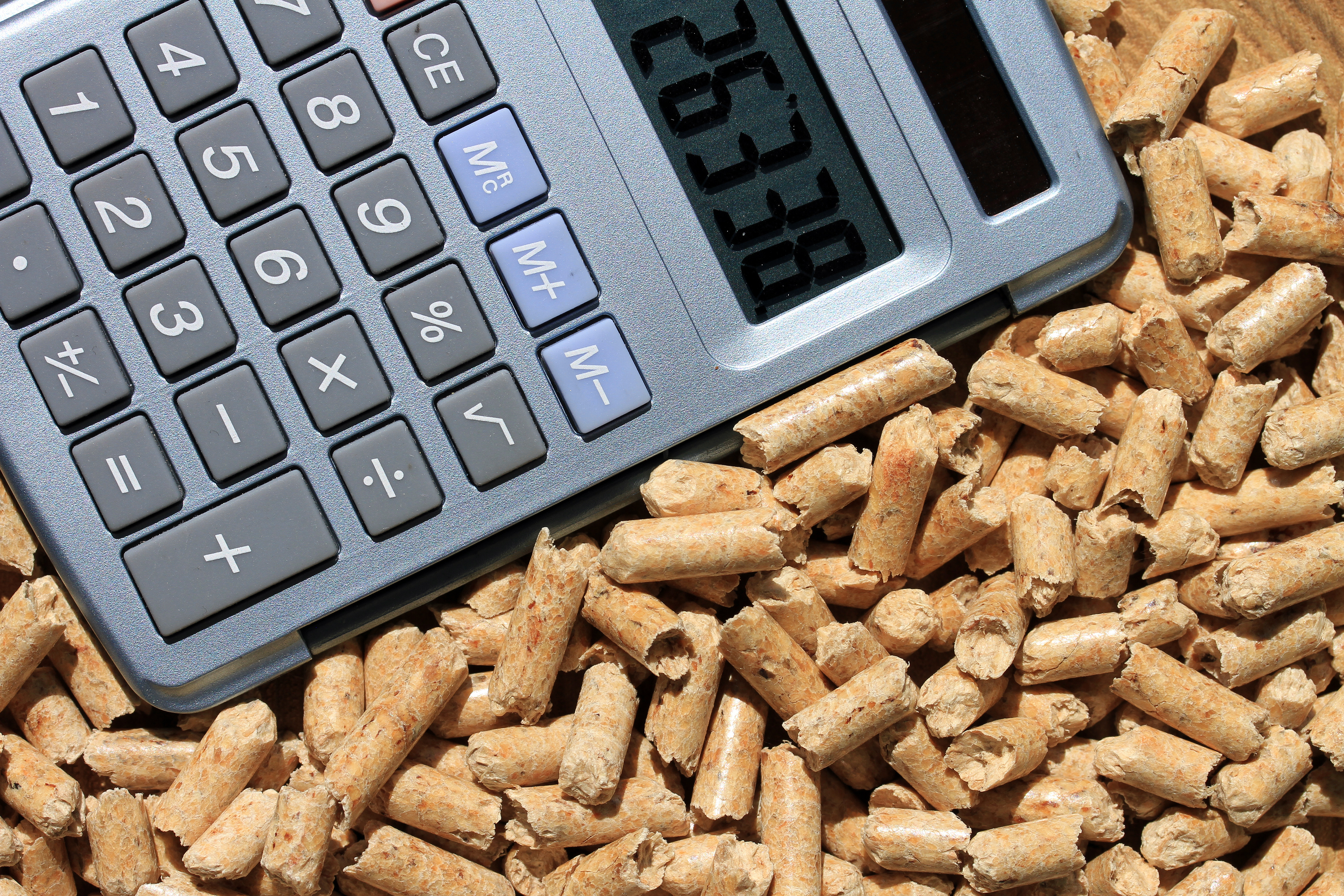
<div class="views-field views-field-field-image"><img loading="lazy" src="https://selectra.info/sites/selectra.info/files/images/pellets-de-bois-baisse-des-prix.jpg" width="5184" height="3456" alt="calculatrice au milieu de pellets de bois" typeof="foaf:Image"></div>
<div class="most-read__items--text">
<div class="views-field views-field-title"><a href="https://selectra.info/energie/actualites/marche/pellets-bois-enfin-une-baisse-des-prix" hreflang="fr">Enfin une baisse du prix des pellets de bois ?</a></div>
<div class="most-read__items--text-footer">
<div class="views-field views-field-created"><svg class="icon icon--20 icon--secondary icon--left" aria-hidden="true">
<use xlink:href="/themes/custom/agrippa/img/sprite.svg#icon-calendar-rounded"></use>
</svg><time datetime="2023-02-24T17:09:38+01:00" title="Vendredi 24 février 2023 - 17:09">24 fév 2023</time></div>
<div class="views-field views-field-reading-time"><svg class="icon icon--20 icon--secondary icon--left" aria-hidden="true">
<use xlink:href="/themes/custom/agrippa/img/sprite.svg#icon-schedule"></use>
</svg>3 min de lecture</div>
</div>
</div>
</div>
</div>
</div>
You can use ordered lists, unordered lists, and a mix of both types nested.
<nav class="summary" aria-labelledby="summary-title">
  <p id="summary-title" class="title">Summary:</p>
  <ol>
    <li><a href="#id1">Link</a>
      <ol>
        <li><a href="#id1a">Link</a>
          <ol>
            <li><a href="#id1a1">Link</a></li>
            <li><a href="#id1a2">Link</a></li>
          </ol>
        </li>
      </ol>
    </li>
    <li><a href="#id2">Link</a>
      <ol>
        <li><a href="#id1a">Link</a></li>
        <li><a href="#id1b">Link</a></li>
      </ol>
    </li>
    <li><a href="#id3">Link</a></li>
  </ol>
</nav>
Lorem ipsum dolor sit amet, consectetur adipiscing elit, sed do eiusmod tempor incididunt ut labore et dolore magna aliqua. Ut enim ad minim veniam, quis nostrud exercitation ullamco laboris nisi ut aliquip ex ea commodo consequat. Duis aute irure dolor in reprehenderit in voluptate velit esse cillum dolore eu fugiat nulla pariatur. Excepteur sint occaecat cupidatat non proident, sunt in culpa qui officia deserunt mollit anim id est laborum.
<h3 id="title-id" Section Title </h3>
<p> Lorem ipsum dolor sit amet, consectetur adipiscing elit, sed do eiusmod tempor incididunt ut labore et dolore magna aliqua. Ut enim ad minim veniam, quis nostrud exercitation ullamco laboris nisi ut aliquip ex ea commodo consequat. Duis aute irure dolor in reprehenderit in voluptate velit esse cillum dolore eu fugiat nulla pariatur. Excepteur sint occaecat cupidatat non proident, sunt in culpa qui officia deserunt mollit anim id est laborum. </p>
<nav class="summary" aria-labelledby="title-id">
  <ol>
    <li><a href="#id1">Link</a>
      <ol>
        <li><a href="#id1a">Link</a>
          <ol>
            <li><a href="#id1a1">Link</a></li>
            <li><a href="#id1a2">Link</a></li>
          </ol>
        </li>
      </ol>
    </li>
    <li><a href="#id2">Link</a>
      <ol>
        <li><a href="#id1a">Link</a></li>
        <li><a href="#id1b">Link</a></li>
      </ol>
    </li>
    <li><a href="#id3">Link</a></li>
  </ol>
</nav>
<nav class="summary" aria-labelledby="summary-title">
  <p id="summary-title" class="title">Summary:</p>
  <ol>
    <li><a href="#id1">Link</a>
      <ol>
        <li><a href="#id1a">Link</a>
          <ol>
            <li><a href="#id1a1">Link</a></li>
            <li><a href="#id1a2">Link</a></li>
          </ol>
        </li>
      </ol>
    </li>
    <li><a href="#id2">Link</a>
      <ol>
        <li><a href="#id1a">Link</a></li>
        <li><a href="#id1b">Link</a></li>
      </ol>
    </li>
    <li><a href="#id3">Link</a></li>
  </ol>
</nav>
<nav class="summary" aria-labelledby="summary-title">
  <p id="summary-title" class="title">Summary:</p>
  <ul>
    <li><a href="#id1">Link</a>
      <ul>
        <li><a href="#id1a">Link</a>
          <ul>
            <li><a href="#id1a1">Link</a></li>
            <li><a href="#id1a2">Link</a></li>
          </ul>
        </li>
      </ul>
    </li>
    <li><a href="#id2">Link</a>
      <ul>
        <li><a href="#id1a">Link</a></li>
        <li><a href="#id1b">Link</a></li>
      </ul>
    </li>
    <li><a href="#id3">Link</a></li>
  </ul>
</nav>
<nav class="summary bullets" aria-labelledby="summary-title">
  <p id="summary-title" class="title">Summary:</p>
  <ol>
    <li><a href="#id1">Link</a>
      <ol>
        <li><a href="#id1a">Link</a>
          <ol>
            <li><a href="#id1a1">Link</a></li>
            <li><a href="#id1a2">Link</a></li>
          </ol>
        </li>
      </ol>
    </li>
    <li><a href="#id2">Link</a>
      <ol>
        <li><a href="#id1a">Link</a></li>
        <li><a href="#id1b">Link</a></li>
      </ol>
    </li>
    <li><a href="#id3">Link</a></li>
  </ol>
</nav>
We have danger, success and secondary only (the rest of the text boxes has dissapeared, like namely, pdf...). So if you have old text-boxes, please, change the markup (HTML) by the new one.
By default, if you don't add "success" or "danger" classes you will have "secondary".
You can use the icon you want.
Too many people fall between thecoche and the andén, because the estación is en curva.
<div class="text-box secondary">
  <svg class="icon textbox--icon">
    <use xlink:href="/themes/custom/agrippa/img/sprite.svg#icon-circle-info-outlined"></use>
  </svg>
  <span class="title">Title</span>
  <p>Text</p>
</div>
Don't ever swallow aMentos and then drink Coca Cola, it can be dangerous!
<div class="text-box danger">
  <svg class="icon textbox--icon">
    <use xlink:href="/themes/custom/agrippa/img/sprite.svg#icon-extremely-dissatisfied"></use>
  </svg>
  <span class="title">Title</span>
  <p>Text</p>
</div>
Don't ever swallow aMentos and then drink Coca Cola, it can be dangerous!
<div class="text-box success">
  <svg class="icon textbox--icon">
    <use xlink:href="/themes/custom/agrippa/img/sprite.svg#icon-thumbs-up"></use>
  </svg>
  <span class="title">Title</span>
  <p>Text</p>
</div>
You can add the
<div class="text-corner">
feature to most of the text-boxes if you need to emphasize on the fact it's an ad.
Déménagement ? Contactez Web Energie au 09 87 67 54 75 (lundi-vendredi 8H30-21H, samedi 9H-18H) pour mettre votre compteur d'électricité et/ou de gaz à votre nom ou ouvrir le compteur avec un fournisseur alternatif. Cette plateforme multifournisseurs se charge de vos démarches liées au déménagement et vous oriente vers l'offre partenaire la plus compétitive dans votre cas.
<div class="text-box success">
 <svg class="icon textbox--icon">
    <use xlink:href="/themes/custom/agrippa/img/sprite.svg#icon-thumbs-up"></use>
  </svg>
  <p>Text</p>
  <div class="text-corner">Annonce</div>
</div>
You have to add
<div class="text-corner__wrapper">
and then, add inside the tooltip. Also, add
class="tooltip-left"
to put the tooltip text alignment to left if you want.
Déménagement ? Contactez Web Energie au 09 87 67 54 75 (lundi-vendredi 8H30-21H, samedi 9H-18H) pour mettre votre compteur d'électricité et/ou de gaz à votre nom ou ouvrir le compteur avec un fournisseur alternatif. Cette plateforme multifournisseurs se charge de vos démarches liées au déménagement et vous oriente vers l'offre partenaire la plus compétitive dans votre cas.
<div class="text-box danger">
 <svg class="icon textbox--icon">
    <use xlink:href="/themes/custom/agrippa/img/sprite.svg#icon-extremely-dissatisfied"></use>
  </svg>
  <p> Text </p>
  <div class="text-corner__wrapper">
    <div class="text-corner tooltip-left" data-toggle="tooltip" tabindex="0" title="tooltip text">
      <a aria-label="Help" class="btn-help btn-help--sm btn-help--right">
        <svg aria-hidden="true" class="icon btn-help__icon">
          <use xlink:href="/themes/custom/agrippa/img/sprite.svg#icon-circle-info-outlined"></use>
        </svg>
        <svg aria-hidden="true" class="icon btn-help__icon">
          <use xlink:href="/themes/custom/agrippa/img/sprite.svg#icon-circle-info-filled"></use>
        </svg>
      </a>
    </div>
  </div>
</div>
Déménagement ? Contactez Web Energie au 09 87 67 54 75 (lundi-vendredi 8H30-21H, samedi 9H-18H) pour mettre votre compteur d'électricité et/ou de gaz à votre nom ou ouvrir le compteur avec un fournisseur alternatif. Cette plateforme multifournisseurs se charge de vos démarches liées au déménagement et vous oriente vers l'offre partenaire la plus compétitive dans votre cas.
<div class="text-box background">
 <svg class="icon textbox--icon">
    <use xlink:href="/themes/custom/agrippa/img/sprite.svg#icon-smartphone"></use>
  </svg>
  <p> Text </p>
  <div class="text-corner__wrapper">
    <div class="text-corner tooltip-left" data-toggle="tooltip" tabindex="0" title="tooltip text">
      <a aria-label="Help" class="btn-help btn-help--sm btn-help--right">
        <svg aria-hidden="true" class="icon btn-help__icon">
          <use xlink:href="/themes/custom/agrippa/img/sprite.svg#icon-circle-info-outlined"></use>
        </svg>
        <svg aria-hidden="true" class="icon btn-help__icon">
          <use xlink:href="/themes/custom/agrippa/img/sprite.svg#icon-circle-info-filled"></use>
        </svg>
      </a>
    </div>
  </div>
</div>
Déménagement ? Contactez Web Energie au 09 87 67 54 75 (lundi-vendredi 8H30-21H, samedi 9H-18H) pour mettre votre compteur d'électricité et/ou de gaz à votre nom ou ouvrir le compteur avec un fournisseur alternatif. Cette plateforme multifournisseurs se charge de vos démarches liées au déménagement et vous oriente vers l'offre partenaire la plus compétitive dans votre cas.
Table legend
<div class="text-box success">
  <svg class="icon textbox--icon">
    <use xlink:href="/themes/custom/agrippa/img/sprite.svg#icon-thumbs-up"></use>
  </svg>
  <span class="title">Title</span>
  <p>Text</p>
</div>
<p class="table__legend"> Your text </p>
This list has a green border and checkmarks.
<ul class="list--box-check">
  <li class="title">Things To Do</li>
  <li> Smile </li>
  <li> Play your favorite song at full volume </li>
  <li> Dance to your favorite song jumping </li>
  <li> Apologize to your downstairs neighbor </li>
</ul>
<ul class="list--check">
  <li> Smile </li>
  <li> Play your favorite song at full volume </li>
  <li> Dance to your favorite song jumping </li>
  <li> Apologize to your downstairs neighbor </li>
</ul>
<ul class="list--cross">
  <li> Eat cockroaches </li>
  <li> Stay sill on the left side of subway escalators </li>
  <li> Mind the gap </li>
</ul>
<ul class="list--custom">
  <li class="b--check"> Celebrate Real Madrid goals </li>
  <li class="b--cross"> Celebrate Barcelona goals </li>
  <li class="b--arrow"> Yes, Real Madrid rocks </li>
</ul>
<ol class="list--numbered">
  <li> Wake up </li>
  <li> Breakfast </li>
  <li> Go to bed again</li>
</ol>
You only have to add the choosen class to a
span
tag. Then,
add your text outside the
span
tag.
Numbered icons up to 20TextTextTextTextTextTextTextTextTextTextTextTextTextTextTextTextTextTextTextText
<span class="one"> </span><span>Text</span>
<span class="two"> </span><span>Text</span>
<span class="three"> </span><span>Text</span>
<span class="four"> </span><span>Text</span>
<span class="five"> </span><span>Text</span>
<span class="six"> </span><span>Text</span>
<span class="seven"> </span><span>Text</span>
<span class="eight"> </span><span>Text</span>
<span class="nine"> </span><span>Text</span>
<span class="ten"> </span><span>Text</span>
<span class="eleven"> </span><span>Text</span>
<span class="twelve"> </span><span>Text</span>
<span class="thirteen"> </span><span>Text</span>
<span class="fourteen"> </span><span>Text</span>
<span class="fifteen"> </span><span>Text</span>
<span class="sixteen"> </span><span>Text</span>
<span class="seventeen"> </span><span>Text</span>
<span class="eighteen"> </span><span>Text</span>
<span class="nineteen"> </span><span>Text</span>
<span class="twenty"> </span><span>Text</span>
Numbered icons inlineWhen three chickens go to the field, the first goes first the second goes behind the third is the last one.
<p>
<span> When three chickens go to the field, </span>
<span class="one"> </span> the first goes first
<span class="two"> </span> the second goes behind
<span class="three"> </span> the third is the last one.
</p>
Check / Cross icons inlineThis is a nice way to: confirm that this is OKwhereas this is not OK at all.
<p>
This is a nice way to: confirm that this is OK <span class="icon--check"> </span>
whereas this is not OK at all. <span class="icon--cross"> </span>
</p>
You can add also icons with HTML code. Here is the whole icon list. . You have to change the source with the name of your site.
Icons that start with 'icon-xxx'
Flags
Icon
<svg class="icon" aria-hidden="true">
  <use xlink:href="/themes/custom/agrippa/img/sprite.svg#icon-arrow-curved-right"></use>
</svg>

Flags
<svg class="icon" aria-hidden="true">
  <use xlink:href="/themes/custom/agrippa/img/sprite.svg#flag-ar"></use>
</svg>
You can modify the icon colors (no flags), adding only one class. In each site theme the colors are different (according to theme color), but the name classes are the same. You can combine color classes with position and size classes.
Primary
Secondary
Warning
Danger
Success
Neutral
 Primary
<svg class="icon icon--primary" aria-hidden="true">
  <use xlink:href="/themes/custom/agrippa/img/sprite.svg#icon-arrow-curved-right"></use>
</svg>
 Secondary
<svg class="icon icon--secondary" aria-hidden="true">
  <use xlink:href="/themes/custom/agrippa/img/sprite.svg#icon-arrow-curved-right"></use>
</svg>
 Danger
<svg class="icon icon--danger" aria-hidden="true">
  <use xlink:href="/themes/custom/agrippa/img/sprite.svg#icon-arrow-curved-right"></use>
</svg>
 Warning
<svg class="icon icon--warning" aria-hidden="true">
  <use xlink:href="/themes/custom/agrippa/img/sprite.svg#icon-arrow-curved-right"></use>
</svg>
 Success
<svg class="icon icon--success" aria-hidden="true">
  <use xlink:href="/themes/custom/agrippa/img/sprite.svg#icon-arrow-curved-right"></use>
</svg>
 Neutral
<svg class="icon icon--neutral" aria-hidden="true">
  <use xlink:href="/themes/custom/agrippa/img/sprite.svg#icon-arrow-curved-right"></use>
</svg>
You can modify the icon size with 6 classes. Also, you can add color and position classes.
8
12
16
24
32
48
 8
<svg class="icon icon--primary icon--8" aria-hidden="true">
  <use xlink:href="/themes/custom/agrippa/img/sprite.svg#icon-arrow-curved-right"></use>
</svg>
<svg class="icon icon--primary icon--8" aria-hidden="true">
  <use xlink:href="/themes/custom/agrippa/img/sprite.svg#flag-at"></use>
</svg>
 12
<svg class="icon icon--secondary icon--12" aria-hidden="true">
  <use xlink:href="/themes/custom/agrippa/img/sprite.svg#icon-arrow-curved-right"></use>
</svg>
 <svg class="icon icon--primary icon--12" aria-hidden="true">
  <use xlink:href="/themes/custom/agrippa/img/sprite.svg#flag-be"></use>
</svg>
 16
<svg class="icon icon--ternary icon--16" aria-hidden="true">
  <use xlink:href="/themes/custom/agrippa/img/sprite.svg#icon-arrow-curved-right"></use>
</svg>
 <svg class="icon icon--primary icon--16" aria-hidden="true">
  <use xlink:href="/themes/custom/agrippa/img/sprite.svg#flag-br"></use>
</svg>
 24
<svg class="icon icon--danger icon--24" aria-hidden="true">
  <use xlink:href="/themes/custom/agrippa/img/sprite.svg#icon-arrow-curved-right"></use>
</svg>
 <svg class="icon icon--primary icon--24" aria-hidden="true">
  <use xlink:href="/themes/custom/agrippa/img/sprite.svg#flag-fr"></use>
</svg>
 32
<svg class="icon icon--warning icon--32" aria-hidden="true">
  <use xlink:href="/themes/custom/agrippa/img/sprite.svg#icon-arrow-curved-right"></use>
</svg>
 <svg class="icon icon--primary icon--32" aria-hidden="true">
  <use xlink:href="/themes/custom/agrippa/img/sprite.svg#flag-es"></use>
</svg>
 48
<svg class="icon icon--success icon--48" aria-hidden="true">
  <use xlink:href="/themes/custom/agrippa/img/sprite.svg#icon-arrow-curved-right"></use>
</svg>
 <svg class="icon icon--primary icon--48" aria-hidden="true">
  <use xlink:href="/themes/custom/agrippa/img/sprite.svg#flag-pe"></use>
</svg>
If you add your icon with text, you can add a little margin between text and icon. Also, you can combine position classes with color an size classes.
If you add your icon first, and then the text, you have to add icon--left class.
If you add your text and then your icon, you have to add icon--right class.
Icon LeftMy text after the icon
Icon RightMy text first
 Left
<svg class="icon icon--primary icon--16 icon--left" aria-hidden="true">
  <use xlink:href="/themes/custom/agrippa/img/sprite.svg#icon-arrow-curved-right"></use>
</svg>
<span> My text after icon </span>


 Right
<span> My text before icon </span>
<svg class="icon icon--secondary icon--16 icon--right" aria-hidden="true">
  <use xlink:href="/themes/custom/agrippa/img/sprite.svg#icon-arrow-curved-right"></use>
</svg>
In the new Design System version we have unify blockquotes and ahead elements.
Also, cite and footer are optionals.
Lorem ipsum dolor sit amet, consectetur adipisicing elit. Vero, rem, officiis.
<blockquote>
  <p>Text</p>
  <footer>Person<cite title="source">source</cite></footer>
</blockquote>
Lorem ipsum dolor sit amet, consectetur adipisicing elit. Vero, rem, officiis.
<blockquote class="right">
  <p>Text</p>
  <footer>Person<cite title="source">source</cite></footer>
</blockquote>
Lorem ipsum dolor sit amet, consectetur adipisicing elit. Vero, rem, officiis.
<blockquote class="center">
  <p>Text</p>
  <footer>Person<cite title="source">source</cite></footer>
</blockquote>
You can add a mark inside quotations to highlight a word or a phrase.
Lorem ipsum dolor sit amet, consectetur adipisicing elit. Vero, rem, officiis.
Lorem ipsum dolor sit amet, consectetur adipisicing elit. Vero, rem, officiis.
<blockquote>
  <p>Text <strong> Text in bold </strong> </p>
  <footer>Person<cite title="source">source</cite></footer>
</blockquote>
<blockquote>
  <p>Text <em> Text in bold </em> </p>
  <footer>Person<cite title="source">source</cite></footer>
</blockquote>
You can custom the border color inside quotations or delete it.
Lorem ipsum dolor sit amet, consectetur adipisicing elit. Vero, rem, officiis.
Lorem ipsum dolor sit amet, consectetur adipisicing elit. Vero, rem, officiis.
Lorem ipsum dolor sit amet, consectetur adipisicing elit. Vero, rem, officiis.
<blockquote class="border--success">
  <p>Text <strong> Text in bold </strong> </p>
  <footer>Person<cite title="source">source</cite></footer>
</blockquote>
<blockquote class="border--none">
  <p>Text <em> Text in bold </em> </p>
  <footer>Person<cite title="source">source</cite></footer>
</blockquote>
<blockquote class="border--primary">
  <p>Text <em> Text in bold </em> </p>
  <footer>Person<cite title="source">source</cite></footer>
</blockquote>
You can custom the background color inside quotations.
Lorem ipsum dolor sit amet, consectetur adipisicing elit. Vero, rem, officiis.
Lorem ipsum dolor sit amet, consectetur adipisicing elit. Vero, rem, officiis.
Lorem ipsum dolor sit amet, consectetur adipisicing elit. Vero, rem, officiis.
<blockquote class="bg--neutral-light">
  <p>Text <strong> Text in bold </strong> </p>
  <footer>Person<cite title="source">source</cite></footer>
</blockquote>
<blockquote class="bg--secondary-light">
  <p>Text <em> Text in bold </em> </p>
  <footer>Person<cite title="source">source</cite></footer>
</blockquote>
<blockquote class="bg--primary-light">
  <p>Text <em> Text in bold </em> </p>
  <footer>Person<cite title="source">source</cite></footer>
</blockquote>
You must use this wrapper when you add an image to your article to make sure it's responsive and laying out correctly. Combine the different modifiers to achieve the desired appearance!
Laziness (also known as indolence) is disinclination to activity or exertion despite having the ability to act or to exert oneself. It is often used as a pejorative; terms for a person seen to be lazy include "couch potato", "slacker", and "bludger".
One of the Catholic seven deadly sins is sloth, which is often defined as spiritual and/or physical apathy or laziness. Sloth is discouraged in (Hebrews 6:12), 2 Thessalonians, and associated with wickedness in one of the parables of Jesus in the Gospel of Matthew (Matthew 25:26). In the Wisdom books of Proverbs and Ecclesiastes, it is stated that laziness can lead to poverty (Proverbs 10:4, Ecclesiastes 10:18). According to Peter Binsfeld's Binsfeld's Classification of Demons, Belphegor is thought to be its chief demon.
<figure class="image-box left">
  <img class="u-img--fluid" data-src="url" alt="alt" />
  <figcaption>Caption</figcaption>
</figure>
<p>Text</p>
<p>Text</p>
Once upon a time there were three little pigs. One day they set out from the farm where they had been born. They were going out into the world to start new lives and enjoy any adventures that might come their way. The first little pig met a man carrying some straw, and he asked him if he might have some to build himself a house.
-"Of course, little pig," said the man. He gave the little pig a big bundle of straw, and the little pig built himself a lovely house of golden straw. A big bad wolf lived nearby. He came along and saw the new house and, feeling rather hungry and thinking he would like to eat a little pig for supper, he called out: -"Little pig, little pig, let me come in." To which the little pig replied, -"No, no, by the hair of my chinny chin chin, I´ll not let you in!" So the wolf shouted very crossly, -"Then I´ll huff and I´ll puff, Till I blow your house in!" And he huffed and he puffed, and he HUFFED and he PUFFED until the house of straw fell in, and the wolf ate the little pig for his supper that evening.
<figure class="image-box center">
  <img class="u-img--fluid" data-src="url" alt="alt" />
  <figcaption>Caption</figcaption>
</figure>
Y'all act like you never seen a white person before Jaws all on the floor like Pam, like Tommy just burst in the door And started whoopin' her ass worse than before They first were divorced, throwin' her over furniture (Agh!) It's the return of the "Oh, wait, no way, you're kidding He didn't just say what I think he did, did he?" And Dr. Dre said Nothing, you idiots, Dr. Dre's dead, he's locked in my basement
Feminist women love Eminem "Chicka-chicka-chicka, Slim Shady, I'm sick of him Look at him, walkin' around, grabbin' his you-know-what Flippin' the you-know-who", "Yeah, but he's so cute though" Yeah, I probably got a couple of screws up in my head loose But no worse than what's goin' on in your parents' bedrooms Sometimes I wanna get on TV and just let loose But can't, but it's cool for Tom Green to hump a dead moose "My bum is on your lips, my bum is on your lips"
<figure class="image-box right">
  <img class="u-img--fluid" data-src="url" alt="alt" />
  <figcaption>Caption</figcaption>
</figure>
<p>Text</p>
<p>Text</p>
Let's go Llegó la mami La reina, la dura, una Bugatti El mundo 'tá loco con este body Si tengo un problema, no es monetary Les vuelvo loquito' a todos los daddie' Voy siempre primera, nunca secondary Apena' hago doom, doom con mi boom, boom Y le' tengo dando zoom, zoom on my yummy
Y no se confundan Señora' y señore' Yo siempre estoy ready Pa' romper cadera', romper corazones Solo existe una No hay imitacione' (na, na) Y si aún no me creen pue' me toca mostrárselo Take a video Watch it slow mo, mo, mo, mo, mo (yeah)
<figure class="image-box left no-border">
  <img class="u-img--fluid" data-src="url" alt="alt" />
  <figcaption>Caption</figcaption>
</figure>
<p>Text</p>
<p>Text</p>
Laziness (also known as indolence) is disinclination to activity or exertion despite having the ability to act or to exert oneself. It is often used as a pejorative; terms for a person seen to be lazy include "couch potato", "slacker", and "bludger".
One of the Catholic seven deadly sins is sloth, which is often defined as spiritual and/or physical apathy or laziness. Sloth is discouraged in (Hebrews 6:12), 2 Thessalonians, and associated with wickedness in one of the parables of Jesus in the Gospel of Matthew (Matthew 25:26). In the Wisdom books of Proverbs and Ecclesiastes, it is stated that laziness can lead to poverty (Proverbs 10:4, Ecclesiastes 10:18). According to Peter Binsfeld's Binsfeld's Classification of Demons, Belphegor is thought to be its chief demon.
<figure class="image-box center no-border">
  <img class="u-img--fluid" data-src="url" alt="alt" />
  <figcaption>Caption</figcaption>
</figure>
Laziness (also known as indolence) is disinclination to activity or exertion despite having the ability to act or to exert oneself. It is often used as a pejorative; terms for a person seen to be lazy include "couch potato", "slacker", and "bludger".
One of the Catholic seven deadly sins is sloth, which is often defined as spiritual and/or physical apathy or laziness. Sloth is discouraged in (Hebrews 6:12), 2 Thessalonians, and associated with wickedness in one of the parables of Jesus in the Gospel of Matthew (Matthew 25:26). In the Wisdom books of Proverbs and Ecclesiastes, it is stated that laziness can lead to poverty (Proverbs 10:4, Ecclesiastes 10:18). According to Peter Binsfeld's Binsfeld's Classification of Demons, Belphegor is thought to be its chief demon.
<figure class="image-box right no-border">
  <img class="u-img--fluid" data-src="url" alt="alt" />
  <figcaption>Caption</figcaption>
</figure>
<p>Text</p>
<p>Text</p>
If you want to display two adjacent images, use the
double
class.
Laziness (also known as indolence) is disinclination to activity or exertion despite having the ability to act or to exert oneself. It is often used as a pejorative; terms for a person seen to be lazy include "couch potato", "slacker", and "bludger".
One of the Catholic seven deadly sins is sloth, which is often defined as spiritual and/or physical apathy or laziness. Sloth is discouraged in (Hebrews 6:12), 2 Thessalonians, and associated with wickedness in one of the parables of Jesus in the Gospel of Matthew (Matthew 25:26). In the Wisdom books of Proverbs and Ecclesiastes, it is stated that laziness can lead to poverty (Proverbs 10:4, Ecclesiastes 10:18). According to Peter Binsfeld's Binsfeld's Classification of Demons, Belphegor is thought to be its chief demon.
<figure class="image-box double">
  <img class="u-img--fluid" data-src="url" alt="alt" />
  <img class="u-img--fluid" data-src="url2" alt="alt2" />
  <figcaption>Cats are known for their laziness, but dogs can be quite lazy too.</figcaption>
</figure>
Simply don't add the
figcaption
tag.
Laziness (also known as indolence) is disinclination to activity or exertion despite having the ability to act or to exert oneself. It is often used as a pejorative; terms for a person seen to be lazy include "couch potato", "slacker", and "bludger".
One of the Catholic seven deadly sins is sloth, which is often defined as spiritual and/or physical apathy or laziness. Sloth is discouraged in (Hebrews 6:12), 2 Thessalonians, and associated with wickedness in one of the parables of Jesus in the Gospel of Matthew (Matthew 25:26). In the Wisdom books of Proverbs and Ecclesiastes, it is stated that laziness can lead to poverty (Proverbs 10:4, Ecclesiastes 10:18). According to Peter Binsfeld's Binsfeld's Classification of Demons, Belphegor is thought to be its chief demon.
<figure class="image-box left no-border">
  <img class="u-img--fluid" data-src="url" alt="alt" />
</figure>
<p>Text</p>
<p>Text</p>
To center the caption you have to add
figcaption--center
class.
Laziness (also known as indolence) is disinclination to activity or exertion despite having the ability to act or to exert oneself. It is often used as a pejorative; terms for a person seen to be lazy include "couch potato", "slacker", and "bludger".
One of the Catholic seven deadly sins is sloth, which is often defined as spiritual and/or physical apathy or laziness. Sloth is discouraged in (Hebrews 6:12), 2 Thessalonians, and associated with wickedness in one of the parables of Jesus in the Gospel of Matthew (Matthew 25:26). In the Wisdom books of Proverbs and Ecclesiastes, it is stated that laziness can lead to poverty (Proverbs 10:4, Ecclesiastes 10:18). According to Peter Binsfeld's Binsfeld's Classification of Demons, Belphegor is thought to be its chief demon.
<figure class="image-box left no-border">
  <img class="u-img--fluid" data-src="url" alt="alt" />
  <figcaption class="figcaption--center">
    your text
  </figcaption>
</figure>
<p>Text</p>
<p>Text</p>
To see a different image in mobile and desktop, you can add responsive classes in the figure tag.
u-display--md-noneu-display--none u-display--md-block


<figure class="image-box no-border u-display--md-none"">
  <img class="u-img--fluid" data-src="url" alt="alt" />
  <figcaption class="figcaption--center">
    Mobile Only
  </figcaption>
</figure>
<figure class="image-box no-border u-display--none u-display--md-block">
  <img class="u-img--fluid" data-src="url" alt="alt" />
  <figcaption class="figcaption--center">
    Tablet  Only
  </figcaption>
</figure>
You only have to add class into your text tag (
span,
p,
h1,
h2,
h3
...)
Lorem ipsum dolor sit amet, consectetur adipisicing elit.
Cupiditate quae ipsa, eum consequuntur ipsum est tempora, recusandae mollitia. Impedit soluta,
libero a nobis repellendus excepturi fugit repellat accusamus nisi velit.<!-- Green -->
<span class="text--green">Text</span>
<!-- Red -->
<p class="text--red">Text</p>
XS inside normal text
Lorem ipsum dolor sit amet, consectetur adipisicing elit.
SM inside normal text
Lorem ipsum dolor sit amet, consectetur adipisicing elit.
MD inside normal text
Lorem ipsum dolor sit amet, consectetur adipisicing elit.
LG inside normal text
Lorem ipsum dolor sit amet, consectetur adipisicing elit.
XL inside normal text
Impedit soluta, voluptatem, harum mollitia odio animi earum sapiente nesciunt sint blanditiis vero.
XL-2 inside normal text
Lorem ipsum dolor sit amet, consectetur adipisicing elit.
XL-3 inside normal text
Lorem ipsum dolor sit amet, consectetur adipisicing elit.
XL-4 inside normal text
Lorem ipsum dolor sit amet, consectetur adipisicing elit.
XL-5 inside normal text
Lorem ipsum dolor sit amet, consectetur adipisicing elit.
XL-6 inside normal text
Lorem ipsum dolor sit amet, consectetur adipisicing elit.
XL-7 inside normal text
Lorem ipsum dolor sit amet, consectetur adipisicing elit.
XL-8 inside normal text
Lorem ipsum dolor sit amet, consectetur adipisicing elit.
XL-9 inside normal text
Lorem ipsum dolor sit amet, consectetur adipisicing elit.
<!-- XS -->
<span class="text--xs">Text</span>

<!-- SM -->
<span class="text--sm">Text</span>

<!-- MD -->
<span class="text--md">Text</span>

<!-- LG -->
<span class="text--lg">Text</span>

<!-- XL -->
<span class="text--xl">Text</span>

<!-- XL-2 -->
<span class="text--xl-2">Text</span>

<!-- XL-3 -->
<span class="text--xl-3">Text</span>

<!-- XL-4 -->
<span class="text--xl-4">Text</span>

<!-- XL-5 -->
<span class="text--xl-5">Text</span>

<!-- XL-6 -->
<span class="text--xl-6">Text</span>

<!-- XL-7 -->
<span class="text--xl-7">Text</span>

<!-- XL-8 -->
<span class="text--xl-8">Text</span>

<!-- XL-9 -->
<span class="text--xl-9">Text</span>
You can bold your text in 2 ways: adding a class or a tag
Lorem ipsum dolor sit amet, consectetur adipisicing elit.
<!-- Tag -->
<p>
  <strong>Text</strong>
</p>

<!-- Class -->
<p class="tel">Your text</p>
<span class="tel">Your text</span>
If you want to add more than 1 word, you have to add
& nbsp;
(without spaces between
&
and
nbsp) instead of a space.
Now you can choose between different colors: secondary, success, danger, warning, neutral and black. if you don't add any color class, by default, the color is going to be secondary.
Seconday (Default)
Lorem ipsum dolor sit amet, consectetur adipisicing elit. Dolorem architecto, cupiditate molestiae nostrum delectus animi vitae nihil in porro dolorum.
Success
Lorem ipsum dolor sit amet, consectetur adipisicing elit.
Danger
Lorem ipsum dolor sit amet, consectetur adipisicing elit.
Warning
Lorem ipsum dolor sit amet, consectetur adipisicing elit.
Neutral
Lorem ipsum dolor sit amet, consectetur adipisicing elit.
Black
Lorem ipsum dolor sit amet, consectetur adipisicing elit.
No class
Lorem ipsum dolor sit amet, consectetur adipisicing elit.
Half background
Lorem ipsum dolor sit amet, consectetur adipisicing elit.
<p>
  <mark class="mark">Default (Secondary)</mark>
  <mark class="mark mark--secondary">Secondary Text2</mark>
  <mark class="mark mark--success">Success</mark>
  <mark class="mark mark--danger">Danger</mark>
  <mark class="mark mark--warning">Warning</mark>
  <mark class="mark mark--neutral">Neutral</mark>
  <mark class="mark mark--black">Black</mark>
  <mark>No class</mark>
  <mark class="half-background">Half background</mark>
</p>
Lorem ipsum dolor sit amet,
consectetur adipisicing
elit. Dolorem architecto, cupiditate molestiae nostrum delectus animi vitae nihil in porro dolorum.
<p>
  <del>Text</del>
</p>
Lorem ipsum dolor sit amet, consectetur adipisicing elit. Dolorem architecto, cupiditate molestiae nostrum delectus animi vitae nihil in porro dolorum.
<p>
  <u>Text</u>
</p>
Lorem ipsum dolor sit amet, consectetur adipisicing elit. Dolorem architecto, cupiditate molestiae nostrum delectus animi vitae nihil in porro dolorum.
<p>
  <small>Text</small>
</p>
<div class="mention">Text</div>
Lorem ipsum dolor sit amet, consectetur adipisicing elit. Dolorem architecto, cupiditate molestiae nostrum delectus animi vitae nihil in porro dolorum.
<p>
  <em>Text</em>
</p>
<abbr title="text on hover"> C.P.U. </abbr>
Add any of the following modifiers to change the alignment of a text:
Left alignment (default)
Lorem ipsum dolor sit amet, consectetur adipisicing elit. Cupiditate quae ipsa, eum consequuntur ipsum est tempora, recusandae mollitia. Impedit soluta, libero a nobis repellendus excepturi fugit repellat accusamus nisi velit voluptatem, harum mollitia odio animi earum sapiente nesciunt sint blanditiis vero.
Centered alignment
Lorem ipsum dolor sit amet, consectetur adipisicing elit. Cupiditate quae ipsa, eum consequuntur ipsum est tempora, recusandae mollitia. Impedit soluta, libero a nobis repellendus excepturi fugit repellat accusamus nisi velit voluptatem, harum mollitia odio animi earum sapiente nesciunt sint blanditiis vero.
Right alignment
Lorem ipsum dolor sit amet, consectetur adipisicing elit. Cupiditate quae ipsa, eum consequuntur ipsum est tempora, recusandae mollitia. Impedit soluta, libero a nobis repellendus excepturi fugit repellat accusamus nisi velit voluptatem, harum mollitia odio animi earum sapiente nesciunt sint blanditiis vero.
<!-- Left (default) -->
<p class="text--left">Text</p>

<!-- Right -->
<p class="text--right">Text</p>

<!-- Center -->
<p class="text--center">Text</p>
Basic code with no modifiers.
| Puissance du compteur | Abonnement annuel (Base) | Prix du kWh (Base) | Abonnement annuel (HP/HC) | Prix du kWh (HP) | Prix du kWh (HC) |
|---|---|---|---|---|---|
| 3 kVA | 102.18€ | 0.1439€ | / | / | / |
| 6 kVA | 126.55€ | 0.1439€ | 137.83€ | 0.1656€ | 0.1247€ |
| 9 kVA | 150.80€ | 0.1475€ | 170.18€ | 0.1656€ | 0.1247€ |
| 12 kVA | 175.04€ | 0.1475€ | 200.76€ | 0.1656€ | 0.1247€ |
Tarifs TTC à jour au 1er Septembre 2020.
<div class="table--swap">
  <table class="table">
    <caption class="table__title">Caption</caption>
    <thead>
      <tr>
        <th></th>
        <th></th>
        <th></th>
      </tr>
    </thead>
    <tbody>
      <tr>
        <td></td>
        <td></td>
        <td></td>
      </tr>
      <tr>
        <td></td>
        <td></td>
        <td></td>
      </tr>
    </tbody>
  </table>
</div>
<p class="table__legend">Legend</p>
 Forfait 80 Go 4G+ |
|
14,99€/mois pendant 1 an puis 29,99€/mois, sans engagement |
|
Forfait 80 Go 4G+ |
|
14,99€/mois pendant 1 an puis 29,99€/mois, sans engagement |
|
Forfait 80 Go 4G+ |
|
14,99€/mois pendant 1 an puis 29,99€/mois, sans engagement |
<div class="table--card-like-layout">
  <table class="table">
    <caption class="table__title">Card table layout</caption>
    <tbody>
      <tr>
        <td>Forfait 80 Go 4G+</td>
        <td>
          <ul class="list--check">
            <li>Appels, SMS et MMS illimités en France vers fixes et mobiles de France & DOM</li>
            <li>MMS illimités en France métropolitaine</li>
            <li>80 Go en 4G+ dans toute la France</li>
            <li>80 Go dans l'UE et les DOM, Suisse et Andorre</li>
            <li>Appels, SMS/MMS illimités dans l'UE et les DOM, Suisse et Andorre</li>
          </ul>
        </td>
        <td>14,99€/mois pendant 1 an puis 29,99€/mois, sans engagement</td>
      </tr>
      <tr>
        <td>Forfait 80 Go 4G+</td>
        <td>
          <ul class="list--cross">
            <li>Appels, SMS et MMS illimités en France vers fixes et mobiles de France & DOM</li>
            <li>MMS illimités en France métropolitaine</li>
            <li>80 Go en 4G+ dans toute la France</li>
            <li>80 Go dans l'UE et les DOM, Suisse et Andorre</li>
            <li>Appels, SMS/MMS illimités dans l'UE et les DOM, Suisse et Andorre</li>
          </ul>
        </td>
        <td>14,99€/mois pendant 1 an puis 29,99€/mois, sans engagement</td>
      </tr>
      <tr>
        <td>Forfait 80 Go 4G+</td>
        <td>
          <ul class="list--numbered">
            <li>Appels, SMS et MMS illimités en France vers fixes et mobiles de France & DOM</li>
            <li>MMS illimités en France métropolitaine</li>
            <li>80 Go en 4G+ dans toute la France</li>
            <li>80 Go dans l'UE et les DOM, Suisse et Andorre</li>
            <li>Appels, SMS/MMS illimités dans l'UE et les DOM, Suisse et Andorre</li>
          </ul>
        </td>
        <td>14,99€/mois pendant 1 an puis 29,99€/mois, sans engagement</td>
      </tr>
    </tbody>
  </table>
</div>
This is the same style like
Card table layout
but with cols width fixed, so you can align the columns. To do thay you have to add the class
fix-width-cols
|
Forfait 80 Go 4G+ |
|
14,99€/mois pendant 1 an puis 29,99€/mois, sans engagement |
|
Forfait 80 Go 4G+ |
|
14,99€/mois pendant 1 an puis 29,99€/mois, sans engagement |
|
Forfait 80 Go 4G+ |
|
14,99€/mois pendant 1 an puis 29,99€/mois, sans engagement |
<div class="table--card-like-layout fix-width-cols">
  <table class="table">
    <caption class="table__title">Card table layout With Fixed Cols</caption>
    <tbody>
      <tr>
        <td>Forfait 80 Go 4G+</td>
        <td>
          <ul class="list--check">
            <li>Appels, SMS et MMS illimités en France vers fixes et mobiles de France & DOM</li>
            <li>MMS illimités en France métropolitaine</li>
            <li>80 Go en 4G+ dans toute la France</li>
            <li>80 Go dans l'UE et les DOM, Suisse et Andorre</li>
            <li>Appels, SMS/MMS illimités dans l'UE et les DOM, Suisse et Andorre</li>
          </ul>
        </td>
        <td>14,99€/mois pendant 1 an puis 29,99€/mois, sans engagement</td>
      </tr>
      <tr>
        <td>Forfait 80 Go 4G+</td>
        <td>
          <ul class="list--cross">
            <li>Appels, SMS et MMS illimités en France vers fixes et mobiles de France & DOM</li>
            <li>MMS illimités en France métropolitaine</li>
            <li>80 Go en 4G+ dans toute la France</li>
            <li>80 Go dans l'UE et les DOM, Suisse et Andorre</li>
            <li>Appels, SMS/MMS illimités dans l'UE et les DOM, Suisse et Andorre</li>
          </ul>
        </td>
        <td>14,99€/mois pendant 1 an puis 29,99€/mois, sans engagement</td>
      </tr>
      <tr>
        <td>Forfait 80 Go 4G+</td>
        <td>
          <ul class="list--numbered">
            <li>Appels, SMS et MMS illimités en France vers fixes et mobiles de France & DOM</li>
            <li>MMS illimités en France métropolitaine</li>
            <li>80 Go en 4G+ dans toute la France</li>
            <li>80 Go dans l'UE et les DOM, Suisse et Andorre</li>
            <li>Appels, SMS/MMS illimités dans l'UE et les DOM, Suisse et Andorre</li>
          </ul>
        </td>
        <td>14,99€/mois pendant 1 an puis 29,99€/mois, sans engagement</td>
      </tr>
    </tbody>
  </table>
</div>
You have to think mobile-first, and tables are a tricky element on narrow devices. Depending on the behaviour you expect from your table on small devices, you will choose one of the following wrappers:
Write your table HTML code the usual way. A JS function will read each table with
table--swap
class and build a "mobile version" the following way:
Desktop
| Puissance du compteur | Abonnement annuel (Base) | Prix du kWh (Base) | Abonnement annuel (HP/HC) | Prix du kWh (HP) | Prix du kWh (HC) |
|---|---|---|---|---|---|
| 3 kVA | 11€ | 12€ | 13€ | 14€ | 15€ |
| 6 kVA | 21€ | 22€ | 23€ | 24€ | 25€ |
| 9 kVA | 31€ | 32€ | 33€ | 34€ | 35€ |
| 12 kVA | 41€ | 42€ | 43€ | 44€ | 45€ |
Tarifs TTC à jour au 1er Septembre 2020.
Mobile
| Puissance du compteur | 3kVA |
| Abonnement annuel (Base) | 11€ |
| Prix du kWh (Base) | 12€ |
| Abonnement annuel (HP/HC) | 13€ |
| Prix du kWh (HP) | 14€ |
| Prix du kWh (HC) | 15€ |
| Puissance du compteur | 6kVA |
| Abonnement annuel (Base) | 21€ |
| Prix du kWh (Base) | 22€ |
| Abonnement annuel (HP/HC) | 23€ |
| Prix du kWh (HP) | 24€ |
| Prix du kWh (HC) | 25€ |
| Puissance du compteur | 9kVA |
| Abonnement annuel (Base) | 31€ |
| Prix du kWh (Base) | 32€ |
| Abonnement annuel (HP/HC) | 33€ |
| Prix du kWh (HP) | 34€ |
| Prix du kWh (HC) | 35€ |
| Puissance du compteur | 12kVA |
| Abonnement annuel (Base) | 41€ |
| Prix du kWh (Base) | 42€ |
| Abonnement annuel (HP/HC) | 43€ |
| Prix du kWh (HP) | 44€ |
| Prix du kWh (HC) | 45€ |
<div class="table--swap">
  <table class="table">
    <caption class="table__title">Caption</caption>
    <thead>
      <tr>
        <th></th>
        <th></th>
        <th></th>
      </tr>
    </thead>
    <tbody>
      <tr>
        <td></td>
        <td></td>
        <td></td>
      </tr>
    </tbody>
  </table>
</div>
As for the default swap, write your table HTML code the usual way. A JS function will read each table with
table--swap-cols
class and build a "mobile version" the following way:
Desktop
| Puissance du compteur | Abonnement annuel (Base) | Prix du kWh (Base) | Abonnement annuel (HP/HC) | Prix du kWh (HP) | Prix du kWh (HC) |
|---|---|---|---|---|---|
| 3 kVA | 11€ | 12€ | 13€ | 14€ | 15€ |
| 6 kVA | 21€ | 22€ | 23€ | 24€ | 25€ |
| 9 kVA | 31€ | 32€ | 33€ | 34€ | 35€ |
| 12 kVA | 41€ | 42€ | 43€ | 44€ | 45€ |
Tarifs TTC à jour au 1er Septembre 2020.
Mobile
| Puissance du compteur | Abonnement annuel (Base) |
| 3kVA | 11€ |
| 6kVA | 21€ |
| 9kVA | 31€ |
| 12kVA | 41€ |
| Puissance du compteur | Prix du kWh (Base) |
| 3kVA | 12€ |
| 6kVA | 22 |
| 9kVA | 32€ |
| 12kVA | 42€ |
| Puissance du compteur | Abonnement annuel (HP/HC) |
| 3kVA | 13€ |
| 6kVA | 23€ |
| 9kVA | 33€ |
| 12kVA | 43€ |
| Puissance du compteur | Prix du kWh (HP) |
| 3kVA | 14€ |
| 6kVA | 24€ |
| 9kVA | 34€ |
| 12kVA | 44€ |
| Puissance du compteur | Prix du kWh (HC) |
| 3kVA | 15€ |
| 6kVA | 25€ |
| 9kVA | 35€ |
| 12kVA | 45€ |
<div class="table--swap-cols">
  <table class="table">
    <caption class="table__title">Caption</caption>
    <thead>
      <tr>
        <th></th>
        <th></th>
        <th></th>
      </tr>
    </thead>
    <tbody>
      <tr>
        <td></td>
        <td></td>
        <td></td>
      </tr>
    </tbody>
  </table>
</div>
Your table will simply be contained in a wrapper as wide as the screen, with an horizontal scroll.
Before
| Lorem ipsum. | Lorem. | Lorem. | Lorem. | Lorem. |
|---|---|---|---|---|
| Lorem ipsum dolor. | Lorem ipsum dolor. | Lorem ipsum dolor. | Lorem ipsum dolor. | Lorem ipsum dolor. |
| Lorem ipsum dolor. | Lorem ipsum dolor. | Lorem ipsum dolor. | Lorem ipsum dolor. | Lorem ipsum dolor. |
After
| Lorem ipsum. | Lorem. | Lorem. | Lorem. | Lorem. |
|---|---|---|---|---|
| Lorem ipsum dolor. | Lorem ipsum dolor. | Lorem ipsum dolor. | Lorem ipsum dolor. | Lorem ipsum dolor. |
| Lorem ipsum dolor. | Lorem ipsum dolor. | Lorem ipsum dolor. | Lorem ipsum dolor. | Lorem ipsum dolor. |
<div class="table--responsive">
  <table class="table">
    <caption>Caption</caption>
    <thead>
      <tr>
        <th></th>
        <th></th>
        <th></th>
      </tr>
    </thead>
    <tbody>
      <tr>
        <td></td>
        <td></td>
        <td></td>
      </tr>
    </tbody>
  </table>
</div>
This is not really a "responsive wrapper". The
table--collapse
class applied to the wrapper will:
<tbody>
tag other than the first in mobile
Desktop
| Puissance du compteur | Abonnement annuel (Base) | Prix du kWh (Base) | Abonnement annuel (HP/HC) | Prix du kWh (HP) | Prix du kWh (HC) |
|---|---|---|---|---|---|
| 3 kVA | 102.18€ | 0.1439€ | / | / | / |
| 6 kVA | 126.55€ | 0.1439€ | 137.83€ | 0.1656€ | 0.1247€ |
| 9 kVA | 150.80€ | 0.1475€ | 170.18€ | 0.1656€ | 0.1247€ |
| 12 kVA | 175.04€ | 0.1475€ | 200.76€ | 0.1656€ | 0.1247€ |
Tarifs TTC à jour au 1er Septembre 2020.
Mobile
| Puissance du compteur | 3kVA |
| Abonnement annuel (Base) | 11€ |
| Prix du kWh (Base) | 12€ |
| Abonnement annuel (HP/HC) | 13€ |
| Prix du kWh (HP) | 14€ |
| Prix du kWh (HC) | 15€ |
| Puissance du compteur | 6kVA |
| Abonnement annuel (Base) | 21€ |
| Prix du kWh (Base) | 22€ |
| Abonnement annuel (HP/HC) | 23€ |
| Prix du kWh (HP) | 24€ |
| Prix du kWh (HC) | 25€ |
| Puissance du compteur | 9kVA |
| Abonnement annuel (Base) | 31€ |
| Prix du kWh (Base) | 32€ |
| Abonnement annuel (HP/HC) | 33€ |
| Prix du kWh (HP) | 34€ |
| Prix du kWh (HC) | 35€ |
| Puissance du compteur | 12kVA |
| Abonnement annuel (Base) | 41€ |
| Prix du kWh (Base) | 42€ |
| Abonnement annuel (HP/HC) | 43€ |
| Prix du kWh (HP) | 44€ |
| Prix du kWh (HC) | 45€ |
<div class="table--swap table--collapse" data-text-open="Voir plus" data-text-close="Voir moins">
  <table class="table">
    <caption class="table__title">Caption</caption>
    <thead>
      <tr>
        <th></th>
        <th></th>
        <th></th>
      </tr>
    </thead>
    <!-- First <tbody> tag will be displayed normally -->
    <tbody>
      <tr>
        <td></td>
        <td></td>
        <td></td>
      </tr>
      <tr>
        <td></td>
        <td></td>
        <td></td>
      </tr>
    </tbody>
    <!-- Second (or more) <tbody> tag will be hidden but showable on click -->
    <tbody>
      <tr>
        <td></td>
        <td></td>
        <td></td>
      </tr>
      <tr>
        <td></td>
        <td></td>
        <td></td>
      </tr>
    </tbody>
  </table>
</div>
<p class="table__legend">Legend</p>
This is an extension of
table--collapse
In the last table--collapse, if you have in desktop 3 rows visibles outside the collapse, in mobile you will see only 1 row outside the collapse. If you want to see in mobile the same rows outside the collapse, like in desktop, this is your table.
To do that, you only have to add the class
table--collapse-not-hidden
inside your first
tbody
Desktop (2 rows visible outside the collapse)
| Puissance du compteur | Abonnement annuel (Base) | Prix du kWh (Base) | Abonnement annuel (HP/HC) | Prix du kWh (HP) | Prix du kWh (HC) |
|---|---|---|---|---|---|
| 3 kVA | 102.18€ | 0.1439€ | / | / | / |
| 6 kVA | 126.55€ | 0.1439€ | 137.83€ | 0.1656€ | 0.1247€ |
| 9 kVA | 150.80€ | 0.1475€ | 170.18€ | 0.1656€ | 0.1247€ |
| 12 kVA | 175.04€ | 0.1475€ | 200.76€ | 0.1656€ | 0.1247€ |
Tarifs TTC à jour au 1er Septembre 2020.
Mobile (2 rows visible outside the collapse)
| Puissance du compteur | 3kVA |
| Abonnement annuel (Base) | 11€ |
| Prix du kWh (Base) | 12€ |
| Abonnement annuel (HP/HC) | 13€ |
| Prix du kWh (HP) | 14€ |
| Prix du kWh (HC) | 15€ |
| Puissance du compteur | 6kVA |
| Abonnement annuel (Base) | 21€ |
| Prix du kWh (Base) | 22€ |
| Abonnement annuel (HP/HC) | 23€ |
| Prix du kWh (HP) | 24€ |
| Prix du kWh (HC) | 25€ |
| Puissance du compteur | 9kVA |
| Abonnement annuel (Base) | 31€ |
| Prix du kWh (Base) | 32€ |
| Abonnement annuel (HP/HC) | 33€ |
| Prix du kWh (HP) | 34€ |
| Prix du kWh (HC) | 35€ |
| Puissance du compteur | 12kVA |
| Abonnement annuel (Base) | 41€ |
| Prix du kWh (Base) | 42€ |
| Abonnement annuel (HP/HC) | 43€ |
| Prix du kWh (HP) | 44€ |
| Prix du kWh (HC) | 45€ |
<div class="table--swap table--collapse" data-text-open="Voir plus" data-text-close="Voir moins">
  <table class="table">
    <caption class="table__title">Caption</caption>
    <thead>
      <tr>
        <th></th>
        <th></th>
        <th></th>
      </tr>
    </thead>
    <!-- First <tbody> tag will be displayed normally -->
    <tbody class="table--collapse-not-hidden">
      <tr>
        <td></td>
        <td></td>
        <td></td>
      </tr>
      <tr>
        <td></td>
        <td></td>
        <td></td>
      </tr>
    </tbody>
    <!-- Second (or more) <tbody> tag will be hidden but showable on click -->
    <tbody>
      <tr>
        <td></td>
        <td></td>
        <td></td>
      </tr>
      <tr>
        <td></td>
        <td></td>
        <td></td>
      </tr>
    </tbody>
  </table>
</div>
<p class="table__legend">Legend</p>
This is an extension of
table--swaplink.
This is a new design for tables to compare data. If you keep empty a TH inside thead, the TH is going to be invisible.
Desktop
| Abonnement | Prix du kWh (Base) | HP/HC | |
|---|---|---|---|
| 3 kVA | 102.18€ | 0.1439€ | / |
| 6 kVA | 126.55€ | 0.1439€ | 137.83€ |
| 9 kVA | 150.80€ | 0.1475€ | 170.18€ |
| 12 kVA | 175.04€ | 0.1475€ | 200.76€ |
Tarifs TTC à jour au 1er Septembre 2020.
Mobile
| Puissance du compteur | Abonnement annuel (Base) |
| 3kVA | 11€ |
| 6kVA | 21€ |
| 9kVA | 31€ |
| 12kVA | 41€ |
| Puissance du compteur | Prix du kWh (Base) |
| 3kVA | 12€ |
| 6kVA | 22 |
| 9kVA | 32€ |
| 12kVA | 42€ |
| Puissance du compteur | Abonnement annuel (HP/HC) |
| 3kVA | 13€ |
| 6kVA | 23€ |
| 9kVA | 33€ |
| 12kVA | 43€ |
| Puissance du compteur | Prix du kWh (HP) |
| 3kVA | 14€ |
| 6kVA | 24€ |
| 9kVA | 34€ |
| 12kVA | 44€ |
| Puissance du compteur | Prix du kWh (HC) |
| 3kVA | 15€ |
| 6kVA | 25€ |
| 9kVA | 35€ |
| 12kVA | 45€ |
<div class="table--swap table--comparative">
  <table class="table table--stripped">
    <caption class="table__title">Caption</caption>
    <thead>
      <tr>
        <th></th>
        <th></th>
        <th></th>
      </tr>
    </thead>
    <tbody>
      <tr>
        <td></td>
        <td></td>
        <td></td>
      </tr>
      <tr>
        <td></td>
        <td></td>
        <td></td>
      </tr>
      <tr>
        <td></td>
        <td></td>
        <td></td>
      </tr>
      <tr>
        <td></td>
        <td></td>
        <td></td>
      </tr>
    </tbody>
  </table>
</div>
<p class="table__legend">Legend</p>
There are a handful of modifiers whose aim is to improve the readability of the table. Modifiers have to be added to the
<table>
tag.
Table with the
table--bordered
modifier applied,
| Puissance du compteur | Abonnement annuel (Base) | Prix du kWh (Base) | Abonnement annuel (HP/HC) | Prix du kWh (HP) | Prix du kWh (HC) |
|---|---|---|---|---|---|
| 3 kVA | 102.18€ | 0.1439€ | / | / | / |
| 6 kVA | 126.55€ | 0.1439€ | 137.83€ | 0.1656€ | 0.1247€ |
| 9 kVA | 150.80€ | 0.1475€ | 170.18€ | 0.1656€ | 0.1247€ |
| 12 kVA | 175.04€ | 0.1475€ | 200.76€ | 0.1656€ | 0.1247€ |
Tarifs TTC à jour au 1er Septembre 2020.
<div class="table--swap">
  <table class="table table--bordered">
    <caption class="table__title">Caption</caption>
    <thead>
      <tr>
        <th></th>
        <th></th>
        <th></th>
      </tr>
    </thead>
    <tbody>
      <tr>
        <td></td>
        <td></td>
        <td></td>
      </tr>
      <tr>
        <td></td>
        <td></td>
        <td></td>
      </tr>
    </tbody>
  </table>
</div>
<p class="table__legend">Legend</p>
Table with the
table--no-bordered
modifier applied,
| Puissance du compteur | Abonnement annuel (Base) | Prix du kWh (Base) | Abonnement annuel (HP/HC) | Prix du kWh (HP) | Prix du kWh (HC) |
|---|---|---|---|---|---|
| 3 kVA | 102.18€ | 0.1439€ | / | / | / |
| 6 kVA | 126.55€ | 0.1439€ | 137.83€ | 0.1656€ | 0.1247€ |
| 9 kVA | 150.80€ | 0.1475€ | 170.18€ | 0.1656€ | 0.1247€ |
| 12 kVA | 175.04€ | 0.1475€ | 200.76€ | 0.1656€ | 0.1247€ |
Tarifs TTC à jour au 1er Septembre 2020.
<div class="table--swap">
  <table class="table table--no-bordered">
    <caption class="table__title">Caption</caption>
    <thead>
      <tr>
        <th></th>
        <th></th>
        <th></th>
      </tr>
    </thead>
    <tbody>
      <tr>
        <td></td>
        <td></td>
        <td></td>
      </tr>
      <tr>
        <td></td>
        <td></td>
        <td></td>
      </tr>
    </tbody>
  </table>
</div>
<p class="table__legend">Legend</p>
Table with the
table--left
modifier.
| Puissance du compteur | Abonnement annuel (Base) | Prix du kWh (Base) | Abonnement annuel (HP/HC) | Prix du kWh (HP) | Prix du kWh (HC) |
|---|---|---|---|---|---|
| 3 kVA | 102.18€ | 0.1439€ | / | / | / |
| 6 kVA | 126.55€ | 0.1439€ | 137.83€ | 0.1656€ | 0.1247€ |
| 9 kVA | 150.80€ | 0.1475€ | 170.18€ | 0.1656€ | 0.1247€ |
| 12 kVA | 175.04€ | 0.1475€ | 200.76€ | 0.1656€ | 0.1247€ |
Tarifs TTC à jour au 1er Septembre 2020.
<div class="table--swap">
  <table class="table table--left">
    <caption class="table__title">Caption</caption>
    <thead>
      <tr>
        <th></th>
        <th></th>
        <th></th>
      </tr>
    </thead>
    <tbody>
      <tr>
        <td></td>
        <td></td>
        <td></td>
      </tr>
      <tr>
        <td></td>
        <td></td>
        <td></td>
      </tr>
    </tbody>
  </table>
</div>
<p class="table__legend">Legend</p>
Table with the
table--v-top
modifier.
| Puissance du compteur | Abonnement annuel (Base) | Prix du kWh (Base) |
|---|---|---|
| Lorem ipsum dolor sit amet, consectetur adipiscing elit. Suspendisse non ante orci. | Lorem ipsum dolor sit amet, consectetur adipiscing elit. Suspendisse non ante orci. Nullam efficitur iaculis ex, sit amet bibendum elit semper nec. Ut vitae risus massa. Vestibulum pretium vitae orci pretium congue. | Lorem ipsum dolor sit amet, consectetur adipiscing elit. Suspendisse non ante orci. Nullam efficitur iaculis ex, sit amet bibendum elit semper nec. |
| Lorem ipsum dolor sit amet, consectetur adipiscing elit. Suspendisse non ante orci. Nullam efficitur iaculis ex, sit amet bibendum elit semper nec. | Lorem ipsum dolor sit amet, consectetur adipiscing elit. Suspendisse non ante orci. | Lorem ipsum dolor sit amet, consectetur adipiscing elit. Suspendisse non ante orci. Nullam efficitur iaculis ex, sit amet bibendum elit semper nec. |
<div class="table--swap">
  <table class="table">
    <caption class="table__title">Caption</caption>
    <thead>
      <tr>
        <th></th>
        <th></th>
        <th></th>
      </tr>
    </thead>
    <tbody>
      <tr class="table--v-top">
        <td></td>
        <td></td>
        <td></td>
      </tr>
      <tr>
        <td></td>
        <td class="table--v-top"></td>
        <td></td>
      </tr>
    </tbody>
  </table>
</div>
<p class="table__legend">Legend</p>
Table with the
table__title--center
modifier.
| Puissance du compteur | Abonnement annuel (Base) | Prix du kWh (Base) | Abonnement annuel (HP/HC) | Prix du kWh (HP) | Prix du kWh (HC) |
|---|---|---|---|---|---|
| 3 kVA | 102.18€ | 0.1439€ | / | / | / |
| 6 kVA | 126.55€ | 0.1439€ | 137.83€ | 0.1656€ | 0.1247€ |
| 9 kVA | 150.80€ | 0.1475€ | 170.18€ | 0.1656€ | 0.1247€ |
| 12 kVA | 175.04€ | 0.1475€ | 200.76€ | 0.1656€ | 0.1247€ |
Tarifs TTC à jour au 1er Septembre 2020.
<div class="table--swap">
  <table class="table">
    <caption class="table__title table__title--center">Caption</caption>
    <thead>
      <tr>
        <th></th>
        <th></th>
        <th></th>
      </tr>
    </thead>
    <tbody>
      <tr>
        <td></td>
        <td></td>
        <td></td>
      </tr>
      <tr>
        <td></td>
        <td></td>
        <td></td>
      </tr>
    </tbody>
  </table>
</div>
<p class="table__legend">Legend</p>
Table with the
table--stripped
modifier.
| Puissance du compteur | Abonnement annuel (Base) | Prix du kWh (Base) | Abonnement annuel (HP/HC) | Prix du kWh (HP) | Prix du kWh (HC) |
|---|---|---|---|---|---|
| 3 kVA | 102.18€ | 0.1439€ | / | / | / |
| 6 kVA | 126.55€ | 0.1439€ | 137.83€ | 0.1656€ | 0.1247€ |
| 9 kVA | 150.80€ | 0.1475€ | 170.18€ | 0.1656€ | 0.1247€ |
| 12 kVA | 175.04€ | 0.1475€ | 200.76€ | 0.1656€ | 0.1247€ |
Tarifs TTC à jour au 1er Septembre 2020.
<div class="table--swap">
  <table class="table table--stripped">
    <caption class="table__title">Caption</caption>
    <thead>
      <tr>
        <th></th>
        <th></th>
        <th></th>
      </tr>
    </thead>
    <tbody>
      <tr>
        <td></td>
        <td></td>
        <td></td>
      </tr>
      <tr>
        <td></td>
        <td></td>
        <td></td>
      </tr>
    </tbody>
  </table>
</div>
<p class="table__legend">Legend</p>
Table with the
table--small
modifier. All the text inside this table will be slightly smaller.
| Puissance du compteur | Abonnement annuel (Base) | Prix du kWh (Base) | Abonnement annuel (HP/HC) | Prix du kWh (HP) | Prix du kWh (HC) |
|---|---|---|---|---|---|
| 3 kVA | 102.18€ | 0.1439€ | / | / | / |
| 6 kVA | 126.55€ | 0.1439€ | 137.83€ | 0.1656€ | 0.1247€ |
| 9 kVA | 150.80€ | 0.1475€ | 170.18€ | 0.1656€ | 0.1247€ |
| 12 kVA | 175.04€ | 0.1475€ | 200.76€ | 0.1656€ | 0.1247€ |
Tarifs TTC à jour au 1er Septembre 2020.
<div class="table--swap">
  <table class="table table--small">
    <caption class="table__title">Caption</caption>
    <thead>
      <tr>
        <th></th>
        <th></th>
        <th></th>
      </tr>
    </thead>
    <tbody>
      <tr>
        <td></td>
        <td></td>
        <td></td>
      </tr>
      <tr>
        <td></td>
        <td></td>
        <td></td>
      </tr>
    </tbody>
  </table>
</div>
<p class="table__legend">Legend</p>
Table with the color modifiers (table--neutral,
table--secondary,
table--primary,
table--success,
table--danger) modifiers applied either to individual cells (<td>
and
<th>) or whole rows (<tr>).
| Neutral | Secondary | Primary | Success | Danger |
|---|
| Neutral | Neutral | Neutral |
| Secondary | Secondary | Secondary |
| Primary | Primary | Primary |
| Success | Success | Success |
| Danger | Danger | Danger |
<td class="table--neutral">Neutral</td>
<td class="table--secondary">Secondary</td>
<td class="table--primary">Primary</td>
<td class="table--success">Success</td>
<td class="table--danger">Danger</td>

<tr class="table--neutral">
  <td></td>
  <td></td>
  <td></td>
</tr>
<tr class="table--secondary">
  <td></td>
  <td></td>
  <td></td>
</tr>
<tr class="table--primary">
  <td></td>
  <td></td>
  <td></td>
</tr>
<tr class="table--success">
  <td></td>
  <td></td>
  <td></td>
</tr>
<tr class="table--danger">
  <td></td>
  <td></td>
  <td></td>
</tr>
If you need some piece of text not to be wrapper (typically a button or a phone number), you can add the
nowrap
class to the
<th>
or
<td>
tags and it will prevent the words to be broken.
| Puissance du compteur | Abonnement annuel (Base) | Abonnement annuel (HP/HC) | Contact (without nowrap class) | Contact (with nowrap class) |
|---|---|---|---|---|
| 3 kVA | 102.18€ | / | 06 66 66 66 66 | 06 66 66 66 66 |
| 6 kVA | 126.55€ | 137.83€ | 06 66 66 66 66 | 06 66 66 66 66 |
| 9 kVA | 150.80€ | 170.18€ | 06 66 66 66 66 | 06 66 66 66 66 |
| 12 kVA | 175.04€ | 200.76€ | 06 66 66 66 66 | 06 66 66 66 66 |
Tarifs TTC à jour au 1er Septembre 2020.
<div class="table--swap">
  <table class="table">
    <caption class="table__title">Caption</caption>
    <thead>
      <tr>
        <th></th>
        <th></th>
        <th></th>
      </tr>
    </thead>
    <tbody>
      <tr>
        <td></td>
        <td></td>
        <td class="nowrap"></td>
      </tr>
      <tr>
        <td></td>
        <td></td>
        <td class="nowrap"></td>
      </tr>
    </tbody>
  </table>
</div>
<p class="table__legend">Legend</p>
To make the first, first two, or first three columns sticky (fixed when scrolling horizontally), just add one of these classes to your
<table>
:
table--sticky-col-1
: Only the first column is sticky
table--sticky-col-2
: The first and second columns are sticky
table--sticky-col-3
: The first, second, and third columns are sticky| Puissance du compteur | Abonnement annuel (Base) | Abonnement annuel (HP/HC) | Contact 1 | Contact 2 | More info | More info 2 |
|---|---|---|---|---|---|---|
| 3 kVA | 102.18€ | / | 06 66 66 66 66 | 06 66 66 66 66 | More info here to add if you want | More info here to add if you want 2 |
| 6 kVA | 126.55€ | 137.83€ | 06 66 66 66 66 | 06 66 66 66 66 | More info here to add if you want | More info here to add if you want 2 |
| 9 kVA | 150.80€ | 170.18€ | 06 66 66 66 66 | 06 66 66 66 66 | More info here to add if you want | More info here to add if you want 2 |
Sticky Horizontal Cols (2 cols)
| Puissance du compteur | Abonnement annuel (Base) | Abonnement annuel (HP/HC) | Contact 1 | Contact 2 | More info | More info 2 |
|---|---|---|---|---|---|---|
| 3 kVA | 102.18€ | / | 06 66 66 66 66 | 06 66 66 66 66 | More info here to add if you want | More info here to add if you want 2 |
| 6 kVA | 126.55€ | 137.83€ | 06 66 66 66 66 | 06 66 66 66 66 | More info here to add if you want | More info here to add if you want 2 |
| 9 kVA | 150.80€ | 170.18€ | 06 66 66 66 66 | 06 66 66 66 66 | More info here to add if you want | More info here to add if you want 2 |
| Row 4 Col 1 | Row 4 Col 2 | Row 4 Col 3 | Row 4 Col 4 | Row 4 Col 5 | Row 4 Col 6 | Row 4 Col 7 |
| Row 5 Col 1 | Row 5 Col 2 | Row 5 Col 3 | Row 5 Col 4 | Row 5 Col 5 | Row 5 Col 6 | Row 5 Col 7 |
| Row 6 Col 1 | Row 6 Col 2 | Row 6 Col 3 | Row 6 Col 4 | Row 6 Col 5 | Row 6 Col 6 | Row 6 Col 7 |
Sticky Horizontal Cols (1 cols) + Collapse
<div class="table--responsive">
  <table class="table table--sticky-col-2">
    <caption class="table__title">Sticky Horizontal Cols (2 cols)</caption>
    <thead>
      <tr>
        <th class="nowrap">Puissance du compteur</th>
        <th class="nowrap">Abonnement annuel (Base)</th>
        <th class="nowrap">Abonnement annuel (HP/HC)</th>
        <th>Contact 1</th>
        <th>Contact 2</th>
        <th>More info</th>
        <th>More info 2</th>
      </tr>
    </thead>
    <tbody>
      <tr>
        <td>3 kVA</td>
        <td>102.18€</td>
        <td>/</td>
        <td class="nowrap"><a class="btn btn--md btn--secondary btn--pill" href="tel:+33666666666">06 66 66 66 66</a></td>
        <td class="nowrap"><a class="btn btn--md btn--secondary btn--pill" href="tel:+33666666666">06 66 66 66 66</a></td>
        <td class="nowrap">More info here to add if you want</td>
        <td class="nowrap">More info here to add if you want 2</td>
      </tr>
      <tr>
        <td>6 kVA</td>
        <td>126.55€</td>
        <td>137.83€</td>
        <td class="nowrap"><a class="btn btn--md btn--secondary btn--pill" href="tel:+33666666666">06 66 66 66 66</a></td>
        <td class="nowrap"><a class="btn btn--md btn--secondary btn--pill" href="tel:+33666666666">06 66 66 66 66</a></td>
        <td class="nowrap">More info here to add if you want</td>
        <td class="nowrap">More info here to add if you want 2</td>
      </tr>
      <tr>
        <td>9 kVA</td>
        <td>150.80€</td>
        <td>170.18€</td>
        <td class="nowrap"><a class="btn btn--md btn--secondary btn--pill" href="tel:+33666666666">06 66 66 66 66</a></td>
        <td class="nowrap"><a class="btn btn--md btn--secondary btn--pill" href="tel:+33666666666">06 66 66 66 66</a></td>
        <td class="nowrap">More info here to add if you want</td>
        <td class="nowrap">More info here to add if you want 2</td>
      </tr>
    </tbody>
  </table>
</div>
<p class="table__legend">Sticky Horizontal Cols (2 cols)</p>
<div class="table--responsive table--collapse">
  <table class="table table--sticky-col-1">
    <caption class="table__title">Sticky Horizontal Cols (1 cols) + Collapse</caption>
    <thead>
      <tr>
        <th class="nowrap">Puissance du compteur</th>
        <th class="nowrap">Abonnement annuel (Base)</th>
        <th class="nowrap">Abonnement annuel (HP/HC)</th>
        <th>Contact 1</th>
        <th>Contact 2</th>
        <th>More info</th>
        <th>More info 2</th>
      </tr>
    </thead>
    <tbody>
      <tr>
        <td>3 kVA</td>
        <td>102.18€</td>
        <td>/</td>
        <td class="nowrap"><a class="btn btn--md btn--secondary btn--pill" href="tel:+33666666666">06 66 66 66 66</a></td>
        <td class="nowrap"><a class="btn btn--md btn--secondary btn--pill" href="tel:+33666666666">06 66 66 66 66</a></td>
        <td class="nowrap">More info here to add if you want</td>
        <td class="nowrap">More info here to add if you want 2</td>
      </tr>
      <tr>
        <td>6 kVA</td>
        <td>126.55€</td>
        <td>137.83€</td>
        <td class="nowrap"><a class="btn btn--md btn--secondary btn--pill" href="tel:+33666666666">06 66 66 66 66</a></td>
        <td class="nowrap"><a class="btn btn--md btn--secondary btn--pill" href="tel:+33666666666">06 66 66 66 66</a></td>
        <td class="nowrap">More info here to add if you want</td>
        <td class="nowrap">More info here to add if you want 2</td>
      </tr>
      <tr>
        <td>9 kVA</td>
        <td>150.80€</td>
        <td>170.18€</td>
        <td class="nowrap"><a class="btn btn--md btn--secondary btn--pill" href="tel:+33666666666">06 66 66 66 66</a></td>
        <td class="nowrap"><a class="btn btn--md btn--secondary btn--pill" href="tel:+33666666666">06 66 66 66 66</a></td>
        <td class="nowrap">More info here to add if you want</td>
        <td class="nowrap">More info here to add if you want 2</td>
      </tr>
    </tbody>
    <tbody>
      <tr>
        <td>Row 4 Col 1</td>
        <td>Row 4 Col 2</td>
        <td>Row 4 Col 3</td>
        <td>Row 4 Col 4</td>
        <td>Row 4 Col 5</td>
        <td>Row 4 Col 6</td>
        <td>Row 4 Col 7</td>
      </tr>
      <tr>
        <td>Row 5 Col 1</td>
        <td>Row 5 Col 2</td>
        <td>Row 5 Col 3</td>
        <td>Row 5 Col 4</td>
        <td>Row 5 Col 5</td>
        <td>Row 5 Col 6</td>
        <td>Row 5 Col 7</td>
      </tr>
      <tr>
        <td>Row 6 Col 1</td>
        <td>Row 6 Col 2</td>
        <td>Row 6 Col 3</td>
        <td>Row 6 Col 4</td>
        <td>Row 6 Col 5</td>
        <td>Row 6 Col 6</td>
        <td>Row 6 Col 7</td>
      </tr>
    </tbody>
</div>
<p class="table__legend">Sticky Horizontal Cols (1 cols) + Collapse</p>
The basic structure of this component is simple, you only need a
div
element with the class
youtube-embed
and a
data-id
attribute, used to specify the Youtube video ID.
You have to add the library:
{{ attach_library('agrippa/youtube-embed') }}
<div class="youtube-embed" data-id="BTZl9KMjbrU" data-alt="Alt" aria-hidden="true"></div>
Additional configuration can be carried using modifiers or size and position.
Use this modifier to make the video player fill half of the parent container width.
<div class="youtube-embed youtube-embed--50" data-id="BTZl9KMjbrU" data-alt="Alt" aria-hidden="true"></div>
Use this modifier to make the video player fill three quarters of the parent container width.
<div class="youtube-embed youtube-embed--75" data-id="s-yVQzCCRMs" data-alt="Alt" aria-hidden="true"></div>
Float the player to the left.
Prince of Persia is a video game franchise created by Jordan Mechner, originally developed and published by Brøderbund, then The Learning Company, and currently Ubisoft. The franchise is built around a series of action-adventure games focused on various incarnations of the eponymous Iranian prince. The first game in the series was designed by Mechner after the success of his previous game with Brøderbund, Karateka. The original title spawned two sequels.
<div class="youtube-embed youtube-embed--50 youtube-embed--left" data-id="gC3WEwSJoHs" data-alt="Alt" aria-hidden="true"></div>
Float the player to the right.
Prince of Persia is a video game franchise created by Jordan Mechner, originally developed and published by Brøderbund, then The Learning Company, and currently Ubisoft. The franchise is built around a series of action-adventure games focused on various incarnations of the eponymous Iranian prince. The first game in the series was designed by Mechner after the success of his previous game with Brøderbund, Karateka. The original title spawned two sequels.
<div class="youtube-embed youtube-embed--50 youtube-embed--right" data-id="gC3WEwSJoHs" data-alt="Alt" aria-hidden="true"></div>
Sometimes you want to add vertical videos, like "Short videos in Youtube". You only have to add class
youtube-embed__iframe--vertical
Vois sur ton chemin gamins oubliés, égarés donne-leur la main pour les mener vers d'autres lendemains pour les mener vers d'autres lendemains
Sens, au cœur de la nuit L'onde d'espoir Ardeur de la vie Sentier de gloire Ardeur de la vie, de la vie
Sentier de gloire, sentier de gloire Bonheurs enfantins Trop vite oubliés, effacés Une lumière dorée Brille sans fin tout au bout du chemin Vite oubliés, effacés Une lumière dorée brille sans fin
Sens, au cœur de la nuit L'onde d'espoir Ardeur de la vie Sentier de gloire
Ardeur de la vie, de la vie Sentier de gloire, sentier de gloire Vois sur ton chemin Gamins oubliés, égarés Donne-leur la main
Pour les mener vers d'autres lendemains Donne-leur la main Pour les mener vers d'autres lendemains
Sens, au cœur de la nuit L'onde d'espoir Ardeur de la vie
Sentier de gloire sens, au cœur de la nuit L'onde d'espoir Ardeur de la vie Sentier de gloire
<div class="youtube-embed youtube-embed--50 youtube-embed--right youtube-embed__iframe--vertical" data-id="udZv20F8bS0" data-alt="Vois sur ton chemin" aria-hidden="true"></div>
<p> Vois sur ton chemin gamins oubliés, égarés donne-leur la main pour les mener vers d'autres lendemains pour les mener vers d'autres lendemains </p>
To add a Social Media post, you only need to add few code, instead of go to the social media post and click of "embed" post. We have created this element to avoid you to copy the big code that social media gives you.
Also, you can custom your iframe and add it centered, aligned to right or aligned to left. By default, your iframe it's going to be centered.
You have to add the library:
{{ attach_library('agrippa/iframe-embed') }}
<div class="iframe-embed__wrapper">
  <iframe class="iframe-embed" width="400" height="700" data-src="depends-social-media" scrolling="no" frameborder="0"></iframe>
</div>
To add it, you only have to add a class inside <div class="iframe-embed__wrapper"> parent:
iframe-embed--left
Use this modifier to align your iframe to left (by default it's centered aligned).
Set in Madrid, a mysterious man known as the "Professor" recruits a group of eight people, who choose city names as their aliases, to carry out an ambitious plan that involves entering the Royal Mint of Spain, and escaping with €984 million. After taking 67 people hostage inside the Mint, the team plans to remain inside for 11 days to print the money as they deal with elite police forces. In the events following the initial heist, the group's members are forced out of hiding and prepare for a second heist, with some additional members, this time aiming to escape with gold from the Bank of Spain, as they again deal with hostages and police forces. The people of the heist members are far from one-dimensional with progressive character development throughout the series. For example, Sergio's character is that of an analytical thinker, with slight social impairment and shyness. The professor's insecurities and repressed need for love and company lead to a significant character arc for more than one person in the series. Berlin's character displays countless shades of grey throughout the series with him taking an irreversible shot at redemption along the way. Tokyo sees her self-destructive pattern play out more than once and Raquel learns to love and trust again.
<div class="iframe-embed__wrapper iframe-embed--left">
  <iframe class="iframe-embed" width="400" height="707" data-src="https://www.instagram.com/p/CVv-n8zIHDf/embed" scrolling="no" frameborder="0"></iframe>
</div>
<p> Your text </p>
To add it, you only have to add a class inside <div class="iframe-embed__wrapper"> parent:
iframe-embed--right
Use this modifier to align your iframe to left (by default it's centered aligned).
Set in Madrid, a mysterious man known as the "Professor" recruits a group of eight people, who choose city names as their aliases, to carry out an ambitious plan that involves entering the Royal Mint of Spain, and escaping with €984 million. After taking 67 people hostage inside the Mint, the team plans to remain inside for 11 days to print the money as they deal with elite police forces. In the events following the initial heist, the group's members are forced out of hiding and prepare for a second heist, with some additional members, this time aiming to escape with gold from the Bank of Spain, as they again deal with hostages and police forces. The people of the heist members are far from one-dimensional with progressive character development throughout the series. For example, Sergio's character is that of an analytical thinker, with slight social impairment and shyness. The professor's insecurities and repressed need for love and company lead to a significant character arc for more than one person in the series. Berlin's character displays countless shades of grey throughout the series with him taking an irreversible shot at redemption along the way. Tokyo sees her self-destructive pattern play out more than once and Raquel learns to love and trust again.
<div class="iframe-embed__wrapper iframe-embed--right">
  <iframe class="iframe-embed" width="400" height="608" data-src="https://www.instagram.com/p/CVv-n8zIHDf/embed" scrolling="no" frameborder="0"></iframe>
</div>
<p> Your text </p>
To add it, you have to search the post you want to add in your browser and open it. Then, check the URL, it has to be something like this:
https://www.instagram.com/p/CzT_7Dgo0Gq/
and add at the end of the URL:
/embed
So the result it's:
https://www.instagram.com/p/CzT_7Dgo0Gq/embed
Remember to set width and height in iframe.
Now you can add right or left classes in wrapper if you want (by default it's going to be centered).
<div class="iframe-embed__wrapper">
  <iframe class="iframe-embed" width="320" height="580" data-src=https://www.instagram.com/p/CzT_7Dgo0Gq/embed" scrolling="no" frameborder="0"></iframe>
</div>
To add it, you have to search the post you want to add in your browser and open it. Then, check the URL, it has to be something like this:
https://www.tiktok.com/@caioklin_/video/7290679795292048645
Then, copy the end of the URL (it's the video ID), in this case:
7290679795292048645
The URL you have to add allways inside data-src attribute is:
https://www.tiktok.com/embed/v2/+videoID
So the result it's going to be something like this:
https://www.tiktok.com/embed/v2/7290679795292048645
Remember to set width and height in iframe.
Now you can add right or left classes in wrapper if you want (by default it's going to be centered).
<div class="iframe-embed__wrapper">
  <iframe class="iframe-embed" width="320" height="740" data-src="https://www.tiktok.com/embed/v2/7323992859076545825" scrolling="no" frameborder="0"></iframe>
</div>
This element is more customizable. You can custom:
embedID
the ID you want for your posthideCard
You can select
true
if you want to see your post like a card or
false
if you don't want to see it.
hideThread
You can select
true
if you want to see your post threads or
false
if you don't want to see them.
theme
You can select
light
to see your post with light theme or
dark
to see it with dark theme.
lang
You can select the language you want to see your post. For example:
it
for Italian websites. By default it's going to be English.
id
to find it you have to open you post in browser (clicking on it and open it alone) and the URL has to be something like this:https://twitter.com/Tezzathekchen/status/17494094221480185011749409422148018501
and add it to the config
Then you have to add all these configs inside
data-src attribute,
merging them with
&
like this:
data-src="https://platform.twitter.com/embed/Tweet.html?embedId=twitter-widget-0&hideCard=false&hideThread=false&theme=light&lang=es&id=1258048433035894784"
Important
URL inside data-src has to start allways with:
https://platform.twitter.com/embed/Tweet.html?
and then, add your configs.
Remember to set width and height in iframe.
Now you can add right or left classes in wrapper if you want (by default it's going to be centered).
<div class="iframe-embed__wrapper">
  <iframe class="iframe-embed" width="400" height="600" data-src="https://platform.twitter.com/embed/Tweet.html?embedId=twitter-widget-0&hideCard=false&hideThread=false&theme=light&lang=it&id=1258048433035894784" scrolling="no" frameborder="0"></iframe>
</div>
You can add this code or the Yaml Block called "Share"
In this case we've added a link to share a post with the current article, but of course, you can change the URL and add the link to social media networks that suit your needs.
You have to add the library:
{{ attach_library('agrippa/share') }}
Title
<section class="yaml-section share container">
  <p class="section__title share__title"> Title </p>
  <div class="share__networks">

    <div class="share__network">
      <a class="btn btn--circle btn--md btn--facebook" href="https://www.facebook.com/sharer/sharer.php?u=[current-page:url]" target="_blank" rel="nofollow">
        <svg class="icon" aria-hidden="true">
          <use xlink:href="/themes/custom/agrippa/img/sprite.svg#icon-facebook"></use>
        </svg>
      </a>
    </div>

    <div class="share__network">
      <a class="btn btn--circle btn--md btn--twitter" href="https://twitter.com/intent/tweet?url=[current-page:url]" target="_blank" rel="nofollow">
        <svg class="icon" aria-hidden="true">
          <use xlink:href="/themes/custom/agrippa/img/sprite.svg#icon-twitter"></use>
        </svg>
      </a>
    </div>

    <div class="share__network">
      <a class="btn btn--circle btn--md btn--linkedin" href="https://www.linkedin.com/shareArticle?mini=true&url=[current-page:url]" target="_blank" rel="nofollow">
        <svg class="icon" aria-hidden="true">
          <use xlink:href="/themes/custom/agrippa/img/sprite.svg#icon-linkedin"></use>
        </svg>
      </a>
    </div>

    <div class="share__network">
      <a class="btn btn--circle btn--md btn--telegram" href="https://t.me/share/url?url=[current-page:url]" target="_blank" rel="nofollow">
        <svg class="icon" aria-hidden="true">
          <use xlink:href="/themes/custom/agrippa/img/sprite.svg#icon-telegram"></use>
        </svg>
      </a>
    </div>

    <div class="share__network">
      <a class="btn btn--circle btn--md btn--whatsapp" href="https://api.whatsapp.com/send?text=[current-page:url]" target="_blank" rel="nofollow">
        <svg class="icon" aria-hidden="true">
          <use xlink:href="/themes/custom/agrippa/img/sprite.svg#icon-whatsapp"></use>
        </svg>
      </a>
    </div>

    <div class="share__network">
      <a class="btn btn--circle btn--md btn--reddit" href=" https://www.reddit.com/r/energie_fr/" target="_blank" rel="nofollow">
        <svg class="icon" aria-hidden="true">
          <use xlink:href="/themes/custom/agrippa/img/sprite.svg#icon-reddit"></use>
        </svg>
      </a>
    </div>

  </div>
</section>
Also, you can use this other design:
Title
<section class="text-box secondary">
  <p class="title"> Title </p>
  <div class="share__networks">

    <div class="share__network">
      <a class="btn btn--circle btn--md btn--secondary-pastel" href="https://www.facebook.com/sharer/sharer.php?u=[current-page:url]" target="_blank" rel="nofollow">
        <svg class="icon" aria-hidden="true">
          <use xlink:href="/themes/custom/agrippa/img/sprite.svg#icon-facebook"></use>
        </svg>
      </a>
    </div>

    <div class="share__network">
      <a class="btn btn--circle btn--md btn--secondary-pastel" href="https://twitter.com/intent/tweet?url=[current-page:url]" target="_blank" rel="nofollow">
        <svg class="icon" aria-hidden="true">
          <use xlink:href="/themes/custom/agrippa/img/sprite.svg#icon-twitter"></use>
        </svg>
      </a>
    </div>

    <div class="share__network">
      <a class="btn btn--circle btn--md btn--secondary-pastel" href="https://www.linkedin.com/shareArticle?mini=true&url=[current-page:url]" target="_blank" rel="nofollow">
        <svg class="icon" aria-hidden="true">
          <use xlink:href="/themes/custom/agrippa/img/sprite.svg#icon-linkedin"></use>
        </svg>
      </a>
    </div>

    <div class="share__network">
      <a class="btn btn--circle btn--md btn--secondary-pastel" href="https://t.me/share/url?url=[current-page:url]" target="_blank" rel="nofollow">
        <svg class="icon" aria-hidden="true">
          <use xlink:href="/themes/custom/agrippa/img/sprite.svg#icon-telegram"></use>
        </svg>
      </a>
    </div>

    <div class="share__network">
      <a class="btn btn--circle btn--md btn--secondary-pastel" href="https://api.whatsapp.com/send?text=[current-page:url]" target="_blank" rel="nofollow">
        <svg class="icon" aria-hidden="true">
          <use xlink:href="/themes/custom/agrippa/img/sprite.svg#icon-whatsapp"></use>
        </svg>
      </a>
    </div>

    <div class="share__network">
      <a class="btn btn--circle btn--md btn--secondary-pastel" href=" https://www.reddit.com/r/energie_fr/" target="_blank" rel="nofollow">
        <svg class="icon" aria-hidden="true">
          <use xlink:href="/themes/custom/agrippa/img/sprite.svg#icon-reddit"></use>
        </svg>
      </a>
    </div>

  </div>
</section>
You have to add library
{{ attach_library('agrippa/badge') }}
{{ attach_library('agrippa/badge') }}
<h3>h3 heading <span class="badge">Text</span></h3>
Size modifier allows you to change the font sizing ratio of the badge and its paddings.
<!-- Small -->
<span class="badge badge--sm">Text</span>

<!-- Medium -->
<span class="badge badge--md">Text</span>

<!-- Large -->
<span class="badge badge--lg">Text</span>
7 colors are available based on the main colors of the theme used in your project. Some old colors have dissapeared (primary and white), and 2 new have appeared: PDF and Word.
if you don't add any color class, by default, the color will be: secondary.
<!-- Secondary -->
<span class="badge badge--secondary">Text</span>

<!-- Success -->
<span class="badge badge--success">Text</span>

<!-- Warning -->
<span class="badge badge--warning">Text</span>

<!-- Danger -->
<span class="badge badge--danger">Text</span>

<!-- Neutral -->
<span class="badge badge--neutral">Text</span>

<!-- PDF -->
<span class="badge badge--pdf">Text</span>

<!-- Word -->
<span class="badge badge--word">Text</span>
Also remember you can use classes to change color text here more info so you can add badges like these:
<!-- Secondary -->
<span class="badge badge--secondary u-text--white">My Text</span>

<!-- Success -->
<span class="badge badge--success u-text--secondary">My Text</span>

<!-- Neutral -->
<span class="badge badge--neutral u-text--primary">My Text</span>
Badge can have an icon.
Badge with Icon
Badge with other Icon
<span class="badge">
  <svg class="icon icon--left" aria-hidden="true">
    <use xlink:href="/themes/custom/agrippa/img/sprite.svg#icon-circle-info-outlined">Text</use>
  </svg>
  Your text
</span>

<span class="badge badge--success">
  Your text
  <svg class="icon icon--right" aria-hidden="true">
    <use xlink:href="/themes/custom/agrippa/img/sprite.svg#icon-check-mark">Text</use>
  </svg>
</span>
A button is composed by an element which has the
btn
class with a
size
and a
color
modifier, it can be used on the following elements:
button(type="button/submit/reset")input(type="button/submit/reset")a<!-- Button -->
<div>
<button type="button" class="btn btn--md btn--secondary">Label</button>
</div>
<!-- Input -->
<div>
<input type="submit" class="btn btn--md btn--secondary" value="Label" />
</div>
<!-- Link -->
<div>
<a href="" class="btn btn--md btn--secondary">Label</a>
</div>
Add the following modifiers to change the appearance of a button.
Size modifier comes in 3 variants and allows you to change the font size and the padding of the button making it smaller or bigger.
<!-- Small -->
<button type="button" class="btn btn--sm btn--secondary">Label</button>

<!-- Medium -->
<button type="button" class="btn btn--md btn--secondary">Label</button>

<!-- Large -->
<button type="button" class="btn btn--lg btn--secondary">Label</button>
8 colors are available based on the main colors of the theme used in your project.
<!-- Primary -->
<button type="button" class="btn btn--md btn--primary">Text</button>

<!-- Secondary -->
<button type="button" class="btn btn--md btn--secondary">Text</button>

<!-- Success -->
<button type="button" class="btn btn--md btn--success">Text</button>

<!-- Warning -->
<button type="button" class="btn btn--md btn--warning">Text</button>

<!-- Danger -->
<button type="button" class="btn btn--md btn--danger">Text</button>

<!-- White -->
<button type="button" class="btn btn--md btn--white">Text</button>

<!-- Neutral -->
<button type="button" class="btn btn--md btn--neutral">Text</button>
Button can take the shape of a pill (round corners) using the modifier below.
<button type="button" class="btn btn--md btn--secondary btn--pill">Text</button>
Outline modifier, remove the background of the button in profit of a border.
<button type="button" class="btn btn--md btn--secondary btn--outline">Text</button>
Circle modifier change the shape of the button for a circle, it must be used only with an icon.
<button type="button" class="btn btn--md btn--secondary btn--circle">
  <svg class="icon" aria-hidden="true">
    <use xlink:href="/themes/custom/agrippa/img/sprite.svg#icon-check-mark"></use>
  </svg>
</button>
Block modifier allows the button to fit the whole width of his direct ancestor.
<button type="button" class="btn btn--block">Text</button>
If you want to center a button you'll have to add
class="btn--center" style="width: 200px;"
where
width: 200px;
defines the width of your button (without a fixed width, a button can't be centered).
<button type="button" class="btn btn--md btn--secondary btn--center" style="width: 200px">Text</button>
We follow the Mobile first philosophy, which means we start designing/thinking for mobile devices, and we apply our modifications as we go up in size.
With this in mind, first apply the classes you need (i.E.: without breakpoints) to your elements, and start adding modifier classes to it when you want to hide/show the element in bigger screens.
↔️ Change the size of your window to see what happens ↔️
You can add these classes on any element in your code:
<!-- Hide a paragraph on any window wider than xs -->
<p class="u-display--sm-none"> ... </p>


<!-- Hide an image on xs devices and show it on sm and wider windows -->
<img class="u-display--none u-display--sm-block" />
| XS Extra small devices (Portrait phones) <576px |
SM Small devices (Landscape phones) ≥576px - <768px |
MD Medium devices (Tablets) ≥768px - <992px |
LG Large devices (Desktops) ≥992px - <1200px |
XL Extra large devices (Desktops) ≥1200px |
|
|---|---|---|---|---|---|
|
.u-display--none
|
Hidden | Hidden | Hidden | Hidden | Hidden |
|
.u-display--sm-none
|
Visible | Hidden | Hidden | Hidden | Hidden |
|
.u-display--md-none
|
Visible | Visible | Hidden | Hidden | Hidden |
|
.u-display--lg-none
|
Visible | Visible | Visible | Hidden | Hidden |
|
.u-display--xl-none
|
Visible | Visible | Visible | Visible | Hidden |
|
.u-display--block (Similar to not putting any class*) |
Visible | Visible | Visible | Visible | Visible |
|
.u-display--none +.u-display--xl-block
*
|
Hidden | Hidden | Hidden | Hidden | Visible |
|
.u-display--none +.u-display--lg-block
*
|
Hidden | Hidden | Hidden | Visible | Visible |
|
.u-display--none +.u-display--md-block
*
|
Hidden | Hidden | Visible | Visible | Visible |
|
.u-display--none +.u-display--sm-block
*
|
Hidden | Visible | Visible | Visible | Visible |
The action box is the equivalent of an advertisement. It can be sponsored or not.
<div class="action-box">
  <div class="action-box-body">
    <p class="title">Normal Action Box</p>
    <p>Nos conseillers vous aident à trouver l'offre la plus adaptée selon vos besoins chez fournisseur.</p>
    <div class="action-box-btn">
      <a class="btn btn--md btn--pill btn--secondary btn--outline" href="#" title="Appelez-nous gratuitement">09 87 67 54 76</a>
      <a class="btn btn--md btn--primary" href="#" title="Nous vous rappelons gratuitement">Rappel gratuit</a>
    </div>
  </div>
</div>

¿Necesitas un seguro de vida?
Protege el futuro de tu familia con el mejor seguro de vida
¿Necesitas un seguro de vida?
Protege el futuro de tu familia con el mejor seguro de vida
<div class="action-box">
  <div class="action-box-header">
      Action Box Header Title
  </div>
  <div class="row">
      <div class="col-xs-12 col-md-3">
        <img data-src="https://selectra.info/sites/selectra.info/files/images/process-steps/je-profite.svg" alt="logo">
      </div>
      <div class="u-display--none u-display--md-block col-md-9">
          <p class="text--xl">
              <strong> ¿Necesitas un seguro de vida? </strong>
              <br>
              <small> Protege el futuro de tu familia con el mejor seguro de vida </small>
          </p>
          <p class="u-display--inline-block">
              <a class="btn btn--md btn--primary btn--inline-block" href="#"> Button 1 desktop </a>
          </p>
          <p class="u-display--inline-block">
              <a class="btn btn--md btn--outline btn--secondary btn--inline-block" href="#"> Button 2 desktop </a>
          </p>
      </div>
      <div class="u-display--md-none col-xs-12">
          <p class="text--left">
              <big><strong>¿Necesitas un seguro de vida?</strong></big>
              Protege el futuro de tu familia con el mejor seguro de vida
          </p>
          <p class="u-display--block">
              <a class="btn btn--md btn--primary btn--inline-block" href="#"> Button mobile </a>
          </p>
          <p class="call-block--open u-display--block" data-callcenter="seguros">
              <a class="btn btn--md btn--outline btn--secondary btn--inline-block" href="tel:+34911233811"> Button mobile Open </a>
          </p>
          <p class="call-block--closed u-display--block" data-callcenter="seguros">
              <a class="btn btn--md btn--outline btn--secondary btn--inline-block" href="#"> Button mobile closed </a>
          </p>
      </div>
  </div>
</div>
<div class="action-box call-block--open" data-callcenter="energia">
    <div class="action-box-header">
        Llamada gratuita
    </div>
    <div class="text--center action-box-body">
        <img data-src="https://selectra.info/sites/selectra.info/files/images/process-steps/je-profite.svg" alt="Logo">
        <p>
            <span class="title"> Title </span>
            <br>
            <em>Información / Contratación / Gestiones</em>
        </p>
        <div class="u-display--md-none">
            <a class="btn btn--md btn--outline btn--secondary btn--block" href="#">
              <svg class="icon icon--left" aria-hidden="true" viewBox="0 0 24 24" xmlns="http://www.w3.org/2000/svg">
                <use xlink:href="/themes/custom/agrippa/img/sprite.svg#icon-arrow-curved-right"></use>
              </svg>
              Te llamamos
            </a>
        </div>
        <p class="u-display--md-none">
            <a class="btn--pill btn btn--md btn--primary btn--block" href="tel:+34911239171"> 91 123 91 71 </a>
        </p>
        <p>
            <a class="btn--pill btn btn--md btn--primary u-display--none u-display--md-block" data-fetch-url="/callback/modal_telefono_naturgy" data-modal-size="sm" data-target="callback-modal" data-toggle="modal"><svg class="icon icon--left" aria-hidden="true" viewBox="0 0 24 24" xmlns="http://www.w3.org/2000/svg"><use xlink:href="/themes/custom/agrippa/img/sprite.svg#icon-smartphone"></use></svg>91 123 91 71</a>
        </p>
        <p>
            <a class="btn btn--md btn--outline btn--secondary u-display--none u-display--md-block" data-fetch-url="/callback/modal_telefono_naturgy" data-modal-size="sm" data-target="callback-modal" data-toggle="modal"><svg class="icon icon--left" aria-hidden="true" viewBox="0 0 24 24" xmlns="http://www.w3.org/2000/svg"><use xlink:href="/themes/custom/agrippa/img/sprite.svg#icon-arrow-curved-right"></use></svg>Te llamamos</a>
        </p>
    </div>
</div>


<div class="action-box call-block--closed" data-callcenter="energia">
    <div class="action-box-header">
        Asesoramiento gratuito
    </div>
    <div class="text--center action-box-body">
        <img data-src="https://selectra.info/sites/selectra.info/files/images/process-steps/je-profite.svg" alt="Logo">
        <p>
            <span class="title">Naturgy</span>
            <br>
            <em>Información / Contratación / Gestiones</em>
        </p>
        <p>
            <a class="btn btn--md btn--outline btn--secondary btn--block" href="#">
              <svg class="icon icon--left" aria-hidden="true" viewBox="0 0 24 24" xmlns="http://www.w3.org/2000/svg">
                <use xlink:href="/themes/custom/agrippa/img/sprite.svg#icon-arrow-curved-right"></use>
              </svg>
              Te llamamos
            </a>
        </p>
    </div>
</div>
¡Ahorra hasta un 50% en tu seguro de coche! Lo calculamos por ti
Servicio gratuito para la tarificación de seguros de coche
<div class="action-box">
  <div class="action-box-link">
    <p class="title">
      Title
    </p>
    <p>
      <a class="btn btn--primary btn--md" href="#">
        <svg aria-hidden="true" class="icon icon--left">
          <use xlink:href="/themes/custom/agrippa/img/sprite.svg#icon-car"></use>
        </svg>
        Calcular Online
      </a>
    </p>
  </div>
  <center class="action-box--center">
    <svg class="icon icon--left icon--16">
      <use xlink:href="/themes/custom/agrippa/img/sprite.svg#icon-check-selectra"></use>
    </svg>
    <p class="text--xs">Servicio gratuito para la tarificación de seguros de coche</p>
  </center>
</div>
Action Box Aside
Nos conseillers vous aident à trouver l'offre la plus adaptée selon vos besoins chez fournisseur.
<div class="action-box aside">
  <div class="action-box-body">
    <p class="title" id="secondary">Action Box Aside</p>
    <p>Nos conseillers vous aident à trouver l'offre la plus adaptée selon vos besoins chez fournisseur.</p>
    <div class="action-box-btn">
      <a class="btn btn--md btn--pill btn--primary btn--outline" href="#" title="Appelez-nous gratuitement">09 87 67 54 76</a>
      <a class="btn btn--md btn--secondary" href="#" title="Nous vous rappelons gratuitement">Rappel gratuit</a>
    </div>
  </div>
</div>
<div class="action-box">
  <figure>
    <img data-src="/img/marquee/universe2.jpg" alt="universe"/>
  </figure>
  <div class="action-box-body">
    <p class="title">Image Action Box</p>
    <p>Nos conseillers vous aident à trouver l'offre la plus adaptée selon vos besoins chez fournisseur.</p>
    <div class="action-box-btn">
      <a class="btn btn--md btn--pill btn--secondary btn--outline" href="#" title="Appelez-nous gratuitement">09 87 67 54 76</a>
      <a class="btn btn--md btn--primary" href="#" title="Nous vous rappelons gratuitement">Rappel gratuit</a>
    </div>
  </div>
</div>

<div class="action-box aside">
  <figure>
    <img data-src="/img/marquee/universe2.jpg" alt="universe"/>
  </figure>
  <div class="action-box-body">
    <p class="title">Image Action Box Aside</p>
    <p>Nos conseillers vous aident à trouver l'offre la plus adaptée selon vos besoins chez fournisseur.</p>
    <div class="action-box-btn">
      <a class="btn btn--md btn--pill btn--secondary btn--outline" href="#" title="Appelez-nous gratuitement">09 87 67 54 76</a>
      <a class="btn btn--md btn--primary" href="#" title="Nous vous rappelons gratuitement">Rappel gratuit</a>
    </div>
  </div>
</div>

<div class="action-box">
  <figure>
    <img data-src="/img/marquee/universe2.jpg" alt="universe"/>
  </figure>
  <div class="action-box-body text--center">
    <div>
      <img data-src="/img/marquee/universe2.jpg" alt="universe"/>
    </div>
    <p class="title">Image Action Box</p>
    <p>Nos conseillers vous aident à trouver l'offre la plus adaptée selon vos besoins chez fournisseur.</p>
    <div>
      <a class="btn btn--md btn--pill btn--secondary btn--outline" href="#" title="Appelez-nous gratuitement">09 87 67 54 76</a>
    </div>
    <div>
      <a class="btn btn--md btn--primary" href="#" title="Nous vous rappelons gratuitement">Rappel gratuit</a>
    </div>
  </div>
</div>

<div class="action-box">
  <div class="action-box-body text--center">
    <div>
      <img data-src="/img/marquee/universe2.jpg" alt="universe"/>
    </div>
    <p class="title">Image Action Box</p>
    <p>Nos conseillers vous aident à trouver l'offre la plus adaptée selon vos besoins chez fournisseur.</p>
    <div>
      <a class="btn btn--md btn--pill btn--secondary btn--outline" href="#" title="Appelez-nous gratuitement">09 87 67 54 76</a>
    </div>
    <div>
      <a class="btn btn--md btn--primary" href="#" title="Nous vous rappelons gratuitement">Rappel gratuit</a>
    </div>
  </div>
</div>
Visit the universe
Find a personalised journey in the cosmos by comparing online to get a free quote or by calling one of our friendly knowledgeable advisors.
<div class="action-box not-img--mobile">
  <figure>
    <img data-src="/img/marquee/universe2.jpg" alt="universe" />
  </figure>
  <div class="action-box-body">
    <p class="title">Visit the universe</p>
    <p>Find a personalised journey in the cosmos by comparing online to get a free quote or by calling one of our friendly knowledgeable advisors.</p>
    <div class="action-box-btn">
      <a class="btn btn--md btn--pill btn--primary u-anim--shake btn--big-text" href="#" title="Appelez-nous gratuitement">
        <svg class="icon icon--left">
          <use xlink:href="/themes/custom/agrippa/img/sprite.svg#icon-smartphone"></use>
        </svg>
        00 00 00 00
      </a>
      <a class="btn btn--md btn--outline btn--secondary" href="#" title="Free callback">
        <svg class="icon icon--left">
          <use xlink:href="/themes/custom/agrippa/img/sprite.svg#icon-arrow-curved-right"></use>
        </svg>
        Free callback
      </a>
    </div>
  </div>
</div>
Visit the universe
Find a personalised journey in the cosmos by comparing online to get a free quote or by calling one of our friendly knowledgeable advisors.
<div class="action-box warning action-box__border-top">
  <div class="action-box-body">
    <p class="title">Visit the universe</p>
    <p>Find a personalised journey in the cosmos by comparing online to get a free quote or by calling one of our friendly knowledgeable advisors.</p>
    <div class="action-box-btn">
      <a class="btn btn--md" href="#" title="Appelez-nous gratuitement">
        <svg class="icon icon--left">
          <use xlink:href="/themes/custom/agrippa/img/sprite.svg#icon-smartphone"></use>
        </svg>
        00 00 00 00
      </a>
      <a class="btn btn--md" href="#" title="Free callback">
        <svg class="icon icon--left">
          <use xlink:href="/themes/custom/agrippa/img/sprite.svg#icon-arrow-curved-right"></use>
        </svg>
        Free callback
      </a>
    </div>
  </div>
</div>
Visit the universe
Find a personalised journey in the cosmos by comparing online to get a free quote or by calling one of our friendly knowledgeable advisors.
<div class="action-box primary action-box__title-border">
  <div class="action-box-body">
    <p class="title">Visit the universe</p>
    <p>Find a personalised journey in the cosmos by comparing online to get a free quote or by calling one of our friendly knowledgeable advisors.</p>
    <div class="action-box-btn">
      <a class="btn btn--md" href="#" title="Appelez-nous gratuitement">
        <svg class="icon icon--left">
          <use xlink:href="/themes/custom/agrippa/img/sprite.svg#icon-smartphone"></use>
        </svg>
        00 00 00 00
      </a>
      <a class="btn btn--md" href="#" title="Free callback">
        <svg class="icon icon--left">
          <use xlink:href="/themes/custom/agrippa/img/sprite.svg#icon-arrow-curved-right"></use>
        </svg>
        Free callback
      </a>
    </div>
  </div>
</div>
The cosmos is the Universe
I want to know more!<div class="action-box">
<div class="action-box-link">
<p class="title">The cosmos is the Universe</p>
<div>
<a class="btn btn--md btn--secondary" href="#">I want to know more!</a>
</div>
</div>
</div>
<div class="action-box">
<div class="action-box-link">
<p class="title">The cosmos is the Universe</p>
<div>
<a class="btn btn--md btn--secondary" href="#">I want to know more!</a>
</div>
<div>
<a class="btn btn--md btn--primary" href="#">I want to know more!</a>
</div>
</div>
</div>
The cosmos is the Universe
I want to know more!<div class="action-box action-box-link--rounded">
<div class="action-box-link">
<p class="title">The cosmos is the Universe</p>
<div>
<a class="btn btn--md btn--secondary" href="#">I want to know more!</a>
</div>
</div>
</div>
The cosmos is the Universe
I want to know more!<div class="action-box action-box-link--bordered">
<div class="action-box-link">
<p class="title">The cosmos is the Universe</p>
<div>
<a class="btn btn--md btn--secondary" href="#">I want to know more!</a>
</div>
</div>
</div>
The cosmos is the Universe
I want to know more!<div class="action-box action-box-link--rounded action-box-link--bordered">
<div class="action-box-link">
<p class="title">The cosmos is the Universe</p>
<div>
<a class="btn btn--md btn--secondary" href="#">I want to know more!</a>
</div>
</div>
</div>
In this new design, outlined buttons are not available. And also, the color it's gong to be secondary (no matter what classes you have added).
To be
Lorem ipsum dolor sit amet, consectetur adipisicing elit. Numquam molestias placeat velit sint voluptatibus, expedita.
I want to beOr not to be
Neque porro quisquam est qui dolorem ipsum quia. Neque porro quisquam est qui dolorem ipsum quia.
I prefer not to beThat is the question
Lorem ipsum dolor sit amet, consectetur adipisicing elit. Numquam molestias placeat velit sint voluptatibus, expedita.
I am not sure<div class="action-box">
<div class="action-box-presentation">
<div class="action-box-col"><img data-src="/img/marquee/skull2.png" alt="laptop" width="64" height="64" />
<p class="title">To be</p>
<p>Lorem ipsum dolor sit amet, consectetur adipisicing elit. Numquam molestias placeat velit sint voluptatibus, expedita.</p><a class="btn btn--md btn--primary" href="#">I want to be</a>
</div>
<div class="action-box-col"><img data-src="/img/marquee/skull4.png" alt="smartphone" width="64" height="64" />
<p class="title">Or not to be</p>
<p>Neque porro quisquam est qui dolorem ipsum quia. Neque porro quisquam est qui dolorem ipsum quia.</p><a class="btn btn--md btn--danger" href="#">I prefer not to be</a>
</div>
<div class="action-box-col"><img data-src="/img/marquee/skull3.png" alt="thumbs-up" width="64" height="64" />
<p class="title">That is the question</p>
<p>Lorem ipsum dolor sit amet, consectetur adipisicing elit. Numquam molestias placeat velit sint voluptatibus, expedita.</p><a class="btn btn--md btn--secondary" href="#">I am not sure</a>
</div>
</div>
</div>
You can use different colors for basic (normal) action box, the aside version of it, normal action box with image, title border and border top.
The colors available are:
If you don't add any class color, you can change the buttons with the colors you want.
<div class="action-box primary">
  <div class="action-box-body">
    <p class="title">Primary Action Box</p>
    <p>Nos conseillers vous aident à trouver l'offre la plus adaptée selon vos besoins chez fournisseur.</p>
    <div class="action-box-btn">
      <a class="btn btn--md" href="#" title="Appelez-nous gratuitement">09 87 67 54 76</a>
      <a class="btn btn--md" href="#" title="Nous vous rappelons gratuitement">Rappel gratuit</a>
    </div>
  </div>
</div>

<div class="action-box secondary">
  <div class="action-box-body">
    <p class="title">Secondary Action Box</p>
    <p>Nos conseillers vous aident à trouver l'offre la plus adaptée selon vos besoins chez fournisseur.</p>
    <div class="action-box-btn">
      <a class="btn btn--md" href="#" title="Appelez-nous gratuitement">09 87 67 54 76</a>
      <a class="btn btn--md" href="#" title="Nous vous rappelons gratuitement">Rappel gratuit</a>
    </div>
  </div>
</div>

<div class="action-box danger">
  <div class="action-box-body">
    <p class="title">Danger Action Box</p>
    <p>Nos conseillers vous aident à trouver l'offre la plus adaptée selon vos besoins chez fournisseur.</p>
    <div class="action-box-btn">
      <a class="btn btn--md" href="#" title="Appelez-nous gratuitement">09 87 67 54 76</a>
      <a class="btn btn--md" href="#" title="Nous vous rappelons gratuitement">Rappel gratuit</a>
    </div>
  </div>
</div>

<div class="action-box warning">
  <div class="action-box-body">
    <p class="title">Warning Action Box</p>
    <p>Nos conseillers vous aident à trouver l'offre la plus adaptée selon vos besoins chez fournisseur.</p>
    <div class="action-box-btn">
      <a class="btn btn--md" href="#" title="Appelez-nous gratuitement">09 87 67 54 76</a>
      <a class="btn btn--md" href="#" title="Nous vous rappelons gratuitement">Rappel gratuit</a>
    </div>
  </div>
</div>

<div class="action-box success">
  <div class="action-box-body">
    <p class="title">Success Action Box</p>
    <p>Nos conseillers vous aident à trouver l'offre la plus adaptée selon vos besoins chez fournisseur.</p>
    <div class="action-box-btn">
      <a class="btn btn--md" href="#" title="Appelez-nous gratuitement">09 87 67 54 76</a>
      <a class="btn btn--md" href="#" title="Nous vous rappelons gratuitement">Rappel gratuit</a>
    </div>
  </div>
</div>
Normally we set up two versions of the action box, depending on the state of the call center ( open or closed ).
Basic open version
Visit the universe
Find a personalised journey in the cosmos by comparing online to get a free quote or by calling one of our friendly knowledgeable advisors.
Open version
Visit the universe
Find a personalised journey in the cosmos by comparing online to get a free quote or by calling one of our friendly knowledgeable advisors.
<div class="action-box call-block--open" data-callcenter="france-energie">
  <figure>
    <img data-src="/img/marquee/universe2.jpg" alt="universe" />
  </figure>
  <div class="action-box-body">
    <p class="title">Visit the universe</p>
    <p>Find a personalised journey in the cosmos by comparing online to get a free quote or by calling one of our friendly knowledgeable advisors.</p>
    <div class="action-box-btn">
      <a class="btn btn--md btn--pill btn--primary u-anim--shake btn--big-text" href="#" title="Appelez-nous gratuitement">
        <svg class="icon icon--left">
          <use xlink:href="/themes/custom/agrippa/img/sprite.svg#icon-smartphone"></use>
        </svg>
        +∞ 00 00 00 00
      </a>
      <a class="btn btn--md btn--outline btn--secondary" href="#" title="Free callback">
        <svg class="icon icon--left">
          <use xlink:href="/themes/custom/agrippa/img/sprite.svg#icon-arrow-curved-right"></use>
        </svg>
        Free callback
      </a>
    </div>
  </div>
</div>
Open version 2
Souscrire chez fournisseur
Nos conseillers vous aident à trouver l'offre la plus adaptée selon vos besoins chez fournisseur.
<div class="action-box call-block--open action-box__callback" data-callcenter="france-energie" data-action-box-url="/test">
  <figure>
    <img data-src="/img/marquee/universe2.jpg" alt="universe" />
  </figure>
  <div class="action-box-body">
    <p class="title">Visit the universe</p>
    <p>Find a personalised journey in the cosmos by comparing online to get a free quote or by calling one of our friendly knowledgeable advisors.</p>
    <div class="action-box-btn">
      <div>
        <a class="btn btn--md btn--pill btn--primary u-anim--shake btn--big-text" href="#" title="Appelez-nous gratuitement">
          <svg class="icon icon--left">
            <use xlink:href="/themes/custom/agrippa/img/sprite.svg#icon-smartphone"></use>
          </svg>
          +∞ 00 00 00 00
        </a>
      </div>
      <div class="action-box__phone-wrapper" data-form-id="your-form-id">
        <div class="form-group">
          <div class="form-group__label form-group__label-addon">
            <label for="action-box__input-phone">
              Add your phone
            </label>
            <a aria-label="Help" class="btn-help btn-help--sm btn-help--right" data-toggle="tooltip" role="button" tabindex="0" title="tooltip text">
              <svg aria-hidden="true" class="icon btn-help__icon">
                <use xlink:href="/themes/custom/agrippa/img/sprite.svg#icon-circle-info-outlined"></use>
              </svg>
              <svg aria-hidden="true" class="icon btn-help__icon">
                <use xlink:href="/themes/custom/agrippa/img/sprite.svg#icon-circle-info-filled"></use>
              </svg>
            </a>
          </div>
          <div class="form-group__item-addon">
            <input class="form-group__item" id="action-box__input-phone" name="action-box__input-phone" placeholder="Add your phone" type="type" />
            <div>
              <button class="btn btn--md btn--primary form-group__addon-btn" data-middleware="/agrippa-modal/middleware" id="action-box__submit" name="action-box__submit" type="button"> Send </button>
            </div>
          </div>
          <div>
            <small class="form-group__msg form-group__msg--danger u-display--none"> Incorrect phone </small>
            <small class="form-group__msg form-group__msg--success u-display--none"> Message success </small>
          </div>
          <div class="form-group">
            <div class="form-group__item-addon">
              <input id="action-box__timestamp" name="action-box__timestamp" type="hidden" value="1624975754" />
            </div>
          </div>
      </div>
    </div>
  </div>
</div>
Closed version 1
Visit the universe
Our advisers will help you to find the best galaxy to visit.
<div class="action-box call-block--closed" data-callcenter="france-energie">
  <figure>
    <img data-src="/img/marquee/universe2.jpg" alt="universe" />
  </figure>
  <div class="action-box-body">
    <p class="title">Visit the universe</p>
    <p>Our advisers will help you to find the best galaxy to visit.</p>
    <div class="action-box-btn">
      <a class="btn btn--md btn--pill btn--primary" href="#" title="Compare">
        Compare offers
      </a>
      <a class="btn btn--md btn--outline btn--secondary" href="#" title="Free callback">
        <svg class="icon icon--left">
          <use xlink:href="/themes/custom/agrippa/img/sprite.svg#icon-arrow-curved-right"></use>
        </svg>
        Free callback
      </a>
    </div>
  </div>
</div>
Closed version 2
Visit the universe
Our advisers will help you to find the best galaxy to visit.
<div class="action-box call-block--closed" data-callcenter="france-energie">
  <figure>
    <img data-src="/img/marquee/universe2.jpg" alt="universe" />
  </figure>
  <div class="action-box-body">
    <p class="title">Visit the universe</p>
    <p>Our advisers will help you to find the best galaxy to visit.</p>
     <form>
       <fieldset>
         <div class="label-help">
           <label for=""> Je souhaite être rappelé par un conseiller : </label>
         </div>
         <div class="form-group day">
           <select aria-label="jour de rappel" class="dropdown dropdown--block" id="select-day">
             <option value=""> 28/11/2016 </option>
             <option value=""> 29/11/2016 </option>
             <option value=""> 30/11/2016 </option>
           </select>
         </div>
         <div class="form-group hour">
           <select aria-label="Moment de la journée" class="dropdown dropdown--block" id="select-hour">
             <option value=""> Matin </option>
             <option value=""> Midi </option>
             <option value=""> Soir </option>
           </select>
         </div>
         <div class="form-group tel">
           <input aria-label="Votre numéro de téléphone" class="form-group__item" placeholder="06 05 04 03 02" type="tel" />
         </div>
         <button class="btn btn--md btn--primary" type="submit"> Valider </button>
       </fieldset>
     </form>
  </div>
</div>
Add the
text-corner__wrapper
element and the other classes to any
action-box
to create a
tooltip.
You have to add them inside
action-box-body
class.
Action Box
Nos conseillers vous aident à trouver l'offre la plus adaptée selon vos besoins chez fournisseur.
Visit the universe
Find a personalised journey in the cosmos by comparing online to get a free quote or by calling one of our friendly knowledgeable advisors.
Visit the universe
Find a personalised journey in the cosmos by comparing online to get a free quote or by calling one of our friendly knowledgeable advisors.
Inside
title
attribute, you can add the text you want to see displayed when hovered.
<div class="action-box">
  <div class="action-box-body">
    <p class="title" id="secondary">Action Box</p>
    <p>Nos conseillers vous aident à trouver l'offre la plus adaptée selon vos besoins chez fournisseur.</p>
    <div class="action-box-btn">
      <a class="btn btn--md btn--pill btn--primary btn--outline" href="#" title="Appelez-nous gratuitement">09 87 67 54 76</a>
      <a class="btn btn--md btn--secondary" href="#" title="Nous vous rappelons gratuitement">Rappel gratuit</a>
    </div>
    <div class="text-corner__wrapper">
      <div class="text-corner" data-toggle="tooltip" tabindex="0" title="tooltip text when hovered">
        Announce
      </div>
    </div>
  </div>
</div>

<div class="action-box danger action-box__border-top">
  <div class="action-box-body">
    <p class="title">Visit the universe</p>
    <p>Find a personalised journey in the cosmos by comparing online to get a free quote or by calling one of our friendly knowledgeable advisors.</p>
    <div class="action-box-btn">
      <a class="btn btn--md" href="#" title="Appelez-nous gratuitement">
        <svg class="icon icon--left">
          <use xlink:href="/themes/custom/agrippa/img/sprite.svg#icon-smartphone"></use>
        </svg>
        00 00 00 00
      </a>
      <a class="btn btn--md" href="#" title="Free callback">
        <svg class="icon icon--left">
          <use xlink:href="/themes/custom/agrippa/img/sprite.svg#icon-arrow-curved-right"></use>
        </svg>
        Free callback
      </a>
    </div>
    <div class="text-corner__wrapper">
      <div class="text-corner" data-toggle="tooltip" tabindex="0" title="tooltip text when hovered">
        Announce
      </div>
    </div>
  </div>
</div>

<div class="action-box secondary action-box__title-border">
  <div class="action-box-body">
    <p class="title">Visit the universe</p>
    <p>Find a personalised journey in the cosmos by comparing online to get a free quote or by calling one of our friendly knowledgeable advisors.</p>
    <div class="action-box-btn">
      <a class="btn btn--md" href="#" title="Appelez-nous gratuitement">
        <svg class="icon icon--left">
          <use xlink:href="/themes/custom/agrippa/img/sprite.svg#icon-smartphone"></use>
        </svg>
        00 00 00 00
      </a>
      <a class="btn btn--md" href="#" title="Free callback">
        <svg class="icon icon--left">
          <use xlink:href="/themes/custom/agrippa/img/sprite.svg#icon-arrow-curved-right"></use>
        </svg>
        Free callback
      </a>
    </div>
    <div class="text-corner__wrapper">
      <div class="text-corner" data-toggle="tooltip" tabindex="0" title="tooltip text when hovered">
        Announce
      </div>
    </div>
  </div>
</div>
Visit the universe
Find a personalised journey in the cosmos by comparing online to get a free quote or by calling one of our friendly knowledgeable advisors.
<div class="action-box call-block--open" data-callcenter="france-energie">
  <figure>
    <img data-src="/img/marquee/universe2.jpg" alt="universe" />
  </figure>
  <div class="action-box-body">
    <p class="title">Visit the universe</p>
    <p>Find a personalised journey in the cosmos by comparing online to get a free quote or by calling one of our friendly knowledgeable advisors.</p>
    <div class="action-box-btn">
      <a class="btn btn--md btn--pill btn--primary u-anim--shake btn--big-text" href="#" title="Appelez-nous gratuitement">
        <svg class="icon icon--left">
          <use xlink:href="/themes/custom/agrippa/img/sprite.svg#icon-smartphone"></use>
        </svg>
        00 00 00 00
      </a>
      <a class="btn btn--md btn--outline btn--secondary" href="#" title="Free callback">
        <svg class="icon icon--left">
          <use xlink:href="/themes/custom/agrippa/img/sprite.svg#icon-arrow-curved-right"></use>
        </svg>
        Free callback
      </a>
    </div>
    <div class="text-corner__wrapper right">
      <div class="text-corner" data-toggle="tooltip" tabindex="0" title="tooltip text when hovered"> Announce
        <a class="btn-help btn-help--sm">
          <svg class="btn-help__icon">
            <use xlink:href="/themes/custom/agrippa/img/sprite.svg#icon-circle-info-outlined"></use>
          </svg>
          <svg class="btn-help__icon">
            <use xlink:href="/themes/custom/agrippa/img/sprite.svg#icon-circle-info-filled"></use>
          </svg>
        </a>
      </div>
    </div>
  </div>
</div>
You can add the class
text-corner--bold
near the class
text-corner
to put the text corner text in
strong
Visit the universe
Find a personalised journey in the cosmos by comparing online to get a free quote or by calling one of our friendly knowledgeable advisors.
<div class="action-box call-block--open" data-callcenter="france-energie">
  <figure>
    <img data-src="/img/marquee/universe2.jpg" alt="universe" />
  </figure>
  <div class="action-box-body">
    <p class="title">Visit the universe</p>
    <p>Find a personalised journey in the cosmos by comparing online to get a free quote or by calling one of our friendly knowledgeable advisors.</p>
    <div class="action-box-btn">
      <a class="btn btn--md btn--pill btn--primary u-anim--shake btn--big-text" href="#" title="Appelez-nous gratuitement">
        <svg class="icon icon--left">
          <use xlink:href="/themes/custom/agrippa/img/sprite.svg#icon-smartphone"></use>
        </svg>
        00 00 00 00
      </a>
      <a class="btn btn--md btn--outline btn--secondary" href="#" title="Free callback">
        <svg class="icon icon--left">
          <use xlink:href="/themes/custom/agrippa/img/sprite.svg#icon-arrow-curved-right"></use>
        </svg>
        Free callback
      </a>
    </div>
    <div class="text-corner__wrapper">
      <div class="text-corner text-corner--bold" data-toggle="tooltip" tabindex="0" title="tooltip text when hovered"> Announce
        <a class="btn-help btn-help--sm" href="#">
          <svg class="btn-help__icon">
            <use xlink:href="/themes/custom/agrippa/img/sprite.svg#icon-circle-info-outlined"></use>
          </svg>
          <svg class="btn-help__icon">
            <use xlink:href="/themes/custom/agrippa/img/sprite.svg#icon-circle-info-filled"></use>
          </svg>
        </a>
      </div>
    </div>
  </div>
</div>
You can add the class
text-corner--bigger
near the class
text-corner
to put the text corner text bigger
Visit the universe
Find a personalised journey in the cosmos by comparing online to get a free quote or by calling one of our friendly knowledgeable advisors.
<div class="action-box call-block--open" data-callcenter="france-energie">
  <div class="action-box-body">
    <p class="title">Visit the universe</p>
    <p>Find a personalised journey in the cosmos by comparing online to get a free quote or by calling one of our friendly knowledgeable advisors.</p>
    <div class="action-box-btn">
      <a class="btn btn--md btn--pill btn--primary u-anim--shake btn--big-text" href="#" title="Appelez-nous gratuitement">
        <svg class="icon icon--left">
          <use xlink:href="/themes/custom/agrippa/img/sprite.svg#icon-smartphone"></use>
        </svg>
        00 00 00 00
      </a>
      <a class="btn btn--md btn--outline btn--secondary" href="#" title="Free callback">
        <svg class="icon icon--left">
          <use xlink:href="/themes/custom/agrippa/img/sprite.svg#icon-arrow-curved-right"></use>
        </svg>
        Free callback
      </a>
    </div>
    <div class="text-corner__wrapper">
      <div class="text-corner text-corner--bigger" data-toggle="tooltip" tabindex="0" title="tooltip text when hovered"> Announce
        <a class="btn-help btn-help--sm" href="#">
          <svg class="btn-help__icon">
            <use xlink:href="/themes/custom/agrippa/img/sprite.svg#icon-circle-info-outlined"></use>
          </svg>
          <svg class="btn-help__icon">
            <use xlink:href="/themes/custom/agrippa/img/sprite.svg#icon-circle-info-filled"></use>
          </svg>
        </a>
      </div>
    </div>
  </div>
</div>
Visit the universe
Find a personalised journey in the cosmos by comparing online to get a free quote or by calling one of our friendly knowledgeable advisors.
Table legend
<div class="action-box call-block--open" data-callcenter="france-energie">
  <figure>
    <img data-src="/img/marquee/universe2.jpg" alt="universe" />
  </figure>
  <div class="action-box-body">
    <p class="title">Visit the universe</p>
    <p>Find a personalised journey in the cosmos by comparing online to get a free quote or by calling one of our friendly knowledgeable advisors.</p>
    <div class="action-box-btn">
      <a class="btn btn--md btn--pill btn--primary u-anim--shake btn--big-text" href="#" title="Appelez-nous gratuitement">
        <svg class="icon icon--left">
          <use xlink:href="/themes/custom/agrippa/img/sprite.svg#icon-smartphone"></use>
        </svg>
        00 00 00 00
      </a>
      <a class="btn btn--md btn--outline btn--secondary" href="#" title="Free callback">
        <svg class="icon icon--left">
          <use xlink:href="/themes/custom/agrippa/img/sprite.svg#icon-arrow-curved-right"></use>
        </svg>
        Free callback
      </a>
    </div>
  </div>
</div>
<p class="table__legend"> Your text </p>
If you add an icon in your aside action box button, the icon will be in XL window size (more than 1200px), but it's going to disappear in LG size (max 1200px) to have more space.
Add a tooltip when some users may need some information but some others don't.
There are two ways to trigger a tooltip: hovering with the mouse and focusing with the tab key.
A tooltip component is simply an element with a
data-toggle="tooltip"
attribute and a
title
attribute in which you input the text you want to see displayed when hovered.
Also you can align the tooltip to the right or left adding
class="tooltip-right"
or
class="tooltip-left"
The
tabindex="0"
attribute makes the element focusable with tabindex (for accessibility purposes). The
button
element is focusable by default.
<!--Random icon-->
<div data-toggle="tooltip" title="Tooltip text here" tabindex="0">
  <svg class="icon icon--32 icon--secondary">
    <use xlink:href="/themes/custom/agrippa/img/sprite.svg#icon-check-mark"></use>
  </svg>
</div>

<!--Random button-->
<button class="btn btn--md btn--pill btn--secondary tooltip-left" href="#" data-toggle="tooltip" title="Tooltip text here">Hover please</button>

<!--Link-->
<a href="#" class="tooltip-right" data-toggle="tooltip" title="Tooltip text here" title="Tooltip text here" tabindex="0">Hoverable link</a>
Use this component at the bottom of your articles to display each question/answer in a collapse.
Lorem Ipsum is simply dummy text of the printing and typesetting industry. Lorem Ipsum has been the industry's standard dummy text ever since the 1500s, when an unknown printer took a galley of type and scrambled it to make a type specimen book. It has survived not only five centuries, but also the leap into electronic typesetting, remaining essentially unchanged. It was popularised in the 1960s with the release of Letraset sheets containing Lorem Ipsum passages, and more recently with desktop publishing software like Aldus PageMaker including versions of Lorem Ipsum.
Contrary to popular belief, Lorem Ipsum is not simply random text. It has roots in a piece of classical Latin literature from 45 BC, making it over 2000 years old. Richard McClintock, a Latin professor at Hampden-Sydney College in Virginia, looked up one of the more obscure Latin words, consectetur, from a Lorem Ipsum passage, and going through the cites of the word in classical literature, discovered the undoubtable source. Lorem Ipsum comes from sections 1.10.32 and 1.10.33 of "de Finibus Bonorum et Malorum" (The Extremes of Good and Evil) by Cicero, written in 45 BC. This book is a treatise on the theory of ethics, very popular during the Renaissance. The first line of Lorem Ipsum, "Lorem ipsum dolor sit amet..", comes from a line in section 1.10.32.
It is a long established fact that a reader will be distracted by the readable content of a page when looking at its layout. The point of using Lorem Ipsum is that it has a more-or-less normal distribution of letters, as opposed to using 'Content here, content here', making it look like readable English. Many desktop publishing packages and web page editors now use Lorem Ipsum as their default model text, and a search for 'lorem ipsum' will uncover many web sites still in their infancy. Various versions have evolved over the years, sometimes by accident, sometimes on purpose (injected humour and the like).
There are many variations of passages of Lorem Ipsum available, but the majority have suffered alteration in some form, by injected humour, or randomised words which don't look even slightly believable. If you are going to use a passage of Lorem Ipsum, you need to be sure there isn't anything embarrassing hidden in the middle of text. All the Lorem Ipsum generators on the Internet tend to repeat predefined chunks as necessary, making this the first true generator on the Internet. It uses a dictionary of over 200 Latin words, combined with a handful of model sentence structures, to generate Lorem Ipsum which looks reasonable. The generated Lorem Ipsum is therefore always free from repetition, injected humour, or non-characteristic words etc.
This component is composed by a wrapper with the
faq
class, in which we add a title (html tag can change depending on SEO purposes) with
faq__title
class and then a succession of
collapse
elements. The collapses simply consist in a wrapper with
collapse
class and inside that, a title with
collapse__header
class and a
div
with
collapse__content
class.
<div class="collapse-box">
  <h2 class="collapse-box__title">Frequently Asked Questions</h2>

  <div class="collapse" data-opened="true">
    <h3 class="collapse__header">Question One</h3>
    <div class="collapse__content">
      <p>Answer One</p>
    </div>
  </div>

  <div class="collapse">
    <h3 class="collapse__header">Question Two</h3>
    <div class="collapse__content">
      <p>Answer Two</p>
    </div>
  </div>

  <div class="collapse">
    <h3 class="collapse__header">Question Three</h3>
    <div class="collapse__content">
      <p>Answer Three</p>
    </div>
  </div>

</div>
You can add, for your SEO proposes, structured data in this collapse-box element. Add the following attributes in yellow.
<div class="collapse-box"  id="faq" itemscope itemtype="https://schema.org/FAQPage" >
  <h2 class="collapse-box__title">Frequently Asked Questions</h2>

  <div class="collapse" data-opened="true">
    <div itemprop="mainEntity" itemscope="" itemtype="https://schema.org/Question">
      <h3 class="collapse__header"  itemprop="name" >Question One</h3>
      <div class="collapse__content">
        <div itemprop="acceptedAnswer" itemscope="" itemtype="https://schema.org/Answer">
          <div itemprop="text">
            <p>Answer One</p>
          </div>
        </div>
      </div>
    </div>
  </div>

  <div class="collapse">
    <div itemprop="mainEntity" itemscope="" itemtype="https://schema.org/Question">
      <h3 class="collapse__header"  itemprop="name" >Question Two</h3>
      <div class="collapse__content">
        <div itemprop="acceptedAnswer" itemscope="" itemtype="https://schema.org/Answer">
          <div itemprop="text">
            <p>Answer Two</p>
          </div>
        </div>
      </div>
    </div>
  </div>

</div>
Add the following attribute to open one or more collapses by-default.
Answer One
Answer Two
Answer Three
<div class="collapse-box">
  <h2 class="collapse-box__title">Frequently Asked Questions</h3>
  <div class="collapse">
    <h3 class="collapse__header">Question One</h3>
    <div class="collapse__content">
      <p>Answer One</p>
    </div>
  <div>
  <div class="collapse"data-opened="true">
    <h3 class="collapse__header">Question Two</h3>
    <div class="collapse__content">
      <p>Answer Two</p>
    </div>
  <div>
  <div class="collapse">
    <h3 class="collapse__header">Question Three</h3>
    <div class="collapse__content">
      <p>Answer Three</p>
    </div>
  </div>
</div>
Top Offer Box is used usually to promote offers in the aside and in the body. In the past we used this design, but it is made up of custom code resulting in a layout that is not optimal in term of spacing, alignment...
A new version of this box has been designed to address its major flaws. In addition, multiple variant are introduced to allow content officers to customize it further as well as making it available in the body content. This version is based on the usage of the nano card that has been introduced in nano-cards new yaml block.
The code for aside region is the same.
This element is constitued by:
We have available 5 variants of top offer boxes:
top-offer-box
class, you will have this variant.
Nano-Cards have some elements:
TOB__nano-card__header
TOB__nano-card__footer
It is a grey icon with a black unit.
TOB__nano-card__footer
It is a big green number with optional 2 units (one under the other).
TOB__nano-card__footer
You can customize the button like you want.
This variant is the default. If you don't add another class with class
top-offer-box
, you will have this variant.
Framed (normal and basic)
Profitez des meilleures offres du moment.


Aside Version
<div class="top-offer-box">
  <p class="title"> Framed (normal and basic) </p>
  <p class="description"> Profitez des meilleures offres du moment. </p>
    <div class="TOB__nano-card-wrapper">

      <div class="TOB__nano-card">
        <div class="TOB__nano-card__header">
          <img data-src="https://prix-elec.com/sites/prix-elec.com/files/styles/provider_hero/public/2021-05/totalenergies-test.jpg?itok=PHrZ-QX3" alt="Logo alt">
        </div>
        <div class="TOB__nano-card__footer">
          <div class="TOB__nano-card--first">
            <svg class="icon icon--left icon--20" aria-hidden="true">
              <use xlink:href="/themes/custom/agrippa/img/sprite.svg#icon-file-download"></use>
            </svg>
            <span class="TOB__nano-card--first-unit"> 100 </span>
            <span class="TOB__nano-card--first-unit-value"> GB </span>
          </div>
          <div class="TOB__nano-card-data text--green">
            <span class="TOB__nano-card-data--big"> 40 </span>
            <div class="TOB__nano-card-data--more-info">
              <span class="TOB__nano-card-data--value_1"> 99€ </span>
              <span class="TOB__nano-card-data--value_2"> /mois </span>
            </div>
          </div>
          <a class="btn btn--secondary" href="#" target="_blank"> Button </a>
        </div>
      </div>

      <div class="TOB__nano-card">
        <div class="TOB__nano-card__header">
          <img data-src="https://selectra.info/sites/selectra.info/files/styles/marquee/public/byou-238x80.png?itok=kPZC3iF8" alt="Logo alt">
        </div>
        <div class="TOB__nano-card__footer">
          <div class="TOB__nano-card-data text--green">
            <span class="TOB__nano-card-data--big"> 5 </span>
            <div class="TOB__nano-card-data--more-info">
              <span class="TOB__nano-card-data--value_1"> 99€ </span>
              <span class="TOB__nano-card-data--value_2"> /mois </span>
            </div>
          </div>
        </div>
      </div>

    <div class="TOB__nano-card">
      <div class="TOB__nano-card__header">
        <img data-src="https://selectra.info/sites/selectra.info/files/logo/logo-prixtel-100-38.png" alt="Logo alt">
      </div>
      <div class="TOB__nano-card__footer">
        <div class="TOB__nano-card-data text--green">
          <span class="TOB__nano-card-data--big"> 6 </span>
          <div class="TOB__nano-card-data--more-info">
            <span class="TOB__nano-card-data--value_1"> 95€ </span>
            <span class="TOB__nano-card-data--value_2"> /mois </span>
          </div>
        </div>
        <a class="btn btn--success" href="#" target="_blank"> Button 2 </a>
      </div>
    </div>

  </div>
</div>
This variant is only available in aside region.
To have it, you have to add class
top-offer-box__unframed
with
top-offer-box
class.
<div class="top-offer-box top-offer-box__unframed">
  <p class="title"> Unframed (only aside region) </p>
  <p class="description"> Profitez des meilleures offres du moment. </p>
    <div class="TOB__nano-card-wrapper">
      <div class="TOB__nano-card">
        <div class="TOB__nano-card__header">
          <img data-src="https://prix-elec.com/sites/prix-elec.com/files/styles/provider_hero/public/2021-05/totalenergies-test.jpg?itok=PHrZ-QX3" alt="Logo alt">
        </div>
        <div class="TOB__nano-card__footer">
          <div class="TOB__nano-card--first">
            <svg class="icon icon--left icon--20" aria-hidden="true">
              <use xlink:href="/themes/custom/agrippa/img/sprite.svg#icon-file-download"></use>
            </svg>
            <span class="TOB__nano-card--first-unit"> 100 </span>
            <span class="TOB__nano-card--first-unit-value"> GB </span>
          </div>
          <div class="TOB__nano-card-data text--green">
            <span class="TOB__nano-card-data--big"> 40 </span>
            <div class="TOB__nano-card-data--more-info">
              <span class="TOB__nano-card-data--value_1"> 99€ </span>
              <span class="TOB__nano-card-data--value_2"> /mois </span>
            </div>
          </div>
          <a class="btn btn--secondary" href="#" target="_blank"> Button </a>
        </div>
      </div>
      <div class="TOB__nano-card">
        <div class="TOB__nano-card__header">
          <img data-src="https://selectra.info/sites/selectra.info/files/styles/marquee/public/byou-238x80.png?itok=kPZC3iF8" alt="Logo alt">
        </div>
        <div class="TOB__nano-card__footer">
          <div class="TOB__nano-card-data text--green">
            <span class="TOB__nano-card-data--big"> 5 </span>
            <div class="TOB__nano-card-data--more-info">
              <span class="TOB__nano-card-data--value_1"> 99€ </span>
              <span class="TOB__nano-card-data--value_2"> /mois </span>
            </div>
          </div>
        </div>
      </div>
    <div class="TOB__nano-card">
      <div class="TOB__nano-card__header">
        <img data-src="https://selectra.info/sites/selectra.info/files/logo/logo-prixtel-100-38.png" alt="Logo alt">
      </div>
      <div class="TOB__nano-card__footer">
        <div class="TOB__nano-card-data text--green">
          <span class="TOB__nano-card-data--big"> 6 </span>
          <div class="TOB__nano-card-data--more-info">
            <span class="TOB__nano-card-data--value_1"> 95€ </span>
            <span class="TOB__nano-card-data--value_2"> /mois </span>
          </div>
        </div>
        <a class="btn btn--success" href="#" target="_blank"> Button 2 </a>
      </div>
    </div>
  </div>
</div>
This variant is available for aside and body region.
To have it, you have to add class
top-offer-box__accent
with
top-offer-box
class. If you want the
secondary
variant (with secondary border color), you have to add also
top-offer-box__accent--secondary
class, but let's check it on the next section.
Accent version
Profitez des meilleures offres du moment.
<div class="top-offer-box top-offer-box__accent">
  <p class="title"> Accent </p>
  <p class="description"> Profitez des meilleures offres du moment. </p>
    <div class="TOB__nano-card-wrapper">
      <div class="TOB__nano-card">
        <div class="TOB__nano-card__header">
          <img data-src="https://prix-elec.com/sites/prix-elec.com/files/styles/provider_hero/public/2021-05/totalenergies-test.jpg?itok=PHrZ-QX3" alt="Logo alt">
        </div>
        <div class="TOB__nano-card__footer">
          <div class="TOB__nano-card--first">
            <svg class="icon icon--left icon--20" aria-hidden="true">
              <use xlink:href="/themes/custom/agrippa/img/sprite.svg#icon-file-download"></use>
            </svg>
            <span class="TOB__nano-card--first-unit"> 100 </span>
            <span class="TOB__nano-card--first-unit-value"> GB </span>
          </div>
          <div class="TOB__nano-card-data text--green">
            <span class="TOB__nano-card-data--big"> 40 </span>
            <div class="TOB__nano-card-data--more-info">
              <span class="TOB__nano-card-data--value_1"> 99€ </span>
              <span class="TOB__nano-card-data--value_2"> /mois </span>
            </div>
          </div>
          <a class="btn btn--secondary" href="#" target="_blank"> Button </a>
        </div>
      </div>
      <div class="TOB__nano-card">
        <div class="TOB__nano-card__header">
          <img data-src="https://selectra.info/sites/selectra.info/files/styles/marquee/public/byou-238x80.png?itok=kPZC3iF8" alt="Logo alt">
        </div>
        <div class="TOB__nano-card__footer">
          <div class="TOB__nano-card-data text--green">
            <span class="TOB__nano-card-data--big"> 5 </span>
            <div class="TOB__nano-card-data--more-info">
              <span class="TOB__nano-card-data--value_1"> 99€ </span>
              <span class="TOB__nano-card-data--value_2"> /mois </span>
            </div>
          </div>
        </div>
      </div>
    <div class="TOB__nano-card">
      <div class="TOB__nano-card__header">
        <img data-src="https://selectra.info/sites/selectra.info/files/logo/logo-prixtel-100-38.png" alt="Logo alt">
      </div>
      <div class="TOB__nano-card__footer">
        <div class="TOB__nano-card-data text--green">
          <span class="TOB__nano-card-data--big"> 6 </span>
          <div class="TOB__nano-card-data--more-info">
            <span class="TOB__nano-card-data--value_1"> 95€ </span>
            <span class="TOB__nano-card-data--value_2"> /mois </span>
          </div>
        </div>
        <a class="btn btn--success" href="#" target="_blank"> Button 2 </a>
      </div>
    </div>
  </div>
</div>
This variant is available for aside and body region.
To have it, you have to add classes
top-offer-box__accent top-offer-box__accent--secondary
with
top-offer-box
class and you will have the border with secondary color.
Accent Secondary version
Profitez des meilleures offres du moment.
<div class="top-offer-box top-offer-box__accent top-offer-box__accent--secondary">
  <p class="title"> Accent Secondary </p>
  <p class="description"> Profitez des meilleures offres du moment. </p>
    <div class="TOB__nano-card-wrapper">
      <div class="TOB__nano-card">
        <div class="TOB__nano-card__header">
          <img data-src="https://prix-elec.com/sites/prix-elec.com/files/styles/provider_hero/public/2021-05/totalenergies-test.jpg?itok=PHrZ-QX3" alt="Logo alt">
        </div>
        <div class="TOB__nano-card__footer">
          <div class="TOB__nano-card--first">
            <svg class="icon icon--left icon--20" aria-hidden="true">
              <use xlink:href="/themes/custom/agrippa/img/sprite.svg#icon-file-download"></use>
            </svg>
            <span class="TOB__nano-card--first-unit"> 100 </span>
            <span class="TOB__nano-card--first-unit-value"> GB </span>
          </div>
          <div class="TOB__nano-card-data text--green">
            <span class="TOB__nano-card-data--big"> 40 </span>
            <div class="TOB__nano-card-data--more-info">
              <span class="TOB__nano-card-data--value_1"> 99€ </span>
              <span class="TOB__nano-card-data--value_2"> /mois </span>
            </div>
          </div>
          <a class="btn btn--secondary" href="#" target="_blank"> Button </a>
        </div>
      </div>
      <div class="TOB__nano-card">
        <div class="TOB__nano-card__header">
          <img data-src="https://selectra.info/sites/selectra.info/files/styles/marquee/public/byou-238x80.png?itok=kPZC3iF8" alt="Logo alt">
        </div>
        <div class="TOB__nano-card__footer">
          <div class="TOB__nano-card-data text--green">
            <span class="TOB__nano-card-data--big"> 5 </span>
            <div class="TOB__nano-card-data--more-info">
              <span class="TOB__nano-card-data--value_1"> 99€ </span>
              <span class="TOB__nano-card-data--value_2"> /mois </span>
            </div>
          </div>
        </div>
      </div>
    <div class="TOB__nano-card">
      <div class="TOB__nano-card__header">
        <img data-src="https://selectra.info/sites/selectra.info/files/logo/logo-prixtel-100-38.png" alt="Logo alt">
      </div>
      <div class="TOB__nano-card__footer">
        <div class="TOB__nano-card-data text--green">
          <span class="TOB__nano-card-data--big"> 6 </span>
          <div class="TOB__nano-card-data--more-info">
            <span class="TOB__nano-card-data--value_1"> 95€ </span>
            <span class="TOB__nano-card-data--value_2"> /mois </span>
          </div>
        </div>
        <a class="btn btn--success" href="#" target="_blank"> Button 2 </a>
      </div>
    </div>
  </div>
</div>
This variant is available for aside and body region.
To have it, you have to add classes
top-offer-box__accent top-offer-box__accent--danger
with
top-offer-box
class and you will have the border with danger color.
Accent Danger version
Profitez des meilleures offres du moment.
<div class="top-offer-box top-offer-box__accent top-offer-box__accent--danger">
  <p class="title"> Accent Danger </p>
  <p class="description"> Profitez des meilleures offres du moment. </p>
    <div class="TOB__nano-card-wrapper">
      <div class="TOB__nano-card">
        <div class="TOB__nano-card__header">
          <img data-src="https://prix-elec.com/sites/prix-elec.com/files/styles/provider_hero/public/2021-05/totalenergies-test.jpg?itok=PHrZ-QX3" alt="Logo alt">
        </div>
        <div class="TOB__nano-card__footer">
          <div class="TOB__nano-card--first">
            <svg class="icon icon--left icon--20" aria-hidden="true">
              <use xlink:href="/themes/custom/agrippa/img/sprite.svg#icon-file-download"></use>
            </svg>
            <span class="TOB__nano-card--first-unit"> 100 </span>
            <span class="TOB__nano-card--first-unit-value"> GB </span>
          </div>
          <div class="TOB__nano-card-data text--green">
            <span class="TOB__nano-card-data--big"> 40 </span>
            <div class="TOB__nano-card-data--more-info">
              <span class="TOB__nano-card-data--value_1"> 99€ </span>
              <span class="TOB__nano-card-data--value_2"> /mois </span>
            </div>
          </div>
          <a class="btn btn--secondary" href="#" target="_blank"> Button </a>
        </div>
      </div>
      <div class="TOB__nano-card">
        <div class="TOB__nano-card__header">
          <img data-src="https://selectra.info/sites/selectra.info/files/styles/marquee/public/byou-238x80.png?itok=kPZC3iF8" alt="Logo alt">
        </div>
        <div class="TOB__nano-card__footer">
          <div class="TOB__nano-card-data text--green">
            <span class="TOB__nano-card-data--big"> 5 </span>
            <div class="TOB__nano-card-data--more-info">
              <span class="TOB__nano-card-data--value_1"> 99€ </span>
              <span class="TOB__nano-card-data--value_2"> /mois </span>
            </div>
          </div>
        </div>
      </div>
    <div class="TOB__nano-card">
      <div class="TOB__nano-card__header">
        <img data-src="https://selectra.info/sites/selectra.info/files/logo/logo-prixtel-100-38.png" alt="Logo alt">
      </div>
      <div class="TOB__nano-card__footer">
        <div class="TOB__nano-card-data text--green">
          <span class="TOB__nano-card-data--big"> 6 </span>
          <div class="TOB__nano-card-data--more-info">
            <span class="TOB__nano-card-data--value_1"> 95€ </span>
            <span class="TOB__nano-card-data--value_2"> /mois </span>
          </div>
        </div>
        <a class="btn btn--success" href="#" target="_blank"> Button 2 </a>
      </div>
    </div>
  </div>
</div>
This variant is available for aside and body region.
To have it, you have to add classes
top-offer-box__accent top-offer-box__accent--success
with
top-offer-box
class and you will have the border with success color.
Accent Success version
Profitez des meilleures offres du moment.
<div class="top-offer-box top-offer-box__accent top-offer-box__accent--success">
  <p class="title"> Accent Success </p>
  <p class="description"> Profitez des meilleures offres du moment. </p>
    <div class="TOB__nano-card-wrapper">
      <div class="TOB__nano-card">
        <div class="TOB__nano-card__header">
          <img data-src="https://prix-elec.com/sites/prix-elec.com/files/styles/provider_hero/public/2021-05/totalenergies-test.jpg?itok=PHrZ-QX3" alt="Logo alt">
        </div>
        <div class="TOB__nano-card__footer">
          <div class="TOB__nano-card--first">
            <svg class="icon icon--left icon--20" aria-hidden="true">
              <use xlink:href="/themes/custom/agrippa/img/sprite.svg#icon-file-download"></use>
            </svg>
            <span class="TOB__nano-card--first-unit"> 100 </span>
            <span class="TOB__nano-card--first-unit-value"> GB </span>
          </div>
          <div class="TOB__nano-card-data text--green">
            <span class="TOB__nano-card-data--big"> 40 </span>
            <div class="TOB__nano-card-data--more-info">
              <span class="TOB__nano-card-data--value_1"> 99€ </span>
              <span class="TOB__nano-card-data--value_2"> /mois </span>
            </div>
          </div>
          <a class="btn btn--secondary" href="#" target="_blank"> Button </a>
        </div>
      </div>
      <div class="TOB__nano-card">
        <div class="TOB__nano-card__header">
          <img data-src="https://selectra.info/sites/selectra.info/files/styles/marquee/public/byou-238x80.png?itok=kPZC3iF8" alt="Logo alt">
        </div>
        <div class="TOB__nano-card__footer">
          <div class="TOB__nano-card-data text--green">
            <span class="TOB__nano-card-data--big"> 5 </span>
            <div class="TOB__nano-card-data--more-info">
              <span class="TOB__nano-card-data--value_1"> 99€ </span>
              <span class="TOB__nano-card-data--value_2"> /mois </span>
            </div>
          </div>
        </div>
      </div>
    <div class="TOB__nano-card">
      <div class="TOB__nano-card__header">
        <img data-src="https://selectra.info/sites/selectra.info/files/logo/logo-prixtel-100-38.png" alt="Logo alt">
      </div>
      <div class="TOB__nano-card__footer">
        <div class="TOB__nano-card-data text--green">
          <span class="TOB__nano-card-data--big"> 6 </span>
          <div class="TOB__nano-card-data--more-info">
            <span class="TOB__nano-card-data--value_1"> 95€ </span>
            <span class="TOB__nano-card-data--value_2"> /mois </span>
          </div>
        </div>
        <a class="btn btn--success" href="#" target="_blank"> Button 2 </a>
      </div>
    </div>
  </div>
</div>
This variant is available for aside and body region.
To have it, you have to add classes
top-offer-box__accent top-offer-box__accent--caution
with
top-offer-box
class and you will have the border with caution color.
Accent Caution version
Profitez des meilleures offres du moment.
<div class="top-offer-box top-offer-box__accent top-offer-box__accent--caution">
  <p class="title"> Accent Caution </p>
  <p class="description"> Profitez des meilleures offres du moment. </p>
    <div class="TOB__nano-card-wrapper">
      <div class="TOB__nano-card">
        <div class="TOB__nano-card__header">
          <img data-src="https://prix-elec.com/sites/prix-elec.com/files/styles/provider_hero/public/2021-05/totalenergies-test.jpg?itok=PHrZ-QX3" alt="Logo alt">
        </div>
        <div class="TOB__nano-card__footer">
          <div class="TOB__nano-card--first">
            <svg class="icon icon--left icon--20" aria-hidden="true">
              <use xlink:href="/themes/custom/agrippa/img/sprite.svg#icon-file-download"></use>
            </svg>
            <span class="TOB__nano-card--first-unit"> 100 </span>
            <span class="TOB__nano-card--first-unit-value"> GB </span>
          </div>
          <div class="TOB__nano-card-data text--green">
            <span class="TOB__nano-card-data--big"> 40 </span>
            <div class="TOB__nano-card-data--more-info">
              <span class="TOB__nano-card-data--value_1"> 99€ </span>
              <span class="TOB__nano-card-data--value_2"> /mois </span>
            </div>
          </div>
          <a class="btn btn--secondary" href="#" target="_blank"> Button </a>
        </div>
      </div>
      <div class="TOB__nano-card">
        <div class="TOB__nano-card__header">
          <img data-src="https://selectra.info/sites/selectra.info/files/styles/marquee/public/byou-238x80.png?itok=kPZC3iF8" alt="Logo alt">
        </div>
        <div class="TOB__nano-card__footer">
          <div class="TOB__nano-card-data text--green">
            <span class="TOB__nano-card-data--big"> 5 </span>
            <div class="TOB__nano-card-data--more-info">
              <span class="TOB__nano-card-data--value_1"> 99€ </span>
              <span class="TOB__nano-card-data--value_2"> /mois </span>
            </div>
          </div>
        </div>
      </div>
    <div class="TOB__nano-card">
      <div class="TOB__nano-card__header">
        <img data-src="https://selectra.info/sites/selectra.info/files/logo/logo-prixtel-100-38.png" alt="Logo alt">
      </div>
      <div class="TOB__nano-card__footer">
        <div class="TOB__nano-card-data text--green">
          <span class="TOB__nano-card-data--big"> 6 </span>
          <div class="TOB__nano-card-data--more-info">
            <span class="TOB__nano-card-data--value_1"> 95€ </span>
            <span class="TOB__nano-card-data--value_2"> /mois </span>
          </div>
        </div>
        <a class="btn btn--success" href="#" target="_blank"> Button 2 </a>
      </div>
    </div>
  </div>
</div>
In accent (normal and secondary) you can add a border and box-shadow in nano-cards. Also, you can choose between normal framed or rounded framed.
This variant is available for aside and body region.
To have it, you have to add class
TOB__nano-card--framed
with
TOB__nano-card
class and you will have your nano card with a normal border and a box-shadow.
If you want a border
rounded
you have to add also class
TOB__nano-card--framed-rounded
with
TOB__nano-card TOB__nano-card--framed
classes.
If you add a
button link in a
TOB__nano-card--framed
or in a
TOB__nano-card--framed-rounded
the whole card it's going to be clicable, not only the button.
Accent Primary with Framed and Rounded Framed Nano Cards
Profitez des meilleures offres du moment.
Accent Secondary with Framed and Rounded Framed Nano Cards
Profitez des meilleures offres du moment.
<div class="top-offer-box top-offer-box__accent">
  <p class="title"> Accent Secondary </p>
  <p class="description"> Profitez des meilleures offres du moment. </p>
    <div class="TOB__nano-card-wrapper">
      <div class="TOB__nano-card">
        <div class="TOB__nano-card__header">
          <img data-src="https://prix-elec.com/sites/prix-elec.com/files/styles/provider_hero/public/2021-05/totalenergies-test.jpg?itok=PHrZ-QX3" alt="Logo alt">
        </div>
        <div class="TOB__nano-card__footer">
          <div class="TOB__nano-card--first">
            <svg class="icon icon--left icon--20" aria-hidden="true">
              <use xlink:href="/themes/custom/agrippa/img/sprite.svg#icon-file-download"></use>
            </svg>
            <span class="TOB__nano-card--first-unit"> 100 </span>
            <span class="TOB__nano-card--first-unit-value"> GB </span>
          </div>
          <div class="TOB__nano-card-data text--green">
            <span class="TOB__nano-card-data--big"> 40 </span>
            <div class="TOB__nano-card-data--more-info">
              <span class="TOB__nano-card-data--value_1"> 99€ </span>
              <span class="TOB__nano-card-data--value_2"> /mois </span>
            </div>
          </div>
          <a class="btn btn--secondary" href="#" target="_blank"> Button </a>
        </div>
      </div>
      <div class="TOB__nano-card  TOB__nano-card--framed ">
        <div class="TOB__nano-card__header">
          <img data-src="https://selectra.info/sites/selectra.info/files/styles/marquee/public/byou-238x80.png?itok=kPZC3iF8" alt="Logo alt">
        </div>
        <div class="TOB__nano-card__footer">
          <div class="TOB__nano-card-data text--green">
            <span class="TOB__nano-card-data--big"> 5 </span>
            <div class="TOB__nano-card-data--more-info">
              <span class="TOB__nano-card-data--value_1"> 99€ </span>
              <span class="TOB__nano-card-data--value_2"> /mois </span>
            </div>
          </div>
        </div>
      </div>
    <div class="TOB__nano-card  TOB__nano-card--framed TOB__nano-card--framed-rounded ">
      <div class="TOB__nano-card__header">
        <img data-src="https://selectra.info/sites/selectra.info/files/logo/logo-prixtel-100-38.png" alt="Logo alt">
      </div>
      <div class="TOB__nano-card__footer">
        <div class="TOB__nano-card-data text--green">
          <span class="TOB__nano-card-data--big"> 6 </span>
          <div class="TOB__nano-card-data--more-info">
            <span class="TOB__nano-card-data--value_1"> 95€ </span>
            <span class="TOB__nano-card-data--value_2"> /mois </span>
          </div>
        </div>
        <a class="btn btn--success" href="#" target="_blank"> Button 2 </a>
      </div>
    </div>
  </div>
</div>
This variant has a coulourful background with square shapes. All nano-cards have a white background color and you can choose between normal frame or rounded (we will see it in the next section). Also, if you add a button link the whole nano-card it is going to be clicable, not only the button.
You can choose between different background color: primary (default), secondary, warning, danger or success.
This variant is available in body and aside region.
Primary version
Squares Primary version
Profitez des meilleures offres du moment.
Danger Version
Squares Danger version
Profitez des meilleures offres du moment.
Success Version
Squares Success version
Profitez des meilleures offres du moment.
<div class="top-offer-box top-offer-box__squares top-offer-box__squares--primary">
  <p class="title"> Square Primary </p>
  <p class="description"> Profitez des meilleures offres du moment. </p>
    <div class="TOB__nano-card-wrapper">
      <div class="TOB__nano-card TOB__nano-card--framed">
        <div class="TOB__nano-card__header">
          <img data-src="https://prix-elec.com/sites/prix-elec.com/files/styles/provider_hero/public/2021-05/totalenergies-test.jpg?itok=PHrZ-QX3" alt="Logo alt">
        </div>
        <div class="TOB__nano-card__footer">
          <div class="TOB__nano-card--first">
            <svg class="icon icon--left icon--20" aria-hidden="true">
              <use xlink:href="/themes/custom/agrippa/img/sprite.svg#icon-file-download"></use>
            </svg>
            <span class="TOB__nano-card--first-unit"> 100 </span>
            <span class="TOB__nano-card--first-unit-value"> GB </span>
          </div>
          <div class="TOB__nano-card-data text--green">
            <span class="TOB__nano-card-data--big"> 40 </span>
            <div class="TOB__nano-card-data--more-info">
              <span class="TOB__nano-card-data--value_1"> 99€ </span>
              <span class="TOB__nano-card-data--value_2"> /mois </span>
            </div>
          </div>
          <a class="btn btn--secondary" href="#" target="_blank"> Button </a>
        </div>
      </div>
      <div class="TOB__nano-card TOB__nano-card--framed">
        <div class="TOB__nano-card__header">
          <img data-src="https://selectra.info/sites/selectra.info/files/styles/marquee/public/byou-238x80.png?itok=kPZC3iF8" alt="Logo alt">
        </div>
        <div class="TOB__nano-card__footer">
          <div class="TOB__nano-card-data text--green">
            <span class="TOB__nano-card-data--big"> 5 </span>
            <div class="TOB__nano-card-data--more-info">
              <span class="TOB__nano-card-data--value_1"> 99€ </span>
              <span class="TOB__nano-card-data--value_2"> /mois </span>
            </div>
          </div>
        </div>
      </div>
    <div class="TOB__nano-card TOB__nano-card--framed">
      <div class="TOB__nano-card__header">
        <img data-src="https://selectra.info/sites/selectra.info/files/logo/logo-prixtel-100-38.png" alt="Logo alt">
      </div>
      <div class="TOB__nano-card__footer">
        <div class="TOB__nano-card-data text--green">
          <span class="TOB__nano-card-data--big"> 6 </span>
          <div class="TOB__nano-card-data--more-info">
            <span class="TOB__nano-card-data--value_1"> 95€ </span>
            <span class="TOB__nano-card-data--value_2"> /mois </span>
          </div>
        </div>
        <a class="btn btn--success" href="#" target="_blank"> Button 2 </a>
      </div>
    </div>
  </div>
</div>

<div class="top-offer-box top-offer-box__squares top-offer-box__squares--secondary">
  <p class="title"> Square Secondary </p>
  <p class="description"> Profitez des meilleures offres du moment. </p>
    <div class="TOB__nano-card-wrapper">
      <div class="TOB__nano-card TOB__nano-card--framed">
        <div class="TOB__nano-card__header">
          <img data-src="https://prix-elec.com/sites/prix-elec.com/files/styles/provider_hero/public/2021-05/totalenergies-test.jpg?itok=PHrZ-QX3" alt="Logo alt">
        </div>
        <div class="TOB__nano-card__footer">
          <div class="TOB__nano-card--first">
            <svg class="icon icon--left icon--20" aria-hidden="true">
              <use xlink:href="/themes/custom/agrippa/img/sprite.svg#icon-file-download"></use>
            </svg>
            <span class="TOB__nano-card--first-unit"> 100 </span>
            <span class="TOB__nano-card--first-unit-value"> GB </span>
          </div>
          <div class="TOB__nano-card-data text--green">
            <span class="TOB__nano-card-data--big"> 40 </span>
            <div class="TOB__nano-card-data--more-info">
              <span class="TOB__nano-card-data--value_1"> 99€ </span>
              <span class="TOB__nano-card-data--value_2"> /mois </span>
            </div>
          </div>
          <a class="btn btn--secondary" href="#" target="_blank"> Button </a>
        </div>
      </div>
      <div class="TOB__nano-card TOB__nano-card--framed">
        <div class="TOB__nano-card__header">
          <img data-src="https://selectra.info/sites/selectra.info/files/styles/marquee/public/byou-238x80.png?itok=kPZC3iF8" alt="Logo alt">
        </div>
        <div class="TOB__nano-card__footer">
          <div class="TOB__nano-card-data text--green">
            <span class="TOB__nano-card-data--big"> 5 </span>
            <div class="TOB__nano-card-data--more-info">
              <span class="TOB__nano-card-data--value_1"> 99€ </span>
              <span class="TOB__nano-card-data--value_2"> /mois </span>
            </div>
          </div>
        </div>
      </div>
    <div class="TOB__nano-card TOB__nano-card--framed">
      <div class="TOB__nano-card__header">
        <img data-src="https://selectra.info/sites/selectra.info/files/logo/logo-prixtel-100-38.png" alt="Logo alt">
      </div>
      <div class="TOB__nano-card__footer">
        <div class="TOB__nano-card-data text--green">
          <span class="TOB__nano-card-data--big"> 6 </span>
          <div class="TOB__nano-card-data--more-info">
            <span class="TOB__nano-card-data--value_1"> 95€ </span>
            <span class="TOB__nano-card-data--value_2"> /mois </span>
          </div>
        </div>
        <a class="btn btn--success" href="#" target="_blank"> Button 2 </a>
      </div>
    </div>
  </div>
</div>

<div class="top-offer-box top-offer-box__squares top-offer-box__squares--danger">
  <p class="title"> Square Danger </p>
  <p class="description"> Profitez des meilleures offres du moment. </p>
    <div class="TOB__nano-card-wrapper">
      <div class="TOB__nano-card TOB__nano-card--framed">
        <div class="TOB__nano-card__header">
          <img data-src="https://prix-elec.com/sites/prix-elec.com/files/styles/provider_hero/public/2021-05/totalenergies-test.jpg?itok=PHrZ-QX3" alt="Logo alt">
        </div>
        <div class="TOB__nano-card__footer">
          <div class="TOB__nano-card--first">
            <svg class="icon icon--left icon--20" aria-hidden="true">
              <use xlink:href="/themes/custom/agrippa/img/sprite.svg#icon-file-download"></use>
            </svg>
            <span class="TOB__nano-card--first-unit"> 100 </span>
            <span class="TOB__nano-card--first-unit-value"> GB </span>
          </div>
          <div class="TOB__nano-card-data text--green">
            <span class="TOB__nano-card-data--big"> 40 </span>
            <div class="TOB__nano-card-data--more-info">
              <span class="TOB__nano-card-data--value_1"> 99€ </span>
              <span class="TOB__nano-card-data--value_2"> /mois </span>
            </div>
          </div>
          <a class="btn btn--secondary" href="#" target="_blank"> Button </a>
        </div>
      </div>
      <div class="TOB__nano-card TOB__nano-card--framed">
        <div class="TOB__nano-card__header">
          <img data-src="https://selectra.info/sites/selectra.info/files/styles/marquee/public/byou-238x80.png?itok=kPZC3iF8" alt="Logo alt">
        </div>
        <div class="TOB__nano-card__footer">
          <div class="TOB__nano-card-data text--green">
            <span class="TOB__nano-card-data--big"> 5 </span>
            <div class="TOB__nano-card-data--more-info">
              <span class="TOB__nano-card-data--value_1"> 99€ </span>
              <span class="TOB__nano-card-data--value_2"> /mois </span>
            </div>
          </div>
        </div>
      </div>
    <div class="TOB__nano-card TOB__nano-card--framed">
      <div class="TOB__nano-card__header">
        <img data-src="https://selectra.info/sites/selectra.info/files/logo/logo-prixtel-100-38.png" alt="Logo alt">
      </div>
      <div class="TOB__nano-card__footer">
        <div class="TOB__nano-card-data text--green">
          <span class="TOB__nano-card-data--big"> 6 </span>
          <div class="TOB__nano-card-data--more-info">
            <span class="TOB__nano-card-data--value_1"> 95€ </span>
            <span class="TOB__nano-card-data--value_2"> /mois </span>
          </div>
        </div>
        <a class="btn btn--success" href="#" target="_blank"> Button 2 </a>
      </div>
    </div>
  </div>
</div>

<div class="top-offer-box top-offer-box__squares top-offer-box__squares--success">
  <p class="title"> Square Success </p>
  <p class="description"> Profitez des meilleures offres du moment. </p>
    <div class="TOB__nano-card-wrapper">
      <div class="TOB__nano-card TOB__nano-card--framed">
        <div class="TOB__nano-card__header">
          <img data-src="https://prix-elec.com/sites/prix-elec.com/files/styles/provider_hero/public/2021-05/totalenergies-test.jpg?itok=PHrZ-QX3" alt="Logo alt">
        </div>
        <div class="TOB__nano-card__footer">
          <div class="TOB__nano-card--first">
            <svg class="icon icon--left icon--20" aria-hidden="true">
              <use xlink:href="/themes/custom/agrippa/img/sprite.svg#icon-file-download"></use>
            </svg>
            <span class="TOB__nano-card--first-unit"> 100 </span>
            <span class="TOB__nano-card--first-unit-value"> GB </span>
          </div>
          <div class="TOB__nano-card-data text--green">
            <span class="TOB__nano-card-data--big"> 40 </span>
            <div class="TOB__nano-card-data--more-info">
              <span class="TOB__nano-card-data--value_1"> 99€ </span>
              <span class="TOB__nano-card-data--value_2"> /mois </span>
            </div>
          </div>
          <a class="btn btn--secondary" href="#" target="_blank"> Button </a>
        </div>
      </div>
      <div class="TOB__nano-card TOB__nano-card--framed">
        <div class="TOB__nano-card__header">
          <img data-src="https://selectra.info/sites/selectra.info/files/styles/marquee/public/byou-238x80.png?itok=kPZC3iF8" alt="Logo alt">
        </div>
        <div class="TOB__nano-card__footer">
          <div class="TOB__nano-card-data text--green">
            <span class="TOB__nano-card-data--big"> 5 </span>
            <div class="TOB__nano-card-data--more-info">
              <span class="TOB__nano-card-data--value_1"> 99€ </span>
              <span class="TOB__nano-card-data--value_2"> /mois </span>
            </div>
          </div>
        </div>
      </div>
    <div class="TOB__nano-card TOB__nano-card--framed">
      <div class="TOB__nano-card__header">
        <img data-src="https://selectra.info/sites/selectra.info/files/logo/logo-prixtel-100-38.png" alt="Logo alt">
      </div>
      <div class="TOB__nano-card__footer">
        <div class="TOB__nano-card-data text--green">
          <span class="TOB__nano-card-data--big"> 6 </span>
          <div class="TOB__nano-card-data--more-info">
            <span class="TOB__nano-card-data--value_1"> 95€ </span>
            <span class="TOB__nano-card-data--value_2"> /mois </span>
          </div>
        </div>
        <a class="btn btn--success" href="#" target="_blank"> Button 2 </a>
      </div>
    </div>
  </div>
</div>

<div class="top-offer-box top-offer-box__squares top-offer-box__squares--warning">
  <p class="title"> Square Warning </p>
  <p class="description"> Profitez des meilleures offres du moment. </p>
    <div class="TOB__nano-card-wrapper">
      <div class="TOB__nano-card TOB__nano-card--framed">
        <div class="TOB__nano-card__header">
          <img data-src="https://prix-elec.com/sites/prix-elec.com/files/styles/provider_hero/public/2021-05/totalenergies-test.jpg?itok=PHrZ-QX3" alt="Logo alt">
        </div>
        <div class="TOB__nano-card__footer">
          <div class="TOB__nano-card--first">
            <svg class="icon icon--left icon--20" aria-hidden="true">
              <use xlink:href="/themes/custom/agrippa/img/sprite.svg#icon-file-download"></use>
            </svg>
            <span class="TOB__nano-card--first-unit"> 100 </span>
            <span class="TOB__nano-card--first-unit-value"> GB </span>
          </div>
          <div class="TOB__nano-card-data text--green">
            <span class="TOB__nano-card-data--big"> 40 </span>
            <div class="TOB__nano-card-data--more-info">
              <span class="TOB__nano-card-data--value_1"> 99€ </span>
              <span class="TOB__nano-card-data--value_2"> /mois </span>
            </div>
          </div>
          <a class="btn btn--secondary" href="#" target="_blank"> Button </a>
        </div>
      </div>
      <div class="TOB__nano-card TOB__nano-card--framed">
        <div class="TOB__nano-card__header">
          <img data-src="https://selectra.info/sites/selectra.info/files/styles/marquee/public/byou-238x80.png?itok=kPZC3iF8" alt="Logo alt">
        </div>
        <div class="TOB__nano-card__footer">
          <div class="TOB__nano-card-data text--green">
            <span class="TOB__nano-card-data--big"> 5 </span>
            <div class="TOB__nano-card-data--more-info">
              <span class="TOB__nano-card-data--value_1"> 99€ </span>
              <span class="TOB__nano-card-data--value_2"> /mois </span>
            </div>
          </div>
        </div>
      </div>
    <div class="TOB__nano-card TOB__nano-card--framed">
      <div class="TOB__nano-card__header">
        <img data-src="https://selectra.info/sites/selectra.info/files/logo/logo-prixtel-100-38.png" alt="Logo alt">
      </div>
      <div class="TOB__nano-card__footer">
        <div class="TOB__nano-card-data text--green">
          <span class="TOB__nano-card-data--big"> 6 </span>
          <div class="TOB__nano-card-data--more-info">
            <span class="TOB__nano-card-data--value_1"> 95€ </span>
            <span class="TOB__nano-card-data--value_2"> /mois </span>
          </div>
        </div>
        <a class="btn btn--success" href="#" target="_blank"> Button 2 </a>
      </div>
    </div>
  </div>
</div>
This is the same markup from
square
version. The only difference it's you have to add
TOB__nano-card--framed-rounded
with TOB__nano-card TOB__nano-card--framed
classes.
Primary version Rounded Nano Cards
Squares Secondary Nano Cards Rounded
Profitez des meilleures offres du moment.
<div class="top-offer-box top-offer-box__squares top-offer-box__squares--secondary">
  <p class="title"> Square Secondary Nano Cards Rounded </p>
  <p class="description"> Profitez des meilleures offres du moment. </p>
    <div class="TOB__nano-card-wrapper">
      <div class="TOB__nano-card TOB__nano-card--framed TOB__nano-card--framed-rounded">
        <div class="TOB__nano-card__header">
          <img data-src="https://prix-elec.com/sites/prix-elec.com/files/styles/provider_hero/public/2021-05/totalenergies-test.jpg?itok=PHrZ-QX3" alt="Logo alt">
        </div>
        <div class="TOB__nano-card__footer">
          <div class="TOB__nano-card--first">
            <svg class="icon icon--left icon--20" aria-hidden="true">
              <use xlink:href="/themes/custom/agrippa/img/sprite.svg#icon-file-download"></use>
            </svg>
            <span class="TOB__nano-card--first-unit"> 100 </span>
            <span class="TOB__nano-card--first-unit-value"> GB </span>
          </div>
          <div class="TOB__nano-card-data text--green">
            <span class="TOB__nano-card-data--big"> 40 </span>
            <div class="TOB__nano-card-data--more-info">
              <span class="TOB__nano-card-data--value_1"> 99€ </span>
              <span class="TOB__nano-card-data--value_2"> /mois </span>
            </div>
          </div>
          <a class="btn btn--secondary" href="#" target="_blank"> Button </a>
        </div>
      </div>
      <div class="TOB__nano-card TOB__nano-card--framed TOB__nano-card--framed-rounded">
        <div class="TOB__nano-card__header">
          <img data-src="https://selectra.info/sites/selectra.info/files/styles/marquee/public/byou-238x80.png?itok=kPZC3iF8" alt="Logo alt">
        </div>
        <div class="TOB__nano-card__footer">
          <div class="TOB__nano-card-data text--green">
            <span class="TOB__nano-card-data--big"> 5 </span>
            <div class="TOB__nano-card-data--more-info">
              <span class="TOB__nano-card-data--value_1"> 99€ </span>
              <span class="TOB__nano-card-data--value_2"> /mois </span>
            </div>
          </div>
        </div>
      </div>
    <div class="TOB__nano-card TOB__nano-card--framed TOB__nano-card--framed-rounded">
      <div class="TOB__nano-card__header">
        <img data-src="https://selectra.info/sites/selectra.info/files/logo/logo-prixtel-100-38.png" alt="Logo alt">
      </div>
      <div class="TOB__nano-card__footer">
        <div class="TOB__nano-card-data text--green">
          <span class="TOB__nano-card-data--big"> 6 </span>
          <div class="TOB__nano-card-data--more-info">
            <span class="TOB__nano-card-data--value_1"> 95€ </span>
            <span class="TOB__nano-card-data--value_2"> /mois </span>
          </div>
        </div>
        <a class="btn btn--success" href="#" target="_blank"> Button 2 </a>
      </div>
    </div>
  </div>
</div>
This variant has a coulourful background with circle shapes. All nano-cards have a white background color and you can choose between normal frame or rounded (we will see it in the next section). Also, if you add a button link the whole nano-card it is going to be clicable, not only the button.
You can choose between different background color: primary (default), secondary, warning, danger or success.
This variant is available in body and aside region.
Primary version
Circles Primary version
Profitez des meilleures offres du moment.
Danger Version
circles Danger version
Profitez des meilleures offres du moment.
Success Version
circles Success version
Profitez des meilleures offres du moment.
<div class="top-offer-box top-offer-box__circles top-offer-box__circles--primary">
  <p class="title"> Circles Primary </p>
  <p class="description"> Profitez des meilleures offres du moment. </p>
    <div class="TOB__nano-card-wrapper">
      <div class="TOB__nano-card TOB__nano-card--framed">
        <div class="TOB__nano-card__header">
          <img data-src="https://prix-elec.com/sites/prix-elec.com/files/styles/provider_hero/public/2021-05/totalenergies-test.jpg?itok=PHrZ-QX3" alt="Logo alt">
        </div>
        <div class="TOB__nano-card__footer">
          <div class="TOB__nano-card--first">
            <svg class="icon icon--left icon--20" aria-hidden="true">
              <use xlink:href="/themes/custom/agrippa/img/sprite.svg#icon-file-download"></use>
            </svg>
            <span class="TOB__nano-card--first-unit"> 100 </span>
            <span class="TOB__nano-card--first-unit-value"> GB </span>
          </div>
          <div class="TOB__nano-card-data text--green">
            <span class="TOB__nano-card-data--big"> 40 </span>
            <div class="TOB__nano-card-data--more-info">
              <span class="TOB__nano-card-data--value_1"> 99€ </span>
              <span class="TOB__nano-card-data--value_2"> /mois </span>
            </div>
          </div>
          <a class="btn btn--secondary" href="#" target="_blank"> Button </a>
        </div>
      </div>
      <div class="TOB__nano-card TOB__nano-card--framed">
        <div class="TOB__nano-card__header">
          <img data-src="https://selectra.info/sites/selectra.info/files/styles/marquee/public/byou-238x80.png?itok=kPZC3iF8" alt="Logo alt">
        </div>
        <div class="TOB__nano-card__footer">
          <div class="TOB__nano-card-data text--green">
            <span class="TOB__nano-card-data--big"> 5 </span>
            <div class="TOB__nano-card-data--more-info">
              <span class="TOB__nano-card-data--value_1"> 99€ </span>
              <span class="TOB__nano-card-data--value_2"> /mois </span>
            </div>
          </div>
        </div>
      </div>
    <div class="TOB__nano-card TOB__nano-card--framed">
      <div class="TOB__nano-card__header">
        <img data-src="https://selectra.info/sites/selectra.info/files/logo/logo-prixtel-100-38.png" alt="Logo alt">
      </div>
      <div class="TOB__nano-card__footer">
        <div class="TOB__nano-card-data text--green">
          <span class="TOB__nano-card-data--big"> 6 </span>
          <div class="TOB__nano-card-data--more-info">
            <span class="TOB__nano-card-data--value_1"> 95€ </span>
            <span class="TOB__nano-card-data--value_2"> /mois </span>
          </div>
        </div>
        <a class="btn btn--success" href="#" target="_blank"> Button 2 </a>
      </div>
    </div>
  </div>
</div>

<div class="top-offer-box top-offer-box__circles top-offer-box__circles--secondary">
  <p class="title"> Circles Secondary </p>
  <p class="description"> Profitez des meilleures offres du moment. </p>
    <div class="TOB__nano-card-wrapper">
      <div class="TOB__nano-card TOB__nano-card--framed">
        <div class="TOB__nano-card__header">
          <img data-src="https://prix-elec.com/sites/prix-elec.com/files/styles/provider_hero/public/2021-05/totalenergies-test.jpg?itok=PHrZ-QX3" alt="Logo alt">
        </div>
        <div class="TOB__nano-card__footer">
          <div class="TOB__nano-card--first">
            <svg class="icon icon--left icon--20" aria-hidden="true">
              <use xlink:href="/themes/custom/agrippa/img/sprite.svg#icon-file-download"></use>
            </svg>
            <span class="TOB__nano-card--first-unit"> 100 </span>
            <span class="TOB__nano-card--first-unit-value"> GB </span>
          </div>
          <div class="TOB__nano-card-data text--green">
            <span class="TOB__nano-card-data--big"> 40 </span>
            <div class="TOB__nano-card-data--more-info">
              <span class="TOB__nano-card-data--value_1"> 99€ </span>
              <span class="TOB__nano-card-data--value_2"> /mois </span>
            </div>
          </div>
          <a class="btn btn--secondary" href="#" target="_blank"> Button </a>
        </div>
      </div>
      <div class="TOB__nano-card TOB__nano-card--framed">
        <div class="TOB__nano-card__header">
          <img data-src="https://selectra.info/sites/selectra.info/files/styles/marquee/public/byou-238x80.png?itok=kPZC3iF8" alt="Logo alt">
        </div>
        <div class="TOB__nano-card__footer">
          <div class="TOB__nano-card-data text--green">
            <span class="TOB__nano-card-data--big"> 5 </span>
            <div class="TOB__nano-card-data--more-info">
              <span class="TOB__nano-card-data--value_1"> 99€ </span>
              <span class="TOB__nano-card-data--value_2"> /mois </span>
            </div>
          </div>
        </div>
      </div>
    <div class="TOB__nano-card TOB__nano-card--framed">
      <div class="TOB__nano-card__header">
        <img data-src="https://selectra.info/sites/selectra.info/files/logo/logo-prixtel-100-38.png" alt="Logo alt">
      </div>
      <div class="TOB__nano-card__footer">
        <div class="TOB__nano-card-data text--green">
          <span class="TOB__nano-card-data--big"> 6 </span>
          <div class="TOB__nano-card-data--more-info">
            <span class="TOB__nano-card-data--value_1"> 95€ </span>
            <span class="TOB__nano-card-data--value_2"> /mois </span>
          </div>
        </div>
        <a class="btn btn--success" href="#" target="_blank"> Button 2 </a>
      </div>
    </div>
  </div>
</div>

<div class="top-offer-box top-offer-box__circles top-offer-box__circles--danger">
  <p class="title"> Circles Danger </p>
  <p class="description"> Profitez des meilleures offres du moment. </p>
    <div class="TOB__nano-card-wrapper">
      <div class="TOB__nano-card TOB__nano-card--framed">
        <div class="TOB__nano-card__header">
          <img data-src="https://prix-elec.com/sites/prix-elec.com/files/styles/provider_hero/public/2021-05/totalenergies-test.jpg?itok=PHrZ-QX3" alt="Logo alt">
        </div>
        <div class="TOB__nano-card__footer">
          <div class="TOB__nano-card--first">
            <svg class="icon icon--left icon--20" aria-hidden="true">
              <use xlink:href="/themes/custom/agrippa/img/sprite.svg#icon-file-download"></use>
            </svg>
            <span class="TOB__nano-card--first-unit"> 100 </span>
            <span class="TOB__nano-card--first-unit-value"> GB </span>
          </div>
          <div class="TOB__nano-card-data text--green">
            <span class="TOB__nano-card-data--big"> 40 </span>
            <div class="TOB__nano-card-data--more-info">
              <span class="TOB__nano-card-data--value_1"> 99€ </span>
              <span class="TOB__nano-card-data--value_2"> /mois </span>
            </div>
          </div>
          <a class="btn btn--secondary" href="#" target="_blank"> Button </a>
        </div>
      </div>
      <div class="TOB__nano-card TOB__nano-card--framed">
        <div class="TOB__nano-card__header">
          <img data-src="https://selectra.info/sites/selectra.info/files/styles/marquee/public/byou-238x80.png?itok=kPZC3iF8" alt="Logo alt">
        </div>
        <div class="TOB__nano-card__footer">
          <div class="TOB__nano-card-data text--green">
            <span class="TOB__nano-card-data--big"> 5 </span>
            <div class="TOB__nano-card-data--more-info">
              <span class="TOB__nano-card-data--value_1"> 99€ </span>
              <span class="TOB__nano-card-data--value_2"> /mois </span>
            </div>
          </div>
        </div>
      </div>
    <div class="TOB__nano-card TOB__nano-card--framed">
      <div class="TOB__nano-card__header">
        <img data-src="https://selectra.info/sites/selectra.info/files/logo/logo-prixtel-100-38.png" alt="Logo alt">
      </div>
      <div class="TOB__nano-card__footer">
        <div class="TOB__nano-card-data text--green">
          <span class="TOB__nano-card-data--big"> 6 </span>
          <div class="TOB__nano-card-data--more-info">
            <span class="TOB__nano-card-data--value_1"> 95€ </span>
            <span class="TOB__nano-card-data--value_2"> /mois </span>
          </div>
        </div>
        <a class="btn btn--success" href="#" target="_blank"> Button 2 </a>
      </div>
    </div>
  </div>
</div>

<div class="top-offer-box top-offer-box__circles top-offer-box__circles--success">
  <p class="title"> Circles Success </p>
  <p class="description"> Profitez des meilleures offres du moment. </p>
    <div class="TOB__nano-card-wrapper">
      <div class="TOB__nano-card TOB__nano-card--framed">
        <div class="TOB__nano-card__header">
          <img data-src="https://prix-elec.com/sites/prix-elec.com/files/styles/provider_hero/public/2021-05/totalenergies-test.jpg?itok=PHrZ-QX3" alt="Logo alt">
        </div>
        <div class="TOB__nano-card__footer">
          <div class="TOB__nano-card--first">
            <svg class="icon icon--left icon--20" aria-hidden="true">
              <use xlink:href="/themes/custom/agrippa/img/sprite.svg#icon-file-download"></use>
            </svg>
            <span class="TOB__nano-card--first-unit"> 100 </span>
            <span class="TOB__nano-card--first-unit-value"> GB </span>
          </div>
          <div class="TOB__nano-card-data text--green">
            <span class="TOB__nano-card-data--big"> 40 </span>
            <div class="TOB__nano-card-data--more-info">
              <span class="TOB__nano-card-data--value_1"> 99€ </span>
              <span class="TOB__nano-card-data--value_2"> /mois </span>
            </div>
          </div>
          <a class="btn btn--secondary" href="#" target="_blank"> Button </a>
        </div>
      </div>
      <div class="TOB__nano-card TOB__nano-card--framed">
        <div class="TOB__nano-card__header">
          <img data-src="https://selectra.info/sites/selectra.info/files/styles/marquee/public/byou-238x80.png?itok=kPZC3iF8" alt="Logo alt">
        </div>
        <div class="TOB__nano-card__footer">
          <div class="TOB__nano-card-data text--green">
            <span class="TOB__nano-card-data--big"> 5 </span>
            <div class="TOB__nano-card-data--more-info">
              <span class="TOB__nano-card-data--value_1"> 99€ </span>
              <span class="TOB__nano-card-data--value_2"> /mois </span>
            </div>
          </div>
        </div>
      </div>
    <div class="TOB__nano-card TOB__nano-card--framed">
      <div class="TOB__nano-card__header">
        <img data-src="https://selectra.info/sites/selectra.info/files/logo/logo-prixtel-100-38.png" alt="Logo alt">
      </div>
      <div class="TOB__nano-card__footer">
        <div class="TOB__nano-card-data text--green">
          <span class="TOB__nano-card-data--big"> 6 </span>
          <div class="TOB__nano-card-data--more-info">
            <span class="TOB__nano-card-data--value_1"> 95€ </span>
            <span class="TOB__nano-card-data--value_2"> /mois </span>
          </div>
        </div>
        <a class="btn btn--success" href="#" target="_blank"> Button 2 </a>
      </div>
    </div>
  </div>
</div>

<div class="top-offer-box top-offer-box__circles top-offer-box__circles--warning">
  <p class="title"> Circles Warning </p>
  <p class="description"> Profitez des meilleures offres du moment. </p>
    <div class="TOB__nano-card-wrapper">
      <div class="TOB__nano-card TOB__nano-card--framed">
        <div class="TOB__nano-card__header">
          <img data-src="https://prix-elec.com/sites/prix-elec.com/files/styles/provider_hero/public/2021-05/totalenergies-test.jpg?itok=PHrZ-QX3" alt="Logo alt">
        </div>
        <div class="TOB__nano-card__footer">
          <div class="TOB__nano-card--first">
            <svg class="icon icon--left icon--20" aria-hidden="true">
              <use xlink:href="/themes/custom/agrippa/img/sprite.svg#icon-file-download"></use>
            </svg>
            <span class="TOB__nano-card--first-unit"> 100 </span>
            <span class="TOB__nano-card--first-unit-value"> GB </span>
          </div>
          <div class="TOB__nano-card-data text--green">
            <span class="TOB__nano-card-data--big"> 40 </span>
            <div class="TOB__nano-card-data--more-info">
              <span class="TOB__nano-card-data--value_1"> 99€ </span>
              <span class="TOB__nano-card-data--value_2"> /mois </span>
            </div>
          </div>
          <a class="btn btn--secondary" href="#" target="_blank"> Button </a>
        </div>
      </div>
      <div class="TOB__nano-card TOB__nano-card--framed">
        <div class="TOB__nano-card__header">
          <img data-src="https://selectra.info/sites/selectra.info/files/styles/marquee/public/byou-238x80.png?itok=kPZC3iF8" alt="Logo alt">
        </div>
        <div class="TOB__nano-card__footer">
          <div class="TOB__nano-card-data text--green">
            <span class="TOB__nano-card-data--big"> 5 </span>
            <div class="TOB__nano-card-data--more-info">
              <span class="TOB__nano-card-data--value_1"> 99€ </span>
              <span class="TOB__nano-card-data--value_2"> /mois </span>
            </div>
          </div>
        </div>
      </div>
    <div class="TOB__nano-card TOB__nano-card--framed">
      <div class="TOB__nano-card__header">
        <img data-src="https://selectra.info/sites/selectra.info/files/logo/logo-prixtel-100-38.png" alt="Logo alt">
      </div>
      <div class="TOB__nano-card__footer">
        <div class="TOB__nano-card-data text--green">
          <span class="TOB__nano-card-data--big"> 6 </span>
          <div class="TOB__nano-card-data--more-info">
            <span class="TOB__nano-card-data--value_1"> 95€ </span>
            <span class="TOB__nano-card-data--value_2"> /mois </span>
          </div>
        </div>
        <a class="btn btn--success" href="#" target="_blank"> Button 2 </a>
      </div>
    </div>
  </div>
</div>
This is the same markup from
square
version. The only difference it's you have to add
TOB__nano-card--framed-rounded
with TOB__nano-card TOB__nano-card--framed
classes.
Primary version Rounded Nano Cards
Circles Primary Nano Cards Rounded
Profitez des meilleures offres du moment.
<div class="top-offer-box top-offer-box__circles top-offer-box__circles--primary">
  <p class="title"> Circles Primary Nano Cards Rounded </p>
  <p class="description"> Profitez des meilleures offres du moment. </p>
    <div class="TOB__nano-card-wrapper">
      <div class="TOB__nano-card TOB__nano-card--framed TOB__nano-card--framed-rounded">
        <div class="TOB__nano-card__header">
          <img data-src="https://prix-elec.com/sites/prix-elec.com/files/styles/provider_hero/public/2021-05/totalenergies-test.jpg?itok=PHrZ-QX3" alt="Logo alt">
        </div>
        <div class="TOB__nano-card__footer">
          <div class="TOB__nano-card--first">
            <svg class="icon icon--left icon--20" aria-hidden="true">
              <use xlink:href="/themes/custom/agrippa/img/sprite.svg#icon-file-download"></use>
            </svg>
            <span class="TOB__nano-card--first-unit"> 100 </span>
            <span class="TOB__nano-card--first-unit-value"> GB </span>
          </div>
          <div class="TOB__nano-card-data text--green">
            <span class="TOB__nano-card-data--big"> 40 </span>
            <div class="TOB__nano-card-data--more-info">
              <span class="TOB__nano-card-data--value_1"> 99€ </span>
              <span class="TOB__nano-card-data--value_2"> /mois </span>
            </div>
          </div>
          <a class="btn btn--secondary" href="#" target="_blank"> Button </a>
        </div>
      </div>
      <div class="TOB__nano-card TOB__nano-card--framed TOB__nano-card--framed-rounded">
        <div class="TOB__nano-card__header">
          <img data-src="https://selectra.info/sites/selectra.info/files/styles/marquee/public/byou-238x80.png?itok=kPZC3iF8" alt="Logo alt">
        </div>
        <div class="TOB__nano-card__footer">
          <div class="TOB__nano-card-data text--green">
            <span class="TOB__nano-card-data--big"> 5 </span>
            <div class="TOB__nano-card-data--more-info">
              <span class="TOB__nano-card-data--value_1"> 99€ </span>
              <span class="TOB__nano-card-data--value_2"> /mois </span>
            </div>
          </div>
        </div>
      </div>
    <div class="TOB__nano-card TOB__nano-card--framed TOB__nano-card--framed-rounded">
      <div class="TOB__nano-card__header">
        <img data-src="https://selectra.info/sites/selectra.info/files/logo/logo-prixtel-100-38.png" alt="Logo alt">
      </div>
      <div class="TOB__nano-card__footer">
        <div class="TOB__nano-card-data text--green">
          <span class="TOB__nano-card-data--big"> 6 </span>
          <div class="TOB__nano-card-data--more-info">
            <span class="TOB__nano-card-data--value_1"> 95€ </span>
            <span class="TOB__nano-card-data--value_2"> /mois </span>
          </div>
        </div>
        <a class="btn btn--success" href="#" target="_blank"> Button 2 </a>
      </div>
    </div>
  </div>
</div>
You can add an opened and a closed version of your Top Offer Box block.
To have it, you have to add 2 Top Offer Box: one for opened version and one for closed version. They can have different content, colors, designs, etc.
In both Top Offer Box, you have to add
data-callcenter="CALLCENTER-YOU-WANT"
call-block--open
or
call-block--closed
in the first DIV:
<div class="top-offer-box ...">
So the result has to be:
<div class="top-offer-box ... call-block--open" data-callcenter="france-energie">
 OPENED VERSION

<div class="top-offer-box top-offer-box__circles top-offer-box__circles--primary call-block--open" data-callcenter="france-energie">
  <p class="title"> OPEN Circles Primary Nano Cards Rounded </p>
  <p class="description"> Opened Version. </p>
    <div class="TOB__nano-card-wrapper">
      <div class="TOB__nano-card TOB__nano-card--framed TOB__nano-card--framed-rounded">
        <div class="TOB__nano-card__header">
          <img data-src="https://prix-elec.com/sites/prix-elec.com/files/styles/provider_hero/public/2021-05/totalenergies-test.jpg?itok=PHrZ-QX3" alt="Logo alt">
        </div>
        <div class="TOB__nano-card__footer">
          <div class="TOB__nano-card--first">
            <svg class="icon icon--left icon--20" aria-hidden="true">
              <use xlink:href="/themes/custom/agrippa/img/sprite.svg#icon-file-download"></use>
            </svg>
            <span class="TOB__nano-card--first-unit"> 100 </span>
            <span class="TOB__nano-card--first-unit-value"> GB </span>
          </div>
          <div class="TOB__nano-card-data text--green">
            <span class="TOB__nano-card-data--big"> 40 </span>
            <div class="TOB__nano-card-data--more-info">
              <span class="TOB__nano-card-data--value_1"> 99€ </span>
              <span class="TOB__nano-card-data--value_2"> /mois </span>
            </div>
          </div>
          <a class="btn btn--secondary" href="#" target="_blank"> Button </a>
        </div>
      </div>
      <div class="TOB__nano-card TOB__nano-card--framed TOB__nano-card--framed-rounded">
        <div class="TOB__nano-card__header">
          <img data-src="https://selectra.info/sites/selectra.info/files/styles/marquee/public/byou-238x80.png?itok=kPZC3iF8" alt="Logo alt">
        </div>
        <div class="TOB__nano-card__footer">
          <div class="TOB__nano-card-data text--green">
            <span class="TOB__nano-card-data--big"> 5 </span>
            <div class="TOB__nano-card-data--more-info">
              <span class="TOB__nano-card-data--value_1"> 99€ </span>
              <span class="TOB__nano-card-data--value_2"> /mois </span>
            </div>
          </div>
        </div>
      </div>
    <div class="TOB__nano-card TOB__nano-card--framed TOB__nano-card--framed-rounded">
      <div class="TOB__nano-card__header">
        <img data-src="https://selectra.info/sites/selectra.info/files/logo/logo-prixtel-100-38.png" alt="Logo alt">
      </div>
      <div class="TOB__nano-card__footer">
        <div class="TOB__nano-card-data text--green">
          <span class="TOB__nano-card-data--big"> 6 </span>
          <div class="TOB__nano-card-data--more-info">
            <span class="TOB__nano-card-data--value_1"> 95€ </span>
            <span class="TOB__nano-card-data--value_2"> /mois </span>
          </div>
        </div>
        <a class="btn btn--success" href="#" target="_blank"> Button 2 </a>
      </div>
    </div>
  </div>
</div>


 CLOSED VERSION

<div class="top-offer-box top-offer-box__accent top-offer-box__accent--danger call-block--closed"  data-callcenter="france-energie" >
  <p class="title"> CLOSED Accent Danger </p>
  <p class="description"> Closed version. </p>
    <div class="TOB__nano-card-wrapper">
      <div class="TOB__nano-card">
        <div class="TOB__nano-card__header">
          <img data-src="https://prix-elec.com/sites/prix-elec.com/files/styles/provider_hero/public/2021-05/totalenergies-test.jpg?itok=PHrZ-QX3" alt="Logo alt">
        </div>
        <div class="TOB__nano-card__footer">
          <div class="TOB__nano-card--first">
            <svg class="icon icon--left icon--20" aria-hidden="true">
              <use xlink:href="/themes/custom/agrippa/img/sprite.svg#icon-file-download"></use>
            </svg>
            <span class="TOB__nano-card--first-unit"> 100 </span>
            <span class="TOB__nano-card--first-unit-value"> GB </span>
          </div>
          <div class="TOB__nano-card-data text--green">
            <span class="TOB__nano-card-data--big"> 40 </span>
            <div class="TOB__nano-card-data--more-info">
              <span class="TOB__nano-card-data--value_1"> 99€ </span>
              <span class="TOB__nano-card-data--value_2"> /mois </span>
            </div>
          </div>
          <a class="btn btn--secondary" href="#" target="_blank"> Button </a>
        </div>
      </div>
      <div class="TOB__nano-card">
        <div class="TOB__nano-card__header">
          <img data-src="https://selectra.info/sites/selectra.info/files/styles/marquee/public/byou-238x80.png?itok=kPZC3iF8" alt="Logo alt">
        </div>
        <div class="TOB__nano-card__footer">
          <div class="TOB__nano-card-data text--green">
            <span class="TOB__nano-card-data--big"> 5 </span>
            <div class="TOB__nano-card-data--more-info">
              <span class="TOB__nano-card-data--value_1"> 99€ </span>
              <span class="TOB__nano-card-data--value_2"> /mois </span>
            </div>
          </div>
        </div>
      </div>
    <div class="TOB__nano-card">
      <div class="TOB__nano-card__header">
        <img data-src="https://selectra.info/sites/selectra.info/files/logo/logo-prixtel-100-38.png" alt="Logo alt">
      </div>
      <div class="TOB__nano-card__footer">
        <div class="TOB__nano-card-data text--green">
          <span class="TOB__nano-card-data--big"> 6 </span>
          <div class="TOB__nano-card-data--more-info">
            <span class="TOB__nano-card-data--value_1"> 95€ </span>
            <span class="TOB__nano-card-data--value_2"> /mois </span>
          </div>
        </div>
        <a class="btn btn--success" href="#" target="_blank"> Button 2 </a>
      </div>
    </div>
  </div>
</div>
<div class="top-offer-box top-offer-box__accent top-offer-box__accent--success">
  <p class="title"> Title </p>
  <p class="description"> Description </p>
  <div class="TOB__nano-card-wrapper">
    <div class="TOB__nano-card TOB__nano-card--framed" style="cursor: pointer;">
      <div class="TOB__nano-card__header">
        <img alt="CyberGhost logo" data-src="https://callmepower.be/sites/callmepower.be/files/cyberghost_logo.webp" />
      </div>
      <div class="TOB__nano-card__footer">
        <a class="btn btn--success" href="https://callmepower.be/nl/selection/cyberghost" target="_blank">CyberGhost VPN</a>
      </div>
    </div>
    <div class="TOB__nano-card TOB__nano-card--framed" style="cursor: pointer;">
      <div class="TOB__nano-card__header">
        <img alt="CyberGhost logo" data-src="https://callmepower.be/sites/callmepower.be/files/nordvpn-logo.png"  />
      </div>
      <div class="TOB__nano-card__footer">
        <a class="btn btn--success" href="https://callmepower.be/nl/selection/nordvpn" target="_blank">NordVPN VPN</a>
      </div>
    </div>
    <div class="TOB__nano-card TOB__nano-card--framed" style="cursor: pointer;">
      <div class="TOB__nano-card__header">
        <img alt="CyberGhost logo" data-src="https://callmepower.be/sites/callmepower.be/files/Surfshark-logo.png" />
      </div>
      <div class="TOB__nano-card__footer">
        <a class="btn btn--success" href="https://callmepower.be/nl/selection/surfshark/vpn" target="_blank">Surfshark VPN</a>
      </div>
    </div>
  </div>
  <div class="text-corner__wrapper">
    <div class="text-corner" data-toggle="tooltip" tabindex="0" title="Text inside tooltip">
      With Text
      <a class="btn-help btn-help--sm">
        <svg class="btn-help__icon">
          <use xlink:href="/themes/custom/agrippa/img/sprite.svg#icon-circle-info-outlined"></use>
        </svg>
        <svg class="btn-help__icon">
          <use xlink:href="/themes/custom/agrippa/img/sprite.svg#icon-circle-info-filled"></use>
        </svg>
      </a>
    </div>
  </div>
</div>
<div class="top-offer-box top-offer-box__accent top-offer-box__accent--success">
  <p class="title"> Title </p>
  <p class="description"> Description </p>
  <div class="TOB__nano-card-wrapper">
    <div class="TOB__nano-card TOB__nano-card--framed" style="cursor: pointer;">
      <div class="TOB__nano-card__header">
        <img alt="CyberGhost logo" data-src="https://callmepower.be/sites/callmepower.be/files/cyberghost_logo.webp" />
      </div>
      <div class="TOB__nano-card__footer">
        <a class="btn btn--success" href="https://callmepower.be/nl/selection/cyberghost" target="_blank">CyberGhost VPN</a>
      </div>
    </div>
    <div class="TOB__nano-card TOB__nano-card--framed" style="cursor: pointer;">
      <div class="TOB__nano-card__header">
        <img alt="CyberGhost logo" data-src="https://callmepower.be/sites/callmepower.be/files/nordvpn-logo.png"  />
      </div>
      <div class="TOB__nano-card__footer">
        <a class="btn btn--success" href="https://callmepower.be/nl/selection/nordvpn" target="_blank">NordVPN VPN</a>
      </div>
    </div>
    <div class="TOB__nano-card TOB__nano-card--framed" style="cursor: pointer;">
      <div class="TOB__nano-card__header">
        <img alt="CyberGhost logo" data-src="https://callmepower.be/sites/callmepower.be/files/Surfshark-logo.png" />
      </div>
      <div class="TOB__nano-card__footer">
        <a class="btn btn--success" href="https://callmepower.be/nl/selection/surfshark/vpn" target="_blank">Surfshark VPN</a>
      </div>
    </div>
  </div>
  <div class="text-corner__wrapper">
    <div class="text-corner" data-toggle="tooltip" tabindex="0" title="Text inside tooltip">
      <a class="btn-help btn-help--sm">
        <svg class="btn-help__icon">
          <use xlink:href="/themes/custom/agrippa/img/sprite.svg#icon-circle-info-outlined"></use>
        </svg>
        <svg class="btn-help__icon">
          <use xlink:href="/themes/custom/agrippa/img/sprite.svg#icon-circle-info-filled"></use>
        </svg>
      </a>
    </div>
  </div>
</div>
<div class="top-offer-box top-offer-box__accent top-offer-box__accent--success">
  <p class="title"> Title </p>
  <p class="description"> Description </p>
  <div class="TOB__nano-card-wrapper">
    <div class="TOB__nano-card TOB__nano-card--framed" style="cursor: pointer;">
      <div class="TOB__nano-card__header">
        <img alt="CyberGhost logo" data-src="https://callmepower.be/sites/callmepower.be/files/cyberghost_logo.webp" />
      </div>
      <div class="TOB__nano-card__footer">
        <a class="btn btn--success" href="https://callmepower.be/nl/selection/cyberghost" target="_blank">CyberGhost VPN</a>
      </div>
    </div>
    <div class="TOB__nano-card TOB__nano-card--framed" style="cursor: pointer;">
      <div class="TOB__nano-card__header">
        <img alt="CyberGhost logo" data-src="https://callmepower.be/sites/callmepower.be/files/nordvpn-logo.png"  />
      </div>
      <div class="TOB__nano-card__footer">
        <a class="btn btn--success" href="https://callmepower.be/nl/selection/nordvpn" target="_blank">NordVPN VPN</a>
      </div>
    </div>
    <div class="TOB__nano-card TOB__nano-card--framed" style="cursor: pointer;">
      <div class="TOB__nano-card__header">
        <img alt="CyberGhost logo" data-src="https://callmepower.be/sites/callmepower.be/files/Surfshark-logo.png" />
      </div>
      <div class="TOB__nano-card__footer">
        <a class="btn btn--success" href="https://callmepower.be/nl/selection/surfshark/vpn" target="_blank">Surfshark VPN</a>
      </div>
    </div>
  </div>
  <div class="text-corner__wrapper right">
    <div class="text-corner" data-toggle="tooltip" tabindex="0" title="Text inside tooltip">
      <a class="btn-help btn-help--sm">
        <svg class="btn-help__icon">
          <use xlink:href="/themes/custom/agrippa/img/sprite.svg#icon-circle-info-outlined"></use>
        </svg>
        <svg class="btn-help__icon">
          <use xlink:href="/themes/custom/agrippa/img/sprite.svg#icon-circle-info-filled"></use>
        </svg>
      </a>
    </div>
  </div>
</div>
You can add the class
text-corner--bold
near the class
text-corner
to put the text corner text in
strong
<div class="top-offer-box top-offer-box__accent top-offer-box__accent--success">
  <p class="title"> Title </p>
  <p class="description"> Description </p>
  <div class="TOB__nano-card-wrapper">
    <div class="TOB__nano-card TOB__nano-card--framed" style="cursor: pointer;">
      <div class="TOB__nano-card__header">
        <img alt="CyberGhost logo" data-src="https://callmepower.be/sites/callmepower.be/files/cyberghost_logo.webp" />
      </div>
      <div class="TOB__nano-card__footer">
        <a class="btn btn--success" href="https://callmepower.be/nl/selection/cyberghost" target="_blank">CyberGhost VPN</a>
      </div>
    </div>
    <div class="TOB__nano-card TOB__nano-card--framed" style="cursor: pointer;">
      <div class="TOB__nano-card__header">
        <img alt="CyberGhost logo" data-src="https://callmepower.be/sites/callmepower.be/files/nordvpn-logo.png"  />
      </div>
      <div class="TOB__nano-card__footer">
        <a class="btn btn--success" href="https://callmepower.be/nl/selection/nordvpn" target="_blank">NordVPN VPN</a>
      </div>
    </div>
    <div class="TOB__nano-card TOB__nano-card--framed" style="cursor: pointer;">
      <div class="TOB__nano-card__header">
        <img alt="CyberGhost logo" data-src="https://callmepower.be/sites/callmepower.be/files/Surfshark-logo.png" />
      </div>
      <div class="TOB__nano-card__footer">
        <a class="btn btn--success" href="https://callmepower.be/nl/selection/surfshark/vpn" target="_blank">Surfshark VPN</a>
      </div>
    </div>
  </div>
  <div class="text-corner__wrapper">
    <div class="text-corner text-corner--bold" data-toggle="tooltip" tabindex="0" title="Text inside tooltip">
      <a class="btn-help btn-help--sm">
        <svg class="btn-help__icon">
          <use xlink:href="/themes/custom/agrippa/img/sprite.svg#icon-circle-info-outlined"></use>
        </svg>
        <svg class="btn-help__icon">
          <use xlink:href="/themes/custom/agrippa/img/sprite.svg#icon-circle-info-filled"></use>
        </svg>
      </a>
    </div>
  </div>
</div>
You can add the class
text-corner--bigger
near the class
text-corner__wrapper
to put the text corner text bigger
<div class="top-offer-box top-offer-box__accent top-offer-box__accent--success">
  <p class="title"> Title </p>
  <p class="description"> Description </p>
  <div class="TOB__nano-card-wrapper">
    <div class="TOB__nano-card TOB__nano-card--framed" style="cursor: pointer;">
      <div class="TOB__nano-card__header">
        <img alt="CyberGhost logo" data-src="https://callmepower.be/sites/callmepower.be/files/cyberghost_logo.webp" />
      </div>
      <div class="TOB__nano-card__footer">
        <a class="btn btn--success" href="https://callmepower.be/nl/selection/cyberghost" target="_blank">CyberGhost VPN</a>
      </div>
    </div>
    <div class="TOB__nano-card TOB__nano-card--framed" style="cursor: pointer;">
      <div class="TOB__nano-card__header">
        <img alt="CyberGhost logo" data-src="https://callmepower.be/sites/callmepower.be/files/nordvpn-logo.png"  />
      </div>
      <div class="TOB__nano-card__footer">
        <a class="btn btn--success" href="https://callmepower.be/nl/selection/nordvpn" target="_blank">NordVPN VPN</a>
      </div>
    </div>
    <div class="TOB__nano-card TOB__nano-card--framed" style="cursor: pointer;">
      <div class="TOB__nano-card__header">
        <img alt="CyberGhost logo" data-src="https://callmepower.be/sites/callmepower.be/files/Surfshark-logo.png" />
      </div>
      <div class="TOB__nano-card__footer">
        <a class="btn btn--success" href="https://callmepower.be/nl/selection/surfshark/vpn" target="_blank">Surfshark VPN</a>
      </div>
    </div>
  </div>
  <div class="text-corner__wrapper text-corner--bigger">
    <div class="text-corner text-corner--bold" data-toggle="tooltip" tabindex="0" title="Text inside tooltip">
      <a class="btn-help btn-help--sm">
        <svg class="btn-help__icon">
          <use xlink:href="/themes/custom/agrippa/img/sprite.svg#icon-circle-info-outlined"></use>
        </svg>
        <svg class="btn-help__icon">
          <use xlink:href="/themes/custom/agrippa/img/sprite.svg#icon-circle-info-filled"></use>
        </svg>
      </a>
    </div>
  </div>
</div>
Add a show-more--arrow component when you have a lot of information and don't want to show all directly. This component collapse your content and add a button "see more" to open the component and show the whole information.
You can add ellipsis at the end of your visible content to tell the users there're more content. When it opens the ellipsis will disappear.
Inside
show-more--arrow
you can add HTML.
Show more component
WITHOUT
ellipsis:
This is the text that users can see directly.
This is the content inside. Here you can add some HTML
See MoreSee Less
Show more component
WITH
ellipsis:
You can add ellipsis at the end to tell users here is more information...
This is the content inside. Here you can add some HTML
Laziness (also known as indolence) is disinclination to activity or exertion despite having the ability to act or to exert oneself. It is often used as a pejorative; terms for a person seen to be lazy include "couch potato", "slacker", and "bludger".
One of the Catholic seven deadly sins is sloth, which is often defined as spiritual and/or physical apathy or laziness. Sloth is discouraged in (Hebrews 6:12), 2 Thessalonians, and associated with wickedness in one of the parables of Jesus in the Gospel of Matthew (Matthew 25:26). In the Wisdom books of Proverbs and Ecclesiastes, it is stated that laziness can lead to poverty (Proverbs 10:4, Ecclesiastes 10:18). According to Peter Binsfeld's Binsfeld's Classification of Demons, Belphegor is thought to be its chief demon.
See MoreSee Less
<div class="collapse show-more--arrow" data-opened="false">
  <p class="show-more--arrow__intro">
    This is the text that users can see directly.
  </p>

  <div class="collapse__content">
    <div class="collapse__content--text">
      <p> Here is your content inside <strong>show-more--arrow</strong> component </p>
    </div>
  </div>

  <div class="collapse__header u-display--none">
    <p class="show-more--arrow__target">
      <span data-id="textOpen"> See more </span>
      <span data-id="textClose"> See less </span>
    </p>
  </div>
</div>
This element has a list (one or more) and you can customize the list, the background-color and the border-color.
You can choose in-short element between Outlined or Filled and then, you can choose between colors: muted (neutral), secondary, primary, danger and success.
You can have 1 column or 2 columns. You have to change the classes with in-short--list
in-short--list col-xs-12
in-short--list col-xs-12 col-md-6
description
description
Text title for unordered list
description
description
description
description
description
<div class="inshort">
  <div class="in-short row outlined success">
    <h3 class="in-short--title col-xs-12">InShort Outlined Success</h3>
    <p class="in-short--description col-xs-12">description</p>
    <div class="in-short--list col-xs-12 col-md-6">
      <h4 class="in-short--list__title"> Text title for unordered list</h4>
      <ul>
        <li>Iphone 13 disponbile en option</li>
        <li>Iphone 13 disponbile en option</li>
      </ul>
    </div>
    <div class="in-short--list col-xs-12 col-md-6">
      <h4 class="in-short--list__title"> Text title for ordered list</h4>
      <ol>
        <li>Iphone 13 disponbile en option</li>
        <li>Iphone 13 disponbile en option</li>
      </ol>
    </div>
    <div class="in-short--list col-xs-12 col-md-6">
      <h4 class="in-short--list__title"> Text title for unordered check list  </h4>
        <ul class="list--check">
          <li>Iphone 13 disponbile en option</li>
          <li>Iphone 13 disponbile en option</li>
        </ul>
    </div>
    <div class="in-short--list col-xs-12 col-md-6">
      <h4 class="in-short--list__title"> Text title for unordered cross list  </h4>
        <ul class="list--cross">
          <li>Iphone 13 disponbile en option</li>
          <li>Iphone 13 disponbile en option</li>
        </ul>
    </div>
    <div class="in-short--list col-xs-12 col-md-6">
      <h4 class="in-short--list__title"> Text title for unordered numbered list  </h4>
        <ul class="list--numbered">
          <li>Iphone 13 disponbile en option</li>
          <li>Iphone 13 disponbile en option</li>
        </ul>
    </div>
  </div>
</div>

<div class="inshort">
  <div class="in-short row outlined secondary">
    <h3 class="in-short--title col-xs-12">InShort Outlined Secondary</h3>
    <p class="in-short--description col-xs-12">description</p>
    <div class="in-short--list col-xs-12">
      <h4 class="in-short--list__title"> Text title for unordered list</h4>
      <ul>
        <li>Iphone 13 disponbile en option</li>
        <li>Iphone 13 disponbile en option</li>
      </ul>
    </div>
  </div>
</div>

<div class="inshort">
  <div class="in-short row outlined muted">
    <h3 class="in-short--title col-xs-12">InShort Outlined Muted</h3>
    <p class="in-short--description col-xs-12">description</p>
    <div class="in-short--list col-xs-12">
      <h4 class="in-short--list__title"> Text title for unordered list</h4>
      <ul>
        <li>Iphone 13 disponbile en option</li>
        <li>Iphone 13 disponbile en option</li>
      </ul>
    </div>
  </div>
</div>

<div class="inshort">
  <div class="in-short row outlined danger">
    <h3 class="in-short--title col-xs-12">InShort Outlined Danger</h3>
    <p class="in-short--description col-xs-12">description</p>
    <div class="in-short--list col-xs-12">
      <h4 class="in-short--list__title"> Text title for unordered list</h4>
      <ul>
        <li>Iphone 13 disponbile en option</li>
        <li>Iphone 13 disponbile en option</li>
      </ul>
    </div>
  </div>
</div>

<div class="inshort">
  <div class="in-short row outlined primary">
    <h3 class="in-short--title col-xs-12">InShort Outlined Primary</h3>
    <p class="in-short--description col-xs-12">description</p>
    <div class="in-short--list col-xs-12">
      <h4 class="in-short--list__title"> Text title for unordered list</h4>
      <ul>
        <li>Iphone 13 disponbile en option</li>
        <li>Iphone 13 disponbile en option</li>
      </ul>
    </div>
  </div>
</div>
description
description
description
description
description
<div class="inshort">
  <div class="in-short row filled success">
    <h3 class="in-short--title col-xs-12">InShort filled Success</h3>
    <p class="in-short--description col-xs-12">description</p>
    <div class="in-short--list col-xs-12 col-md-6">
      <h4 class="in-short--list__title"> Text title for unordered list</h4>
      <ul>
        <li>Iphone 13 disponbile en option</li>
        <li>Iphone 13 disponbile en option</li>
      </ul>
    </div>
    <div class="in-short--list col-xs-12 col-md-6">
      <h4 class="in-short--list__title"> Text title for ordered list</h4>
      <ol>
        <li>Iphone 13 disponbile en option</li>
        <li>Iphone 13 disponbile en option</li>
      </ol>
    </div>
    <div class="in-short--list col-xs-12 col-md-6">
      <h4 class="in-short--list__title"> Text title for unordered check list  </h4>
        <ul class="list--check">
          <li>Iphone 13 disponbile en option</li>
          <li>Iphone 13 disponbile en option</li>
        </ul>
    </div>
    <div class="in-short--list col-xs-12 col-md-6">
      <h4 class="in-short--list__title"> Text title for unordered cross list  </h4>
        <ul class="list--cross">
          <li>Iphone 13 disponbile en option</li>
          <li>Iphone 13 disponbile en option</li>
        </ul>
    </div>
    <div class="in-short--list col-xs-12 col-md-6">
      <h4 class="in-short--list__title"> Text title for unordered  numbered list  </h4>
        <ul class="list--numbered">
          <li>Iphone 13 disponbile en option</li>
          <li>Iphone 13 disponbile en option</li>
        </ul>
    </div>
  </div>
</div>


<div class="inshort">
  <div class="in-short row filled secondary">
    <h3 class="in-short--title col-xs-12">InShort filled Secondary</h3>
    <p class="in-short--description col-xs-12">description</p>
    <div class="in-short--list col-xs-12 ">
      <h4 class="in-short--list__title"> Text title for unordered list</h4>
      <ul>
        <li>Iphone 13 disponbile en option</li>
        <li>Iphone 13 disponbile en option</li>
      </ul>
    </div>
  </div>
</div>

<div class="inshort">
  <div class="in-short row filled muted">
    <h3 class="in-short--title col-xs-12">InShort filled Muted</h3>
    <p class="in-short--description col-xs-12">description</p>
    <div class="in-short--list col-xs-12 ">
      <h4 class="in-short--list__title"> Text title for unordered list</h4>
      <ul>
        <li>Iphone 13 disponbile en option</li>
        <li>Iphone 13 disponbile en option</li>
      </ul>
    </div>
  </div>
</div>

<div class="inshort">
  <div class="in-short row filled primary">
    <h3 class="in-short--title col-xs-12">InShort filled Primary</h3>
    <p class="in-short--description col-xs-12">description</p>
    <div class="in-short--list col-xs-12 ">
      <h4 class="in-short--list__title"> Text title for unordered list</h4>
      <ul>
        <li>Iphone 13 disponbile en option</li>
        <li>Iphone 13 disponbile en option</li>
      </ul>
    </div>
  </div>
</div>

<div class="inshort">
  <div class="in-short row filled danger">
    <h3 class="in-short--title col-xs-12">InShort filled Danger</h3>
    <p class="in-short--description col-xs-12">description</p>
    <div class="in-short--list col-xs-12 ">
      <h4 class="in-short--list__title"> Text title for unordered list</h4>
      <ul>
        <li>Iphone 13 disponbile en option</li>
        <li>Iphone 13 disponbile en option</li>
      </ul>
    </div>
  </div>
</div>
You can add these type of cards to display your offers. You can add a collapse to show more information about the offer.
<div itemprop="offers" itemscope="" itemtype="http://schema.org/Offer">
  <div class="customOffer">
    <div class="row noPaddings">
      <div class="col-lg-12 col-sm-12 col-xs-12 nameOffer"> Name Offer </div>
    </div>
    <div class="row">
      <div class="col-lg-2 col-sm-2 col-xs-12 logo text--center">
        <img alt="logo Eolo" src="https://selectra.net/sites/selectra.net/files/images/logo/sm/nobg/eolo.png">
      </div>
      <div class="col-lg-2 col-sm-2 col-xs-4 text--center">
        <div class="row">
          <div class="col-lg-12 tit"> VELOCITÀ </div>
        </div>
        <div class="row">
          <div class="col-lg-12 var"> 30 Mb </div>
        </div>
        <div class="row">
          <div class="col-lg-12 subt"> FIBRA </div>
        </div>
      </div>
      <div class="col-lg-2 col-sm-2 col-xs-4 text--center">
        <div class="row">
          <div class="col-lg-12 tit"> CHIAMATE </div>
        </div>
        <div class="row">
          <div class="col-lg-12 var"> Illimitati </div>
        </div>
        <div class="row">
          <div class="col-lg-12 subt"> FISSO </div>
        </div>
      </div>
      <div class="col-lg-2 col-sm-2 col-xs-4 text--center">
        <div class="row">
          <div class="col-lg-12 tit">PRECIO</div>
        </div>
        <div class="row">
          <div class="col-lg-12 var">
            <span> 24,90 € </span>
          </div>
        </div>
        <div class="row">
          <div class="col-lg-12 subt"> AL MESE </div>
        </div>
      </div>
      <div class="col-lg-4 col-sm-4 col-xs-12 text--center">
        <div class="call-block--open" data-callcenter="italy-telecom">
          <a class="btn btn--md btn--pill btn--success btn--block u-anim--shake u-display--md-none" href="#offer-cards-collapse" title="Servizio gratuito">02 829 58 100</a>
          <a class="btn btn--md btn--pill btn--success btn--block u-anim--shake u-display--none u-display--md-inline-flex" href="#offer-cards-collapse" target="_blank" title="Servizio gratuito" data-fetch-url="/callback/modal_eolo" data-modal-size="sm" data-target="callback-modal" data-toggle="modal">Ti Chiamiamo Noi</a>
        </div>
        <div class="call-block--closed" data-callcenter="italy-telecom" style="display: none !important;">
          <a class="btn btn--md btn--secondary btn--outline" href="#offer-cards-collapse">Ti Chiamiamo Noi</a>
        </div>
      </div>
    </div>
    <div class="extraInfo oculto" id="extraInfo5478">
      <div class="line-bottom">
        <div class="row">
          <div class="col-lg-12">
            <span class="tit">IMPEGNO:</span>
              <span class="var">
                <span class="nowrap">24 mesi</span>
              </span>
          </div>
        </div>
      </div>
    </div>
    <div class="text--center divMoreInfo">
      <a class="moreInfo extraInfoCollapse" data-target="#extraInfo5478" href="#"> See more details </a>
      <span class="u-display--none" id="seeMoreDetails"> See more details </span>
      <span class="u-display--none" id="hideMoreDetails"> Hide details </span>
    </div>
  </div>
</div>
You can add these type of cards to display your offers.
For NO Japan sites: Card Provider (default design)
Acsol Energía es una comercializadora del mercado libre, que ofrece tarifas de luz personalizadas a particulares y empresas. Además, pone a disposición de sus clientes servicios de asesoría para optimizar su consumo eléctrico
<div class="col-xs-12 list-card__item">
  <article class="card card--hover card--provider">
    <header class="card-provider__header">
      <img class="card-provider__logo" data-src="https://selectra.es/sites/selectra.es/files/styles/marquee/public/es-logo-rh-acsol.png?itok=IR3BzmQc" alt="Acsol Energía: Precios, Teléfonos y Opiniones" />
    </header>
    <p class="card-provider__body"> Acsol Energía es una comercializadora del mercado libre, que ofrece tarifas de luz personalizadas a particulares y empresas. Además, pone a disposición de sus clientes servicios de asesoría para optimizar su consumo eléctrico</p>
    <footer class="card-provider__footer">
      <p>
        <a class="btn btn--md btn--secondary btn--outline" href="#" title="Acsol Energía: Precios, Teléfonos y Opiniones">Más información</a>
      </p>
      <p>
        <a class="btn btn--md btn--primary" href="#">Contacto</a>
      </p>
    </footer>
  </article>
</div>
For NO Japan sites: Card Provider (Japan design) with BUTTON in the middle
<div class="col-xs-12 list-card__item">
  <article class="card card--hover card--provider-jp">
    <header class="card--provider__header">
      <p>
        <a href="#" rel="noopener nofollow">
          <img class="card--provider__logo" alt="logo alt" data-src="https://selectra.jp/sites/selectra.jp/files/styles/marquee/public/images/biglobe_mobile_logo.png?itok=01nKS6VX /">
        </a>
      </p>
    </header>
    <p>
      <a class="btn btn--md btn--secondary-pastel btn--center" href="#" rel="noopener nofollow">Button in the center</a>
    </p>
    <footer class="card--provider__footer">
      <p>
        <a class="btn btn--md btn--primary" href="#" target="_blank" rel="noopener nofollow">Button 1</a>
      </p>
      <p>
        <a class="btn btn--md btn--primary" href="#" target="_blank" rel="noopener nofollow">Button 2</a>
      </p>
    </footer>
  </article>
</div>
For NO Japan sites: Card Provider (Japan design) with TEXT in the middle
Some text in the middle
<div class="col-xs-12 list-card__item">
  <article class="card card--hover card--provider-jp">
    <header class="card--provider__header">
      <p>
        <a href="#" rel="noopener nofollow">
          <img class="card--provider__logo" alt="logo alt" data-src="https://selectra.jp/sites/selectra.jp/files/styles/marquee/public/images/biglobe_mobile_logo.png?itok=01nKS6VX /">
        </a>
      </p>
    </header>
    <div class="card--provider__body">
      <p>
        Some text in the middle
      </p>
    </div>
    <footer class="card--provider__footer">
      <p>
        <a class="btn btn--md btn--primary" href="#" target="_blank" rel="noopener nofollow">Button 1</a>
      </p>
      <p>
        <a class="btn btn--md btn--primary" href="#" target="_blank" rel="noopener nofollow">Button 2</a>
      </p>
    </footer>
  </article>
</div>
For ONLY Japan sites: Card Provider (Japan design) with BUTTON in the middle
<div class="col-xs-12 list-card__item">
  <article class="card card--hover card--provider">
    <header class="card--provider__header">
      <p>
        <a href="#" rel="noopener nofollow">
          <img class="card--provider__logo" alt="BIGLOBEモバイル" data-src="https://selectra.jp/sites/selectra.jp/files/styles/marquee/public/images/biglobe_mobile_logo.png?itok=01nKS6VX /">
        </a>
      </p>
    </header>
    <p>
      <a class="btn btn--md btn--secondary-pastel btn--center" href="#" rel="noopener nofollow">Biglobe光の格安SIM。音声付1GB月額1,078円~</a>
    </p>
    <footer class="card--provider__footer">
      <p>
        <a class="btn btn--md btn--primary" href="#" target="_blank" rel="noopener nofollow">公式サイト</a>
      </p>
      <p>
        <a class="btn btn--md btn--primary" href="#" target="_blank" rel="noopener nofollow">公式サイト</a>
      </p>
    </footer>
  </article>
</div>
For ONLY Japan sites: Card Provider (Japan design) with TEXT in the middle
Some text in the middle
<div class="col-xs-12 list-card__item">
  <article class="card card--hover card--provider">
    <header class="card--provider__header">
      <p>
        <a href="#" rel="noopener nofollow">
          <img class="card--provider__logo" alt="BIGLOBEモバイル" data-src="https://selectra.jp/sites/selectra.jp/files/styles/marquee/public/images/biglobe_mobile_logo.png?itok=01nKS6VX /">
        </a>
      </p>
    </header>
    <div class="card--provider__body">
      <p>
        Some text in the middle
      </p>
    </div>
    <footer class="card--provider__footer">
      <p>
        <a class="btn btn--md btn--primary" href="#" target="_blank" rel="noopener nofollow">公式サイト</a>
      </p>
      <p>
        <a class="btn btn--md btn--primary" href="#" target="_blank" rel="noopener nofollow">公式サイト</a>
      </p>
    </footer>
  </article>
</div>
If you want to add a text corner to your component, you can add the class
text-corner
like you can see in the example below.
<div class="text-corner__wrapper">
  <div class="text-corner" data-toggle="tooltip" tabindex="0" title="tooltip text">
    <a aria-label="Help" class="btn-help btn-help--sm">
      <svg aria-hidden="true" class="icon btn-help__icon">
        <use xlink:href="/themes/custom/agrippa/img/sprite.svg#icon-circle-info-outlined"></use>
      </svg>
      <svg aria-hidden="true" class="icon btn-help__icon">
        <use xlink:href="/themes/custom/agrippa/img/sprite.svg#icon-circle-info-filled"></use>
      </svg>
    </a>
  </div>
</div>
You can add text inside your text-corner (not only the icon).
To do that you need to add your text before
<a class="btn-help btn-help--sm" ...>
tag.
<div class="text-corner__wrapper">
  <div class="text-corner" data-toggle="tooltip" tabindex="0" title="tooltip text">
    Some text if you want
    <a aria-label="Help" class="btn-help btn-help--sm">
      <svg aria-hidden="true" class="icon btn-help__icon">
        <use xlink:href="/themes/custom/agrippa/img/sprite.svg#icon-circle-info-outlined"></use>
      </svg>
      <svg aria-hidden="true" class="icon btn-help__icon">
        <use xlink:href="/themes/custom/agrippa/img/sprite.svg#icon-circle-info-filled"></use>
      </svg>
    </a>
  </div>
</div>
If you want to align the tooltip to the right, you can add a new DIV with the class
text-corner__wrapper right
like you can see in the example below.
<div class="text-corner__wrapper right">
  <div class="text-corner" data-toggle="tooltip" tabindex="0" title="tooltip text">
    Some text if you want
    <a aria-label="Help" class="btn-help btn-help--sm">
      <svg aria-hidden="true" class="icon btn-help__icon">
        <use xlink:href="/themes/custom/agrippa/img/sprite.svg#icon-circle-info-outlined"></use>
      </svg>
      <svg aria-hidden="true" class="icon btn-help__icon">
        <use xlink:href="/themes/custom/agrippa/img/sprite.svg#icon-circle-info-filled"></use>
      </svg>
    </a>
  </div>
</div>
Also, to align the tooltip to the right, you can add the class
text--right
also (you have both ways to add tooltip at right). The difference it's in this case, if you want to add Text, it has to be inside <a...> tag
<div class="text--right">
  <a aria-label="Help" class="btn-help btn-help--sm text--xs btn-help--text" data-toggle="tooltip" tabindex="0" title="tooltip text">
    Some text
    <svg aria-hidden="true" class="icon btn-help__icon">
      <use xlink:href="/themes/custom/agrippa/img/sprite.svg#icon-circle-info-outlined"></use>
    </svg>
    <svg aria-hidden="true" class="icon btn-help__icon">
      <use xlink:href="/themes/custom/agrippa/img/sprite.svg#icon-circle-info-filled"></use>
    </svg>
  </a>
</div>
<div class="text-corner__wrapper">
  <div class="text-corner text-corner--bold" data-toggle="tooltip" tabindex="0" title="tooltip text">
    Some text if you want
    <a aria-label="Help" class="btn-help btn-help--sm">
      <svg aria-hidden="true" class="icon btn-help__icon">
        <use xlink:href="/themes/custom/agrippa/img/sprite.svg#icon-circle-info-outlined"></use>
      </svg>
      <svg aria-hidden="true" class="icon btn-help__icon">
        <use xlink:href="/themes/custom/agrippa/img/sprite.svg#icon-circle-info-filled"></use>
      </svg>
    </a>
  </div>
</div>
<div class="text-corner__wrapper">
  <div  class="text-corner text-corner--bigger" data-toggle="tooltip" tabindex="0" title="tooltip text">
    Some text if you want
    <a aria-label="Help" class="btn-help btn-help--sm">
      <svg aria-hidden="true" class="icon btn-help__icon">
        <use xlink:href="/themes/custom/agrippa/img/sprite.svg#icon-circle-info-outlined"></use>
      </svg>
      <svg aria-hidden="true" class="icon btn-help__icon">
        <use xlink:href="/themes/custom/agrippa/img/sprite.svg#icon-circle-info-filled"></use>
      </svg>
    </a>
  </div>
</div>
You can add a button that when you click on it you will have a modal with a typeform inside.
About modal size, you can custom the modal size adding the class you want:
Also, you can custom the button like you want.
<a class="btn btn--secondary btn--pill btn--md" href="#" rel="nofollow" data-toggle="modal" data-target="modal-typeform-1" data-modal-size="xl"> Modal Typeform </a>
<section class="modal-typeform">
  <div class="modal__holder">
    <div class="modal__dialog">
      <div class="modal modal--xl" id="modal-typeform-1" role="dialog" aria-modal="true">
        <div class="modal__header">
          <button class="btn-close btn-close--md" type="button" aria-label="close" data-dismiss="modal">
            <svg class="icon" aria-hidden="true">
              <use xlink:href="/themes/custom/agrippa/img/sprite.svg#icon-cross-rounded"></use>
            </svg>
          </button>
        </div>
        <div class="modal__body">
          <iframe class="typeform" frameborder="0" src="https://selectra.typeform.com/to/lgKFSB" title="your custom title"></iframe>
        </div>
      </div>
    </div>
  </div>
</section>
You can add this block in a custom template or in a custom block with "Twiggy" editor because you need to add the corresponding library (this is not a MEP block).
Image description
Expert Block
Passeggio tutta sola per le strade Guardando attentamente i monumenti La classica straniera con un'aria strana Che gira stanca tutta la città A un certo punto della passeggiata Mi chiama da una parte un ragazzino Sembrava a prima vista tanto perbenino Si offre a far da guida per la città
Image description
Expert Block with rounded img
Pedro, Pedro, Pedro, Pedro, Pè Praticamente il meglio di Santa Fè Pedro, Pedro, Pedro, Pedro, Pè Fidati di me Pedro, Pedro, Pedro, Pedro, Pè Praticamente il meglio di Santa Fè Pedro, Pedro, Pedro, Pedro, PèFidati di me
Expert Block Change Order
Altro che ragazzino, che perbenino Sapeva molte cose più di me Mi ha portato tante volte a veder le stelle Ma non ho visto niente di Santa Fè
Image description
Image description
Expert Block without buttons
Pedro, Pedro, Pedro, Pedro, Pedro, Pè Praticamente il meglio di Santa Fè Pedro, Pedro, Pedro, Pedro, Pè Fidati di me
{{ attach_library('agrippa/expert-block') }}

<section class="cards cards--position container">
  <div class="container">
    <div class="row list-card">

      <div class="list-card__item">
        <div class="card card--aligned card--main-service">
          <div class="row">
            <div class="u-display--xs-block col-md-3 cards-position__fig">
              <img class="cards-position__pic--mobile" data-src="/img/marquee/lazyCat.jpg" alt="alternative text" />
              <p class="cards-position__desc"> Image description  </p>
            </div>
            <div class="col-md-9">
              <p class="card__title"> Expert Block </p>
              <p class="card__paragraph"> Text </p>
              <div class="cards-position__buttons">
                <a class="btn btn--md btn--secondary btn--pill" href="#" target="_blank"> Button </a>
                <a class="btn btn--md btn--secondary btn--pill btn--outline" href="#" target="_blank"> Button 2 </a>
              </div>
            </div>
          </div>
        </div>
      </div>

      <div class="list-card__item">
        <div class="card card--aligned card--main-service">
          <div class="row">
            <div class="u-display--xs-block col-md-3 cards-position__fig">
              <img class="cards-position__pic--mobile  rounded " data-src="/img/marquee/lazyCat.jpg" alt="alternative text" />
              <p class="cards-position__desc"> Image description  </p>
            </div>
            <div class="col-md-9">
              <p class="card__title"> Expert Block with rounded img </p>
              <p class="card__paragraph"> Text </p>
              <div class="cards-position__buttons">
                <a class="btn btn--md btn--secondary btn--pill" href="#" target="_blank"> Button </a>
                <a class="btn btn--md btn--secondary btn--pill btn--outline" href="#" target="_blank"> Button 2 </a>
              </div>
            </div>
          </div>
        </div>
      </div>

      <div class="list-card__item">
        <div class="card card--aligned card--main-service">
          <div class="row">
            <div class="col-md-9">
              <p class="card__title"> Expert Block Change Order </p>
              <p class="card__paragraph"> Text </p>
              <div class="cards-position__buttons">
                <a class="btn btn--md btn--secondary btn--pill" href="#" target="_blank"> Button </a>
                <a class="btn btn--md btn--secondary btn--pill btn--outline" href="#" target="_blank"> Button 2 </a>
              </div>
            </div>
            <div class="u-display--xs-block col-md-3 cards-position__fig">
              <img class="cards-position__pic--mobile" data-src="/img/marquee/lazyCat.jpg" alt="alternative text" />
              <p class="cards-position__desc"> Image description  </p>
            </div>
          </div>
        </div>
      </div>

      <div class="list-card__item">
        <div class="card card--aligned card--main-service">
          <div class="row">
            <div class="u-display--xs-block col-md-3 cards-position__fig">
              <img class="cards-position__pic--mobile" data-src="/img/marquee/lazyCat.jpg" alt="alternative text" />
              <p class="cards-position__desc"> Image description  </p>
            </div>
            <div class="col-md-9">
              <p class="card__title"> Expert Block without buttons </p>
              <p class="card__paragraph"> Text </p>
            </div>
          </div>
        </div>
      </div>

    </div>
  </div>
</section>
You can add this block in a custom template or in a custom block with "Twiggy" editor because you need to add the corresponding library (this is not a MEP block).
Title if you want
TSA 21519
75901 Paris CEDEX 15
{{ attach_library('agrippa/contact--provider') }}

<section class="yaml-section new-mep contact--provider container">
    <div class="row">
      <div class="provider-info__map">
        <div class="card">
            <div class="card__img--wrapper">
              <iframe src="https://www.google.com/maps/embed?pb=!1m18!1m12!1m3!1d5252.636204161274!2d2.2722717332020053!3d48.83307077928502!2m3!1f0!2f0!3f0!3m2!1i1024!2i768!4f13.1!3m3!1m2!1s0x47e67075e28d43fb%3A0x5be2bb406ca231a8!2s2%20Rue%20Louis%20Armand%2C%2075015%20Paris%2C%20France!5e0!3m2!1sen!2ses!4v1606994048998!5m2!1sen!2ses" title="map title" frameborder="0" class="card__img" style="border:0;" allowfullscreen="" aria-hidden="false" tabindex="0" loading="lazy"></iframe>
            </div>
            <p class="card__title"> Title if you want </p>
            <p class="card__info"> TSA 21519 </p>
            <p class="card__info"> 75901 Paris CEDEX 15 </p>
        </div>
      </div>
    </div>
</section>
You can add this block in a custom template or in a custom block with "Twiggy" editor because you need to add the corresponding library (this is not a MEP block).


{{ attach_library('agrippa/card--collapse') }}
  <div class="card--collapse-small">
    <div class="customOffer">
      <!-- HEAD -->
      <div class="row noPaddings">
        <div class="col-lg-12 col-sm-12 col-xs-12 nameOffer">
          Fibritel Fibra 600 Mb + Móvil 150 GB + Netflix
        </div>
      </div>
      <!-- ROW WITH ALL COLUMNS -->
      <div class="row">
        <!-- COLUMN (SELECT SCORE MOBILE ONLY) -->
        <div class="col-lg-2 col-sm-2 col-xs-9 logo text--center u-display--sm-none mb--45">

        </div>
        <div class="col-lg-2 col-sm-2 col-xs-3 logo text--center u-display--sm-none mb--45">
          <img class="mw-60" src="/themes/custom/agrippa/img/score/A-score.svg" alt="Score A" loading="lazy" width="96" height="150">
        </div>
        <!-- FIRST COLUMN (LOGO) -->
        <div class="col-lg-2 col-sm-2 col-xs-12 logo text--center">
          <img src="/common/es-tc-assets/logos/fibritel-xs.png" alt="logo Fibritel" loading="lazy" width="100" height="100">
        </div>
        <!-- SECOND COLUMN -->
        <div class="col-lg-2 col-sm-2 col-xs-4 text--center">
          <div class="row">
            <div class="col-lg-12 tit ">
              VELOCIDAD
            </div>
          </div>
          <div class="row">
            <div class="col-lg-12 var ">
              600 Mb
            </div>
          </div>
          <div class="row">
            <div class="col-lg-12 subt ">
              FIBRA
            </div>
          </div>
          <div class="row">
            <div class="col-lg-12">

            </div>
          </div>
        </div>
        <!-- THIRD COLUMN -->
        <div class="col-lg-2 col-sm-2 col-xs-4 text--center">
          <div class="row">
            <div class="col-lg-12 tit ">
              SIN
            </div>
          </div>
          <div class="row">
            <div class="col-lg-12 var ">
              FIJO
            </div>
          </div>
          <div class="row">
            <div class="col-lg-12 subt ">

            </div>
          </div>
          <div class="row">
            <div class="col-lg-12 ">

            </div>
          </div>
        </div>
        <!-- FOURTH COLUMN -->
        <div class="col-lg-2 col-sm-2 col-xs-4 text--center">
          <div class="row">
            <div class="col-lg-12 tit ">
              PRECIO
            </div>
          </div>
          <div class="row">
            <div class="col-lg-12 var ">
              5,00 €
            </div>
          </div>
          <div class="row">
            <div class="col-lg-12 subt ">
              durante 4 meses
            </div>
          </div>
          <div class="row">
            <div class="col-lg-12 ">

            </div>
          </div>
        </div>
        <!-- COLUMN (SELECT SCORE PC ONLY) -->
        <div class="col-lg-1 col-sm-2 col-xs-4 text--center u-display--none u-display--sm-block">
          <div class="row">
            <div class="col-lg-12 var">
              <img class="ml-10" src="/themes/custom/agrippa/img/score/A-score.svg" alt="Score A" width="40" loading="lazy" height="63">
            </div>
          </div>
          <div class="row">
            <div class="col-lg-12 subt ">

            </div>
          </div>
        </div>
        <!-- FIFTH COLUMN -->
        <div class="col-lg-3 col-sm-4 col-xs-12 text--center spain-centered">
          <div class="call-block--open" data-callcenter="comparaiso">
            <a class="btnPhone u-display--sm-none" href="tel:+34911983084">91 198 30 84</a>
            <a class="btnPhone u-display--none u-display--sm-block sel_boton-tarifa-populoos-telefono" data-fetch-url="/callback/modal_telco_otras_companias" data-modal-size="sm" data-target="callback-modal" data-toggle="modal">91 198 30 84</a>
            <a class="btnModal u-display--none u-display--sm-block" data-fetch-url="/callback/modal_telco_otras_companias" data-modal-size="sm" data-target="callback-modal" data-toggle="modal">Más información</a>
          </div>
          <div class="call-block--closed" style="display:none !important;" data-callcenter="comparaiso">
            <a class="btnPhone" data-fetch-url="/callback/modal_telco_otras_companias" data-modal-size="sm" data-target="callback-modal" data-toggle="modal">Te llamamos</a>
            <a class="btnModal u-display--none u-display--sm-block" data-fetch-url="/callback/modal_telco_otras_companias" data-modal-size="sm" data-target="callback-modal" data-toggle="modal">Más información</a>
          </div>
        </div>
      </div>
      <!-- FOLD-OUT ROW -->
      <div class="extraInfo oculto" id="extraInfo5478">
        <!-- FIRST BLOCK -->
        <div class="line-bottom">
          <div class="row">
            <div class="col-lg-12">
              <span class="tit">PERMANENCIA: </span>  <span class="col-lg-12 var">12 meses </span>
            </div>
          </div>
        </div>
        <!-- SECOND BLOCK -->
        <div class="line-bottom">
          <div class="row">
            <div class="col-lg-12">
              <span class="tit">TELEVISIÓN: </span>
            </div>
          </div>
        </div>
        <!-- THIRD BLOCK -->
        <div class="line-bottom">
          <div class="row">
            <div class="col-lg-12">
              <span class="tit">DESPUÉS DE PROMO: </span>  <span class="col-lg-12 var">33,00 €/mes </span>
            </div>
          </div>
        </div>
        <!-- FOURTH BLOCK -->
        <div class="line-bottom">
          <div class="row">
            <div class="col-lg-12">
              <span class="tit">STREAMING: </span>  <span class="col-lg-12 var">Netflix Estándar con anuncios gratis durante 3 meses </span>
            </div>
          </div>
        </div>
      </div>
      <!-- BUTTON FOR DROP-DOWN -->
      <div class="text--center divMoreInfo">
        <a class="moreInfo extraInfoCollapse" href="#" data-target="#extraInfo5478">Ver más detalles </a>
        <span class="u-display--none" id="seeMoreDetails">Ver más detalles </span>
        <span class="u-display--none" id="hideMoreDetails">Ocultar detalles </span>
      </div>
    </div>
  </div>
You can add this block in a custom template or in a custom block with "Twiggy" editor because you need to add the corresponding library (this is not a MEP block).
{{ attach_library('agrippa/card--collapse') }}
  <div class="card-collapse--wide">
    <div class="customOffer">
      <!-- HEAD -->
      <div class="row noPaddings">
        <div class="col-lg-12 col-sm-12 col-xs-12 nameOffer">
          Fibritel Fibra 600 Mb + Móvil 150 GB + Netflix
        </div>
      </div>
      <!-- ROW WITH ALL COLUMNS -->
      <div class="row">
        <!-- COLUMN (SELECT SCORE MOBILE ONLY) -->
        <div class="col-lg-2 col-sm-2 col-xs-9 logo text--center u-display--sm-none mb--45">

        </div>
        <div class="col-lg-2 col-sm-2 col-xs-3 logo text--center u-display--sm-none mb--45">
          <img class="mw-60" src="/themes/custom/agrippa/img/score/A-score.svg" alt="Score A" loading="lazy" width="96" height="150">
        </div>
        <!-- FIRST COLUMN (LOGO) -->
        <div class="col-lg-2 col-sm-2 col-xs-12 logo text--center">
          <img src="/common/es-tc-assets/logos/fibritel-xs.png" alt="logo Fibritel" loading="lazy" width="100" height="100">
        </div>
        <!-- SECOND COLUMN -->
        <div class="col-lg-2 col-sm-2 col-xs-4 text--center">
          <div class="row">
            <div class="col-lg-12 tit ">
              VELOCIDAD
            </div>
          </div>
          <div class="row">
            <div class="col-lg-12 var ">
              600 Mb
            </div>
          </div>
          <div class="row">
            <div class="col-lg-12 subt ">
              FIBRA
            </div>
          </div>
          <div class="row">
            <div class="col-lg-12">

            </div>
          </div>
        </div>
        <!-- THIRD COLUMN -->
        <div class="col-lg-2 col-sm-2 col-xs-4 text--center">
          <div class="row">
            <div class="col-lg-12 tit ">
              SIN
            </div>
          </div>
          <div class="row">
            <div class="col-lg-12 var ">
              FIJO
            </div>
          </div>
          <div class="row">
            <div class="col-lg-12 subt ">

            </div>
          </div>
          <div class="row">
            <div class="col-lg-12 ">

            </div>
          </div>
        </div>
        <!-- FOURTH COLUMN -->
        <div class="col-lg-2 col-sm-2 col-xs-4 text--center">
          <div class="row">
            <div class="col-lg-12 tit ">
              PRECIO
            </div>
          </div>
          <div class="row">
            <div class="col-lg-12 var ">
              5,00 €
            </div>
          </div>
          <div class="row">
            <div class="col-lg-12 subt ">
              durante 4 meses
            </div>
          </div>
          <div class="row">
            <div class="col-lg-12 ">

            </div>
          </div>
        </div>
        <!-- COLUMN (SELECT SCORE PC ONLY) -->
        <div class="col-lg-1 col-sm-2 col-xs-4 text--center u-display--none u-display--sm-block">
          <div class="row">
            <div class="col-lg-12 var">
              <img class="ml-10" src="/themes/custom/agrippa/img/score/A-score.svg" alt="Score A" width="40" loading="lazy" height="63">
            </div>
          </div>
          <div class="row">
            <div class="col-lg-12 subt ">

            </div>
          </div>
        </div>
        <!-- FIFTH COLUMN -->
        <div class="col-lg-3 col-sm-4 col-xs-12 text--center spain-centered">
          <div class="call-block--open" data-callcenter="comparaiso">
            <a class="btnPhone u-display--sm-none" href="tel:+34911983084">91 198 30 84</a>
            <a class="btnPhone u-display--none u-display--sm-block sel_boton-tarifa-populoos-telefono" data-fetch-url="/callback/modal_telco_otras_companias" data-modal-size="sm" data-target="callback-modal" data-toggle="modal">91 198 30 84</a>
            <a class="btnModal u-display--none u-display--sm-block" data-fetch-url="/callback/modal_telco_otras_companias" data-modal-size="sm" data-target="callback-modal" data-toggle="modal">Más información</a>
          </div>
          <div class="call-block--closed" style="display:none !important;" data-callcenter="comparaiso">
            <a class="btnPhone" data-fetch-url="/callback/modal_telco_otras_companias" data-modal-size="sm" data-target="callback-modal" data-toggle="modal">Te llamamos</a>
            <a class="btnModal u-display--none u-display--sm-block" data-fetch-url="/callback/modal_telco_otras_companias" data-modal-size="sm" data-target="callback-modal" data-toggle="modal">Más información</a>
          </div>
        </div>
      </div>
      <!-- FOLD-OUT ROW -->
      <div class="extraInfo oculto" id="extraInfo5478">
        <!-- FIRST BLOCK -->
        <div class="line-bottom">
          <div class="row">
            <div class="col-lg-12">
              <span class="tit">PERMANENCIA: </span>  <span class="col-lg-12 var">12 meses </span>
            </div>
          </div>
        </div>
        <!-- SECOND BLOCK -->
        <div class="line-bottom">
          <div class="row">
            <div class="col-lg-12">
              <span class="tit">TELEVISIÓN: </span>
            </div>
          </div>
        </div>
        <!-- THIRD BLOCK -->
        <div class="line-bottom">
          <div class="row">
            <div class="col-lg-12">
              <span class="tit">DESPUÉS DE PROMO: </span>  <span class="col-lg-12 var">33,00 €/mes </span>
            </div>
          </div>
        </div>
        <!-- FOURTH BLOCK -->
        <div class="line-bottom">
          <div class="row">
            <div class="col-lg-12">
              <span class="tit">STREAMING: </span>  <span class="col-lg-12 var">Netflix Estándar con anuncios gratis durante 3 meses </span>
            </div>
          </div>
        </div>
      </div>
      <!-- BUTTON FOR DROP-DOWN -->
      <div class="text--center divMoreInfo">
        <a class="moreInfo extraInfoCollapse" href="#" data-target="#extraInfo5478">Ver más detalles </a>
        <span class="u-display--none" id="seeMoreDetails">Ver más detalles </span>
        <span class="u-display--none" id="hideMoreDetails">Ocultar detalles </span>
      </div>
    </div>
  </div>
You can add this block in a custom template or in a custom block with "Twiggy" editor because you need to add the corresponding library (this is not a MEP block).
Code for Sites WITH reviews modules
{{ attach_library('agrippa/card--score') }}

<div class="card card--score">
  <div class="card-score__header">
    <div class="card-score__header--logos">
      <img class="card-score__header--logos-prov" src="https://www.mapetiteenergie.com/wp-content/uploads/2020/06/OHM_Energie.png" alt="Logo Provider" />
      <img class="card-score__header--logos-score" src="/themes/custom/agrippa/img/score/B-score.svg" alt="Score B" />
    </div>
    <p class="card-score__header--title"> Giga Eco </p>

    <div class="card-score__header--rating">
      {{ agrippa_icon('star-filled-2', '24', 'left', '', '') }}
      {% set providerRating = agrippa_get_ratings('ohm_energie') %}
      <strong> {{ providerRating.ratings.rating_global|round }} </strong>
      <span class="card-score__header--rating-separator"> sur </span>
      <strong> 5 </strong>
      <a class="card-score__header--rating-votes" href="#" target="_blank"> {{ providerRating.ratings.n_reviews }} avis </a>
    </div>

  </div>

  <div class="card-score__list">
    <ul class="list--check">
      <li> Prix bloqués </li>
      <li> Offre verte </li>
    </ul>
  </div>

  <div class="card-score__prices">

    <div class="card-score__prices--item">
      <div class="card-score__prices--title"> Coûts estimés </div>
      <div class="card-score__prices--value card-score__prices--value-black">
        <span class="card-score__prices--value-unit"> 1241€ </span>
        <span class="card-score__prices--value-unit-value"> /an </span>
        <a class="btn-help btn-help--sm btn-help--right" data-toggle="tooltip" role="button" aria-label="{{ 'Help'|t }}" title="Tooltip Text" tabindex="0">
            <svg class="icon btn-help__icon" aria-hidden="true">
            <use xlink:href="{{- agrippa_sprite_svg() -}}#icon-circle-info-outlined"></use>
          </svg>
          <svg class="icon btn-help__icon" aria-hidden="true">
            <use xlink:href="{{- agrippa_sprite_svg() -}}#icon-circle-info-filled"></use>
          </svg>
        </a>
      </div>
    </div>

    <div class="card-score__prices--item">
      <div class="card-score__prices--title"> Économies estimées </div>
      <div class="card-score__prices--value card-score__prices--value-success">
        <span class="card-score__prices--value-unit"> 344€ </span>
        <span class="card-score__prices--value-unit-value"> /an </span>
        <a class="btn-help btn-help--sm btn-help--right" data-toggle="tooltip" role="button" aria-label="{{ 'Help'|t }}" title="Tooltip Text" tabindex="0">
            <svg class="icon btn-help__icon" aria-hidden="true">
            <use xlink:href="{{- agrippa_sprite_svg() -}}#icon-circle-info-outlined"></use>
          </svg>
          <svg class="icon btn-help__icon" aria-hidden="true">
            <use xlink:href="{{- agrippa_sprite_svg() -}}#icon-circle-info-filled"></use>
          </svg>
        </a>
      </div>
    </div>

  </div>

  <div class="card-score__score">
    <img src="/themes/custom/agrippa/img/score/B-score.svg" alt="Score B" />
  </div>

  <div class="card-score__buttons">
    <a class="btn btn--block btn--md btn--secondary btn--outline" href="#" target="_blank">
      Souscrire en ligne
    </a>
    <a class="btn btn--block btn--md btn--secondary" href="#" target="_blank">
      {{ agrippa_icon('phone-horn', '16', 'left', '', '') }}
      09 71 07 14 21
    </a>
  </div>

</div>
Code for Sites WITHOUT reviews modules
{{ attach_library('agrippa/card--score') }}

<div class="card card--score">
  <div class="card-score__header">
    <div class="card-score__header--logos">
      <img class="card-score__header--logos-prov" src="https://www.mapetiteenergie.com/wp-content/uploads/2020/06/OHM_Energie.png" alt="Logo Provider" />
      <img class="card-score__header--logos-score" src="/themes/custom/agrippa/img/score/B-score.svg" alt="Score B" />
    </div>
    <p class="card-score__header--title"> Giga Eco </p>

    <div class="card-score__header--rating">
      {{ agrippa_icon('star-filled-2', '24', 'left', '', '') }}

      <strong> 3.9 </strong>
      <span class="card-score__header--rating-separator"> sur </span>
      <strong> 5 </strong>
      <span class="card-score__header--rating-votes"> 558 avis </span>
    </div>

  </div>

  <div class="card-score__list">
    <ul class="list--check">
      <li> Prix bloqués </li>
      <li> Offre verte </li>
    </ul>
  </div>

  <div class="card-score__prices">

    <div class="card-score__prices--item">
      <div class="card-score__prices--title"> Coûts estimés </div>
      <div class="card-score__prices--value card-score__prices--value-black">
        <span class="card-score__prices--value-unit"> 1241€ </span>
        <span class="card-score__prices--value-unit-value"> /an </span>
        <a class="btn-help btn-help--sm btn-help--right" data-toggle="tooltip" role="button" aria-label="{{ 'Help'|t }}" title="Tooltip Text" tabindex="0">
            <svg class="icon btn-help__icon" aria-hidden="true">
            <use xlink:href="{{- agrippa_sprite_svg() -}}#icon-circle-info-outlined"></use>
          </svg>
          <svg class="icon btn-help__icon" aria-hidden="true">
            <use xlink:href="{{- agrippa_sprite_svg() -}}#icon-circle-info-filled"></use>
          </svg>
        </a>
      </div>
    </div>

    <div class="card-score__prices--item">
      <div class="card-score__prices--title"> Économies estimées </div>
      <div class="card-score__prices--value card-score__prices--value-success">
        <span class="card-score__prices--value-unit"> 344€ </span>
        <span class="card-score__prices--value-unit-value"> /an </span>
        <a class="btn-help btn-help--sm btn-help--right" data-toggle="tooltip" role="button" aria-label="{{ 'Help'|t }}" title="Tooltip Text" tabindex="0">
            <svg class="icon btn-help__icon" aria-hidden="true">
            <use xlink:href="{{- agrippa_sprite_svg() -}}#icon-circle-info-outlined"></use>
          </svg>
          <svg class="icon btn-help__icon" aria-hidden="true">
            <use xlink:href="{{- agrippa_sprite_svg() -}}#icon-circle-info-filled"></use>
          </svg>
        </a>
      </div>
    </div>

  </div>

  <div class="card-score__score">
    <img src="/themes/custom/agrippa/img/score/B-score.svg" alt="Score B" />
  </div>

  <div class="card-score__buttons">
    <a class="btn btn--block btn--md btn--secondary btn--outline" href="#" target="_blank">
      Souscrire en ligne
    </a>
    <a class="btn btn--block btn--md btn--secondary" href="#" target="_blank">
      {{ agrippa_icon('phone-horn', '16', 'left', '', '') }}
      09 71 07 14 21
    </a>
  </div>

</div>


